Old Money Subscription Box Upsell Landing Page
Heritage is a dark, immersive masonry landing page template built for an old money subscription box upsell. It pairs a cinematic Letter Cutout header with Creator Spotlight cards, a live Vault scarcity counter, and a tier comparison flip animation. The design fuses deep mahogany tones with electric violet and hot magenta accents to make heritage feel dangerous and alive.
by Rocket studio
Quick summary
Heritage is a single-page upsell template for a quarterly old money subscription box. It targets existing Standard subscribers and moves them toward the Vault tier. A cinematic masked-letter header, staggered Creator Spotlight masonry cards, and a live slot counter work together to make the upgrade feel inevitable rather than commercial.
Who this template is for
This template is built for subscription box brands that sell curated, craft-led products to taste-conscious buyers. It works best when your audience already understands the base offering and needs to feel the pull of something richer.
- Subscription box operators running a tiered product structure with a premium upgrade tier
- Brand teams who want to lead with maker stories and craft provenance rather than product lists
- Founders positioning a lifestyle box around quiet luxury, heritage craft, or generational taste
What problem this template solves
Most upsell pages rely on discount mechanics or feature checklists. That approach undercuts a luxury positioning. When your product earns its price through curation and craft, the page needs to earn the click in the same way.
- Subscribers who already pay do not respond to generic upgrade prompts or price comparisons
- Luxury boxes lose credibility when their pages look like e-commerce conversion funnels
- Scarcity feels hollow when it is stated bluntly; this template builds it through revealed detail and a live remaining-slot count
What you get with this template
You get a complete single-page upsell layout built around atmosphere, maker identity, and tier contrast. Every section has a defined role in moving a Standard subscriber toward the Vault.
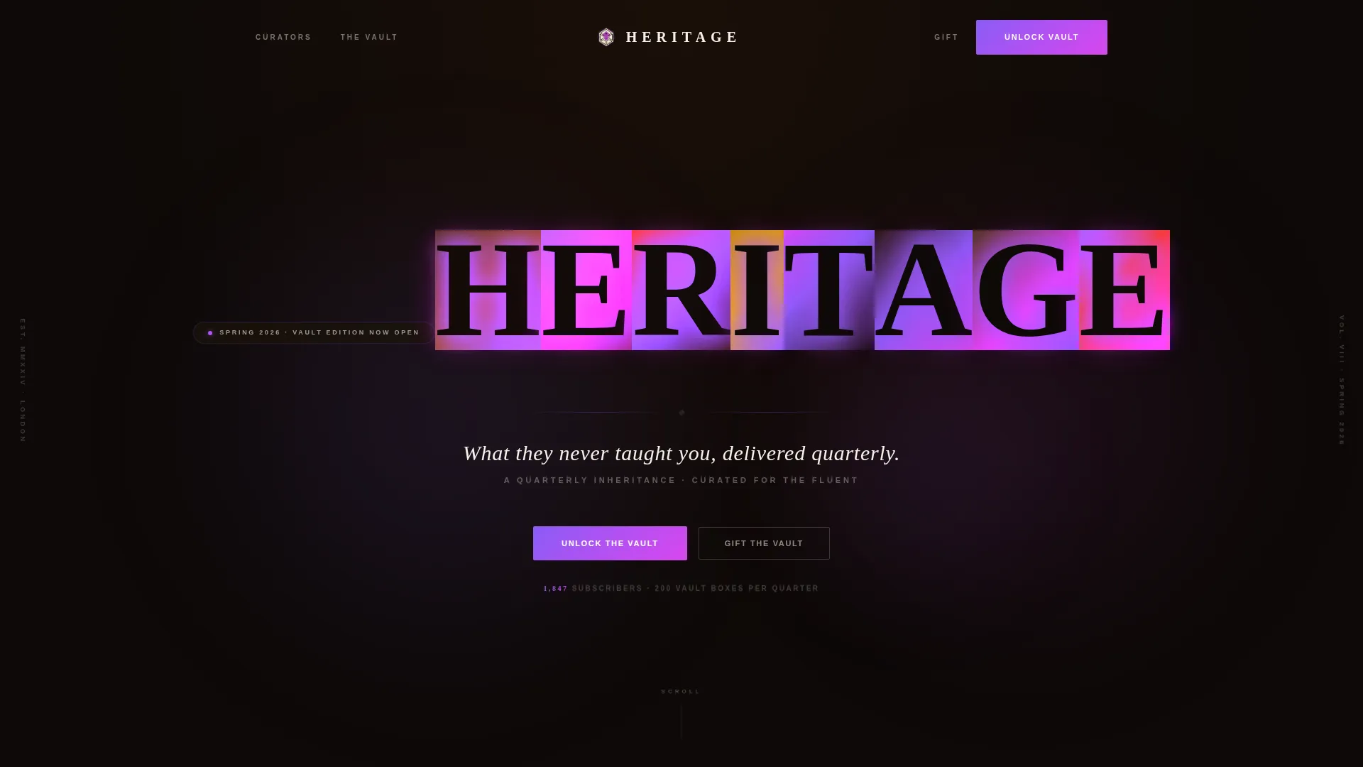
- A viewport-filling Letter Cutout header with per-letter video mask reveals and animated neon edge glow
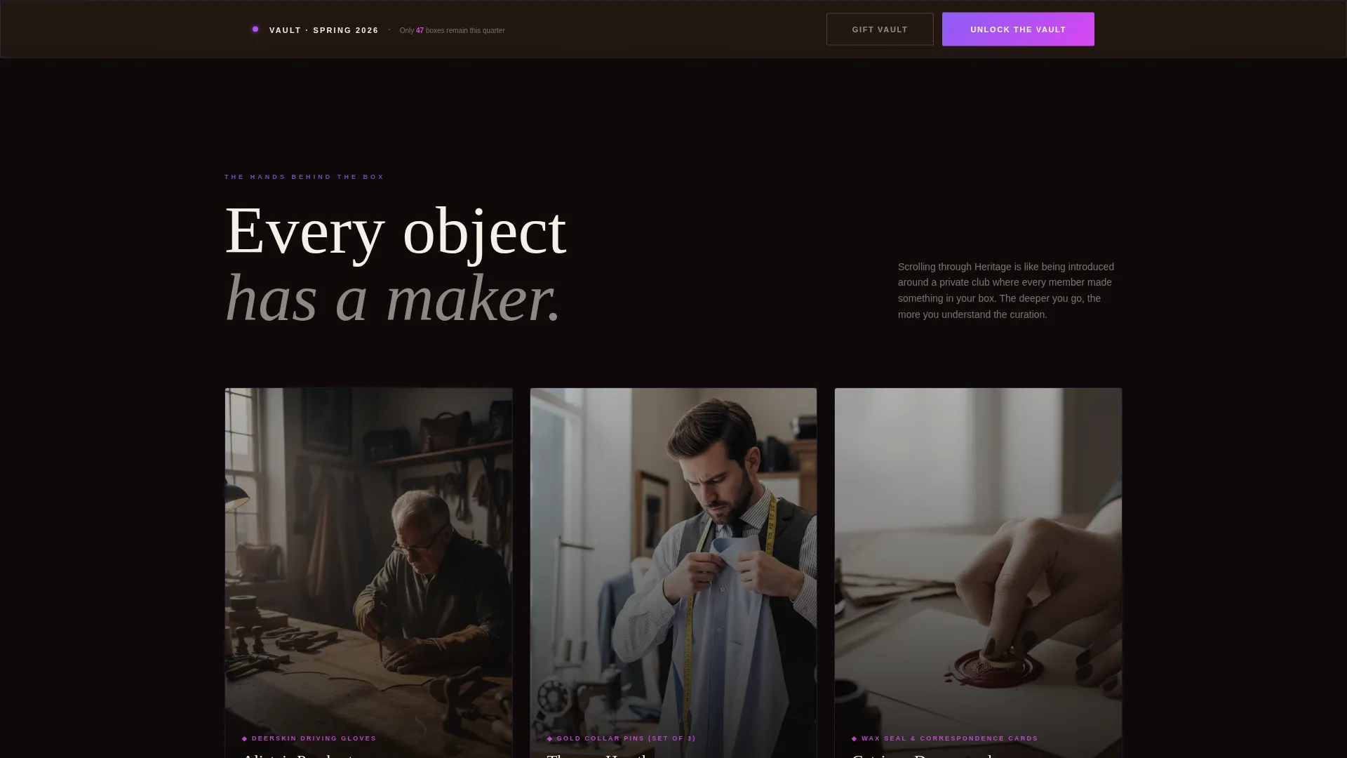
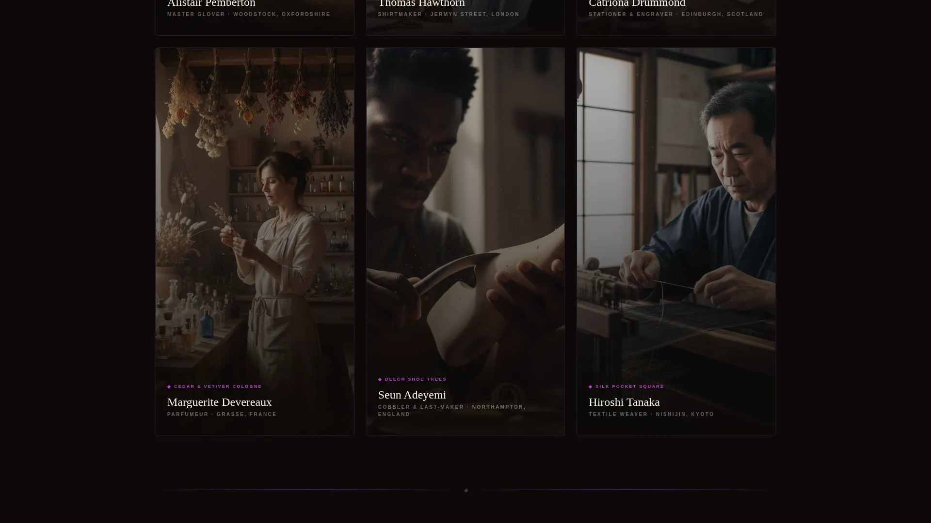
- A staggered masonry Creator Spotlight grid where each card introduces one maker, their object, and their philosophy
- A sticky "Unlock the Vault" call-to-action bar, a Standard versus Vault tier comparison with card flip animation, a "Gift the Vault" secondary path, and a live remaining-slot counter capped at 200 boxes per quarter
Feature list
This section covers the core built-in components that define what the Heritage template delivers.
Letter Cutout Viewport Header
The word "HERITAGE" fills the full viewport in large serif letterforms. Each letter acts as a video mask, revealing a different looping clip beneath: folding a pocket square, wax dripping onto parchment, a signet ring pressing into a seal, a decanter pouring amber liquid, and more. Neon-colored edge animations trace the letterforms with a slow animated glow.
Creator Spotlight Masonry Grid
Cards cascade in staggered columns. Each card features a moody portrait of a real maker, a neon-traced border that intensifies on hover, the object they contributed, and a two-sentence craft philosophy. The layout is designed so scrolling feels like moving through introductions at a private gathering.
Sticky Vault Upgrade Call-to-Action
A "Unlock the Vault" button in electric violet stays pinned to the bottom of the viewport throughout the scroll. It anchors visitor attention to the upgrade path without interrupting the maker narrative above it.
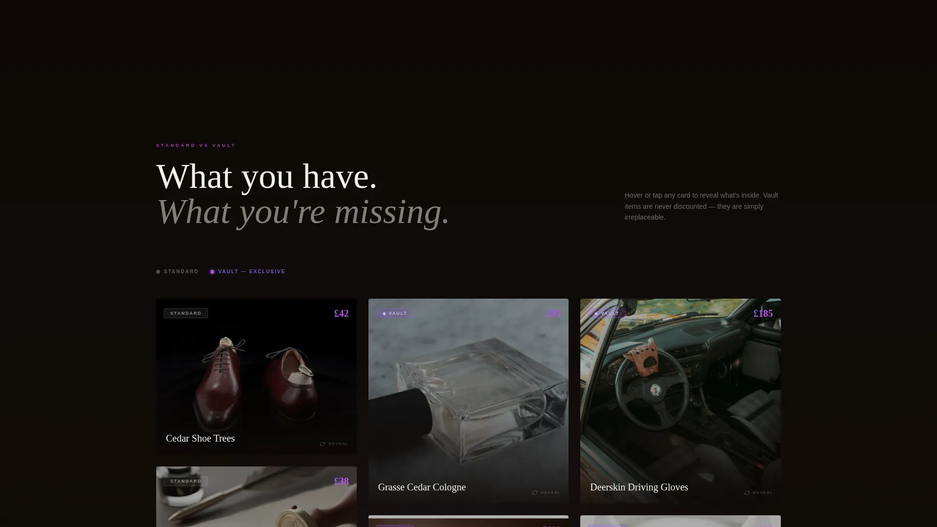
Tier Comparison with Card Flip Animation
Vault tier items are revealed through a masonry card flip animation set against the Standard tier comparison. Each object appears as a discovery rather than a feature checklist, reinforcing the idea that what is inside the Vault cannot simply be described.
Live Remaining Slot Counter
A real-time count of remaining Vault boxes is displayed on the page, with the quarter cap set at 200. The counter converts aspiration into urgency through visible scarcity without using promotional language.
Dual Conversion Path Layout
Two distinct calls to action exist side by side. "Unlock the Vault" targets the subscriber upgrading for themselves. "Gift the Vault" provides a secondary path for subscribers who want to send the premium tier to someone else. Both paths are presented without discount framing.
Page sections overview
| Section | Purpose |
|---|---|
| Letter Cutout Header | Sets the cinematic tone and introduces the brand name through per-letter video masks |
| Tagline Below Header | Delivers the single brand promise in antique cream on dark ground |
| Creator Spotlight Grid | Introduces each maker and their contributed object through staggered masonry cards |
| Sticky Vault call to action | Keeps the upgrade action accessible at all times during the scroll |
| Tier Comparison Module | Contrasts Standard and Vault contents through card flip reveals |
| Live Slot Counter | Displays remaining Vault boxes for the current quarter |
| Gift the Vault Path | Provides an upgrade gifting option as a secondary conversion route |
Design & branding system
The visual identity holds two opposing energies in deliberate tension. Deep mahogany darkness grounds the layout in something old and considered. Electric violet and hot magenta break through that darkness like light through a prism, making heritage feel charged rather than dusty.
- Color palette: deep mahogany black (#0D0907) background, electric violet (#8B5CF6) for the primary call-to-action and hover states, hot magenta (#D946EF) for price tags and tier badges, antique cream (#F5F0E8) for body text
- Typography: large serif letterforms in the header for gravitas, antique cream body text styled to suggest engraved stationery
- Hover and animation system: neon border intensification on Creator Spotlight cards, slow animated glow tracing the header letterforms, card flip transitions in the tier comparison module
Mobile & speed optimization
The masonry grid and video-mask header are the two most visually intensive components. The template is structured so each component has a clear layout role, keeping the experience coherent on smaller viewports.
- Masonry columns reflow for narrower screens so Creator Spotlight cards remain readable and portrait images stay well-framed
- The sticky Vault call-to-action remains pinned at the bottom of the viewport on all screen sizes, preserving the upgrade path at every scroll depth
How this template helps you convert
The Heritage template removes every element that would make the Vault upgrade feel transactional. Conversion comes from atmospheric immersion and felt scarcity rather than promotional mechanics.
- The Creator Spotlight scroll builds personal investment before the tier comparison appears, so subscribers arrive at the Vault reveal already attached to the objects inside it
- The live slot counter makes the 200-box quarterly cap visible and concrete, creating urgency through transparency rather than artificial pressure
- The dual call-to-action layout captures both self-upgraders and gift-intent visitors without splitting the page focus or weakening either path
Other information about this template
Heritage sits at the intersection of old money fashion, quiet luxury lifestyle, and subscription box design. It is built specifically for the masonry layout style with a Dark Immersive theme and a Neon Shock color system. The creative direction follows Creator Spotlight principles, and the header concept uses a Letter Cutout and Mask technique. The landing page direction is Upsell and Upgrade, meaning it assumes an existing subscriber relationship rather than a cold acquisition context.
- Template style: Masonry and Pinterest grid layout
- Theme: Dark Immersive
- Color system: Neon Shock
- Category fit: Fashion and Lifestyle, Old Money Fashion subcategory, Old Money Subscription Box niche
Theme
Dark Immersive
Creative direction
Creator Spotlight
Color system
Neon Shock
Style
Masonry/Pinterest
Direction
Upsell/Upgrade
Page Sections
Letter Cutout Viewport Header
Creator Spotlight Masonry Grid
Sticky Vault Upgrade Button
Tier Comparison with Card Flip
Live Remaining Slot Counter
Dual Conversion Path Layout
Related questions
Who is the target visitor for this landing page?
Does this template support both self-upgrade and gift-upgrade flows?
How does the scarcity mechanic work without discount language?
Can I customize the video content inside the letter mask header?
What makes the Creator Spotlight grid different from a standard product grid?



