Performance-Driven Assessment Landing Page Template
Hirescore is a performance-driven assessment landing page template built for hiring platforms that replace gut-feel decisions with structured, scored evaluations. It features an interactive five-question quiz funnel, a dynamically personalized comparison table, and a before/after metrics panel. The template is designed to make visitors experience the product's logic before they ever reach a sign-up form.
by Rocket studio
Quick summary
Hirescore is a single-page assessment platform template built around a Quiz and Personalize funnel. Visitors answer five inline questions, and the page reshapes itself around their answers. A personalized comparison table, a before/after metrics panel, and two clear conversion paths work together to turn curious visitors into qualified leads.
Who this template is for
This template is built for teams that sell or use structured hiring assessment tools. It speaks directly to the people who feel the pain of high applicant volume and inconsistent evaluation.
- Talent acquisition leads at mid-market software-as-a-service companies managing hundreds of applicants per role
- Learning and development directors who need defensible, structured promotion rubrics
- Agency recruiters who want a shareable scorecard that closes the "one more interview" loop with clients
What problem this template solves
Most hiring pages describe features. This template makes the visitor feel the problem and the solution in the same scroll. It closes the gap between "sounds useful" and "I need this."
- Visitors arrive skeptical and leave without converting because no page proves the product works before sign-up
- Generic comparison tables show every feature to every visitor, burying the ones that actually matter to each buyer
- High applicant volume creates pressure to move fast, and a page that wastes time loses the sale
What you get with this template
You get a complete single-page layout that doubles as a lead qualification engine. Every section is designed to move a specific type of buyer one step closer to action.
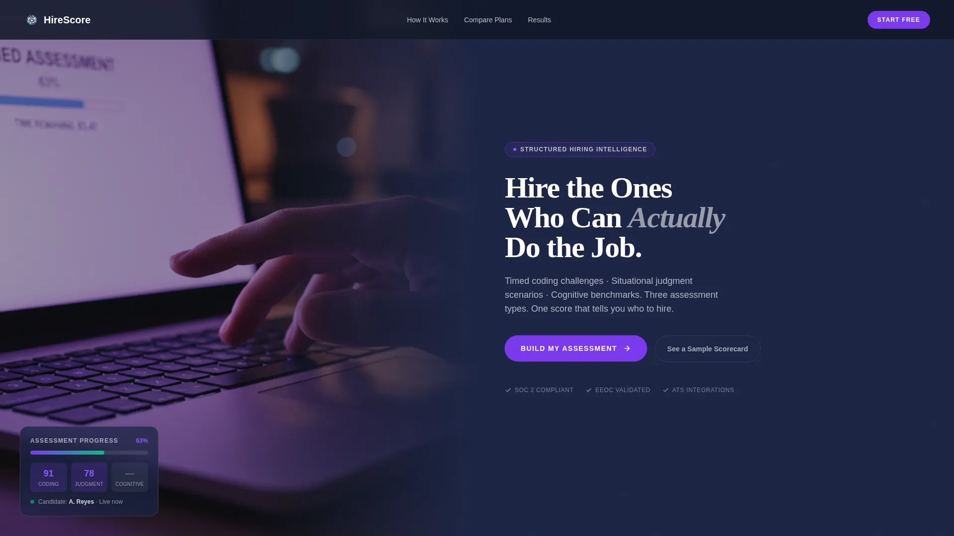
- A half-page photo and text header with a pulsing call-to-action button that launches the inline quiz immediately
- A five-question assessment funnel that collects role type, candidate volume, and current process before question three
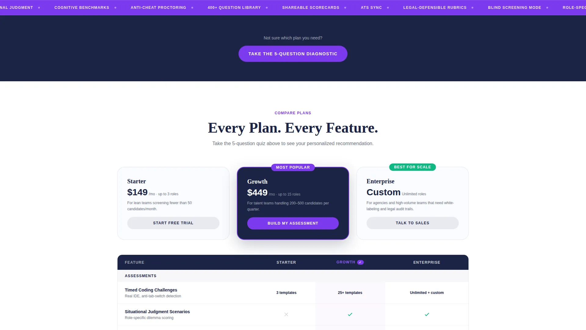
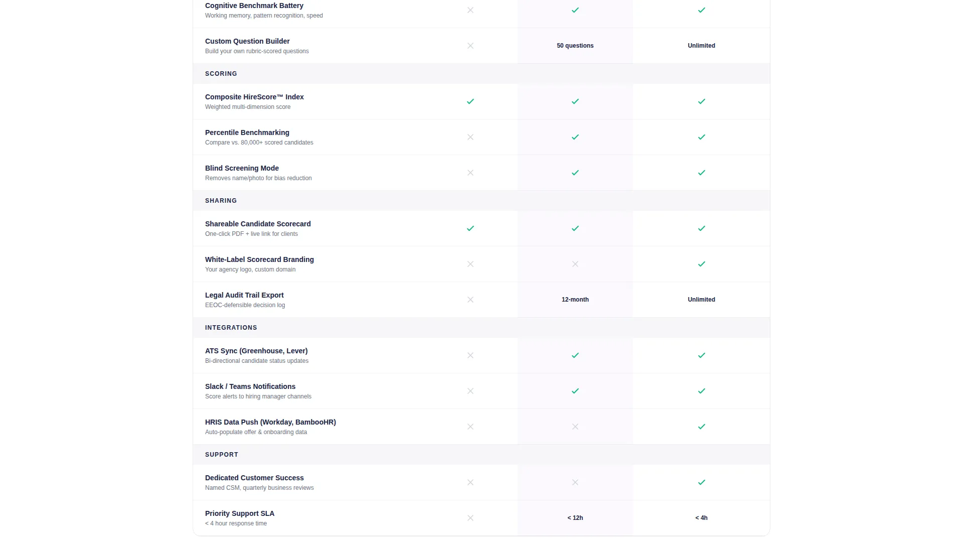
- A dynamically personalized comparison table that surfaces only the plan tier and feature columns relevant to each visitor's answers
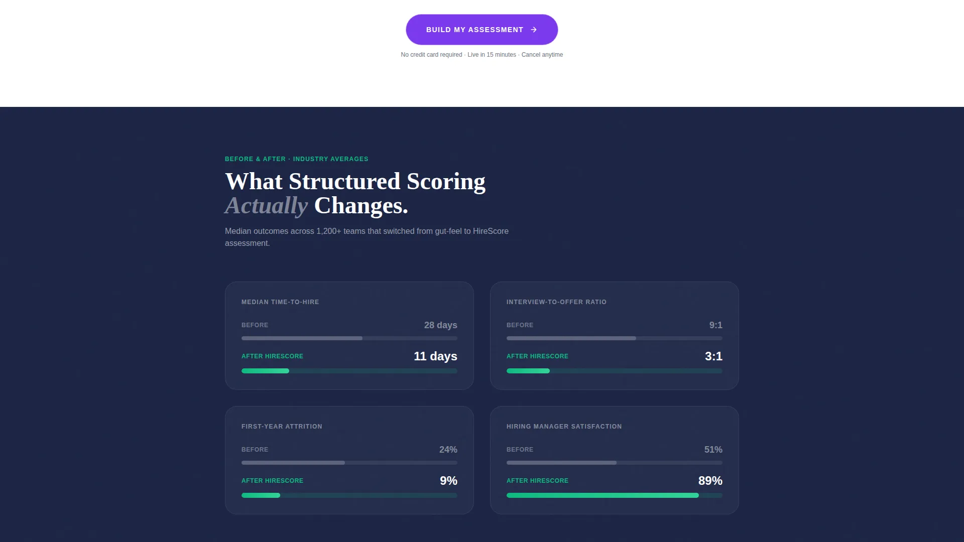
- A before/after metrics panel showing median time-to-hire, interview-to-offer ratio, and first-year attrition adjusted by quiz inputs
- A secondary conversion path, "See a Sample Scorecard," placed behind an email gate for visitors who need proof before committing
Feature list
This template is built around a specific set of components that work together as one cohesive funnel. Each feature serves a deliberate purpose in the visitor's journey from arrival to conversion.
Inline Five-Question Quiz Funnel
The header call-to-action button launches an inline assessment without navigating away from the page. Five questions collect role type, quarterly candidate volume, current scoring process, primary disqualification bottleneck, and quality-of-hire measurement method. By question three, the platform has enough data to qualify the lead for sales prioritization.
Dynamic Comparison Table
The comparison table does not show the same columns to every visitor. Quiz answers reshape the visible plan tiers and feature columns in real time, so each visitor sees only what is relevant to their hiring context. This removes decision fatigue and keeps the page focused.
Before/After Metrics Panel
Scrolling past the personalized table, visitors encounter a metrics panel that shows concrete before/after numbers. Median time-to-hire, interview-to-offer ratio, and first-year attrition figures adjust based on quiz inputs, making the value tangible and specific rather than generic.
Dual Conversion Path Design
The primary call-to-action, "Build My Assessment," appears both inside the quiz flow and pinned at the bottom of the personalized comparison table. A secondary path, "See a Sample Scorecard," gives skeptical visitors an email-gated preview of a real anonymized candidate report. Both paths serve different buyer readiness levels.
Half-Page Photo and Text Header
The header splits into two halves. The left side holds a high-contrast photograph of a hand over a laptop trackpad with a timed progress bar visible at 63 percent. The right side delivers the headline, a three-assessment-type subline, and the quiz-launching button in heavy serif type over a deep navy background.
Page sections overview
| Section | Purpose |
|---|---|
| Header split fold | Introduces the platform and launches the inline quiz immediately |
| Inline quiz flow | Collects five qualifying answers that personalize the page below |
| Personalized comparison table | Shows filtered plan tiers and features based on quiz responses |
| Before/after metrics panel | Displays adjusted hiring metrics to make the value concrete |
| Sample scorecard gate | Lets skeptical visitors preview a real candidate report via email |
| Pinned call to action bar | Keeps "Build My Assessment" visible at the bottom of the table section |
Design & branding system
The visual identity follows an Institutional Authority theme executed through a Dopamine Pop color system. The palette feels rigorous and structured on the surface, then rewards engagement with vivid, satisfying color responses that train the visitor to keep interacting.
- Deep exam-hall navy (#1B2444) dominates the header and footer; crisp whiteboard white (#FAFBFF) opens up the comparison and metrics sections
- Serotonin-hit violet (#7C3AED) marks every primary button and score indicator, drawing the eye to every interactive element
- Correct-answer green (#10B981) fires only on hover states and progress bars, appearing as a reward signal when the visitor engages
Mobile & speed optimization
The template is structured to perform cleanly on smaller screens without sacrificing the quiz-driven flow. Every section is built to load and respond quickly so the inline assessment experience does not feel sluggish on mobile devices.
- The half-page header stacks vertically on mobile, keeping the quiz-launch button immediately visible without scrolling
- The comparison table collapses to a single-column card layout on narrow screens, so personalized results remain readable
How this template helps you convert
The conversion logic is baked into the page structure itself. Visitors are not asked to trust a claim; they are asked to answer a question, and the page does the rest.
- The inline quiz qualifies leads passively: by the time a visitor reaches the comparison table, the platform already knows their role type, volume, and current process, giving sales teams actionable context before first contact.
- The dynamically adjusted metrics panel makes the value personal. A visitor managing four hundred applicants per role sees numbers that reflect their specific situation, making the "Build My Assessment" call-to-action feel like a logical next step rather than a generic prompt.
Other information about this template
This template sits at the intersection of the Education and Training category and the EdTech and Learning Platform subcategory, with a specific focus on the assessment platform niche. It is designed as a comparison table landing page, making it well suited for platforms that want to differentiate plan tiers in a structured, scannable format.
- The template style is Comparison Table, paired with a Quiz/Assessment funnel direction for a lead qualification experience that is uncommon in this category
- The creative direction is Quiz and Personalize, meaning the page actively adapts to each visitor rather than presenting a static layout
- The Institutional Authority theme balances the credibility signals that talent acquisition buyers expect with the engaging, reward-driven color behavior that keeps them interacting
Theme
Institutional Authority
Creative direction
Quiz & Personalize
Color system
Dopamine Pop
Style
Comparison Table
Direction
Quiz/Assessment
Page Sections
Inline Five-question Quiz Funnel
Dynamic Comparison Table
Before/after Metrics Panel
Dual Conversion Path Design
Half-page Photo and Text Header
Related questions
Who is this landing page template designed for?
Can the comparison table really show different content to different visitors?
What are the two conversion paths in this template?
Does the page require visitors to scroll to experience the quiz?
Is this template suitable for a single product or multiple plan tiers?



