Nonprofit Organization Maintenance Website Template
Hold is a brutalist-style nonprofit maintenance landing page built for organizations in active transformation. It replaces a dead-link moment with visible progress, showing board members, recurring donors, and grant officers that the rebuild is real. A split-screen layout, live dashboard metrics, and a before/after comparison engine make the case without a single empty promise.
by Rocket studio
Quick summary
Hold is a single-page nonprofit maintenance template designed for the critical window between "old site down" and "new site live." It puts raw construction progress on display through a 50/50 split-screen layout, a live dashboard tracker, and a three-part before/after comparison engine. Visitors leave with confidence, not confusion.
Who this template is for
This template is built for nonprofits that are actively rebuilding their digital presence and need something live while the new site is in development. It speaks directly to the three people most likely to check the URL during a transition.
- Recurring donors who hit a broken bookmark and need reassurance the organization is still operating
- Board members monitoring rebuild progress and looking for milestone transparency
- Grant officers conducting due diligence who need visible proof of active development
What problem this template solves
A nonprofit mid-transformation faces a specific trust problem. The old site is gone, the new one is not ready, and the silence in between reads as institutional collapse to anyone who checks. This template fills that silence with structured, visible momentum.
- Donors lose confidence when a familiar URL goes dark with no explanation
- Grant officers need documented proof of active development, not just a holding page with a logo
- Board members want milestone visibility, not a generic "coming soon" message
What you get with this template
You get a fully structured single-page layout purpose-built for nonprofit transition communication. Every section is designed to convert anxiety into anticipation and passive visitors into launch-day subscribers.
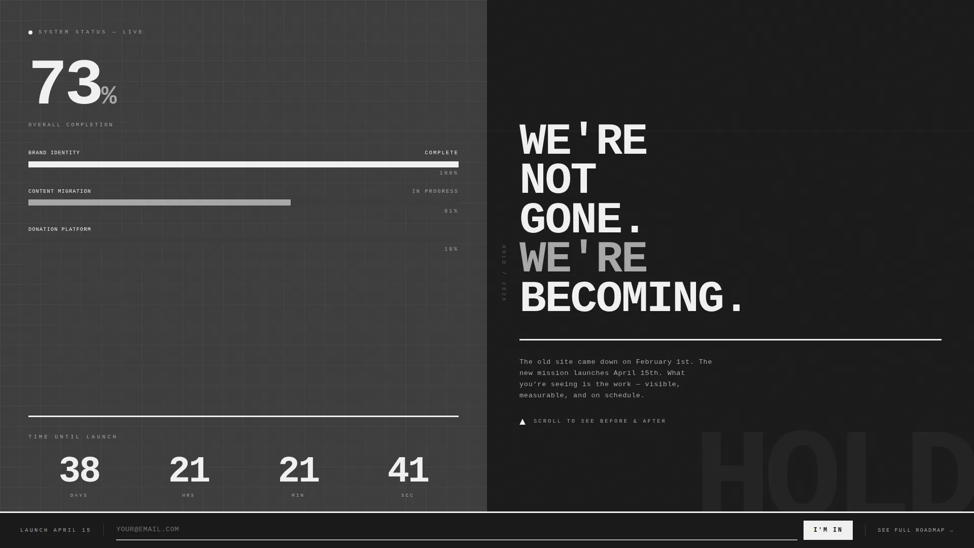
- A hero section with a split-screen dashboard tracker showing completion percentage, countdown timer, and status bars for active workstreams
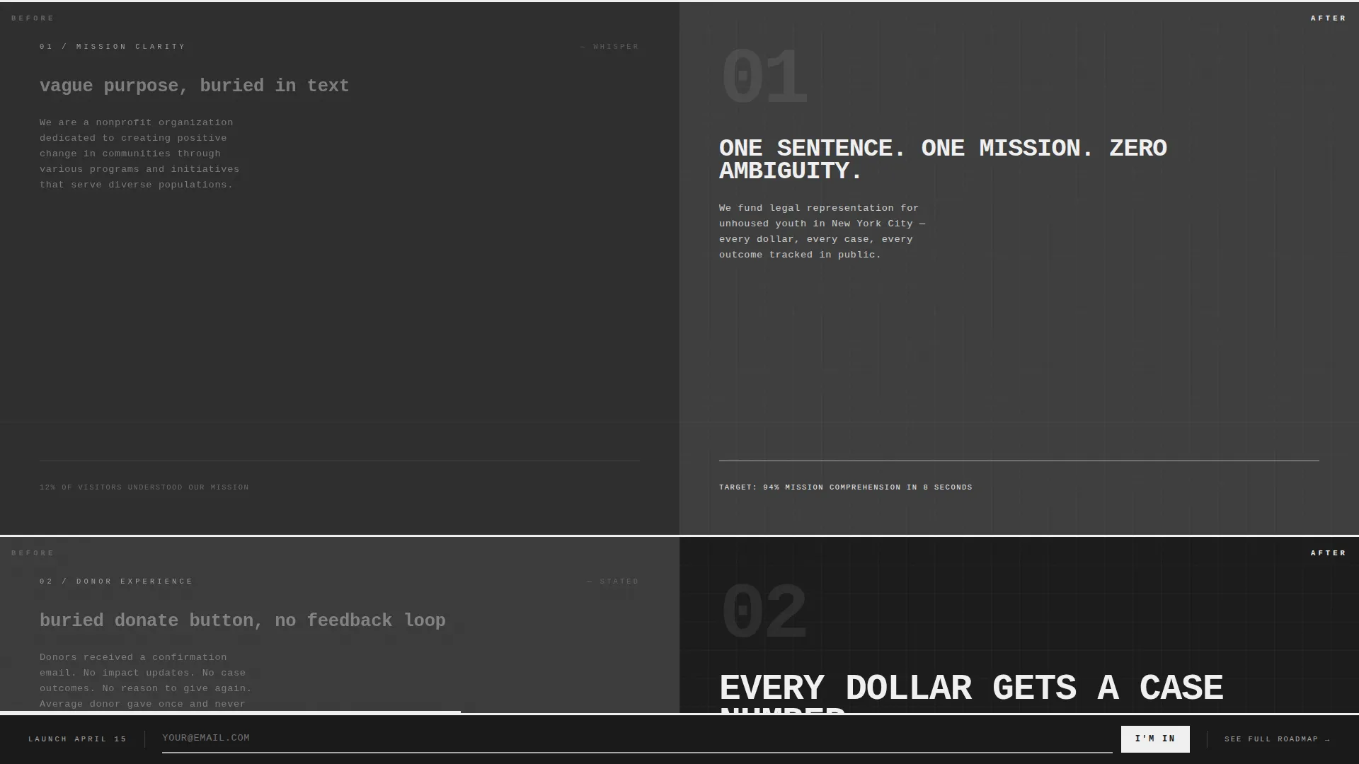
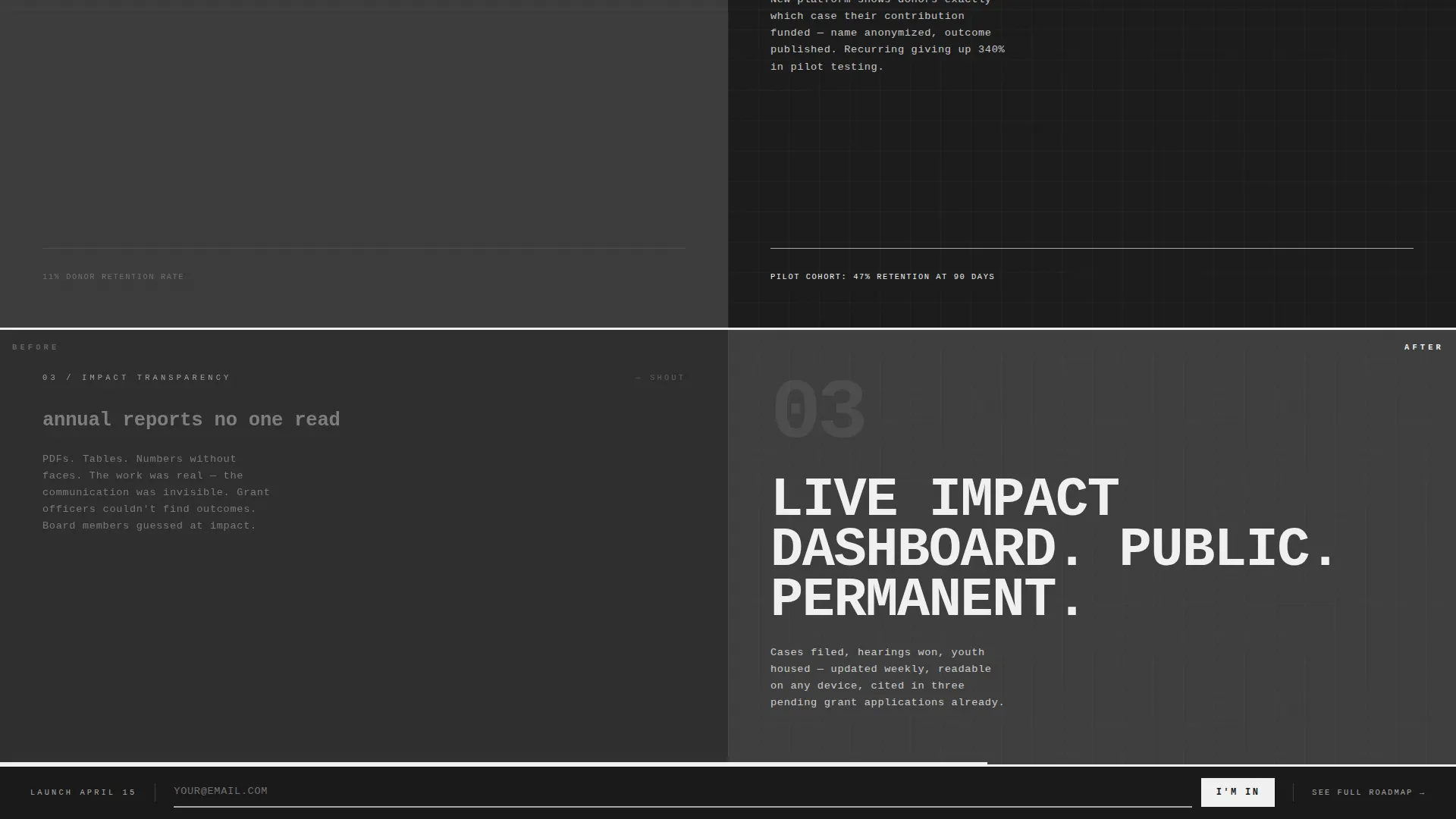
- Three escalating before/after comparison sections covering mission clarity, donor experience, and impact transparency
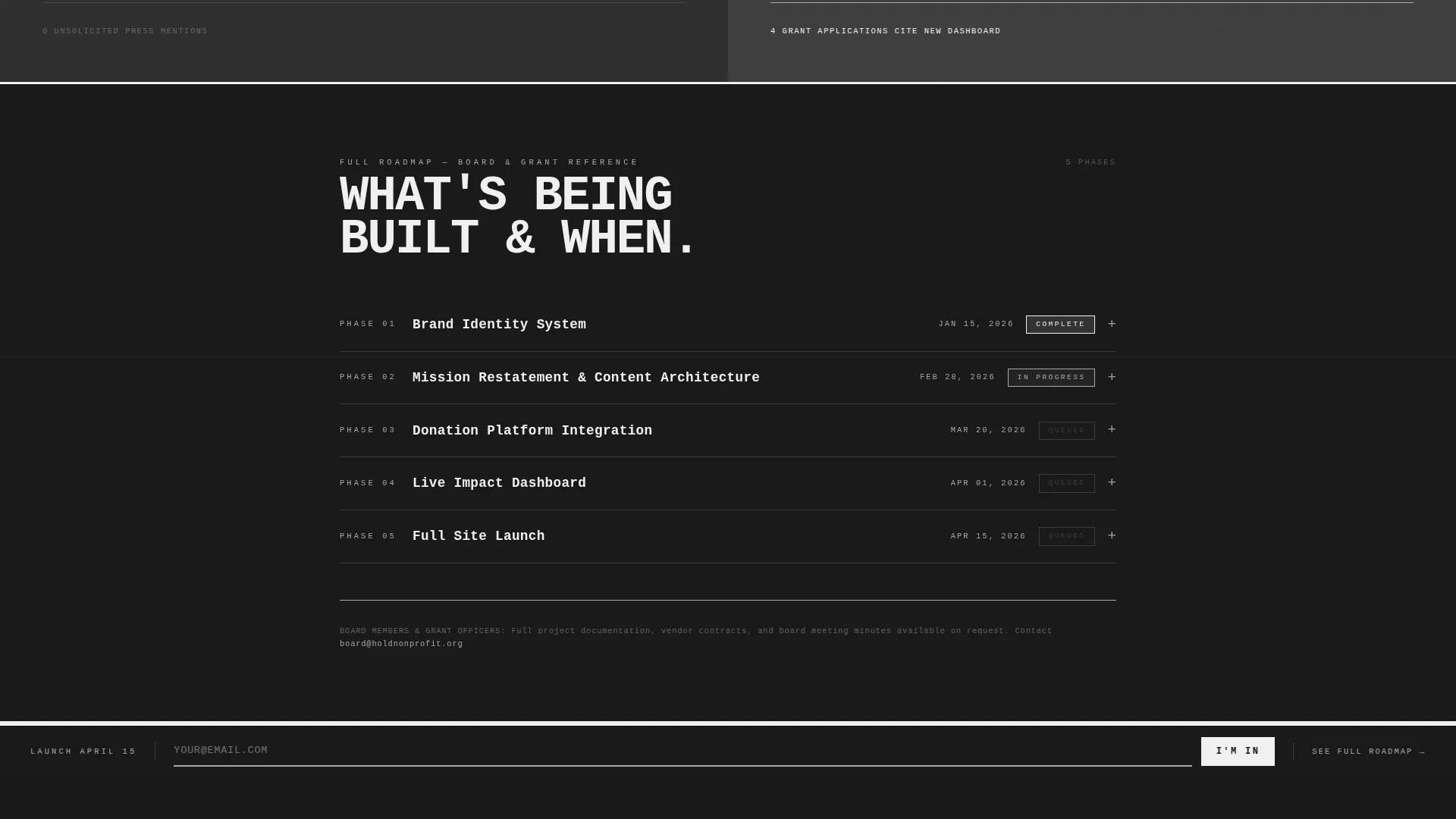
- A persistent email capture bar and an expandable roadmap accordion for full milestone transparency
Feature list
This template delivers a focused set of purpose-built components. Each one addresses a specific visitor need during the organizational rebuild window.
Split-Screen Hero with Live Dashboard
The hero divides the viewport evenly. The left panel displays a stylized project tracker with a 73% completion indicator, a live countdown timer, and thick brutalist progress bars for three active workstreams: Brand Identity, Content Migration, and Donation Platform. The right panel shows a single oversized line of signal white text against forge black, communicating organizational resolve without a logo or tagline.
Escalating Before/After Comparison Engine
Three sequential sections pair the organization's old digital presence against fragments of what is coming. The first section whispers the contrast, the second states it, and the third amplifies it. Each pair covers a distinct dimension: mission clarity, donor experience, and impact transparency. Old-side panels use muted, cramped layouts behind a translucent gunmetal overlay. New-side panels break open with full-bleed brutalist type and visible grid lines.
Persistent Email Capture Bar
A slim notification bar is pinned to the bottom of the viewport at all times. It carries a single email input field and a monospaced submit button labeled "I'M IN." The bar stays visible without obscuring content, keeping the conversion path available at every scroll position.
Expandable Roadmap Accordion
A "See the Full Roadmap" inline link expands a structured accordion of project milestones with dates. This component is specifically designed for board members and grant officers who need timeline transparency rather than marketing language.
Scroll Depth Progress Bar
A horizontal progress bar tracks scroll depth across the bottom of the viewport. It reinforces the feeling of forward momentum as visitors move through the page, turning passive reading into a measurable experience of building toward something.
Page sections overview
| Section | Purpose |
|---|---|
| Split-Screen Hero | Show live rebuild metrics and signal the organization is active |
| Mission Clarity Comparison | Whisper the contrast between old and new mission presentation |
| Donor Experience Comparison | State the improvement to donor-facing communication and flow |
| Impact Transparency Comparison | Amplify the shift toward open, structured impact reporting |
| Roadmap Accordion | Give board members and grant officers dated milestone visibility |
| Footer | Minimal social links and copyright, no distraction |
Design & branding system
The visual identity follows a Bold Brutalist theme built on a Monochrome Steel color system. Every design decision rejects decoration in favor of structural clarity and industrial confidence.
- Color palette: forge black (#1A1A1A) for primary backgrounds, structural gunmetal (#3D3D3D) for section alternation, cold-rolled silver (#A8A8A8) for secondary text, and signal white (#F0F0F0) reserved for primary text and interactive elements
- Typography: JetBrains Mono at oversized scale, edge-slammed against layout boundaries in a stencil-like manner with no gradients, no soft transitions, and no decorative elements
- Layout logic: hard-cut blocks, visible grid lines, thick brutalist progress bar slabs, and a strict 50/50 viewport split that holds the raw architectural energy throughout
Mobile & speed optimization
This template is designed desktop-first, reflecting the primary audience of board members and grant officers working at a desk. A mobile fallback is included so donors checking from their phones still receive the full message.
- Desktop-first layout prioritizes the 50/50 split-screen fidelity and large-format monospaced type at full impact
- Static sections use server-side rendering while interactive components, including the countdown timer and scroll tracker, are handled client-side for clean separation of concerns
- Animated elements, including progress bar fills, the countdown timer, and the roadmap accordion, run at a medium intensity level that communicates urgency without adding unnecessary weight
How this template helps you convert
Every structural choice in this template moves a specific type of visitor toward a single action: subscribing for launch-day notification. The conversion path is persistent, frictionless, and earned through visible evidence rather than persuasive copy.
- The dashboard metrics and progress bars provide immediate proof of active work, giving donors and grant officers a factual reason to stay engaged rather than disengage
- The escalating before/after comparison sections build a cumulative case across three sections, so by the time a visitor reaches the email capture bar they have already seen the evidence
- The roadmap accordion addresses the transparency needs of high-trust visitors, like board members and grant officers, removing the final objection before they commit their email address
Other information about this template
This template fits within the broader category of nonprofit organization website templates, specifically designed for the maintenance and transition phase. It is a practical tool for any organization that needs to communicate active progress rather than absence.
- Template style is Split Screen (50/50), a layout approach that suits side-by-side comparison and dashboard-plus-statement hero patterns
- The creative direction is Launch Energy, meaning urgency compounds across sections rather than remaining flat or decorative
- The header concept is Dashboard Preview, which grounds the page in real metrics rather than aspirational visuals
- The landing page direction is Comparison/Versus, making the structural case for organizational improvement through direct visual contrast
- This template is categorized under Technology and the Nonprofit Organization Website Templates subcategory, with a specific niche focus on nonprofit organization maintenance pages
Theme
Bold Brutalist
Creative direction
Launch Energy
Color system
Monochrome Steel
Style
Split Screen (50/50)
Direction
Comparison/Versus
Page Sections
Split-screen Hero with Dashboard Tracker
Three-part Before/after Comparison Engine
Persistent Email Capture Bar
Expandable Roadmap Accordion
Scroll Depth Progress Bar
Related questions
Who is this landing page template designed for?
Can I update the dashboard metrics and milestone dates to match my actual project?
Does this template include the email notification feature out of the box?
Is this template usable on mobile devices?
Can the before/after comparison sections be customized to reflect our organization's specific story?



