Homeroom - Dynamic K12 Landing Page Template
Homeroom is a bento grid landing page built for K-12 scheduling and booking platforms. It combines a live-stats dashboard header, role-based content toggling, and a launch-sequence scroll flow to drive app downloads. The Acid Digital color system and Dynamic Motion animations make the entire page feel as fast and purposeful as the scheduling engine it promotes.
by Rocket studio
Quick summary
Homeroom is a single-page bento grid landing page designed for K-12 education scheduling and booking platforms. It opens with a mission-control dashboard, escalates through animated feature cards, and closes with a frictionless app download prompt. The design feels institutional yet electric, built to earn trust from administrators, coordinators, and parents in under three scroll segments.
Who this template is for
This template is built for teams running K-12 scheduling and booking products that need to communicate speed, reliability, and simplicity to a busy audience. If your platform handles bell times, substitute coverage, or parent-teacher conference slots, this page speaks directly to the people making those decisions.
- Assistant principals and school administrators managing daily classroom rotations and substitute logistics
- District-level coordinators syncing schedules and bus routes across multiple campuses
- Product teams and ed-tech founders who need a high-converting app download page for a K-12 booking tool
What problem this template solves
Scheduling chaos is invisible to outsiders but exhausting for the people inside it. A generic landing page cannot communicate the real-time pressure of filling a sub vacancy at 7 AM or finding a fifteen-minute parent slot on a Tuesday evening. This template makes the machine visible.
- It shows proof before it asks for anything, letting animations demonstrate the product's speed across three scroll sections
- It removes friction from the download path with a floating call-to-action pill, a text-link prompt, and a scannable QR code tile
- It addresses three distinct user roles in one page by toggling the bento grid view to match the visitor's context
What you get with this template
You get a fully structured bento grid landing page with a coordinated motion system, a role-aware content toggle, and a multi-path app download flow. Every section is purpose-built around a specific moment in the visitor's scroll journey.
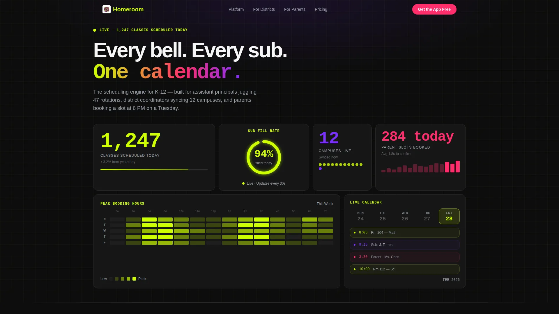
- A stats dashboard header with counting animations, a booking heatmap tile, a substitution fill-rate arc, and a flipping calendar tile
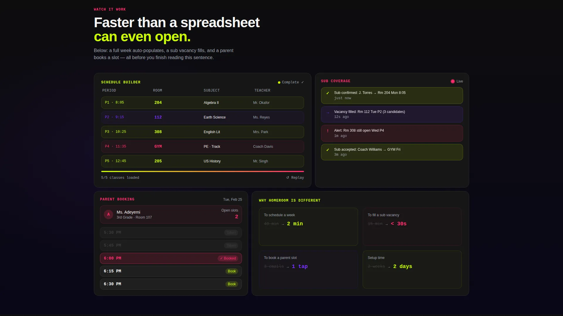
- Staggered bento card animations showing a schedule builder auto-populating, a substitute confirmation ping, and a parent booking widget in action
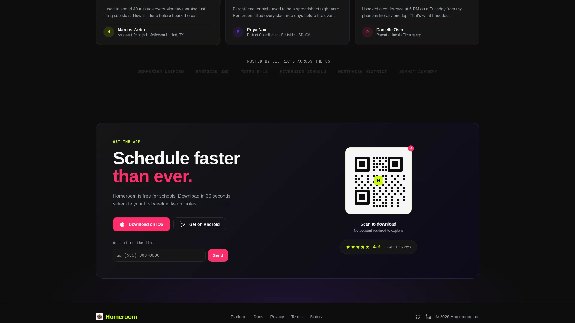
- A floating hot-pink call-to-action pill, a "Text Me the Link" phone-entry prompt with a country selector, and an in-grid QR code tile
Feature list
This template is built around a precise set of components drawn directly from the brief. Each one serves a specific conversion or engagement purpose.
Live Stats Dashboard Header
The header opens with four bento tiles: a class-count display with a counting animation, a peak-hours heatmap glowing chartreuse to pink, a substitution fill-rate readout with a rising arc, and a flipping calendar tile. Numbers are set in monospace type at mission-control scale.
Role-Based Grid Toggle
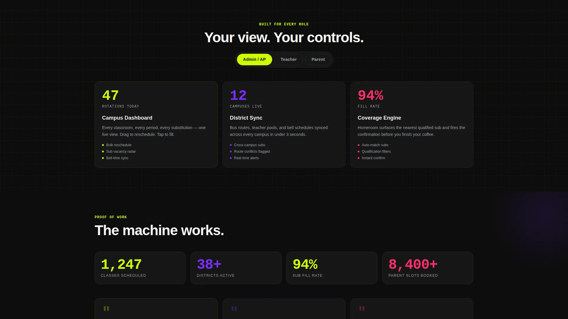
A toggle control lets visitors select their role, admin, teacher, or parent. The bento grid reshuffles to show the layout most relevant to that role. One page, three audiences, zero confusion.
Staggered Launch-Sequence Animations
Each bento card detonates into view with staggered motion as the visitor scrolls. The sequence shows the schedule builder auto-populating a full week, a substitute confirmation notification, and a parent meeting being booked with a single tap.
Multi-Path App Download Flow
The primary call-to-action is a hot-pink floating pill pinned after the first scroll. A secondary "Text Me the Link" prompt opens a single phone-number field with a country selector. A QR code tile inside the grid is scannable without any interaction.
Acid Digital Color System
Electric chartreuse dominates data cards and highlights. UV purple anchors section backgrounds. Hot signal pink pulses on every tappable element. Terminal black holds the grid structure together. The palette is consistent, purposeful, and immediately recognizable.
Page sections overview
| Section | Purpose |
|---|---|
| Stats Dashboard Header | Opens with live-feel metrics and counting animations to establish platform credibility immediately |
| Schedule Builder Demo | Shows the app auto-populating a full school week in two seconds via animated bento card |
| Substitute Confirmation Tile | Demonstrates real-time substitute coverage with a notification ping animation |
| Parent Booking Widget | Shows a parent locking a meeting slot with a single tap inside a dedicated card |
| Role Toggle Grid | Reshuffles the bento layout to reflect the admin, teacher, or parent perspective |
| QR Code Tile | Provides an always-visible, no-click path to the app download inside the grid |
| Floating Download call to action | Pins the "Get the App Free" pill to the viewport bottom after the first scroll |
| Text Link Prompt | Offers a frictionless phone-number field with country selector as a secondary download path |
Design & branding system
The visual identity runs on the Acid Digital color system paired with a Dynamic Motion theme. The result feels like a school hallway rewired with LED strips: institutional structure with a digital nervous system underneath. Typography leans on monospace weights to reinforce the data-readout aesthetic.
- Color roles: chartreuse (#CCFF00) for data highlights and cards, UV purple (#7B2FFF) for section backgrounds, hot signal pink (#FF2D6B) for all tappable elements and alerts, terminal black (#0D0D0D) for the grid framework
- Motion principles: staggered card entrances, counting number animations, a rising arc on the fill-rate readout, and a day-flipping calendar tile all contribute to the Launch Energy creative direction
- Typography uses monospace weights at large scale for metric displays, creating a mission-control readout feel without relying on photography
Mobile & speed optimization
The bento grid layout is designed to reflow naturally on smaller screens, keeping the most impactful tiles prominent on mobile. The floating call-to-action pill and the QR code tile are both preserved in the mobile layout, ensuring the download path stays frictionless regardless of device.
- The floating pink pill call to action remains pinned to the viewport bottom on mobile, keeping the primary conversion action always accessible
- The "Text Me the Link" prompt is intentionally low-friction: one phone field, one country selector, no extra form fields
- Staggered animations are scoped to individual bento cards so they fire as each tile enters the viewport, keeping the scroll experience smooth on mobile
How this template helps you convert
Every design decision in this template is oriented around reducing time-to-download. The page earns the click before it asks for it.
- The stats dashboard header leads with proof: real numbers at scale that make administrators lean forward before reading a single line of marketing copy
- The animated scroll sequence shows the app completing three real tasks, scheduling a week, filling a sub vacancy, confirming a parent meeting, before the visitor reaches the call-to-action
- Three parallel download paths (floating pill, text-link prompt, QR code tile) mean a visitor never has to search for the next step, regardless of how they prefer to act
Other information about this template
This template is a single-page bento grid landing page, not a multi-page site. It is optimized for ed-tech products operating in the K-12 education space, particularly platforms focused on scheduling, booking, and substitute management. The design system and motion approach are production-ready as built.
- The template is part of a broader collection of education technology landing pages built for digital-first K-12 products
- The bento grid layout is modular, making it straightforward to add, remove, or reorder tiles to match your specific product's feature set
- No stock photography is used anywhere in the design; all visual proof comes from animated data displays and interface demonstrations
Theme
Dynamic Motion
Creative direction
Launch Energy
Color system
Acid Digital
Style
Bento Grid
Direction
App Download
Page Sections
Live Stats Dashboard Header
Role-based Grid Toggle
Launch-sequence Scroll Animations
Multi-path App Download Flow
Acid Digital Color System
Related questions
Who is this landing page template built for?
Can I customize the color palette or branding?
Does the template include actual scheduling functionality?
How does the role toggle work?
What are the three ways visitors can download the app?



