Specialized Certification & Programs Education Website Template
Homeroom is a sidebar companion landing page template built for online high schools. It opens with an illustrated persona selector, guides visitors through a problem-to-solution scroll arc, and converts through an inline learning-path quiz. The Electric Indigo and hearthstone color system makes the page feel warm, personal, and distinctly different from generic education sites.
by Rocket studio
Quick summary
Homeroom is a single-page template designed for online high schools that need to speak to students, not at them. It combines a persona-driven header, a guided scroll narrative, and an inline five-question quiz to move visitors toward enrollment without pressure. The Community Hearth visual identity keeps every section warm, clear, and inviting.
Who this template is for
This template is built for online high schools and alternative education programs that serve teenagers who did not thrive in a traditional school setting. It speaks directly to students and the parents supporting them.
- Founders and admissions teams at online high school programs looking for a compelling first impression
- Schools serving military families, young athletes, performers, or self-directed learners who need flexible scheduling
- Education marketers who want a conversion-focused page that feels personal rather than institutional
What problem this template solves
Most school landing pages look like brochures. They list features and credentials without acknowledging why a student is looking for something different in the first place. Homeroom changes that starting point.
- Students arrive carrying a specific frustration, and this template names it out loud before asking them to do anything
- The rigid, one-size-fits-all school experience has no clear visual counterpart on most enrollment pages, this template makes the alternative concrete and visible
- Generic call-to-action buttons fail to earn trust from teenagers who are already skeptical of institutions
What you get with this template
You get a fully structured sidebar companion landing page ready to adapt for your online high school program. Every section has a defined purpose and a clear visual role.
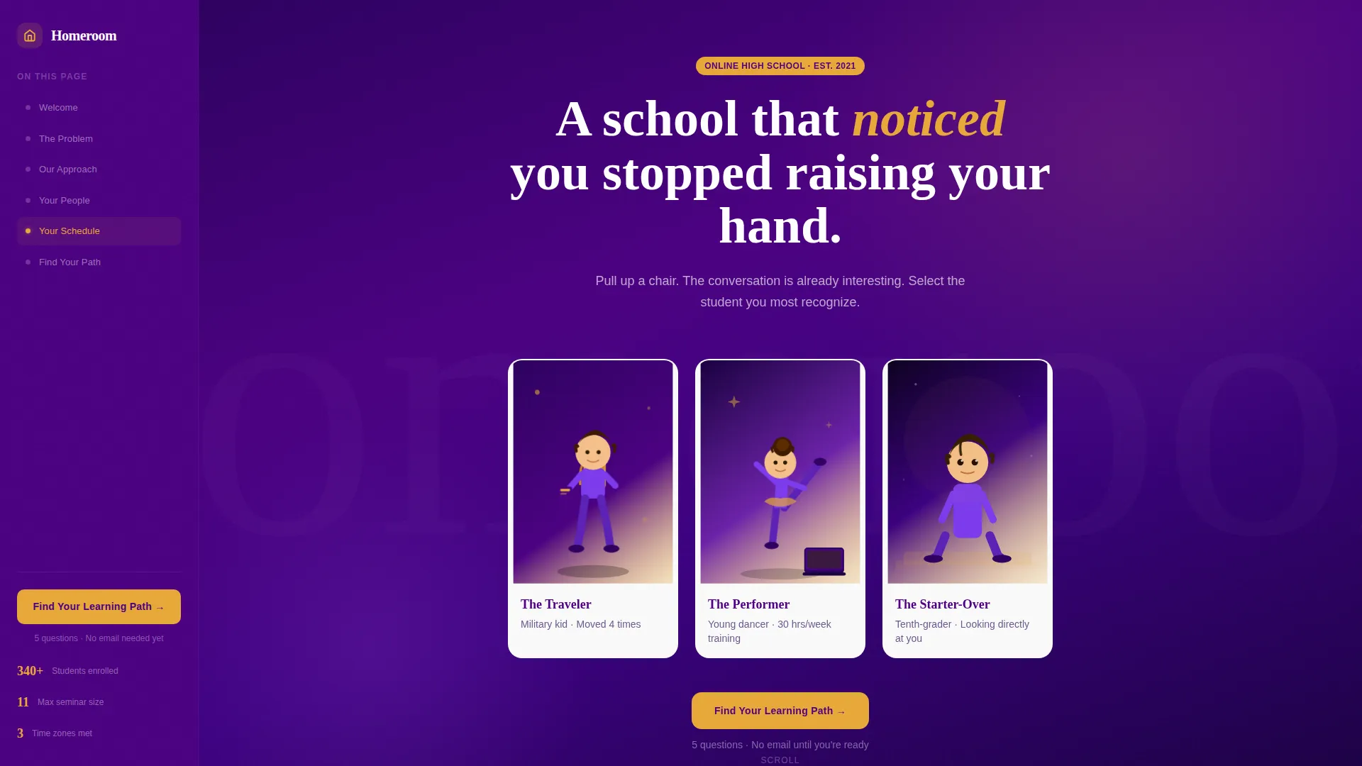
- An animated persona selector header with three illustrated student portraits and personalized hover copy
- A scrolling problem-to-solution arc with draggable calendar tile visuals, seminar-style screen mockups, and embedded testimonial video slots
- An inline five-question quiz flow with illustrated answer cards, a results screen, and a single focused lead-capture field
Feature list
This template is built around purposeful components. Each one earns its place in the page layout.
Animated Persona Selector Header
Three illustrated student portraits sit side by side at the top of the page. Each is rendered in an indigo-and-amber duotone with subtle animation, hair movement, eye blinks, just enough motion to feel alive. Hovering reveals a single sentence that names a relatable school frustration. Clicking selects a personalized path through the rest of the page.
Problem-to-Solution Scroll Arc
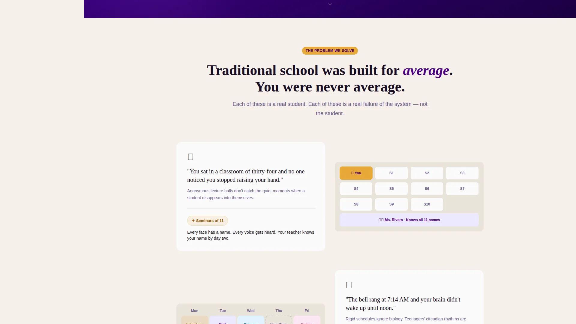
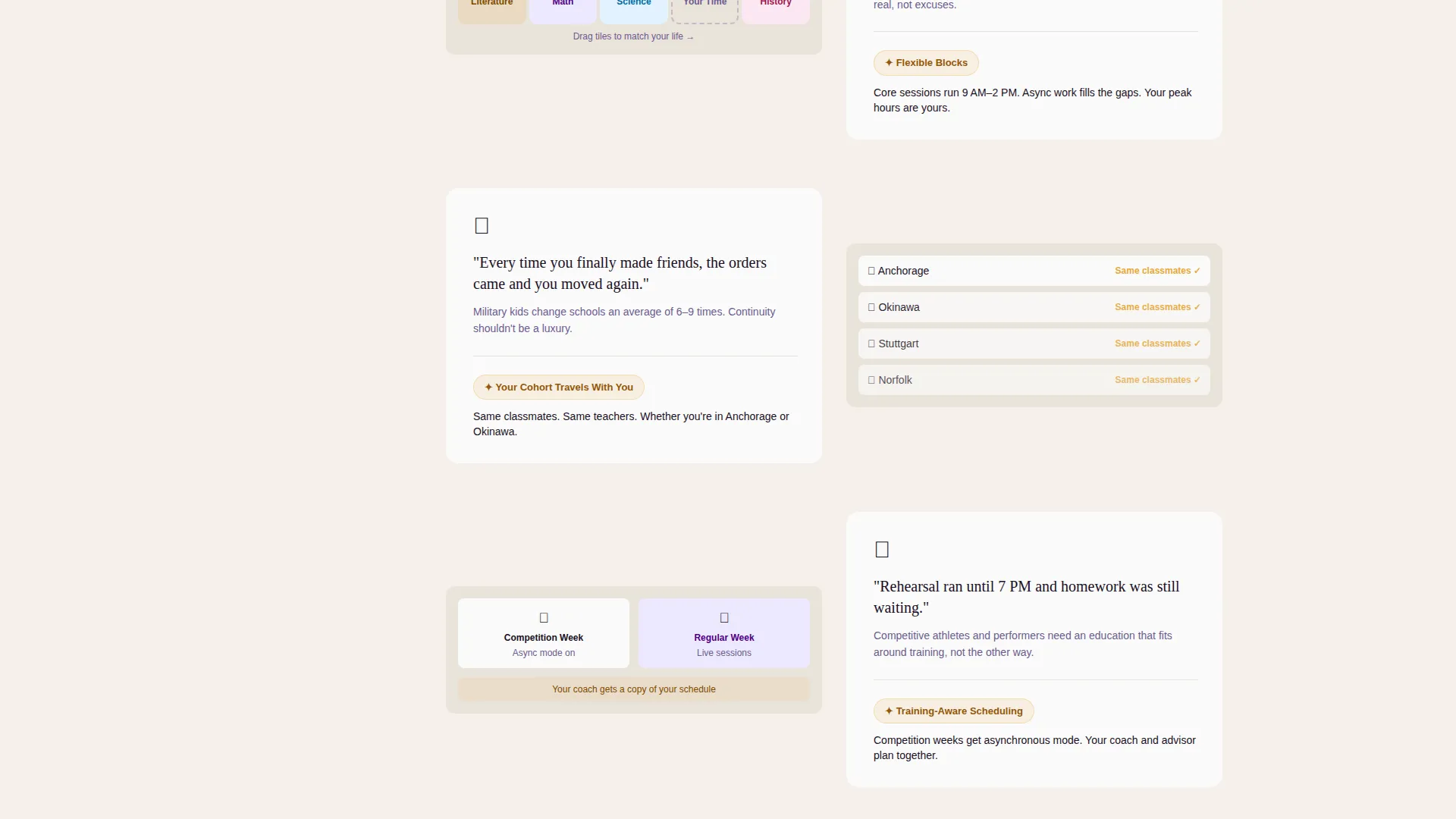
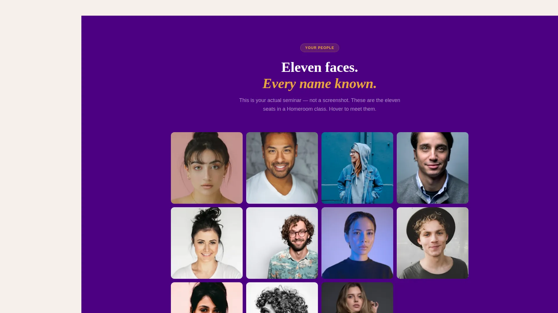
The page narrative unfolds section by section from the persona choice downward. Each scroll block names a specific pain point in plain, direct language, then immediately shows the alternative. Rigid bell schedules become draggable calendar tile visuals. Anonymous lecture halls become illustrated seminars of eleven named faces on screen.
Persistent Sidebar Navigation
The sidebar lives in deep indigo and stays fixed throughout the entire scroll. It functions as a chapter list for the page, pulsing amber on whichever section is currently active. This makes a long scroll feel guided and intentional rather than endless.
Inline Learning-Path Quiz
The primary conversion tool opens inside the page without triggering a redirect. Five illustrated question cards ask low-stakes, personal questions. No email address is required until the results screen appears, keeping the experience low-friction and trust-building from the first question.
Student Testimonial Video Slots
Short video clip blocks interrupt the scroll arc at natural intervals. These slots are sized for raw, thirty-second clips shot on phone cameras, reinforcing the authentic, student-first tone of the page without requiring polished production.
Results Screen with Lead Capture
After the quiz, a dedicated results layout presents a recommended program track, a sample weekly schedule, and a focused lead-capture form. The form asks only for name, email, and grade level, reducing friction at the exact moment the visitor is most engaged.
Page sections overview
| Section | Purpose |
|---|---|
| Persona Selector Header | Lets visitors self-identify and choose a personalized scroll path |
| Pain Point Block | Names the specific frustration tied to the selected persona |
| Solution Reveal Block | Reframes the pain point with a concrete visual alternative |
| Testimonial Video Slot | Builds trust with a short authentic clip from a real student |
| Flexible Schedule Visual | Shows draggable calendar tiles as proof of scheduling freedom |
| Seminar Screen Mockup | Contrasts small named seminars with the anonymous classroom |
| Quiz Entry Call to Action | Introduces the inline learning-path quiz with a clear prompt |
| Inline Quiz Flow | Five illustrated question cards collected without a page change |
| Quiz Results Screen | Delivers a program track, sample schedule, and lead-capture form |
| Persistent Sidebar | Tracks scroll progress and keeps the quiz button always visible |
Design & branding system
The visual identity follows a Community Hearth theme built around an Electric Indigo color system. The palette is designed to feel like a laptop glowing warmly at golden hour, technological but never cold.
- Deep digital indigo (#4B0082) anchors the sidebar and primary brand elements; soft hearthstone (#F5F0EB) warms every background surface; chalk-white (#FAFAFA) fills content panels
- Living-room amber (#E8A838) appears only on active states, hover buttons, pulsing progress indicators, and notification pings, so every amber element signals that something is alive and waiting
- Student portrait illustrations use an indigo-and-amber duotone style throughout, tying the visual identity together from the header down to the quiz answer cards
Mobile & speed optimization
The sidebar companion layout adapts gracefully from desktop to smaller screens. The fixed sidebar collapses into a progress indicator at mobile widths, keeping the page navigable without crowding the main content area.
- Illustrated answer cards in the quiz restack vertically on small screens, preserving the low-friction experience on touch devices
- Testimonial video slots use contained embed areas sized to avoid layout shift as media loads
How this template helps you convert
Homeroom is built around a single insight: a student has to feel understood before they will hand over their contact details. Every layout decision supports that sequence.
- The persona selector opens with identification, not persuasion, visitors choose a portrait that looks like them before reading a single enrollment message, creating immediate personal relevance
- The persistent sidebar quiz button stays visible after the third scroll section, so the call to action is always one tap away without interrupting the narrative
- The inline quiz delays the email field until the results screen, earning the lead by delivering value, a real program track and a sample weekly schedule, before asking for anything in return
Other information about this template
Homeroom fits within the Education and Training category, specifically the online high school niche under Specialized Certification and Programs. It is designed as a sidebar companion landing page with a single-page scroll structure.
- The template's Intersection Match Score is 13, reflecting a well-aligned combination of theme, creative direction, color system, template style, and conversion direction across the matched context fields
- The Problem-to-Solution Arc creative direction means the page narrative has a defined beginning, middle, and end, admissions teams can adapt the copy in each arc section to match their specific program language
- The quiz conversion direction is intentionally low-stakes: illustrated answer cards replace standard radio buttons, and the sequence is designed to feel more like a conversation than a form
Theme
Community Hearth
Creative direction
Problem→Solution Arc
Color system
Electric Indigo
Style
Sidebar Companion
Direction
Quiz/Assessment
Page Sections
Animated Persona Selector Header
Problem-to-solution Scroll Arc
Persistent Sidebar with Progress Tracking
Inline Five-question Learning Quiz
Student Testimonial Video Slots
Focused Quiz Results and Lead Capture
Related questions
Who is this landing page template designed for?
Does the inline quiz require a developer to set up?
Can I use this template for a school with multiple program tracks?
How do the persona selector animations work?
Can the sidebar layout be adapted to match our school's branding?



