K-12 EdTech Landing Page Template
Homeroom is a hub-and-spoke landing page template built for K-12 digital learning platforms. It guides parents from kindergarten curiosity to twelfth-grade transcripts through a timeline-style anchor navigation, a warm Forest Trust color palette, and a progressive lead-generation form that meets families exactly where their child is right now.
by Rocket studio
Quick summary
Homeroom is a single-page, anchor-nav template designed for K-12 educational technology platforms. It uses a timeline progression structure, five life-stage spokes, to walk parents through every chapter of their child's education. The Forest Trust color system and Family First theme keep the experience warm, trustworthy, and focused on one goal: starting a free trial.
Who this template is for
This template is built for edtech founders, product marketers, and curriculum directors who need a landing page that speaks to parents and decision-makers at once. It is especially well-suited for platforms that serve children across a wide grade range.
- Parents researching supplemental learning tools at back-to-school time
- District curriculum directors evaluating programs for multiple school buildings
- Homeschool families building a full academic record from kindergarten through twelfth grade
What problem this template solves
Most edtech landing pages treat all families the same. They list features in a flat order that ignores the real difference between a kindergarten parent and a high school junior's family. Homeroom fixes this by organizing the page around life stages, so every visitor finds their child's moment quickly.
- Parents leave generic edtech pages because nothing feels personally relevant to their child's grade
- Platform teams lose qualified leads when the call to action appears too early or too late in the page flow
- Homeschool and district buyers need different reassurances, and a flat page cannot serve both at once
What you get with this template
You get a fully structured, single-page layout that moves visitors through a natural journey from early childhood learning to high school readiness and into the parent dashboard view. Every section is designed to carry a specific emotional and functional purpose.
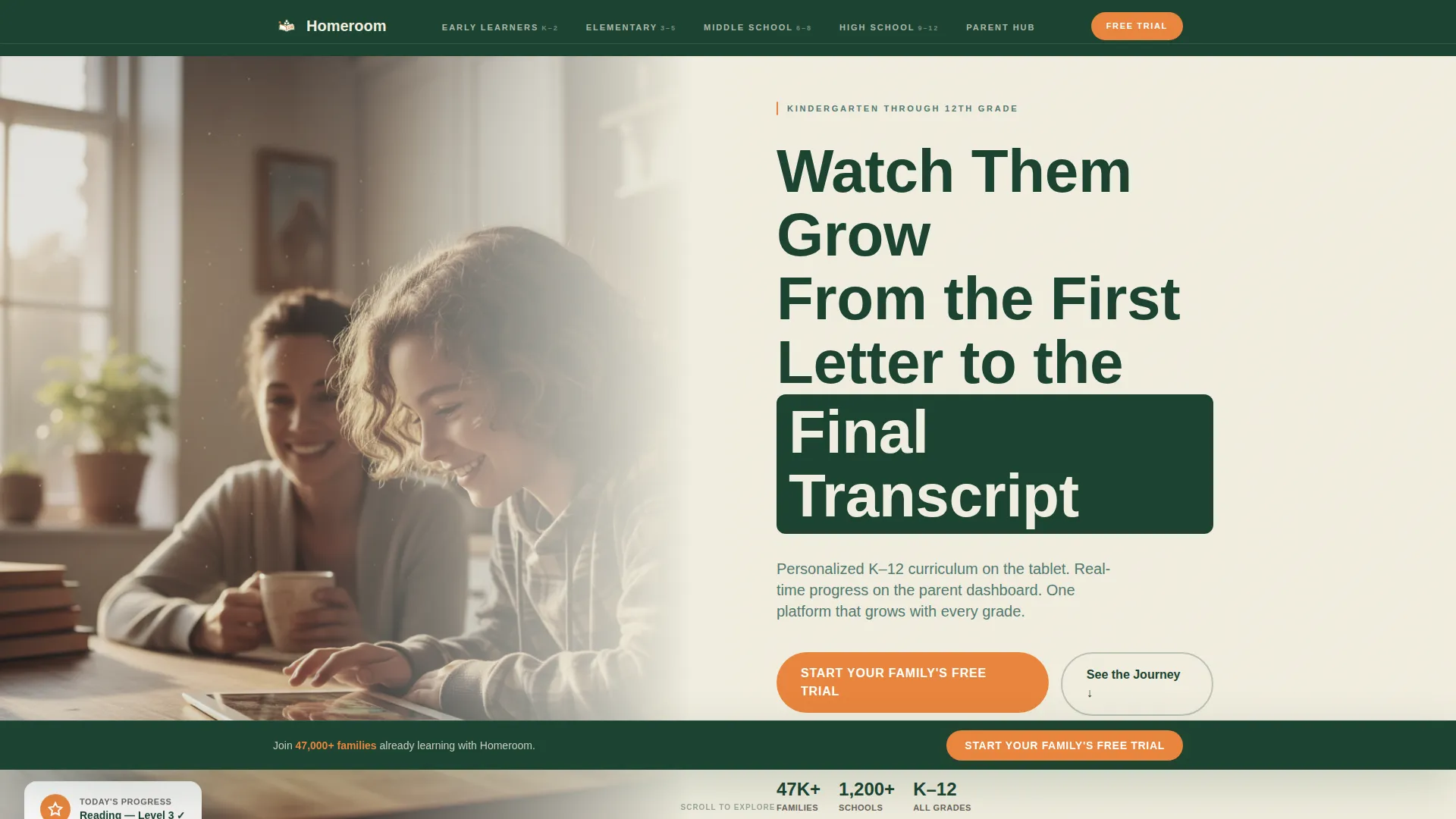
- A half-page header with a golden-hour photo split, a bold headline, and a primary clementine call-to-action button
- Five anchor-nav spokes (Early Learners, Elementary, Middle School, High School, Parent Hub) each scrolling to a dedicated life-stage section
- A three-step progressive lead-generation form with tappable grade-level buttons, a parent contact field, and optional challenge chips
Feature list
This template covers every structural and visual layer a K-12 edtech platform needs to convert curious parents into trial sign-ups.
Half-Page Header with Photo and Headline
The header splits into two halves. The left holds a golden-hour kitchen photograph showing a middle-schooler and a parent sharing a tablet moment. The right presents the headline "Watch Them Grow From the First Letter to the Final Transcript," a subhead noting the grade range and parent dashboard, and a clementine call-to-action button.
Timeline Anchor Navigation
A five-spoke anchor nav sits across the top of the page and labels each life stage: Early Learners, Elementary, Middle School, High School, and Parent Hub. Clicking any label scrolls the visitor directly to that section, letting parents jump to their child's current chapter without scrolling past irrelevant content.
Age-Matched Section Illustrations
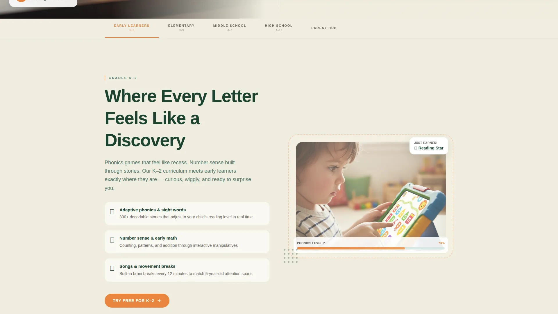
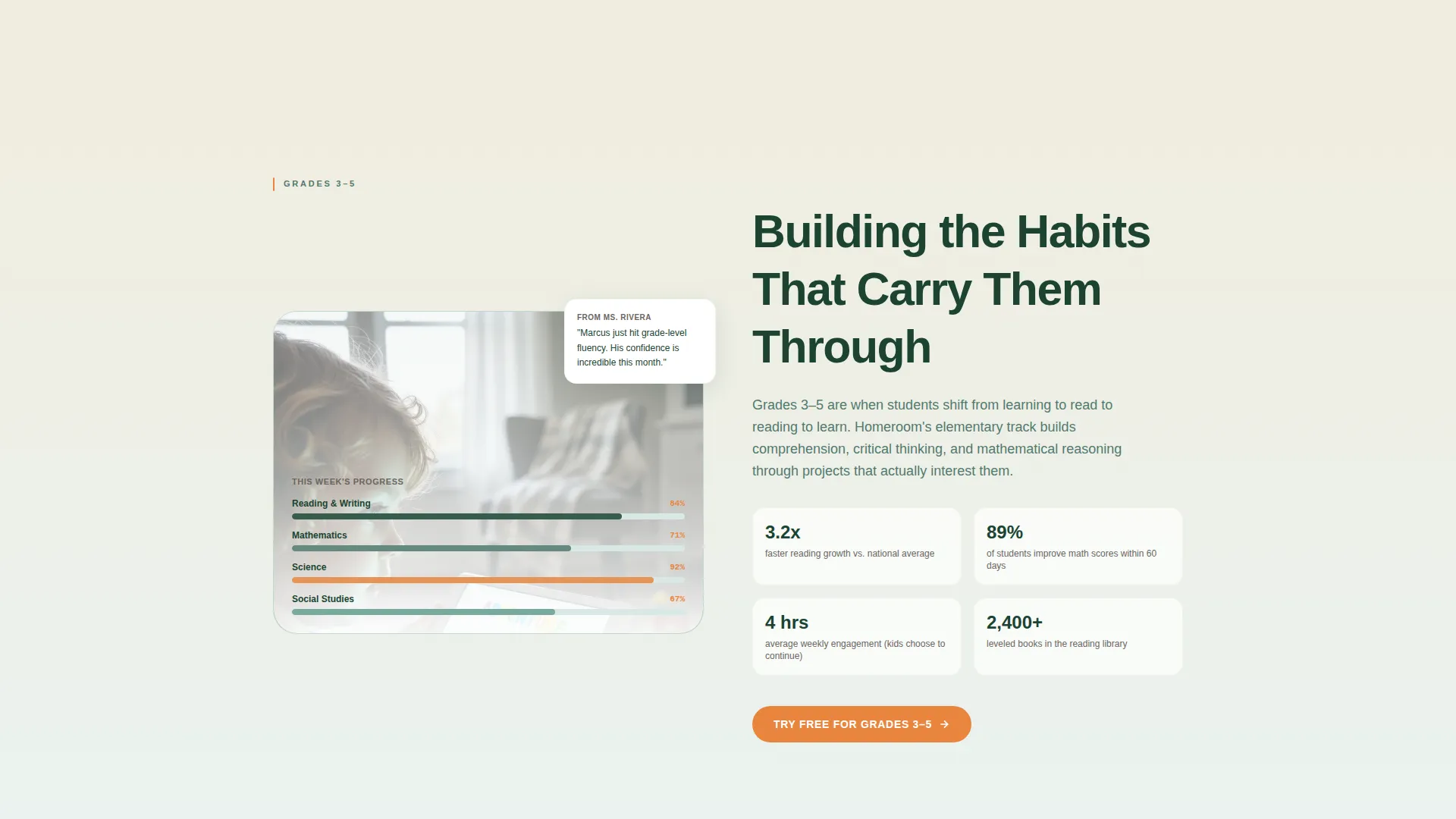
Each spoke section opens with an illustration style matched to that age group. Crayon textures represent kindergarten through second grade. Clean vectors carry the elementary and middle school sections. Data-rich dashboard screenshots anchor the high school and parent views. The visual maturity grows as the visitor scrolls, mirroring a child's own progression.
Progressive Three-Step Lead Form
The lead-generation form is placed after each spoke section, not just at the top of the page. It opens with large, tappable grade-level buttons, moves to a parent name and email field, and closes with an optional challenge-selection step using pre-filled chips such as "Reading confidence," "Math gaps," "Keeping them engaged," and "Tracking progress."
Sticky Call-to-Action Bar
After the first scroll, a sticky bar carrying the "Start Your Family's Free Trial" message stays visible at the top of the viewport. This ensures the primary action is always one tap away regardless of how deep a visitor is in the page.
Forest Trust Color System
The template applies a four-color Forest Trust palette with purpose-built rules. Deep evergreen anchors the navigation bar and section headers. Soft moss fills testimonial and feature-card backgrounds. Warm birch cream covers the main canvas. Clementine is reserved strictly for buttons, progress indicators, and notification badges.
Page sections overview
| Section | Purpose |
|---|---|
| Header hero split | Establish warmth and introduce the headline and primary call to action |
| Anchor nav bar | Let visitors jump directly to their child's life-stage spoke |
| Early Learners spoke | Address kindergarten through second-grade families with crayon-textured visuals |
| Elementary spoke | Serve third through fifth-grade families with structured learning content |
| Middle School spoke | Speak to parents navigating the bridge years with clean vector visuals |
| High School spoke | Show dashboard screenshots and transcript-readiness messaging |
| Parent Hub spoke | Demonstrate progress data collection and dashboard overview for parents |
| Repeating call to action form | Capture leads at each life-stage moment with the progressive three-step form |
| Sticky call to action bar | Keep the free-trial action visible throughout the entire scroll journey |
Design & branding system
The visual identity follows a Family First theme grounded in the Forest Trust color system. The overall feeling is that of a well-loved state park lodge: warm, organized, and quietly dependable. Typography uses a rounded, confident sans-serif that feels approachable without being childish.
- Deep evergreen (#1B4332) anchors the navigation bar and section headers; soft moss (#52796F) fills card and testimonial backgrounds; warm birch cream (#F0EDDF) breathes across the main canvas
- Clementine (#E8853D) appears only on buttons, progress indicators, and notification badges, drawing the eye exactly where action is needed without overpowering the calm palette
- Illustration style matures section by section, from crayon textures in early-learning areas to data-rich screenshots in the high school and parent views
Mobile & speed optimization
The template is structured with mobile interactions in mind, particularly for parents browsing quickly on a phone during back-to-school evenings or between errands. Tappable elements are sized for comfort, and the form flow avoids dropdowns entirely at the grade-selection step.
- Grade-level selection uses large, tappable buttons rather than a dropdown, reducing friction on small screens
- The sticky call-to-action bar is always within thumb reach, keeping the conversion path open at every scroll depth
- Each spoke section is self-contained, so the page loads its purpose clearly even when a visitor enters mid-scroll from a shared link
How this template helps you convert
The lead-generation strategy in this template is built around reducing the mental distance between "this looks relevant" and "let me try it." Every placement decision serves that goal.
- The form appears after each spoke section, so parents encounter the sign-up prompt at the exact moment their child's grade level is front of mind, making the decision feel immediate rather than abstract.
- The sticky call-to-action bar ensures the free-trial offer is never more than a glance away, even for visitors who scroll through every life-stage section before deciding.
Other information about this template
Homeroom is categorized under Education and Training, specifically within the EdTech and Learning Platform subcategory, and is purpose-built for the K-12 edtech platform niche. It carries one of the highest intersection match scores available in this category, reflecting how closely the design system, creative direction, and lead-generation approach align with what K-12 platform buyers need.
- The hub-and-spoke anchor navigation style is well-suited to platforms that serve a wide age range and need to segment messaging without building separate pages
- The Timeline Progression creative direction means the page tells a coherent story from first letter to final transcript, which builds emotional resonance across a long scroll
- The Family First theme and Forest Trust palette were chosen specifically to feel trustworthy to parents, not clinical or corporate, making the template a strong fit for platforms where household buy-in matters as much as institutional approval

Theme
Family First
Creative direction
Timeline Progression
Color system
Forest Trust
Style
Hub & Spoke (Anchor Nav)
Direction
Lead Generation
Page Sections
Timeline Anchor Navigation
Half-page Header with Photo Split
Age-matched Section Illustrations
Progressive Three-step Lead Form
Sticky Free-trial Call-to-action Bar
Forest Trust Color System
Related questions
Can I adapt this template for a platform that serves only one grade band?
Is the three-step lead form included in the template layout?
Who is this template best suited for?
Can the color palette be changed to match our brand?
Does the template include the photography shown in the creative brief?



