Powerful Community | Free Website Template | Rocket
A dark-themed bento grid landing page built for a HubSpot community forum. It opens with a logo bar of partner badges and integration icons, then walks visitors through a Problem→Solution arc where real pain cards flip into resolved threads. A pinned bottom bar and a progressive sign-up form drive lead generation from the first scroll.
by Rocket studio
Quick summary
This is a single-page bento grid landing page designed for a HubSpot community forum. It uses a Dashboard Pro theme with a Carbon Fiber color system: deep blacks, charcoal tiles, and live-signal orange accents that shift to status-green as problems become solutions. The page is built to capture leads and communicate that every HubSpot headache already has a documented fix.
Who this template is for
This template is built for teams or individuals who want to launch a professional community landing page around HubSpot knowledge and peer support. It suits anyone who needs to grow a forum audience from a standing start.
- RevOps managers who need a central place to share portal migration knowledge with peers
- Agency partners managing multiple client accounts who want a structured community resource
- Solo marketers who inherited an undocumented HubSpot instance and need a go-to support hub
What problem this template solves
HubSpot users face real, recurring problems: workflows that enroll contacts by accident, attribution reports returning zero revenue, and messy migrations from other platforms. There is no obvious place that surfaces these problems alongside their fixes in one focused, credible space. This template solves that gap by presenting the community as an always-on knowledge room, not a generic forum sign-up page.
- Visitors have no immediate proof that the community holds relevant, solved problems
- A generic sign-up form feels low-trust and gives no preview of what is inside
- The page lacks a natural hook that converts a skeptical power user into a registered member
What you get with this template
You get a fully structured bento grid landing page with a clear visual hierarchy and a lead generation flow built in. Every layout decision in the template connects back to the core promise: your problem is already solved inside this room.
- A scrolling logo bar that establishes partner and integration credibility above the fold
- A bento grid of pain-point cards that visually transition into resolution tiles as the visitor scrolls
- A progressive sign-up form and a lower-commitment "Browse Top 50 Threads" preview gate
Feature list
This template ships with a set of purpose-built layout components. Each one serves a specific role in moving a skeptical visitor toward joining the community.
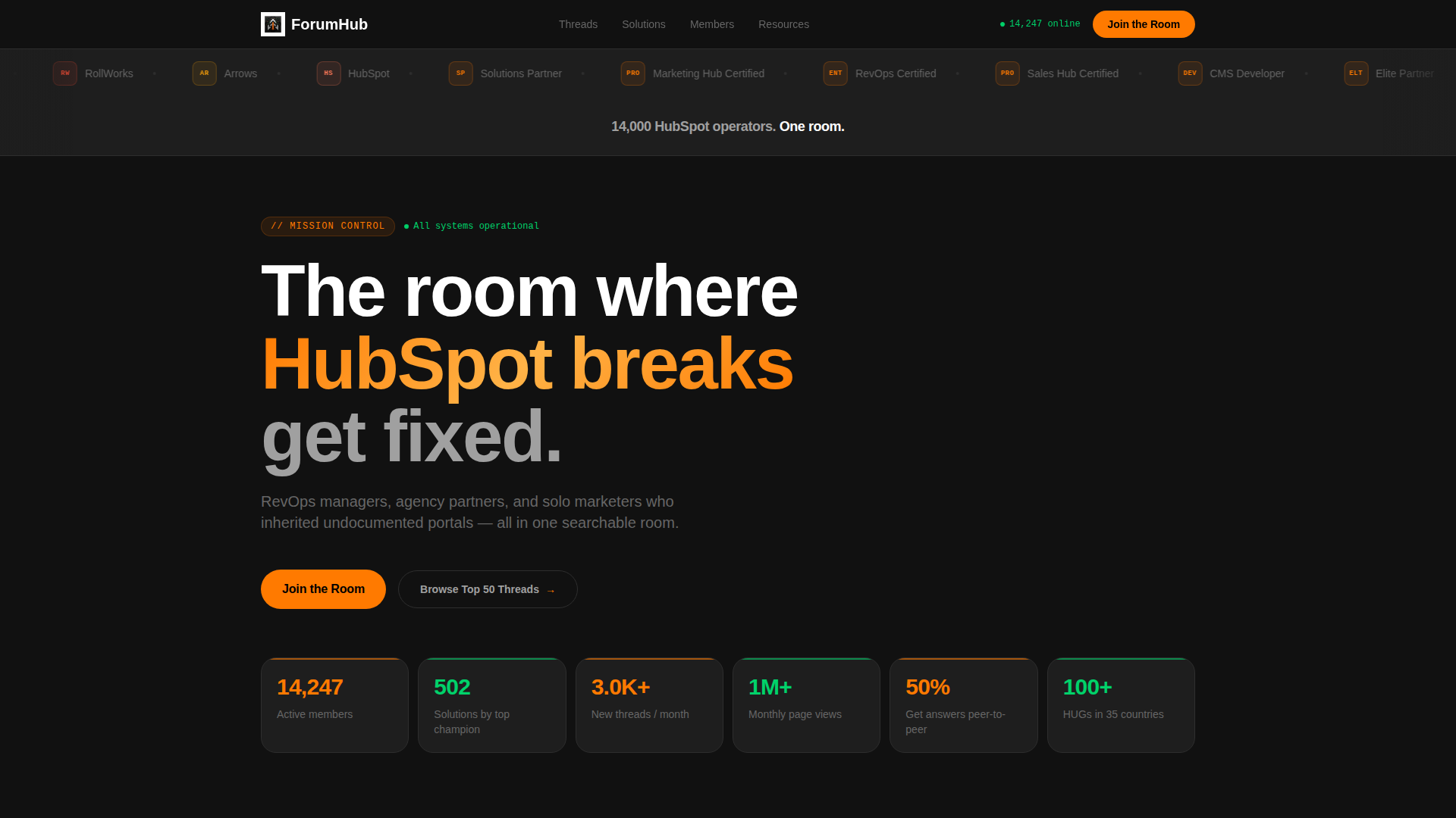
Scrolling Logo Bar Header
A horizontal ribbon of HubSpot Solutions Partner badges, SaaS integration icons, and certification marks loops continuously above the fold. It builds instant ecosystem credibility without a single line of marketing copy. Visitors recognize the tools they already use and feel they have arrived in the right room.
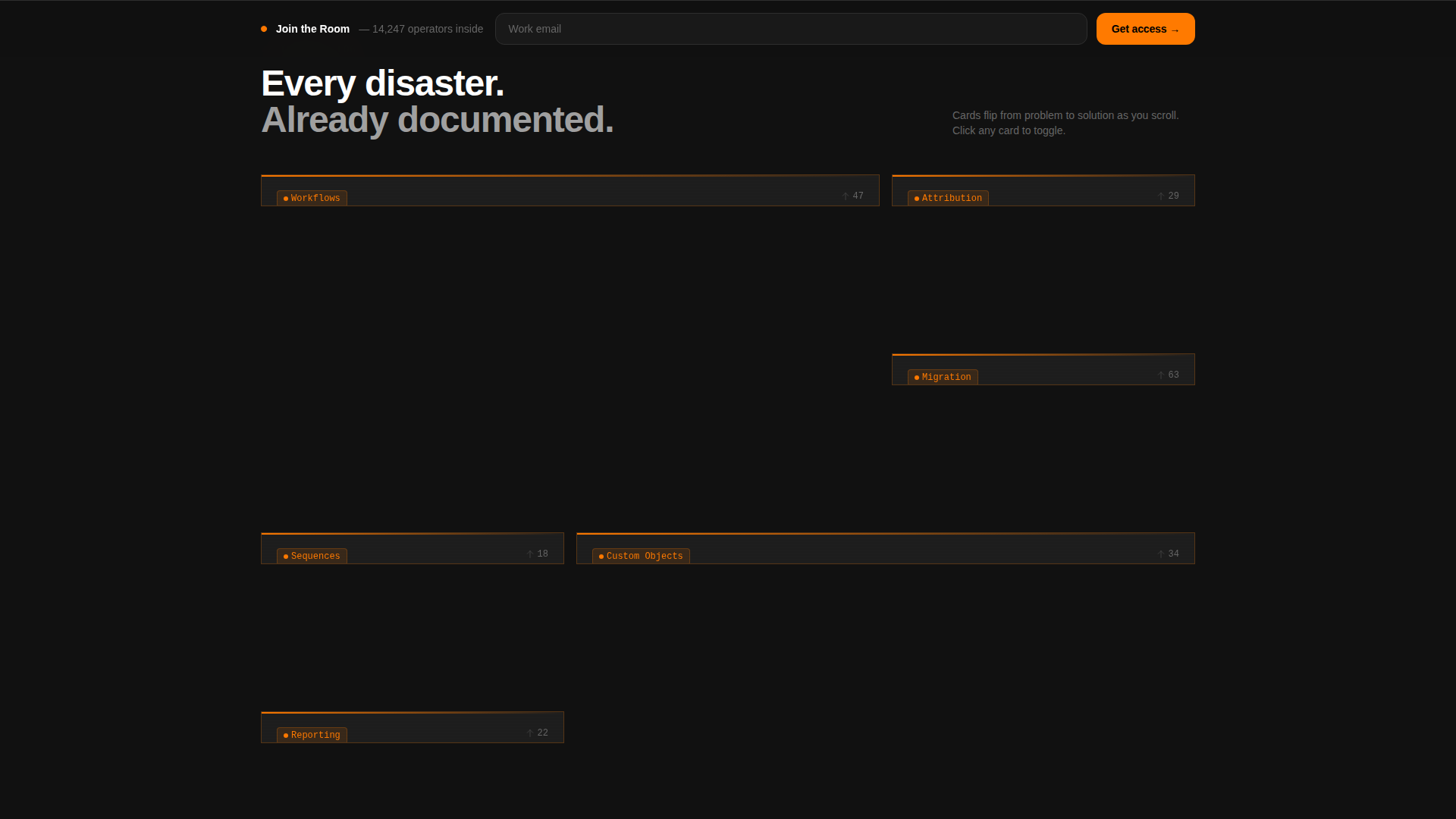
Problem to Solution Bento Grid
The core of the page is a dense bento grid where each tile starts as a real user pain point rendered in charcoal with orange warning accents. As the visitor scrolls, each card transitions into its resolved state showing a thread excerpt, a member answer, or a downloadable template with the accent color shifting from orange to status-green. The rhythm makes the knowledge base feel deep and immediately useful.
Pinned Bottom Bar call to action
A slim "Join the Room" call-to-action bar pins itself to the bottom of the viewport after the visitor completes the first problem-to-solution flip. It stays visible without interrupting the scroll experience. This keeps the primary conversion action one tap away at all times.
Progressive Sign-Up Form
The form starts with a single work email field. On submission, it expands to reveal the visitor's HubSpot portal tier, primary role, and an optional free-text field asking what is breaking right now. This staged approach lowers the initial commitment barrier while collecting meaningful onboarding data.
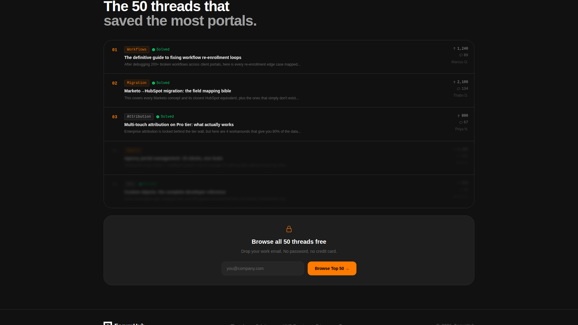
Preview Gate for Top Threads
A secondary conversion path lets visitors browse a curated preview of the top fifty community threads. It requires only an email address, making it a lower-stakes entry point than full registration. This path captures leads who are not yet ready to commit to a full account.
Carbon Fiber Dark Color System
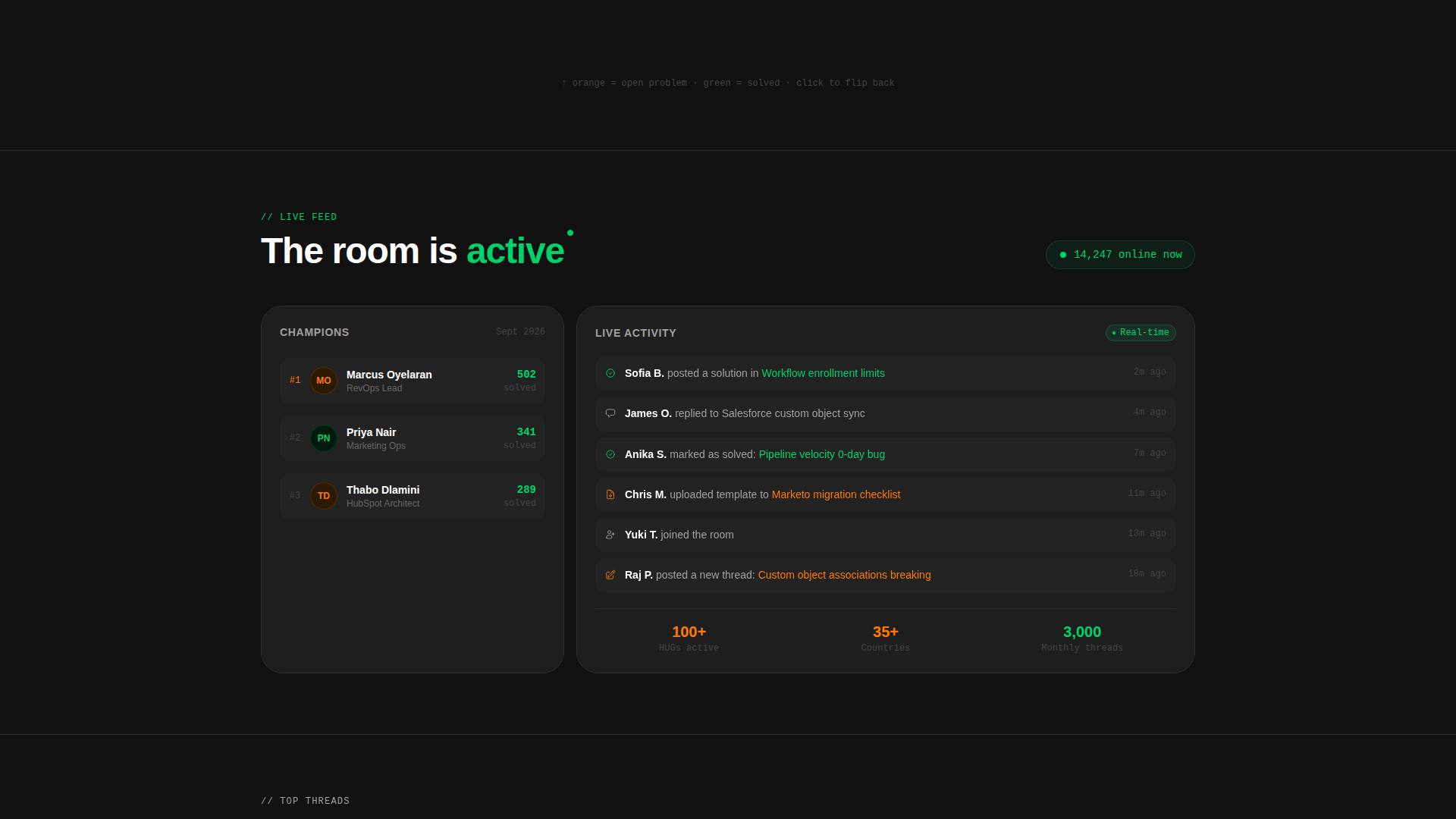
The entire layout uses a five-color Carbon Fiber palette applied with deliberate intent. Deep cockpit black forms the page field, charcoal fills tile bodies, telemetry silver handles secondary text, live-signal orange marks active calls to action and notification badges, and status-green signals solved threads and live member counts. Nothing glows unless it means something.
Page sections overview
| Section | Purpose |
|---|---|
| Logo Bar Header | Establish ecosystem credibility with partner badges and integration icons |
| Hero Headline | Anchor visitor context with a single bold membership statement |
| Pain-Point Grid | Surface real user problems in charcoal tiles with orange warning accents |
| Solution Flip Tiles | Resolve each pain card into a thread answer or downloadable fix |
| Pinned call to action Bar | Keep the primary "Join the Room" action visible after the first scroll flip |
| Progressive Sign-Up Form | Capture work email then expand to collect role and portal tier |
| Preview Gate Section | Offer low-commitment access via a top-threads browse path |
Design & branding system
The visual identity follows a Dashboard Pro theme built on the Carbon Fiber color system. Every color in the palette carries a specific functional meaning, so the page reads like a live monitoring dashboard rather than a decorative layout.
- Deep cockpit black (#111111) as the page field, instrument-panel charcoal (#1E1E1E) for card bodies, and telemetry silver (#A0A0A0) for all secondary text
- Live-signal orange (#FF7A00) reserved for calls to action, notification badges, and active warning states on unsolved pain cards
- Status-green (#00D26A) used exclusively for solved thread indicators, online member counts, and confirmed success states
Mobile & speed optimization
The bento grid layout is designed to restack cleanly on smaller screens without losing the problem-to-solution narrative rhythm. Each tile is a self-contained card, so the transition from a multi-column desktop grid to a single-column mobile stack is straightforward and content stays legible at every breakpoint.
- Bento tiles are self-contained cards that reflow into a vertical single-column stack on mobile
- The pinned bottom call to action bar adapts to mobile viewport height so it never obscures critical content
- The progressive form starts with a single field, keeping the initial load lightweight for mobile users
How this template helps you convert
The template is built around a lead generation objective. Every layout layer is sequenced to reduce friction and increase the visitor's confidence before asking for a commitment.
- The logo bar and pain-point grid work together to establish that this community is both credible and immediately relevant, so the visitor arrives at the call to action already convinced the room is worth entering.
- The progressive form structure starts at the lowest possible commitment level, a single work email, then gathers richer profile data only after that first step is complete, which improves both completion rates and the quality of onboarding data collected.
Other information about this template
This template is categorized under Documentation and Support, specifically within the HubSpot Documentation subcategory, targeting the HubSpot Community Forum niche. It is a strong fit for any operator-led community built around a specific software platform where peer knowledge is the primary value proposition.
- The template style is Bento Grid, using the Dashboard Pro theme with the Carbon Fiber color system
- The creative direction follows a Problem to Solution Arc, a layout strategy that mirrors how forum users naturally think: I have a problem, does someone here have the fix?
- The header concept is a Logo Bar, which replaces traditional hero copy with an ecosystem signal that resonates immediately with HubSpot practitioners familiar with tools like Salesforce, Slack, Zapier, and Stripe
- The intersection match score for this template's category, subcategory, and niche alignment is 13, indicating a strong contextual fit for this specific use case
Theme
Dashboard Pro
Creative direction
Problem→Solution Arc
Color system
Carbon Fiber
Style
Bento Grid
Direction
Lead Generation
Page Sections
Scrolling Logo Bar Header
Problem to Solution Bento Grid
Pinned Bottom Bar Call to Action
Progressive Sign-up Form
Preview Gate for Top Threads
Carbon Fiber Dark Color System
Related questions
Can I edit the pain-point cards to match my community's actual topics?
Does the template include both the sign-up form and the preview gate?
How does the problem-to-solution flip work visually?
Is this template suitable for a community outside the HubSpot space?
What does the progressive form collect beyond the email address?