HVAC Control — Landing Page Template
Thermostat is a dashboard-style landing page template built for HVAC membership sites. It combines a Tech Glass visual identity with a side-by-side comparison layout, interactive module previews, and a sticky conversion flow. Field techs, commercial maintenance leads, and apprentices get a clear picture of what membership delivers before they ever sign up.
by Rocket studio
Quick summary
Thermostat is a single-page membership hub template designed for HVAC professionals. It uses a dark Tech Glass aesthetic, a "With Membership versus. Without Membership" toggle, and an interactive scroll experience to show visitors exactly what they gain. The primary call to action is a free trial week with a two-field signup form.
Who this template is for
This template is built for teams launching or growing an HVAC membership platform. It speaks directly to working technicians and the people who sell them access.
- Field technicians running residential service calls who need fast, reliable reference materials on the job
- Commercial maintenance leads managing preventive maintenance contracts who want a structured knowledge resource
- Apprentices preparing for their EPA 608 certification who need answers faster than a video can buffer
What problem this template solves
HVAC professionals in the field waste time hunting through manufacturer PDFs, calling supply house counters, or posting questions in social groups and waiting for replies. That friction costs money on every call. This template frames the membership as the direct solution to that specific workflow pain.
- Communicates the cost of the "without membership" workflow using side-by-side data grids
- Shows the depth of the resource library through interactive hover previews before asking for a signup
- Reduces signup friction with a two-field form and a credit-card-deferred free trial structure
What you get with this template
The template delivers a fully structured, single-page layout with every section and interaction pattern described in the brief. Nothing requires guesswork about what to build.
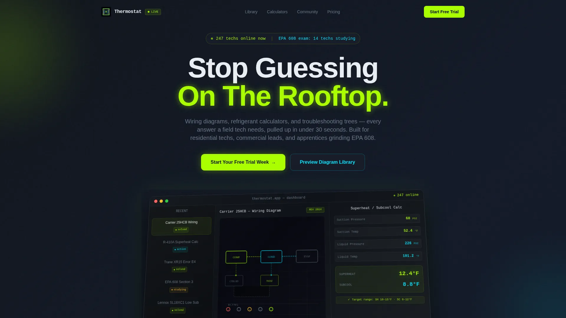
- A full-width product screenshot header showing the membership dashboard mid-use, on an isometric tilt behind anti-glare glass
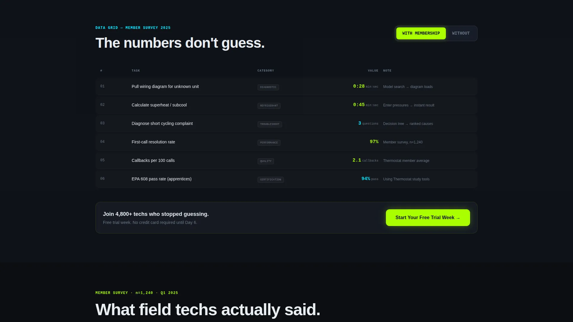
- A sticky comparison toggle that swaps "With Membership" and "Without Membership" data across every section simultaneously
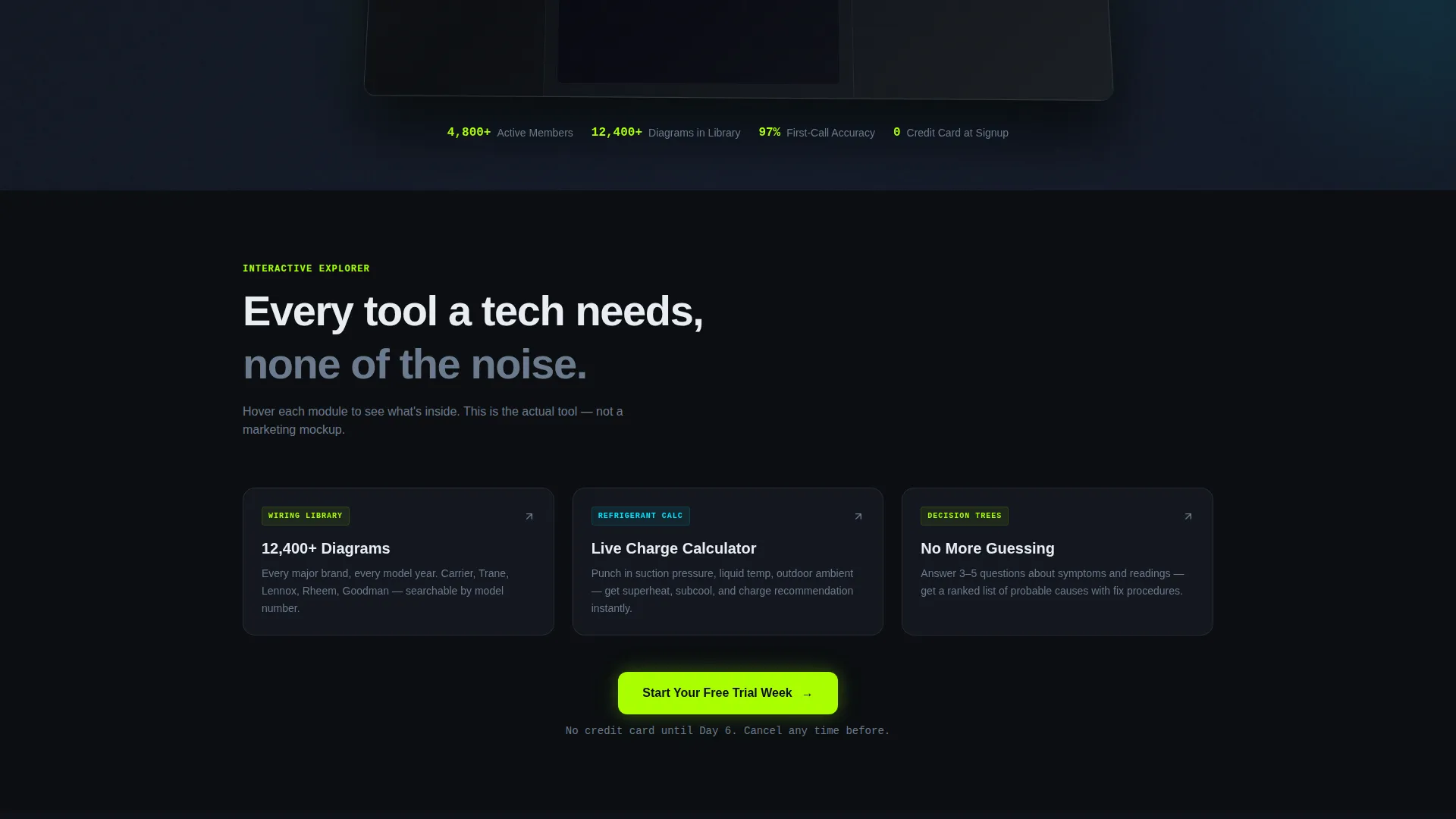
- An interactive explorer scroll where each dashboard module expands with a tooltip preview on hover
Feature list
This template packages purpose-built components that work together to move a skeptical technician toward a free trial signup.
Full-Width Dashboard Screenshot Header
The header is a pixel-sharp product screenshot, not stock photography. It shows a Carrier split-system wiring schematic open in one panel, a superheat and subcool calculator returning live values in another, and a sidebar of community Q&A threads with green "solved" badges. A status bar reads "247 techs online now." The screenshot sits on a slight isometric tilt behind a simulated anti-glare glass layer.
Sticky With/Without Membership Toggle
A persistent toggle bar at the top of the page lets visitors flip between two states. Every data grid, workflow timeline, and comparison block on the page updates to reflect the selected state. This pattern keeps the value proposition visible no matter how far down the visitor scrolls.
Interactive Module Explorer
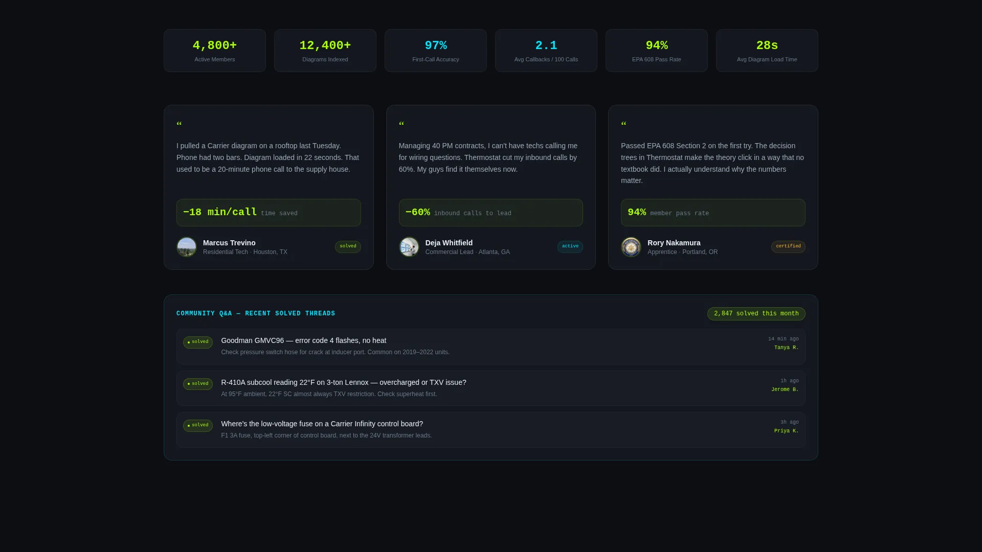
As visitors scroll, each membership dashboard module is displayed as a live-feeling demo. Hovering over a module expands a tooltip that shows real content depth: a wiring diagram preview, a calculator that accepts a single test input and returns output, and a real answered forum thread. The interaction replaces vague feature lists with a hands-on preview.
Side-by-Side Comparison Data Grids
Structured data grids present quantified comparisons between the membership workflow and the alternative. Metrics include time saved per service call, reduction in callbacks, and diagnostic accuracy improvements drawn from member survey data. The grids make the case with numbers, not adjectives.
Low-Friction Dual Conversion Paths
The primary call to action, "Start Your Free Trial Week," appears three times: after the first interactive module, after the comparison grid, and as a fixed bottom bar on mobile. The signup form asks only for email address and primary trade (residential, commercial, or refrigeration). Credit card entry is deferred to day six. A secondary path, "Preview the Diagram Library," captures email from visitors who are not yet ready to commit.
Mobile Fixed Bottom Bar
On mobile viewports, the primary call-to-action bar locks to the bottom of the screen throughout the scroll. This keeps the conversion path accessible without interrupting the reading flow. The fixed bar matches the Acid Digital color palette and stays visually consistent with the rest of the template.
Page sections overview
| Section | Purpose |
|---|---|
| Dashboard Header Screenshot | Establishes the product as a real, working tool through a mid-use screenshot |
| Sticky Toggle Bar | Lets visitors compare membership and non-membership states across all sections |
| First Interactive Module | Shows wiring library depth with a hover-triggered diagram preview |
| Calculator Module Preview | Lets visitors input one test value and see a live superheat/subcool output |
| Forum Module Preview | Displays a real answered thread to demonstrate community quality |
| First Trial call to action | Presents "Start Your Free Trial Week" with a two-field email and trade form |
| Comparison Data Grid | Quantifies time saved, callbacks reduced, and diagnostic accuracy gains |
| Second Trial call to action | Repeats the primary call to action after the comparison section |
| Diagram Library Preview | Secondary conversion path for email capture before full commitment |
| Mobile Fixed call to action Bar | Keeps the trial signup accessible on mobile throughout the entire scroll |
Design & branding system
The visual identity is built on a Tech Glass theme using the Acid Digital color system. Every color choice has a functional role, like reading a digital manifold set in a dark mechanical room.
- Void black (#0B0E11) as the base background, translucent panel gray (#1A1F2B) for layered dashboard panels, electric lime (#AAFF00) for live data points and hover states, and diagnostic cyan (#00E5FF) on interactive callouts
- The isometric tilt and anti-glare glass treatment on the header screenshot create depth without decorative imagery
- No stock photography of people in work gear appears anywhere; every visual element is the product itself
Mobile & speed optimization
The template is structured to work cleanly on the small screens that field technicians actually use on a rooftop or in a mechanical room.
- The fixed bottom call-to-action bar on mobile keeps the trial signup one tap away without covering content
- The comparison toggle and interactive module tooltips are designed to translate to touch interactions
- The two-field signup form keeps mobile entry fast and avoids the friction of long forms on a small keyboard
How this template helps you convert
Every structural decision in this template is aimed at reducing the distance between a first visit and a free trial signup.
- The interactive module explorer lets visitors experience the membership value before committing, which lowers the perceived risk of signing up and makes the free trial feel like a logical next step rather than a sales pitch.
- The sticky comparison toggle keeps the "Without Membership" friction visible throughout the scroll, so the cost of not signing up stays present in the visitor's mind as they read through benefits.
- The dual conversion path captures visitors at two different levels of readiness: those ready to trial and those who want to preview the diagram library first, ensuring no interested visitor leaves without giving an email address.
Other information about this template
This template is categorized under Technology with a subcategory of HVAC Digital Presence and is purpose-built for the HVAC membership site niche. A few additional details worth knowing before you build with it.
- The template style is Dashboard and Data Grid, which makes it well suited for any technical membership product that needs to demonstrate tool depth before asking for a signup
- The creative direction is Interactive Explorer combined with a Comparison/Versus layout, which is a proven structure for subscription products where the alternative workflow is a strong selling point
- The header concept is Product Screenshot, meaning the hero visual should always be an actual capture of the membership interface, never a placeholder or generic illustration
- The Intersection Match Score for this template is 13, indicating a strong alignment between the Technology category, HVAC Digital Presence subcategory, and HVAC membership site niche
- The template is designed for a single-page flow and is not configured as a multi-page site
Theme
Tech Glass
Creative direction
Interactive Explorer
Color system
Acid Digital
Style
Dashboard/Data Grid
Direction
Comparison/Versus
Page Sections
Dashboard Screenshot Hero Header
Sticky Membership Comparison Toggle
Interactive Module Explorer Scroll
Quantified Comparison Data Grids
Dual Low-friction Conversion Paths
Mobile Fixed Call-to-action Bar
Related questions
Does this template include the actual membership dashboard or just the landing page?
Can I use this template for a commercial HVAC service business instead of a membership site?
What do I need to provide to fill the header screenshot section?
Is the comparison toggle functional in the template or does it need custom development?
How does the secondary diagram library preview path work?



