Bold Drinkware Subscription Landing Page Template
Hydrate is a bold, Neo-Retro landing page template built for a drinkware subscription box. It guides visitors through a tiered gallery experience, Starter, Premium, and Collector's, using a Dopamine Pop color system, animated headlines, and an upsell-first layout that turns casual browsers into committed subscribers and encourages existing members to upgrade their plan in a single tap.
by Rocket studio
Quick summary
Hydrate is a single-page drinkware subscription template designed to sell and upsell tier-based box memberships. It blends a Neo-Retro visual identity with a Comparison Journey scroll structure. The result feels less like a product page and more like cracking open a mystery box, with every section pushing deeper into the curated world of bottles, tumblers, and drinkware.
Who this template is for
This template is built for subscription box brands that sell physical drinkware products. It works best when the audience values product design as much as the product itself.
- Subscription box founders selling curated water bottles, tumblers, and specialty drinkware
- E-commerce brands targeting design-obsessed millennials, remote workers, and gift-givers
- Existing subscription businesses that want a conversion-focused upgrade prompt for current members
What problem this template solves
Most subscription landing pages flatten every tier into the same grid. Hydrate solves the problem of making higher-priced tiers feel visually worth it. The page architecture shows each plan as a progressively richer experience, not just a longer feature list.
- Visitors cannot easily see what separates a Starter box from a Collector's box
- Existing subscribers have no visual reason to upgrade when a plain pricing table is all they see
- Gift-givers and design fans need mood and story, not specs and bullet points
What you get with this template
You get a complete single-page layout built around a tiered gallery-plus-detail structure. Every section is purpose-built for a drinkware subscription brand with a strong visual identity.
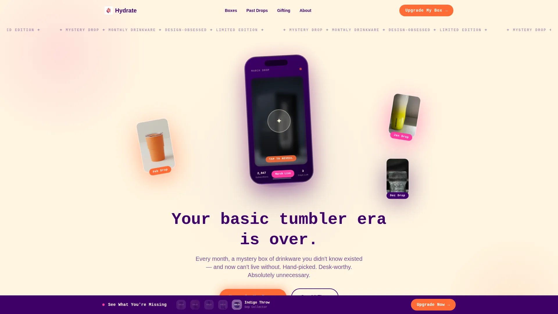
- A header with a floating device mockup, product satellites, and a self-typing animated headline
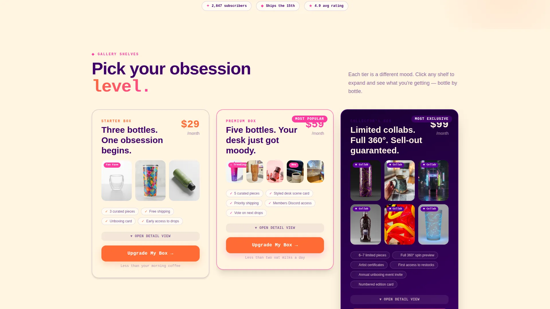
- Three gallery tier sections, Starter, Premium, and Collector's, each with expanding detail cards
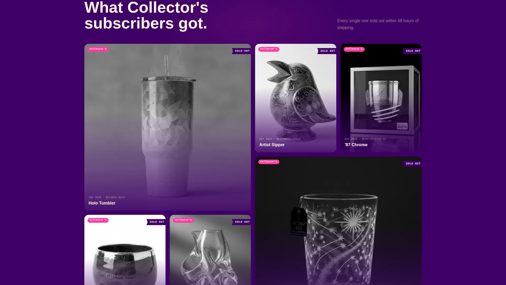
- A sticky upgrade bar, a one-step upgrade toggle form, and a sold-out carousel of Collector's-only bottles
Feature list
This template is packed with purposeful layout components. Each one connects directly to the subscription-box buying experience it was designed for.
Animated Header with Device Mockup
The header centers a phone screen floating at a slight angle on the creamy vanilla background. The screen shows a mid-animation unboxing reveal, with a blurred bottle silhouette about to sharpen. Three actual past-box bottles orbit the phone as product satellites, each casting a colored gel shadow in tangerine, pink, and purple.
Self-Typing Rounded Mono Headline
The headline "Your basic tumbler era is over." types itself in a rounded mono font as the page loads. This single motion sets the brand voice immediately. It signals personality before a visitor reads a single product description.
Tiered Gallery with Expandable Detail Cards
Each subscription tier is presented as a gallery shelf. Clicking any product opens a detail card with richer photography, playful copy, and tier-specific context. Starter shows three bottles on a plain background, Premium shows five on a styled desk scene, and Collector's reveals limited-edition collabs with full 360-degree spins.
Sticky Upgrade Bar with Sold-Out Carousel
After a visitor scrolls past the second tier, a sticky bar appears with the prompt "See What You're Missing." It carries a carousel of Collector's-only bottles that have already sold out. This bar stays visible as visitors continue scrolling, keeping upgrade intent alive throughout the session.
One-Step Upgrade Toggle Form
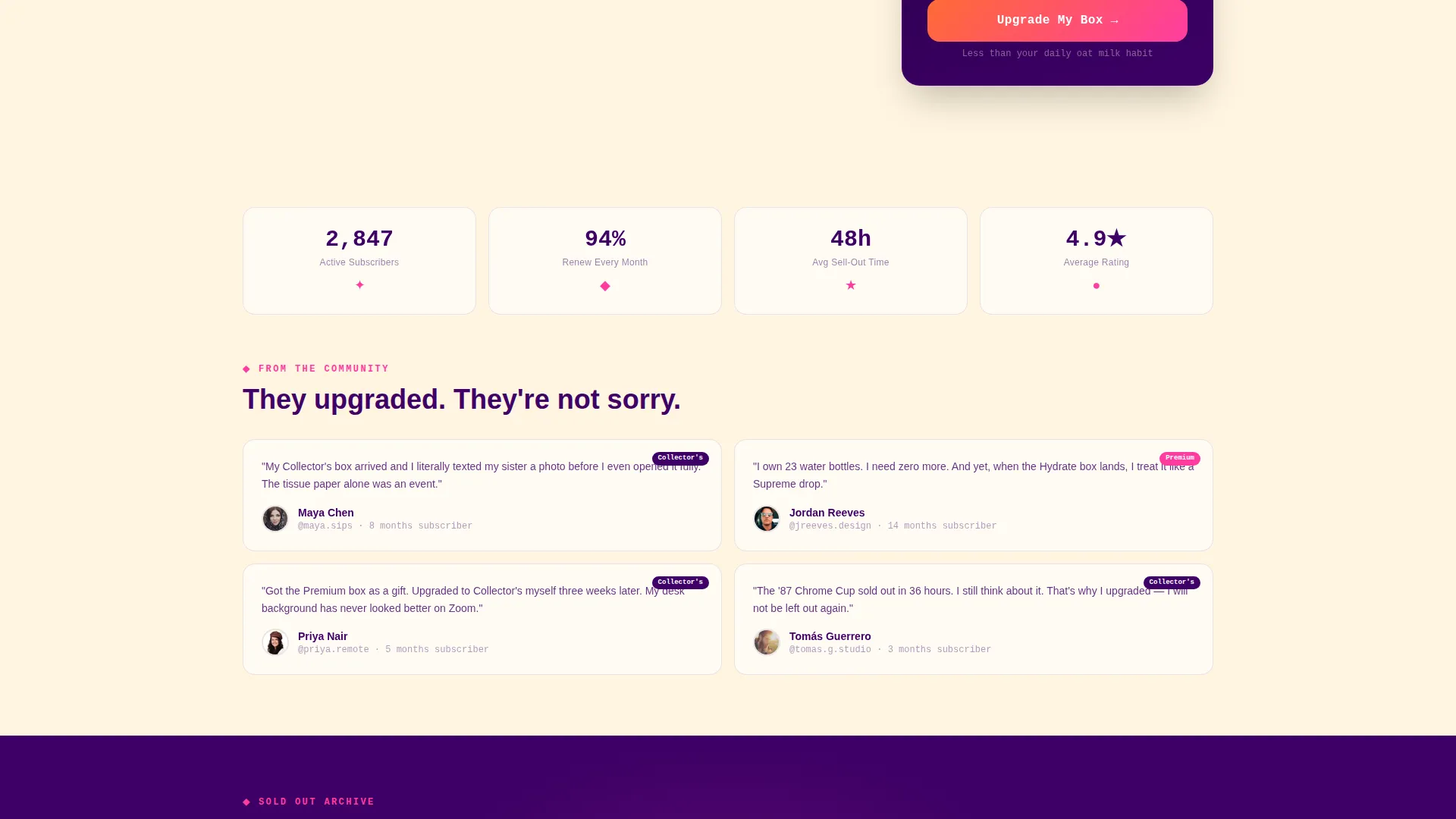
The upgrade form removes every friction point. It shows the visitor's current plan, highlights the new plan, and displays the price difference as a daily cost framed as "less than your oat milk." No shipping or payment details need re-entry. One tap confirms the upgrade.
Dopamine Pop Color System
Electric tangerine fires on hover states and every call-to-action button. Bubblegum pink highlights badges, tags, and the "most popular" ribbons on gallery cards. Deep grape soda purple anchors headlines and navigation. Creamy vanilla serves as the base canvas throughout every section.
Page sections overview
| Section | Purpose |
|---|---|
| Animated Header | Introduces brand with device mockup, product satellites, and typed headline |
| Starter Tier Gallery | Shows three bottles with plain background and expandable detail cards |
| Premium Tier Gallery | Displays five bottles on a styled desk scene with richer photography |
| Collector's Tier Gallery | Reveals limited-edition collabs with 360-degree product spins |
| Sticky Upgrade Bar | Surfaces sold-out Collector's carousel after visitor passes second tier |
| Upgrade Toggle Form | Confirms plan upgrade in one tap with daily cost framing |
Design & branding system
The visual identity is Neo-Retro, built on a Dopamine Pop color palette that feels like a bodega cooler glowing at midnight. Every color has a specific role, and none of them fight each other.
- Creamy vanilla (#FFF5E1) grounds all backgrounds; deep grape soda purple (#3D0066) anchors headlines and navigation
- Electric tangerine (#FF6B35) fires on every call-to-action button and hover state; bubblegum VHS pink (#FF3CA0) highlights badges, tags, and "most popular" ribbons
- Typography uses a rounded mono font for headlines, reinforcing the retro-digital tone across the entire page
Mobile & speed optimization
The layout is built with a mobile-first mindset. Key interactive elements are sized and spaced for thumb-friendly use on smaller screens.
- The device mockup header scales responsively, keeping the floating phone and product satellites readable at any viewport width
- Gallery tier cards and the sticky upgrade bar are optimized for vertical scroll behavior on mobile devices
- The one-step upgrade toggle is designed as a single-tap interaction, reducing friction for subscribers arriving from email or in-app links
How this template helps you convert
Hydrate is wired for conversion at every scroll depth. The page does not rely on a single call-to-action at the bottom; it layers intent across the entire experience.
- The animated header and self-typing headline create immediate brand energy, pulling visitors into the subscription world before they read a word of product copy
- The progressive tier gallery builds perceived value visually, making the Collector's box feel like an obvious upgrade rather than a premium upsell
- The sticky upgrade bar and one-step toggle form reduce drop-off at the decision moment, showing the daily cost difference and confirming with a single tap
Other information about this template
This template sits at the intersection of a Retail and E-Commerce category and a Water Bottles and Drinkware subscription niche. It is built on a Bento Grid template style with a Neo-Retro theme and uses the Comparison Journey creative direction.
- The landing page direction follows a gallery-plus-detail flow, suitable for multi-tier subscription products with distinct visual identities per plan
- The header concept is built around a Bundle Deal framing, showing multiple past-box products together to communicate variety and curation
- This template is a strong match for drinkware subscription brands, water bottle curators, and specialty beverage accessory boxes looking for a bold, personality-driven landing page
Theme
Neo-Retro
Creative direction
Comparison Journey
Color system
Cloud Canvas
Style
Bento Grid
Direction
Marketplace/Multi
Page Sections
Animated Header with Device Mockup
Self-typing Rounded Mono Headline
Tiered Gallery with Expandable Detail Cards
Sticky Upgrade Bar with Sold-out Carousel
One-step Upgrade Toggle Form
Dopamine Pop Color System
Related questions
Who is this landing page template designed for?
Can I use this template to promote all three subscription tiers at once?
How does the upgrade experience work for existing subscribers?
Does the template include the sticky upgrade bar by default?
Can I change the color palette to match my own brand?



