Hydrate - Precision Hydration Tracker Landing Page Template
Hydrate is a precision hydration tracking landing page template built for data-driven users who want more than a reminder app. It features a live in-browser dashboard, scroll-triggered animations, a competitor comparison table, and a personalized micro-quiz flow, all wrapped in a dark, violet-accented Data Command visual identity designed to convert serious trackers into signups.
by Rocket studio
Quick summary
Hydrate is a single-page scroll reveal template for a precision hydration tracking platform. It opens with a fully interactive browser-rendered dashboard, progresses through animated integration panels and correlation analytics, and closes the sale with a feature comparison table and a three-step personalized quiz. The dark Void & Violet design system makes every data point feel urgent and alive.
Who this template is for
This template is built for founders, indie developers, and product teams launching a serious water intake tracker. It speaks directly to users who already think in data and want a product that matches that mindset.
- Biohackers and quantified-self builders tracking hydration alongside nootropic and performance stacks
- Endurance athletes who need race-day fluid protocol tools and multi-device sync
- Remote workers and productivity-focused individuals who lose track of intake during long work sessions
What problem this template solves
Most hydration app landing pages look like wellness blogs. They use pastel tones, generic illustrations, and soft promises. That approach loses the high-intent visitor who arrives already knowing what they want and needs to see proof before scrolling past the fold.
- Generic tracker pages fail to demonstrate real functionality, so skeptical users bounce before seeing the product
- Static screenshots cannot communicate live syncing, correlation graphs, or dynamic progress tracking
- No clear differentiation from competing apps leaves potential users unsure why this tracker is worth switching to
What you get with this template
You get a complete, conversion-focused landing page that leads with a working product preview and builds trust through every scroll. Every section is purposeful, sequenced, and built to move high-intent visitors toward signing up.
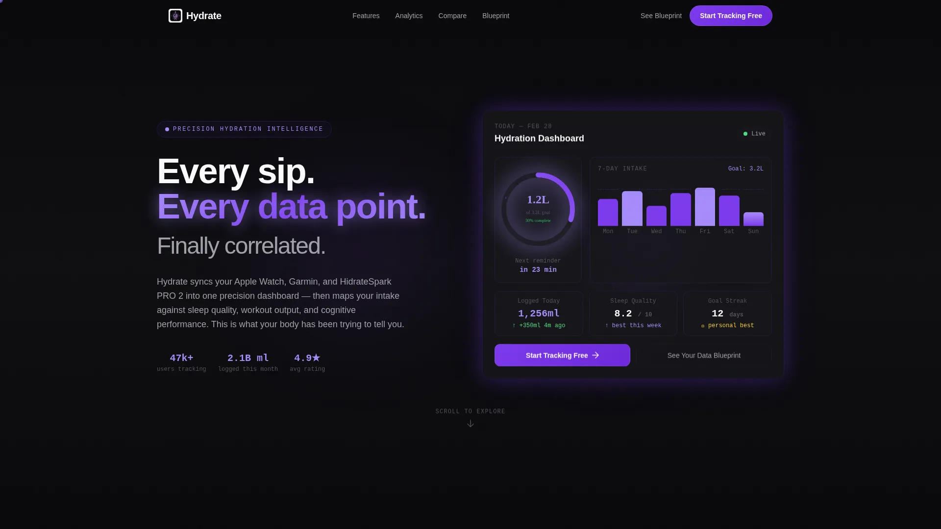
- A live in-browser hydration dashboard in the header with a radial progress ring, a 7-day bar chart, and a ticking intake counter
- Animated integration panels, correlation analytics sections, a sticky competitor comparison table, and a personalized micro-quiz flow
- A full Void & Violet design system with scroll-triggered spring physics animations and violet-on-interaction states throughout
Feature list
This template packs several distinct functional and design capabilities that work together to move visitors from curiosity to commitment.
Live Interactive Header Dashboard
The header renders a functioning hydration dashboard directly in the browser. A radial progress ring fills in real time, a 7-day bar chart displays pre-populated sample data, and a live counter ticks upward to simulate a fresh log entry. The ring pulses violet on completion. No static mockup is used, the visitor's cursor interacts with the interface from the first second.
Scroll-Triggered Spring Physics Animations
Every section enters the viewport with velocity. Elements arrive from below using spring physics, numbers count up as they appear, and data visualizes itself as the visitor watches. The pacing accelerates down the page so each scroll rewards attention with denser functionality rather than fading energy.
Animated Integration Panel
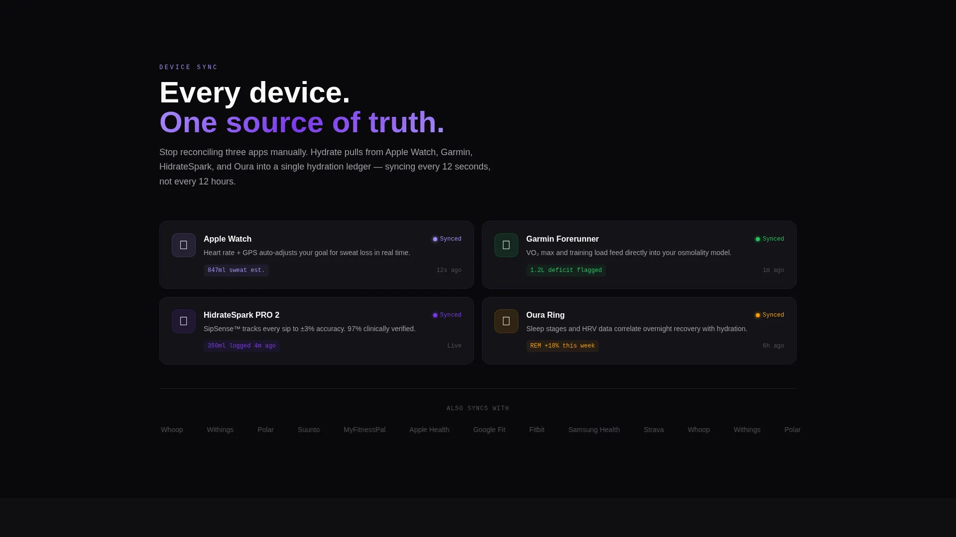
A dedicated section slides up to display device and app syncing in animated sequence. The panel communicates multi-device sync capability and reinforces the platform's data breadth without requiring the visitor to read a single spec sheet.
Sticky Competitor Comparison Table
A comparison section locks into a sticky side-by-side table midway through the page. Animated checkmarks reveal feature wins on scroll, covering areas such as custom electrolyte tracking, direct programming interface (API) access, and multi-device sync without subscription requirements. It converts hesitation into clarity.
Personalized Micro-Quiz Flow
The secondary conversion path is a three-tap micro-quiz covering activity level, current daily intake, and primary goal. The quiz generates a personalized hydration schedule preview before the signup field appears. This converts passive curiosity into active investment before asking for any commitment.
Dual Call-to-Action Architecture
The primary call to action, "Start Tracking Free," appears first inside the interactive header and repeats after the comparison table. The secondary path, "See Your Data Blueprint," leads into the micro-quiz. The two-path structure serves both ready-to-sign visitors and those who need one more reason to commit.
Page sections overview
| Section | Purpose |
|---|---|
| Interactive Header Dashboard | Immerses visitor in a live, cursor-responsive hydration user interface from the first second |
| Integrations Reveal Panel | Demonstrates multi-device sync capability through animated sequencing |
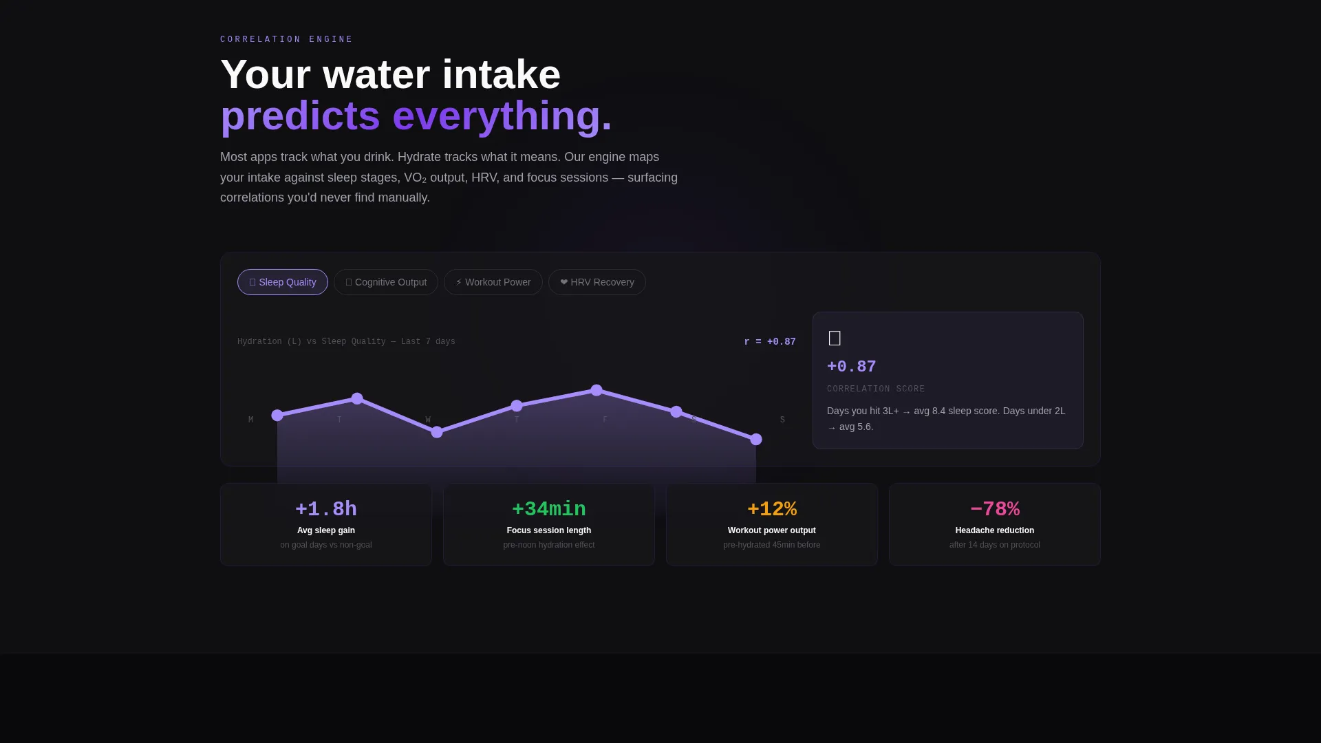
| Analytics Correlation Engine | Shows hydration mapped against sleep, workout, and cognitive performance data |
| Comparison Table Section | Differentiates the tracker from competing apps with animated feature-win checkmarks |
| Micro-Quiz Conversion Flow | Personalizes the value proposition before the signup field appears |
| Primary call to action Repeat Block | Reinforces the "Start Tracking Free" action after the strongest trust signal |
Design & branding system
The Void & Violet color system is built around a mission-control-at-2am atmosphere. Every color has a role: backgrounds stay dark, violet activates on interaction, and white text cuts through cleanly.
- Core palette: absolute void black (#09090B) for backgrounds, deep ultraviolet (#7C3AED) for primary interactive elements, electric orchid (#A78BFA) for active states and data highlights, and phosphor white (#FAFAFA) for all body and display typography
- Violet and orchid gradients pulse through data visualizations; hover states, scroll triggers, and completion events all activate the violet layer so every meaningful interaction has a visual reward
- The overall aesthetic reads like terminal text on a dark screen, purposeful, high-contrast, and quietly intense without relying on decorative noise
Mobile & speed optimization
The scroll reveal template is structured so that progressive section loading keeps the initial render lean. Animations are tied to scroll position rather than preloaded in bulk, which supports smooth performance across devices.
- Spring physics animations are scroll-triggered, meaning only the visible viewport carries active animation weight at any given moment
- The interactive dashboard header is browser-rendered rather than image-based, which avoids large asset loading while still delivering a rich first impression
- Section-by-section reveal pacing naturally breaks the page into digestible load segments, keeping the experience fluid on both desktop and mobile viewports
How this template helps you convert
The page is engineered around two conversion paths that work in parallel, not in sequence. Visitors who are ready to sign up get a fast, clear route. Visitors who need more convincing get personalized value before the ask.
- The live dashboard header creates immediate product credibility, visitors see the tracker working before they read a single headline, which shortens the trust-building journey significantly.
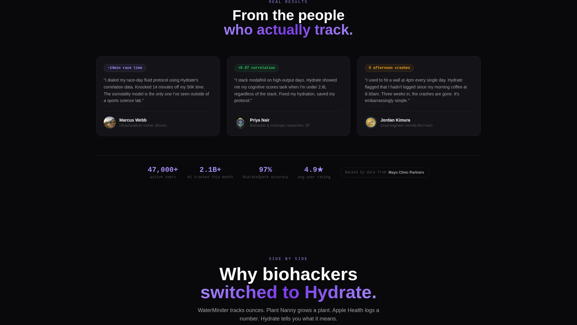
- The sticky comparison table removes the most common objection by showing exactly what this tracker offers that competing apps do not, using animated proof rather than static claims.
- The micro-quiz generates a personalized hydration schedule preview that makes the signup feel like a natural next step rather than a cold form submission.
Other information about this template
This template suits teams that want a technically impressive launch page without building custom animations from scratch. A few additional details worth knowing before you start customizing.
- The template style is Scroll Reveal (Progressive), meaning section animations are sequenced to build narrative momentum rather than fire all at once
- The Data Command theme and Void & Violet color system are designed specifically for the water intake tracker niche, where standing out from pastel-heavy competitors is a real conversion advantage
- The comparison table layout can be adapted to feature different competitor names or reordered feature rows to match your platform's actual differentiators
- The micro-quiz flow is a three-step interaction (activity level, current daily intake, primary goal) that previews a personalized hydration schedule before the user reaches the signup field
- This template is categorized under Technology and Consumer App & Platform, making it a strong fit for app pre-launch pages, product hunt drops, and direct-to-user growth campaigns
Theme
Data Command
Creative direction
Launch Energy
Color system
Void & Violet
Style
Scroll Reveal (Progressive)
Direction
Comparison/Versus
Page Sections
Live In-browser Header Dashboard
Scroll-triggered Spring Physics Animations
Animated Device Integration Panel
Sticky Competitor Comparison Table
Three-step Personalized Micro-quiz
Dual Call-to-action Architecture
Related questions
Does the header dashboard actually run in the browser?
Can I change the competitor names in the comparison table?
Who is this landing page template designed for?
What are the two conversion paths on this page?
How does the scroll animation system work?



