Icon Library Bento Grid Landing Page Template
Iconvault is a bento grid landing page template built for icon library products targeting product teams. It features a live Feature Tab Switcher header, a Problem-to-Solution scroll arc, and a two-step gated early-access form. The Slate and Sky color system gives it a sharp, dark-mode design-tool aesthetic that instantly builds confidence with designers and engineers.
by Rocket studio
Quick summary
Iconvault is a single-page bento grid landing page template for icon library products. It opens with an interactive Feature Tab Switcher, then walks visitors through a Problem-to-Solution scroll arc backed by self-contained proof cards. A gated early-access flow captures leads through a two-step form without blocking the experience upfront.
Who this template is for
This template is built for teams launching or marketing a design system icon library. It speaks directly to the people doing the work at sprint velocity.
- Startup designers who need a polished library page ready before a review cycle
- Front-end engineers who want a clear, no-ambiguity showcase for production-ready icon components
- Design-system leads unifying multiple products under a single visual language
What problem this template solves
Icon library pages often fail to communicate quality and consistency fast enough. Visitors leave before the value lands. This template front-loads proof through interaction, not just description.
- Inconsistent visual language across icon sets erodes trust before a visitor reads a single line
- Generic documentation pages bury the lead and lose engineers who just want to see the install command
- Early-access products struggle to convert curious visitors into registered users without a clear value-first funnel
What you get with this template
You get a fully structured bento grid landing page with every major section pre-built and logically sequenced. The layout is ready to customize with your own icon assets and brand details.
- An interactive Feature Tab Switcher header with three animated tabs: Browse, Copy, and Ship
- A Problem-to-Solution bento card arc with contrast cards showing the messy state and the clean solution
- A two-step gated early-access lead generation flow with a sticky bottom call-to-action bar
Feature list
This template ships with six core sections that work together as a single persuasive argument for your icon library.
Interactive Feature Tab Switcher Header
Three tabs labeled Browse, Copy, and Ship sit above a live interactive panel. Each tab animates its panel content with a 200ms crossfade. Browse shows a real-time filtering grid, Copy triggers a one-click code export toast, and Ship reveals a package install command with a 4.2 kB bundle-size badge.
Bento Grid Problem-to-Solution Arc
The scroll arc opens with a contrast card showing mismatched icon styles and broken alignment. Subsequent cards flip to the solution: consistent stroke weights, optical alignment overlays, dark and light preview toggles, and a Figma plugin screenshot. The layout builds a compounding argument across quality, speed, and scale.
Live Icon Library Counter
A bento card features a live counter ticking past 4,200 icons. This single element communicates library scale at a glance without requiring visitors to browse the full catalog.
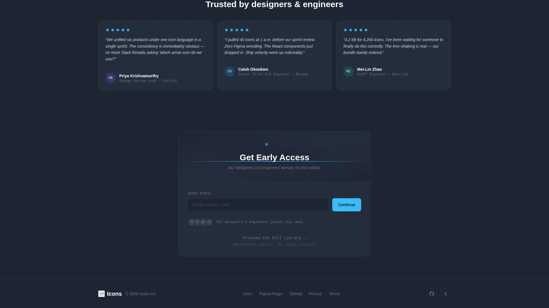
Two-Step Early-Access Lead Form
The primary call-to-action reads "Get Early Access" and appears first in the header panel. After 40 percent scroll depth, a sticky bottom bar repeats the prompt. The first step asks for a work email only. The second step collects role and team size, reducing friction at the point of highest intent.
Secondary Preview Path
A secondary call-to-action labeled "Preview the Full Library" links to a limited browse experience with watermarked exports. This path converts curious visitors into registrations without forcing a commitment upfront.
Proof-Point Bento Cards
Individual bento cards present bundle size comparisons and accessibility scores as self-contained proof points. Each card is readable in isolation but contributes to a wider argument when viewed in sequence.
Page sections overview
| Section | Purpose |
|---|---|
| Feature Tab Header | Demonstrates Browse, Copy, and Ship interactions |
| Problem Contrast Card | Shows the messy icon drawer state |
| Solution Card Row | Presents consistent stroke and alignment fixes |
| Figma Plugin Card | Highlights design-tool integration context |
| Bundle Size Card | Compares payload weight at a glance |
| Accessibility Score Card | Communicates quality and standards coverage |
| Icon Counter Card | Shows live library scale past 4,200 icons |
| Early Access Form | Captures email and role in two steps |
| Sticky call to action Bar | Re-prompts sign-up after 40 percent scroll |
| Preview Library Path | Offers limited browse with watermarked exports |
Design & branding system
The Slate and Sky color system is built to feel like a dark-mode design tool. Every color choice reinforces the product's identity: precise, professional, and fast.
- Deep editor slate (#1E2433) as the primary background, mid-gray zinc (#6B7280) for secondary text and dividers, and sky-blue (#38BDF8) as the signature interactive accent
- Clean white (#F8FAFC) for card surfaces and icon previews, keeping individual bento cards readable against the dark background
- Sky-blue activates across buttons, hover states, and selected icon indicators to give the page a sense of live interactivity
Mobile & speed optimization
The bento grid layout is structured to reflow cleanly at smaller viewport sizes. The interactive header and sticky call to action bar are designed to remain functional and visible on mobile screens.
- Bento card columns collapse to a single-column stack on narrow viewports without losing the proof-point sequence
- The sticky bottom call-to-action bar repositions to sit above the mobile keyboard when the email input is active
- The 200ms crossfade animations in the tab switcher are lightweight by design, keeping interactions responsive on lower-powered devices
How this template helps you convert
The page earns the email before asking for it. Every conversion decision is sequenced to reduce resistance at each stage.
- The interactive tab switcher lets visitors experience Browse, Copy, and Ship behavior with real icons before any form appears, building trust through demonstration rather than description.
- The "Get Early Access" call-to-action appears inside the header panel first, then repeats as a sticky bar after 40 percent scroll depth, catching visitors at two distinct moments of intent.
- The secondary "Preview the Full Library" path offers a low-commitment entry point, converting visitors who are not yet ready to register into engaged users who experience the product directly.
Other information about this template
This template is categorized under Design System and Component Library within the Documentation and Support space. It is purpose-built for the icon library niche, where speed of comprehension and visual credibility are the primary conversion drivers.
- The template style is a bento grid, which works well for presenting multiple independent proof points without a traditional long-form scroll layout
- The Startup Velocity theme informs the pacing: fast tab animations, a live counter, and a header that proves the product before any scrolling happens
- The creative direction follows a strict Problem-to-Solution Arc, ensuring visitors feel the pain of inconsistent icon sets before seeing the resolution
- The template supports a lead generation landing page flow and is not structured as a documentation site or multi-page product


Theme
Startup Velocity
Creative direction
Problem→Solution Arc
Color system
Slate & Sky
Style
Bento Grid
Direction
Lead Generation
Page Sections
Interactive Feature Tab Switcher
Bento Grid Problem-to-solution Arc
Two-step Gated Early-access Form
Live Icon Library Counter
Sticky Bottom Call to Action Bar
Watermarked Preview Path
Related questions
Can I replace the demo icons with my own library assets?
Does the two-step form connect to any specific email platform?
Is the sticky call-to-action bar visible on mobile devices?
Can I edit the tab labels and panel content in the header?
What does the Preview the Full Library path offer visitors?


