Ignite — Customer Reactivation Landing Page Template
Rekindle is a comparison table landing page template built for travel re-engagement email platforms. It targets email marketing managers, revenue teams, and lifecycle leads who need to win back dormant subscribers. A dark, instrument-panel design, a three-tier feature matrix, and a freemium call to action work together to turn cold lists into active bookers.
by Rocket studio
Quick summary
Rekindle is a single-page, conversion-focused landing page template for travel re-engagement email platforms. It pairs a dark, cockpit-inspired visual identity with a structured feature comparison table across three pricing tiers. The design guides visitors from a glowing hero header through capability rows to a freemium signup, making the value gap between tiers impossible to ignore.
Who this template is for
This template is built for travel industry professionals who manage subscriber lists and need to recover revenue from contacts who have gone quiet. It speaks directly to the people accountable for email performance and booking recovery.
- Email marketing managers at boutique tour operators running win-back campaigns
- Revenue teams at regional airlines trying to convert lapsed bookers back into passengers
- Lifecycle leads at hotel chains who watch subscriber engagement drop every quarter
What problem this template solves
Travel email lists decay fast. Unsubscribes, dormant openers, and lapsed bookers quietly drain revenue while they sit unused. Most platforms struggle to show prospects why they need a dedicated re-engagement solution, and a generic pricing page rarely closes the gap.
- Visitors cannot easily see what they are missing without a side-by-side capability view
- Cautious buyers leave without trying the product because no preview of the email flow exists
- The value of moving from a free to a paid tier stays invisible until it is shown row by row
What you get with this template
You get a complete, single-page layout that walks a visitor from awareness to signup without them leaving the page. Every section is purposeful and every design choice reinforces the platform's authority.
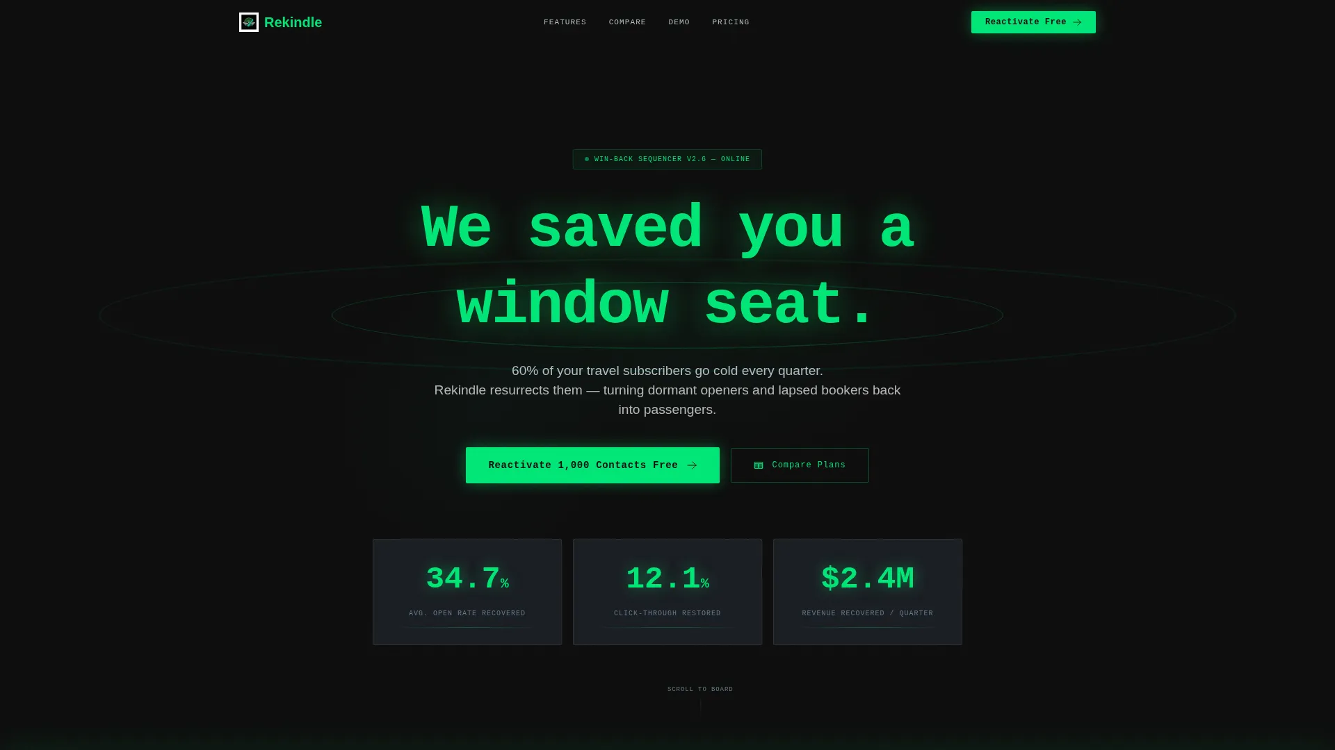
- A full-bleed dark hero header with a terminal-style animated subject line and live metric callouts
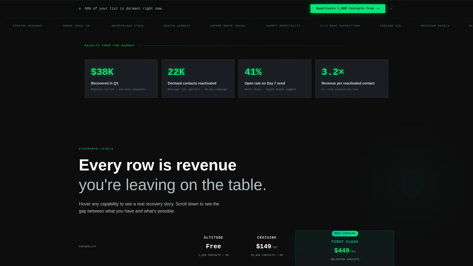
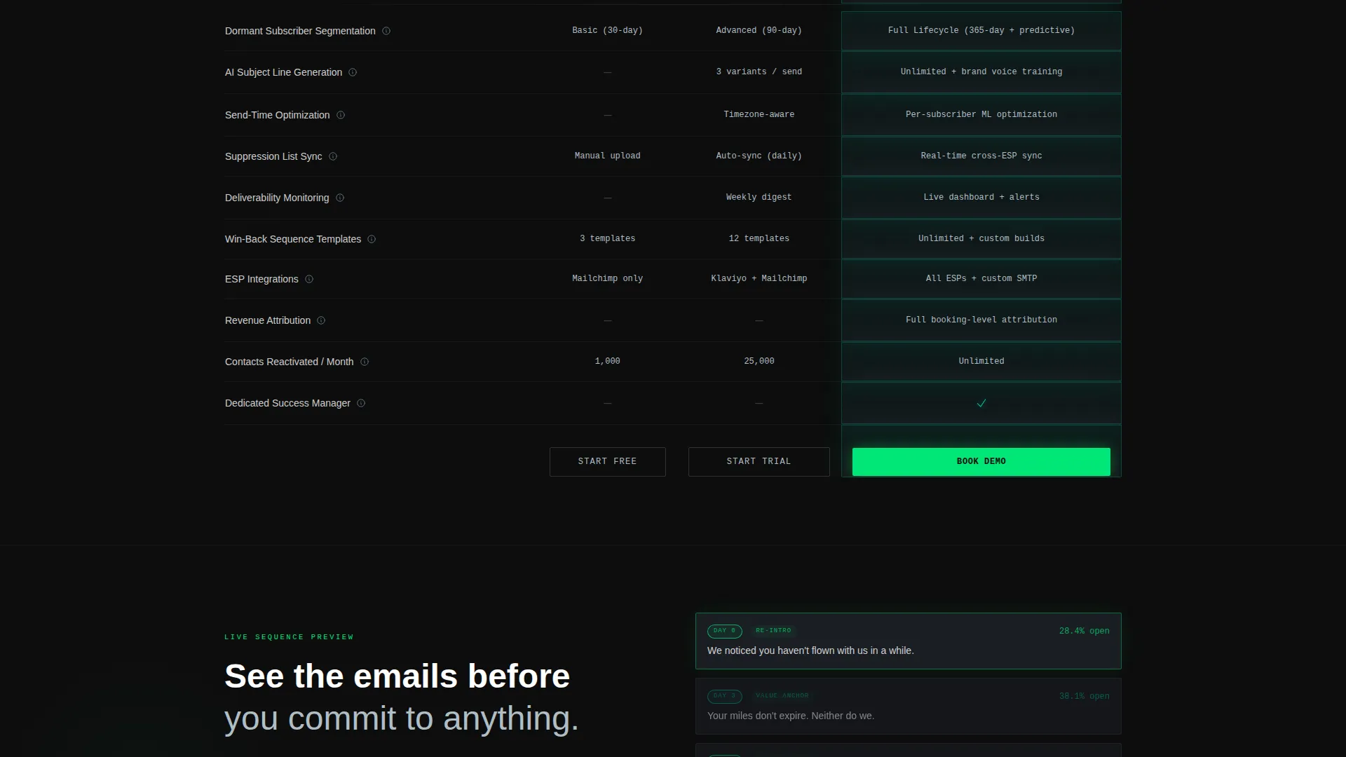
- A three-column feature matrix comparing tier capabilities row by row with tooltip micro-case studies
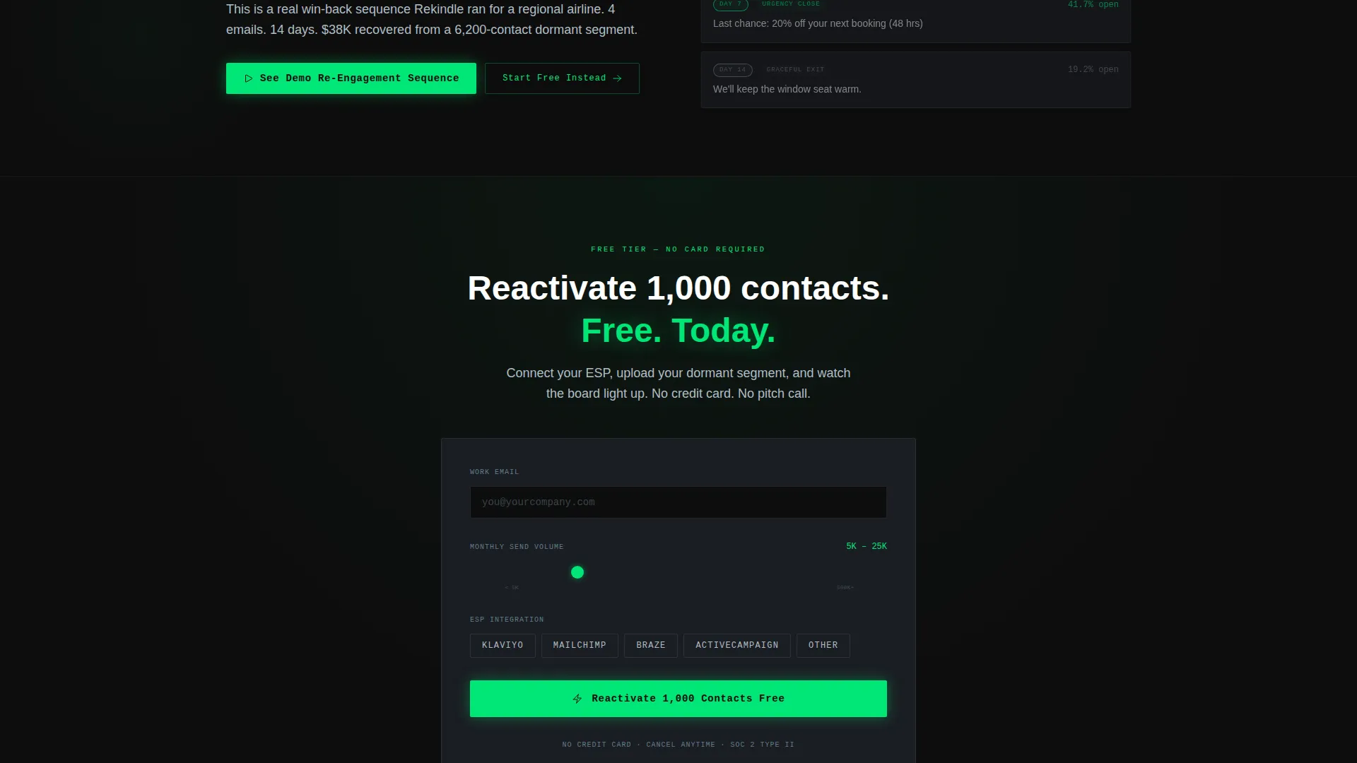
- A sticky freemium call-to-action bar, a stepped signup form, and a secondary demo preview path
Feature list
This template ships with six core design and functional components, each grounded in the source brief.
Terminal-Style Animated Hero
The header fills the full viewport in deep cockpit black. A single subject line types itself out letter by letter in radar-sweep green, followed by a sonar-pulse radiating from the text. Key metrics fade in like cockpit instruments warming up, giving the hero section immediate credibility without a single photograph.
Three-Tier Comparison Table
Three vertical columns are styled to feel etched into a carbon surface. Each row surfaces a specific capability: segmentation depth, artificial intelligence subject-line generation, send-time optimization, suppression list sync, and deliverability monitoring. Visual brightness increases from the free tier to the top tier, making the upgrade path feel earned.
Tooltip Micro-Case Studies
Each capability row in the comparison table includes a hover-triggered tooltip. These tooltips display short, real-world results drawn directly from the brief, such as a regional carrier recovering significant revenue from win-back sequences in a single quarter. The detail builds trust without cluttering the table.
Sticky Freemium Call to Action
A "Reactivate 1,000 Contacts Free" button anchors at the base of the comparison table. After a visitor scrolls past 40% of the page, the same call to action reappears as a sticky bar. The persistent visibility keeps the primary conversion path in reach at every scroll depth.
Stepped Signup Form
The signup form collects information progressively. It starts with a work email, then asks for monthly send volume via a slider, then presents an email service provider integration selector. This reduces friction by only revealing the next question once the previous one is answered.
Demo Re-Engagement Preview Path
A secondary call to action invites cautious visitors to preview an actual email re-engagement sequence before committing. This path lets the product demonstrate its value inside the page itself, removing the need for a visitor to trust a claim they cannot verify.
Page sections overview
| Section | Purpose |
|---|---|
| Full-Bleed Hero | Animate the subject line and fade in platform metrics |
| Metric Instrument Panel | Display open rate, click rate, and revenue recovered |
| Three-Tier Matrix | Compare segmentation, AI tools, and deliverability by tier |
| Tooltip Case Studies | Expand each capability row with real performance results |
| Sticky call to action Bar | Keep the freemium signup visible after 40% scroll depth |
| Stepped Signup Form | Collect work email, send volume, and integration preference |
| Demo Preview Path | Let visitors preview a live re-engagement email sequence |
Design & branding system
The visual identity follows a Directory and Discovery theme built on a Carbon Fiber color system. Every color choice references the interior of an air traffic control room at midnight: dark, precise, and purposeful.
- Core palette: cockpit black (#0D0D0D) for backgrounds, instrument-panel charcoal (#1A1D23) for surface layers, radar-sweep green (#00E676) for primary text and active buttons, and brushed titanium (#B0BEC5) for secondary text and dividers
- Accent glow: luminous teal (#00BFA5) activates on hover states and active toggles, distinguishing interactive elements without noise
- Typography and motion: the terminal typewriter animation, sonar pulse, and tier-brightness graduation all reinforce the cockpit metaphor and guide the eye toward the top pricing tier
Mobile & speed optimization
The template is built around a single-page, section-led scroll structure that keeps the layout lean and load-friendly. Every visual effect is CSS-driven rather than image-heavy, so performance stays strong on mobile connections.
- The full-bleed hero relies on color fills and text animation rather than large background images, keeping initial load fast
- The sticky call-to-action bar and stepped form are touch-friendly and adapt naturally to narrower viewports
- The comparison table columns reflow for smaller screens so tier differences remain scannable without horizontal scrolling
How this template helps you convert
Every structural decision in this template points toward one outcome: turning a skeptical visitor into a signed-up user.
- The animated hero and glowing metrics establish credibility in the first five seconds, before a visitor has read a single feature claim.
- The feature matrix makes the cost of inaction visible row by row, so the decision to upgrade or sign up feels logical rather than pressured.
- The secondary demo preview path removes the last barrier for hesitant visitors, letting them see a real email sequence before they enter their work email.
Other information about this template
This template is categorized under Technology with a subcategory of Travel Email Templates, placing it at the intersection of travel re-engagement email use cases and modern SaaS conversion design. It is well-suited for teams evaluating dedicated win-back platforms alongside tools like Klaviyo, Mailchimp, and Braze, since the signup form explicitly surfaces these integration options as selectable choices.
- The template style is a Comparison Table, making it structurally compatible with feature-rich platform marketing pages
- The freemium and trial conversion model is built into the layout, not bolted on after the fact
- The header concept, Dark Full-Bleed with Glow, and the Feature Matrix creative direction are matched intersection context fields, meaning this template was designed to satisfy that specific combination of visual and structural intent
Theme
Directory & Discovery
Creative direction
Feature Matrix
Color system
Carbon Fiber
Style
Comparison Table
Direction
Freemium/Trial
Page Sections
Terminal-style Animated Hero Header
Three-tier Feature Comparison Matrix
Hover Tooltip Micro-case Studies
Sticky Freemium Call-to-action Bar
Stepped Signup Form with Send Volume Slider
Demo Re-engagement Preview Path
Related questions
Who is the primary audience for this landing page template?
What conversion model does this template use?
Can a visitor preview the product before signing up?
How does the comparison table guide visitors toward upgrading?
What email service provider integrations does the signup form support?



