Insurance Coverage Type Toggle Comparison Website Template
Underwrite is a dark-themed, data-driven insurance agency landing page template built around an interactive comparison table. Visitors toggle between Auto, Home, Life, and Business coverage types and watch tier-by-tier breakdowns restructure in real time. A pinned call-to-action bar and live-agent prompt guide every visitor toward a quote or a conversation.
by Rocket studio
Quick summary
Underwrite is a single-page insurance agency landing page template with a Data Command visual theme. It opens with an animated code-snippet header, flows into an interactive four-category coverage explorer, and closes with a pinned conversion bar. The design targets midnight researchers and on-the-go small-business owners who need fast, clear policy comparisons.
Who this template is for
This template is built for storefront insurance agencies that sell across multiple lines from one office. It fits agencies whose clients arrive already curious but still confused about coverage tiers and pricing.
- Independent insurance agencies offering auto, home, life, and commercial lines
- Agents who want a modern lead-capture landing page without a complex build
- Agencies targeting first-time buyers, young families, and small-business owners
What problem this template solves
Most insurance agency pages overwhelm visitors with walls of text or bury pricing behind a phone call. Prospects leave before they find a reason to stay. Underwrite solves this by making policy data visual, interactive, and instantly comparable.
- Removes the friction of calling just to understand basic coverage options
- Replaces generic brochure copy with a live-feeling, data-driven comparison experience
- Turns a confusing buying process into a structured, confidence-building scroll
What you get with this template
You get a fully designed, single-page layout built around one core interaction: the coverage comparison table. Every section feeds into the next, guiding visitors from curiosity to quote request.
- An animated code-snippet hero section with a live-cursor effect and headline reveal
- A four-tab coverage selector driving a dynamic comparison table with three tier columns
- A pinned bottom call-to-action bar and a secondary live-agent prompt
Feature list
This template includes purpose-built components designed specifically for insurance lead capture. Each piece earns its place by removing a specific barrier between a visitor and a quote.
Animated Code-Snippet Header
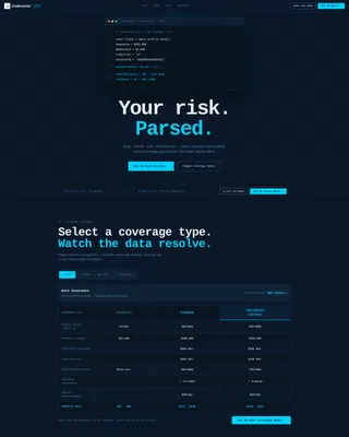
The page opens with a styled block of pseudo-code that appears to execute on load. Lines resolve in sequence, displaying variables like home value, deductible, and annual premium before snapping to a final result. A blinking cursor reinforces the live-system feel and immediately signals that this agency thinks in data.
Interactive Coverage-Type Selector
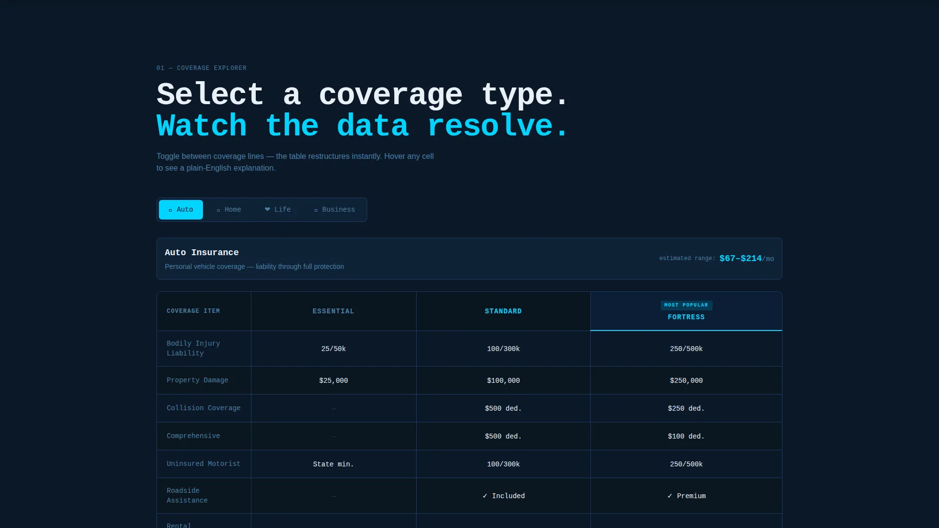
A tab-style toggle lets visitors switch between Auto, Home, Life, and Business categories. Each selection instantly restructures the comparison table below it. This keeps the page focused and lets visitors self-qualify before they ever reach a call-to-action.
Tier-Based Comparison Table
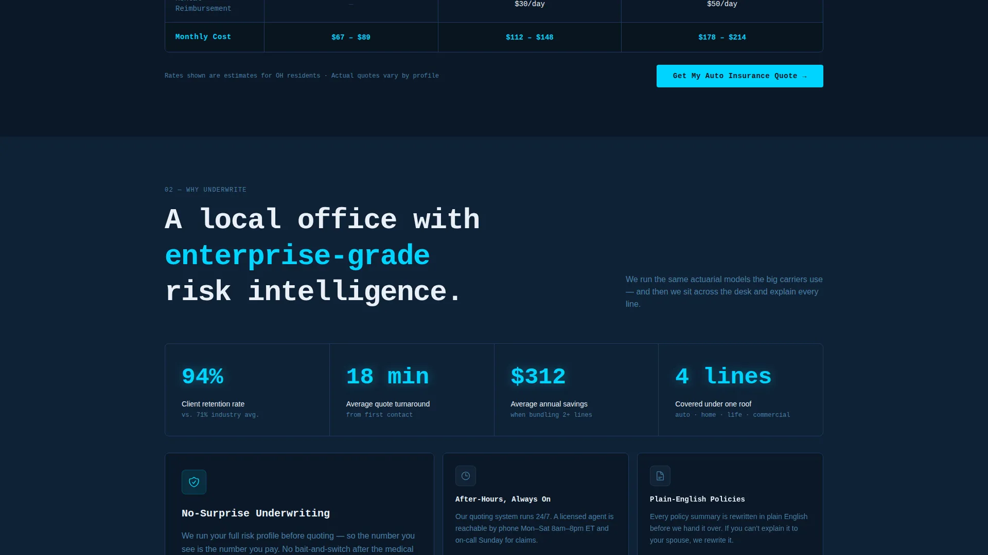
Each coverage category displays a three-column table representing Essential, Standard, and Fortress tiers. Rows cover deductibles, coverage caps, available add-ons, and monthly cost. Cells pulse cyan on hover, revealing a plain-English one-line explanation for each data point.
Pinned Conversion Bar
A slim call-to-action bar stays fixed at the bottom of the viewport throughout the entire scroll. It darkens gradually from slate to deep navy as the visitor scrolls deeper, creating a subtle visual commitment cue. The primary button reads "Get My Custom Quote."
Secondary Live-Agent Prompt
Alongside the primary call-to-action, a secondary prompt labeled "Call an Agent Now" includes a live-hours indicator. This catches visitors who prefer a human conversation over a self-serve form. Both conversion paths are visible at the same time without competing.
Progressive Complexity Escalation
The page is structured so that each coverage section introduces more detail than the last. Auto starts simple; commercial umbrella ends complex. This sequencing teaches visitors they may need broader coverage while simultaneously showing that cost is more manageable than expected.
Page sections overview
| Section | Purpose |
|---|---|
| Code Snippet Hero | Hooks attention with a live-terminal animation and headline reveal |
| Coverage Type Selector | Lets visitors filter the comparison table by coverage category |
| Auto Comparison Table | Compares Essential, Standard, and Fortress auto coverage tiers |
| Home Comparison Table | Breaks down home policy tiers with deductibles and coverage caps |
| Life Comparison Table | Presents term life tiers with plain-English cost context |
| Business Coverage Table | Escalates to commercial lines including general liability and umbrella |
| Pinned Conversion Bar | Keeps the primary quote call-to-action visible at all times |
| Live Agent Prompt | Provides a human contact option with a real-time hours indicator |
Design & branding system
The visual identity follows a Data Command theme. Every color choice reinforces the feeling of a live instrument panel: dark, precise, and purposeful.
- Deep terminal navy (#0B1929) covers all full-bleed backgrounds, setting a focused, low-distraction canvas
- Signal-line cyan (#00D4FF) activates on hover states and highlights active table headers, drawing the eye to interactive elements
- Cool slate (#1E3A5F) surfaces card backgrounds and secondary containers, creating layered depth without breaking the dark palette
- Crisp system white (#EAF0F7) is used for body text and row dividers, ensuring comfortable readability against dark backgrounds
- Monospaced typography throughout the header section reinforces the terminal aesthetic and makes the code-snippet animation feel authentic
Mobile & speed optimization
The template is designed to remain functional and readable on smaller screens. The interactive table layout adapts so that visitors on phones can still compare tiers without horizontal scrolling breaking the experience.
- The coverage-type selector collapses cleanly on mobile, keeping the toggle accessible with thumb-friendly tap targets
- The pinned conversion bar remains visible on mobile viewports, so the quote button is never more than a scroll away
How this template helps you convert
The layout is engineered so that every design decision reinforces forward motion toward a quote request. Visitors are never left wondering what to do next.
- The animated header creates immediate intrigue and signals that this agency is data-literate, building instant credibility before a single word of copy is read.
- The interactive comparison tables answer pricing and coverage questions without requiring a phone call, reducing the single biggest barrier to lead submission.
- The always-visible pinned bar means the "Get My Custom Quote" button is present at the exact moment a visitor decides they are ready, not buried at the bottom of a long page.
Other information about this template
This template sits at the intersection of insurance agency lead capture and technology-forward design. It is suited for agencies that want their digital presence to match the precision of their risk analysis work.
- The template style is a Comparison Table layout, a format proven to reduce decision fatigue by presenting options side by side
- The creative direction is Interactive Explorer, meaning visitor engagement drives the content experience rather than passive reading
- The landing page direction is Click-Through, structured to move visitors from exploration to a defined conversion action in one session
- The header concept is a Code Snippet, a distinctive choice that differentiates this agency from competitors using stock-photo hero sections
- The color system is Midnight Blue, which positions the agency as precise and analytical rather than corporate or generic
Theme
Data Command
Creative direction
Interactive Explorer
Color system
Midnight Blue
Style
Comparison Table
Direction
Click-Through
Page Sections
Animated Code-snippet Hero Section
Interactive Four-tab Coverage Selector
Tier-based Hover-activated Tables
Pinned Progressive Conversion Bar
Secondary Live-agent Contact Prompt
Progressive Complexity Sequencing
Related questions
Can I customize the coverage tiers and table content?
Does this template work for a single-line insurance agency?
What makes the pinned conversion bar different from a standard button?
Is the code-snippet animation a live data connection?
Who is the ideal visitor this landing page is designed to attract?



