Nonprofit Software & SaaS Reviews Website Template
Beacon is a bento grid landing page template built for nonprofit marketing automation platforms. It leads with live-style metrics, benchmark data, and testimonial proof before presenting a clear app download call to action. The Slate & Sky color system gives it the authority of an industry report with the energy of a modern product page.
by Rocket studio
Quick summary
Beacon is a single-page bento grid template designed for nonprofit marketing automation platforms. It opens with a data-forward stats dashboard, walks visitors through sector benchmarks, maps platform features against industry averages, and closes with social proof. The sticky bottom bar drives app downloads while a secondary path captures email leads.
Who this template is for
This template is built for teams marketing nonprofit software to development staff who are tired of manual donor management. It speaks directly to the people who feel the pain of spreadsheet overload every day.
- Small development teams at regional food banks and similar community-focused organizations
- Communications directors at faith-based organizations managing multiple campaigns without automation tools
- Major-gift officers at mid-size universities who need donor pipeline visibility without relying on IT support
What problem this template solves
Nonprofit development teams lose hours every week managing donor touchpoints by hand. A platform that automates email sequences, event follow-ups, and re-engagement campaigns needs a landing page that earns trust before asking for a download.
- Visitors arrive skeptical, so leading with benchmarks and sector data builds credibility before the product pitch begins
- Development staff need to see time savings and revenue impact stated plainly, not buried in feature lists
- Teams not ready to install still need a clear secondary path so no potential lead leaves the page empty-handed
What you get with this template
You get a fully structured, single-page bento grid layout organized to move visitors from curiosity to conversion in one confident scroll. Every section is purpose-built and ready to customize with your platform's real data.
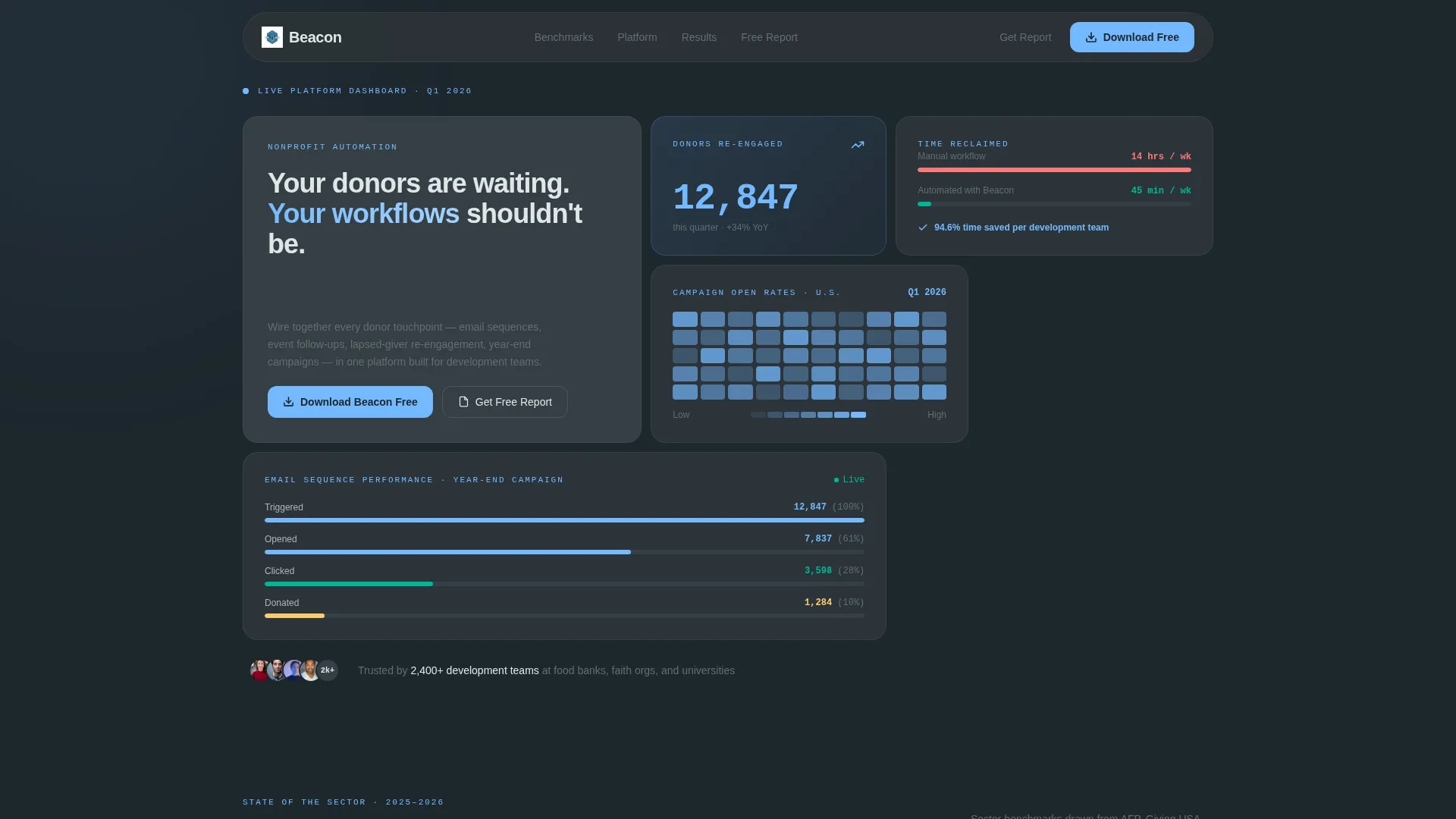
- A living stats dashboard header with four distinct metric tiles showing donor counts, open rate heat maps, email sequence waterfalls, and time-saved comparisons
- Three content sections covering benchmark data, feature-versus-industry comparisons, and testimonial tiles with org logos and one-line results
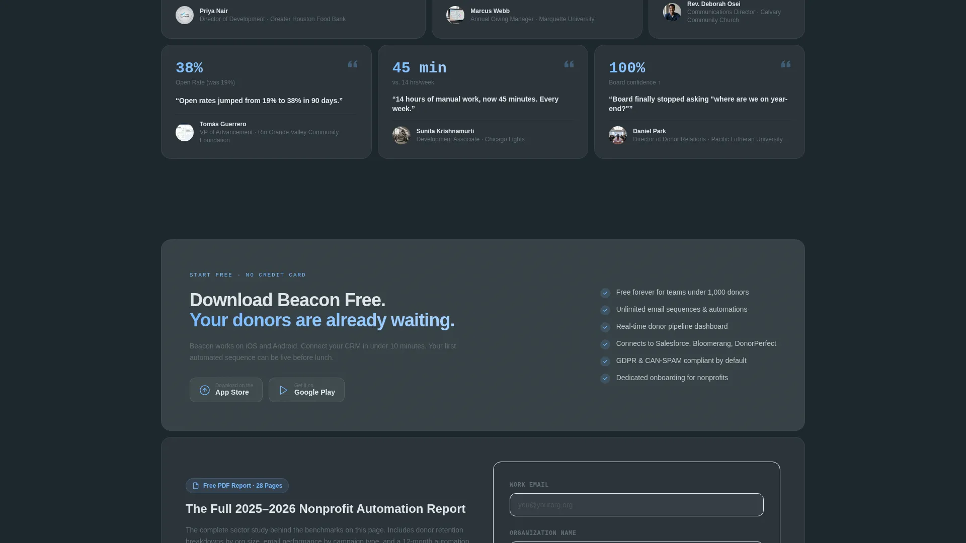
- A sticky bottom bar with paired App Store and Google Play download buttons plus a gated secondary call to action for a downloadable PDF report
Feature list
This template ships with a set of layout and interaction components drawn directly from the brief. Each one serves the conversion strategy built into the page flow.
Living Metrics Dashboard Header
The header is a bento grid of four data tiles that animate on load. Tiles display a climbing donor counter, a U.S. campaign heat map, a real-time email funnel waterfall with progress bars, and a manual-versus-automated time comparison. No stock photography is used; proof comes from data rendered visually.
Benchmark Statistics Section
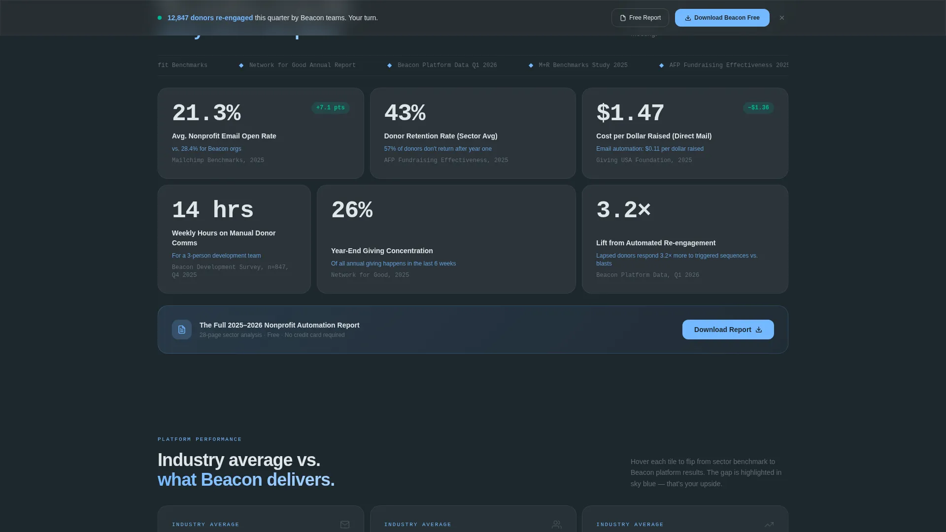
Section two presents a bento grid of sourced, dated sector statistics. Tiles cover average nonprofit email open rates, donor retention rates, and cost-per-dollar-raised figures. This section positions the platform as an authority by showing visitors the state of their own industry.
Feature-versus-Industry Comparison Grid
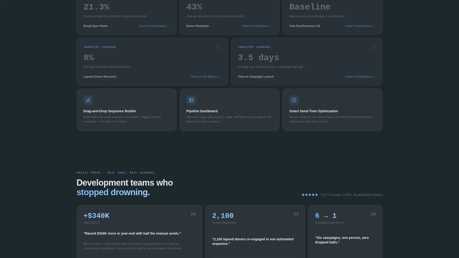
Section three reconfigures the bento grid to place platform results alongside industry averages. Each tile flips from the sector benchmark to the platform's figure, with the performance gap highlighted in sky blue. The layout makes the value proposition impossible to miss.
Testimonial Tile Row
Section four collapses into a row of testimonial tiles featuring headshots, organization logos, and single-line results statements. Results like raising significantly more in a year-end campaign with fewer manual sends give visitors concrete social proof at the moment they are closest to converting.
Sticky App Download Bar
A sticky bottom bar appears after the second scroll fold. It holds the primary call to action alongside App Store and Google Play badges. The bar stays visible through the rest of the scroll so the download opportunity is always one tap away.
Gated PDF Secondary Path
A secondary call to action offers a downloadable nonprofit automation report in exchange for an email address and organization name. This captures visitors who are not ready to install the app and keeps them inside the funnel.
Page sections overview
| Section | Purpose |
|---|---|
| Stats dashboard header | Opens with live-style donor metrics and time-savings data to prove platform value immediately |
| Headline bento cell | Holds the primary headline inside its own tile for visual hierarchy and focus |
| Benchmark statistics grid | Shows sourced sector data to establish authority before introducing the product |
| Feature comparison grid | Maps platform results against industry averages with sky-blue gap highlighting |
| Testimonial tile row | Delivers social proof through org-branded result statements near the conversion point |
| Sticky download bar | Persists App Store and Google Play calls to action after the second fold for continuous access |
| Gated report call to action | Captures email and org name from visitors not yet ready to download the app |
Design & branding system
The Slate & Sky color system gives the page the weight of a printed annual report and the clarity of a clear morning sky. Every color choice serves a functional role in guiding attention and building trust.
- Deep charcoal slate (#2D3436) anchors primary backgrounds and grid frames; mid-tone graphite (#636E72) fills secondary containers so the hierarchy reads instantly
- Open-sky blue (#74B9FF) pulses on metric highlights, active tile states, comparison gaps, and all call-to-action elements to draw the eye where action is needed
- Cloud white (#DFE6E9) surfaces card backgrounds and typography beds, breathing space between tiles so the dense data grid never feels claustrophobic
Mobile & speed optimization
The bento grid layout is structured to reflow cleanly across screen sizes, keeping the data tiles readable and the sticky download bar functional on smaller viewports. The template is designed with a mobile-first audience in mind given the app download goal.
- Tile layouts stack vertically on narrow screens so metric data and comparison content remain legible without horizontal scrolling
- The sticky bottom bar and its paired download badges are sized and spaced for comfortable thumb interaction on mobile devices
How this template helps you convert
Beacon is engineered around a proof-first conversion sequence. Visitors build confidence through data before they ever see a download prompt, which means the ask lands when trust is already established.
- The benchmark statistics section earns authority early, so visitors arrive at the feature comparison grid already primed to believe the numbers they see
- The sticky download bar appears only after the second fold, timed to coincide with the moment visitors have absorbed enough evidence to act
- The gated PDF path ensures that visitors who are not ready to download still leave a contact, giving the platform a second conversion opportunity from the same page visit
Other information about this template
Beacon was designed specifically for the nonprofit software and SaaS category, where buyer trust is earned through data before it is earned through design. A few additional details worth knowing before you build with it.
- The template style is bento grid, which means sections reconfigure their tile arrangements as the page progresses, creating a report-like page-turn feeling without requiring custom animation work
- The Directory & Discovery theme underpins the layout logic: each section surfaces structured information in a browsable, scannable format rather than long prose blocks
- The Industry Report creative direction means the scroll is paced like reading a gated sector study, rewarding visitors who stay engaged at every grid row
- The header concept is a Stats and Metrics dashboard, so the very first thing a visitor sees is the platform working, not a promise that it will work
- This template is well suited for nonprofit marketing automation platforms targeting development professionals who evaluate tools based on measurable outcomes and peer results
Theme
Directory & Discovery
Creative direction
Industry Report
Color system
Slate & Sky
Style
Bento Grid
Direction
App Download
Page Sections
Living Metrics Dashboard Header
Benchmark Statistics Grid
Feature-versus-industry Comparison Tiles
Testimonial Tile Row
Sticky App Download Bar
Gated PDF Secondary Path
Related questions
Who is this landing page template designed for?
Can I use this template without coding skills?
What makes the bento grid layout effective for this type of page?
How does the secondary call to action work alongside the app download path?
Is the Stats dashboard header animated?



