Coaching Digital Presence Specialist Reviews Website Template
Ignite is a split-screen coaching membership landing page built for coaches ready to scale beyond one-on-one work. With a live dashboard preview, animated micro-interactions, and a bold iridescent color system, it communicates authority fast. Three strategically placed calls to action guide visitors toward enrollment without a single form on the page.
by Rocket studio
Quick summary
Ignite is a single-page coaching membership landing page with a clean 50/50 split-screen layout and dynamic motion design. It opens with a live-feeling dashboard preview, escalates through problem and solution sections, and closes with a full-width iridescent gradient and a single click-through call to action. No forms, no friction, just momentum.
Who this template is for
This template is built for coaches who already have a proven method and are ready to package it for scale. If your calendar is full but your revenue ceiling feels stuck, this page speaks directly to that tension.
- Life coaches building on-demand content libraries from their existing frameworks
- Fitness coaches moving away from hour-by-hour client sessions toward group or digital membership models
- Business strategists who want to present a premium membership offer with authority and visual confidence
What problem this template solves
Coaches with real results often struggle to communicate their offer in a way that matches their credibility. A generic page undersells a proven method and leaves potential members clicking away before they feel the impact of what is being offered.
- The template replaces static, low-energy layouts with animated split-screen sections that build urgency as the visitor scrolls
- It removes the barrier of a contact form by routing all intent to a dedicated enrollment page via a single clear action
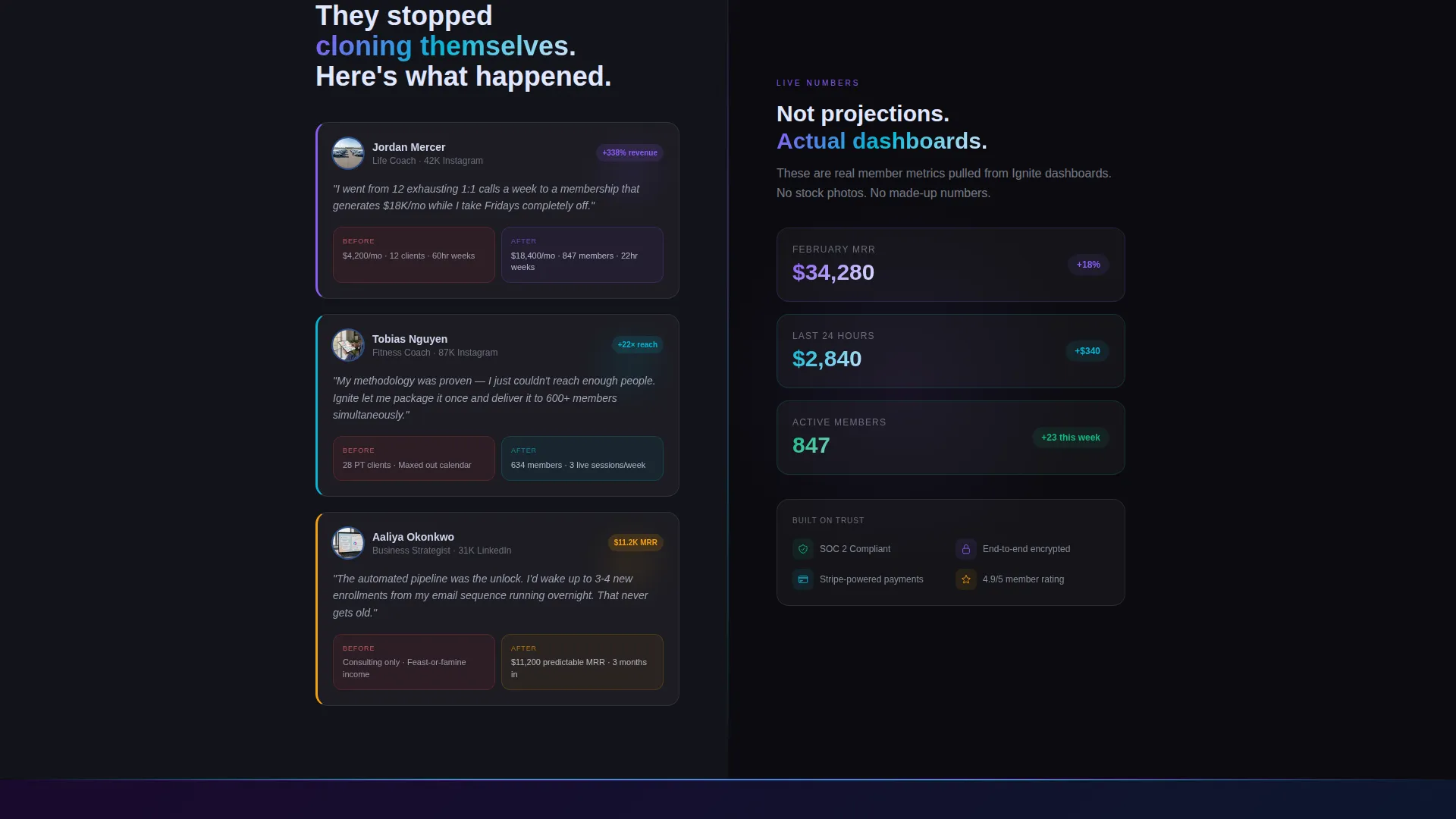
- It presents social proof and dashboard data visually, so trust compounds before the final call to action appears
What you get with this template
You get a fully structured single-page layout designed specifically for coaching membership offers. Every section has a defined role, and the layout guides visitors through a deliberate narrative sequence from problem awareness to confident action.
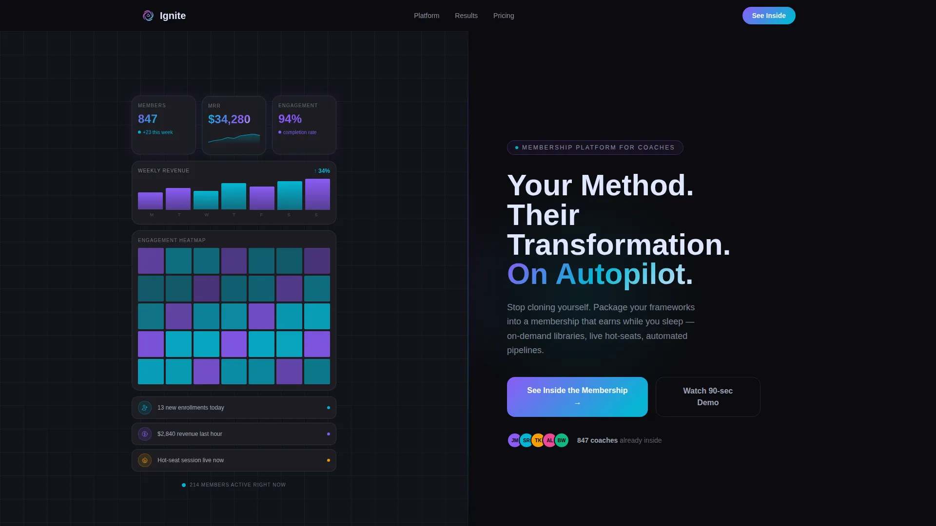
- A split-screen header with a live-style membership dashboard on the left and a bold headline on the right
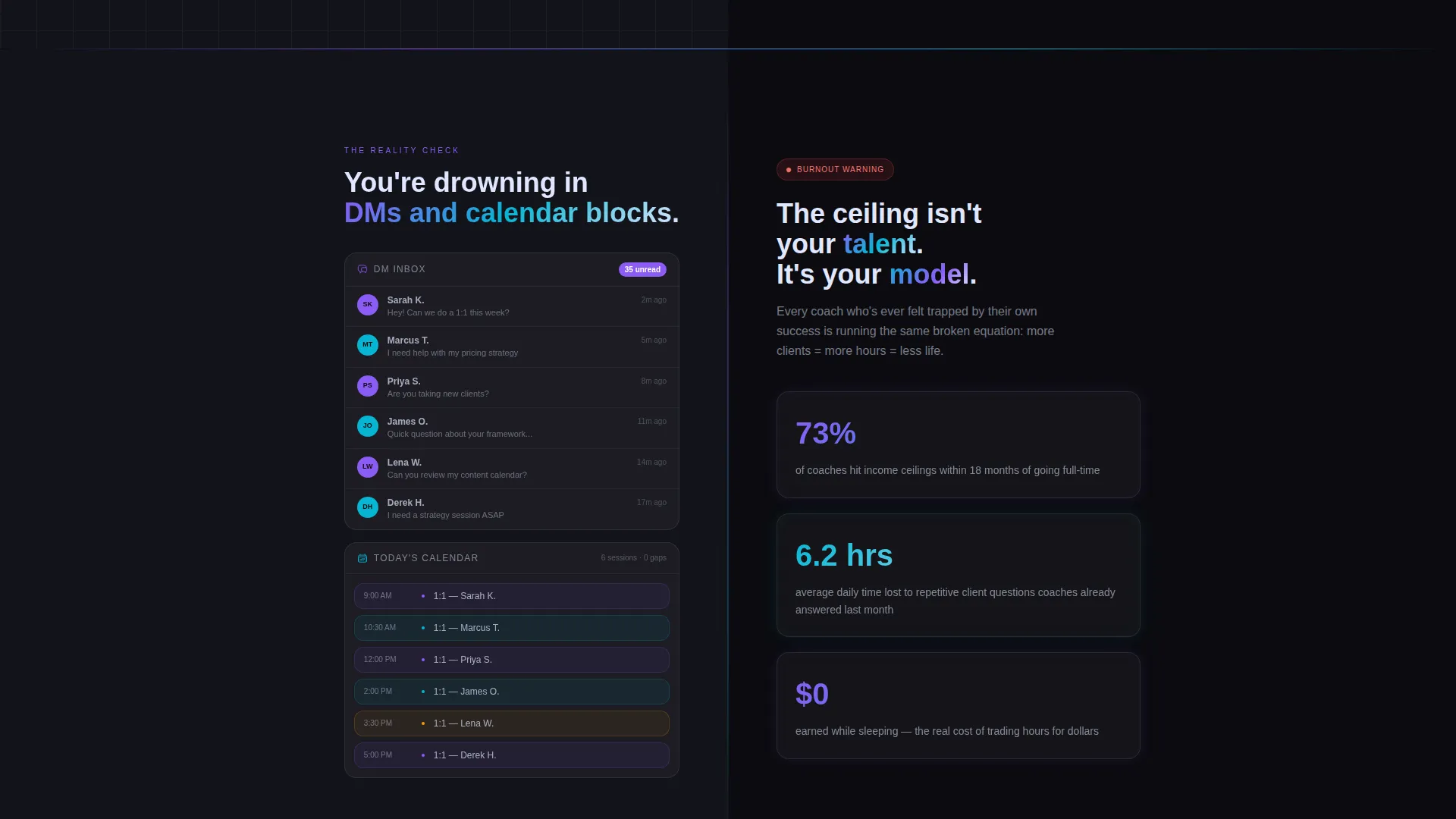
- Three problem-to-solution split sections with horizontal wipe transitions and escalating social evidence
- Three placements of the primary call to action, ending with a full-width closing section that merges both panels into a single gradient
Feature list
This template is built around a small set of high-impact design and layout decisions. Each one serves the core goal of turning visitor skepticism into enrollment intent.
Animated Dashboard Preview Header
The header left panel displays a coach membership dashboard mid-session, complete with ticking member counts, a climbing revenue graph, enrollment notifications, and violet-cyan engagement heat maps. The entire panel feels like a live product, not a static image.
50/50 Split-Screen Layout
Every major section divides the viewport into two equal halves. Left and right panels trade roles across sections, keeping the eye moving and the narrative progressing without ever feeling repetitive or flat.
Horizontal Wipe Section Transitions
Each section transition uses a subtle horizontal wipe animation. Panels slide past each other like tectonic plates, sustaining directional momentum throughout the scroll and preventing the energy from plateauing.
Escalating Social Proof Sections
The template sequences problem, features, and results across three split sections. Revenue screenshots, testimonial video stills, and before-and-after business metrics appear in the results split, building trust through visible evidence rather than written claims alone.
Three-Point Call-to-Action Placement
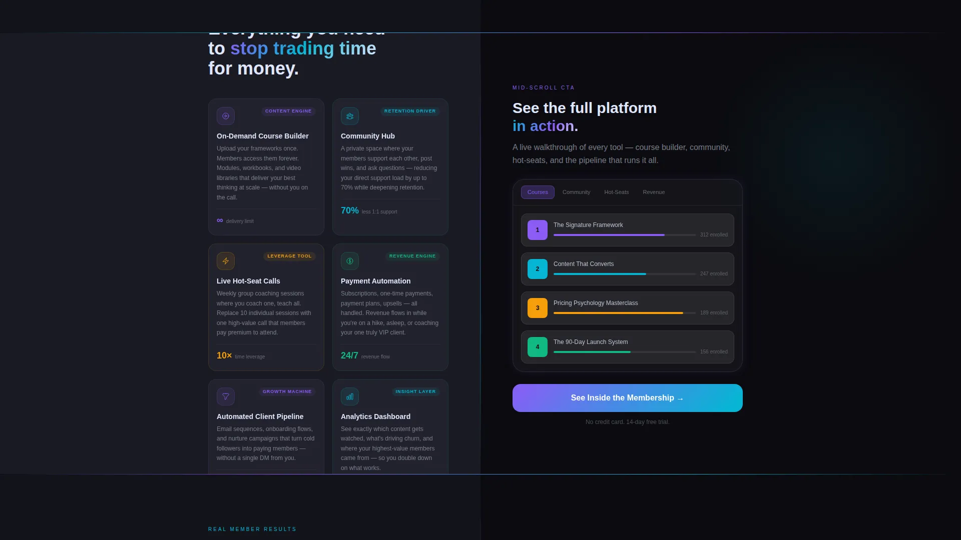
The primary call to action, "See Inside the Membership," appears in the header, mid-scroll after the feature reveal, and on the closing full-width section. This placement strategy catches visitors at every stage of readiness.
Full-Width Iridescent Closing Section
Both split panels merge into a single iridescent gradient on the closing section. The visual shift signals a moment of resolution and focuses all attention on the final call to action before the visitor leaves the page.
Page sections overview
| Section | Purpose |
|---|---|
| Split Header | Introduce dashboard proof and headline |
| Problem Split | Show coach burnout and DM overwhelm |
| Feature Split | Present course builder, community, payments |
| Results Split | Display revenue data and member testimonials |
| Closing call to action | Merge panels and drive enrollment click |
Design & branding system
The template uses an AI Iridescent color system built on four specific values that work together to create a futuristic but trustworthy visual atmosphere. The palette feels like light refracting through a prism on a dark surface, alive and shifting without losing readability.
- Void black (#0B0B0F) forms all backgrounds, giving the color accents maximum contrast and depth
- Holographic violet (#8B5CF6) and electric cyan (#06B6D4) alternate as accent gradients on cards, buttons, and heat map overlays
- Iridescent pearl (#E0E7FF) handles all body copy and headline text, floating softly off the dark canvas with natural luminance
Mobile & speed optimization
The split-screen layout and micro-animations are designed with visual intentionality, ensuring the template feels as deliberate on smaller screens as it does on desktop. The Dynamic Motion theme scales its animation behaviors to maintain the launch-energy feel across devices.
- Split panels reflow cleanly for vertical scroll on mobile without losing the left-right narrative structure
- Micro-animations such as ticking numbers, drawing graphs, and sliding cards are scoped to keep the page feeling alive without overloading the visual experience
How this template helps you convert
This template is built around a single conversion goal: get the visitor to click through to the enrollment page. Every design and structural decision supports that outcome.
- The animated dashboard header front-loads credibility with visible member counts, revenue graphs, and enrollment notifications, so visitors arrive at the first call to action already primed with proof.
- The three-point call-to-action placement means a visitor who is ready early can act immediately, while a visitor who needs more evidence encounters the same prompt again after the results split.
- The no-form approach removes all enrollment friction from this page entirely, making the click feel low-commitment even though it moves the visitor directly into the sales funnel.
Other information about this template
This template sits within the Technology category under the Coaching Digital Presence subcategory, making it a focused tool for coaches operating at the intersection of digital products and community-based membership models.
- The template style is Split Screen (50/50), the theme is Dynamic Motion, and the header concept is Dashboard Preview with the creative direction labeled Launch Energy
- The landing page direction is Click-Through, meaning no lead capture form is present and all conversion intent routes to a separate pricing and enrollment page
- The color system is classified as AI Iridescent, a palette choice that signals innovation and forward momentum without sacrificing warmth or readability
Theme
Dynamic Motion
Creative direction
Launch Energy
Color system
AI Iridescent
Style
Split Screen (50/50)
Direction
Click-Through
Page Sections
Animated Dashboard Preview Header
50/50 Split-screen Layout
Horizontal Wipe Transitions
Escalating Social Proof Sections
Three-point Call to Action Placement
Full-width Iridescent Closing Section
Related questions
Does this template include a sign-up form or checkout flow?
Can I replace the dashboard preview with my own membership screenshots?
Is this template suitable for a fitness coach or only business coaches?
How many times does the call to action appear on the page?
What makes the split-screen layout effective for a coaching membership offer?



