Ignition - Powerful Automotive Landing Page Template
Ignition is a bold brutalist bento grid landing page template built for an automotive mobile app. It opens with a live repair cost estimator, then unfolds a grid of diagnostic features, mechanic-finding tools, and head-to-head comparisons. The design uses reactor teal, asphalt black, and monospaced typography to feel industrial, immediate, and trustworthy from the first scroll.
by Rocket studio
Quick summary
Ignition is a single-page bento grid landing page for an automotive mobile app. It skips hero imagery entirely and leads with a repair cost calculator. From there, bento tiles roll out diagnostic scanning, maintenance tracking, mechanic reviews, and sharp dealership comparisons. The bold brutalist design is built to feel urgent, mechanical, and conversion-ready.
Who this template is for
This template is built for founders, product teams, and indie developers launching an automotive mobile app. It suits anyone who needs to communicate a technical product quickly and honestly, without relying on polished visuals.
- App makers targeting everyday drivers, commuters, and first-time car owners
- Fleet managers or B2B teams who need to demonstrate multi-vehicle utility
- Automotive software teams running direct comparison campaigns against dealership tools
What problem this template solves
Most app landing pages bury the value under hero images and vague taglines. Drivers looking for repair answers want proof up front, not promises. This template solves that mismatch directly.
- Visitors land on a working cost estimator before any marketing copy appears
- The comparison tiles address dealer markup skepticism without requiring a separate page
- The sticky call-to-action bar keeps conversion visible throughout the entire scroll
What you get with this template
You get a fully structured bento grid landing page that moves visitors from problem awareness to conversion in a single scroll. Every section has a defined job, and the layout does not waste space.
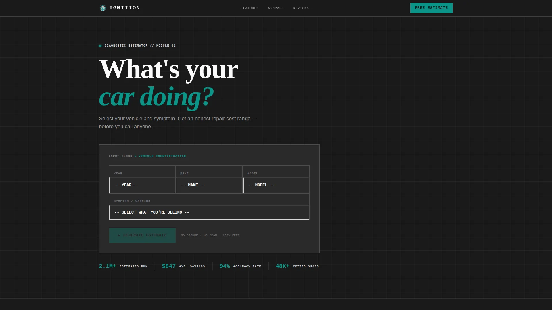
- A brutalist calculator header block with year, make, and model inputs and a real-time cost estimate display
- A bento tile grid covering diagnostic scanning, maintenance timelines, mechanic reviews, and versus comparisons
- A persistent sticky bottom bar with a primary call-to-action button in reactor teal
Feature list
This template is built around specific, functional layout decisions. Each section earns its place.
Repair Cost Estimator Header
The page opens with a thick-bordered input block instead of a hero image. Visitors select year, make, and model using oversized monospaced fields. A cost estimate renders immediately below, showing an app price range alongside a dealership average for direct contrast.
Bento Grid Tile Layout
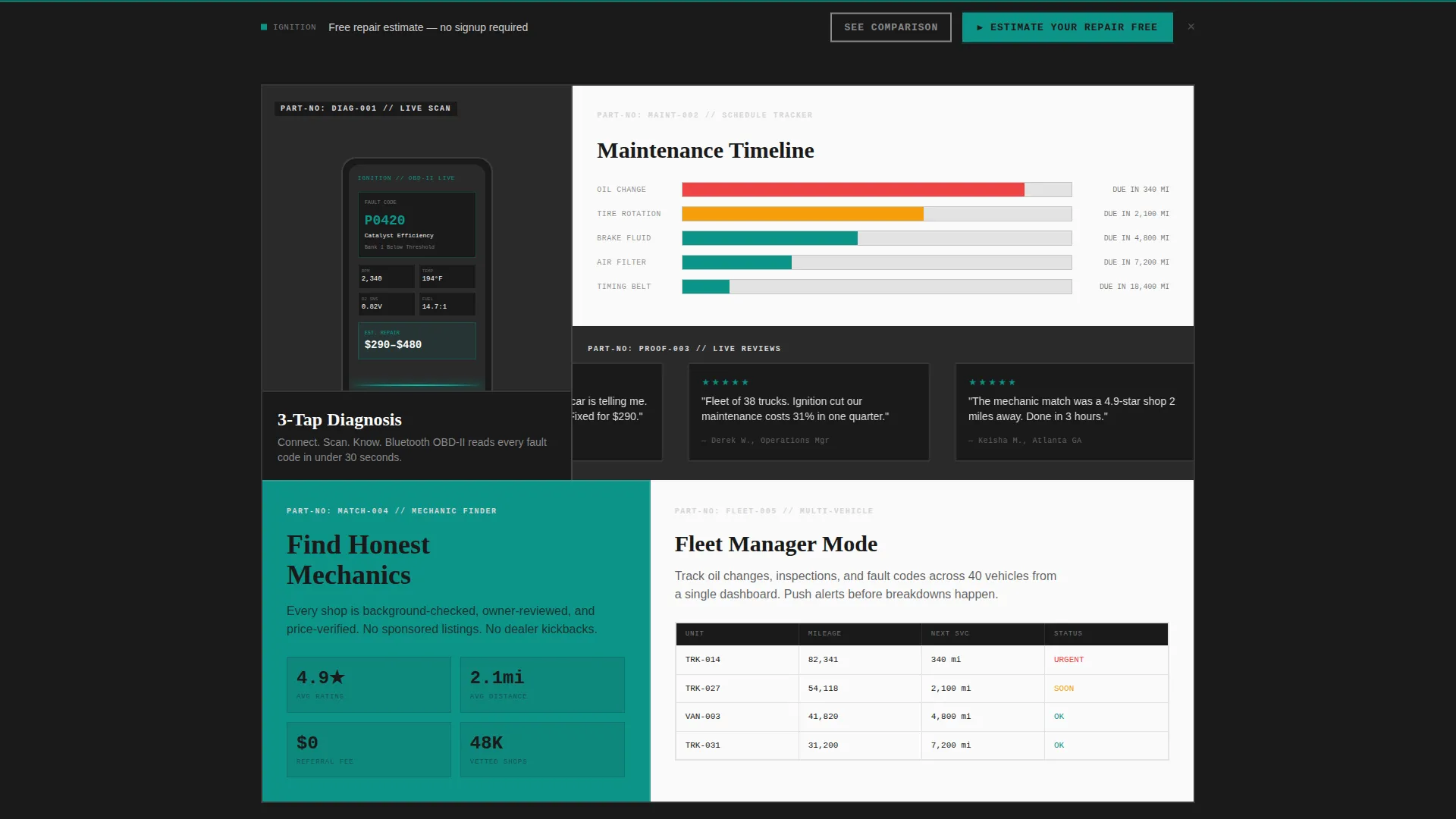
The grid uses asymmetric tiles with no rounded corners and thick borders throughout. A tall left tile shows the app mid-scan, a square tile animates a maintenance timeline, and a wide tile runs a horizontal ticker of five-star mechanic reviews. Each tile carries a monospaced part-number label in the top-left corner.
Woven Comparison Tiles
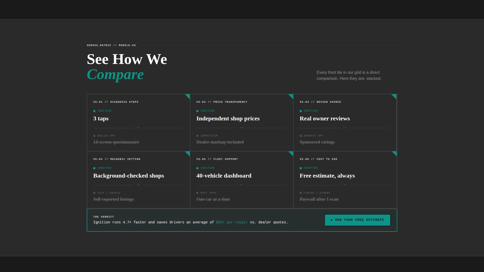
Every third tile in the grid contrasts the app against dealership tools and generic estimators. Callouts like "3-tap diagnosis versus. 14-screen questionnaire" and "real owner reviews versus. sponsored ratings" appear inside the grid flow rather than in a separate table. The repetition builds the versus argument without isolating it.
Sticky Conversion Bar
A persistent bottom bar in reactor teal anchors the primary call-to-action across every scroll position after the first section. The button reads "Estimate Your Repair Free" and leads to an email capture that saves the estimate and triggers a mechanic match.
Anchor-Linked Secondary Path
A secondary call-to-action, "See How We Compare," fires a scroll-jump to the densest cluster of comparison tiles. This gives hesitant visitors a low-commitment detour before the email ask.
Launch Energy Scroll Rhythm
The tile sequence is designed to detonate capabilities one at a time. Features tile, versus tile, social proof tile, versus tile: the rhythm accelerates as the visitor scrolls, mimicking a countdown rather than a passive feature list.
Page sections overview
| Section | Purpose |
|---|---|
| Cost Estimator Header | Opens the page with a real-time repair cost calculator as the first impression |
| Diagnostic Scan Tile | Shows the app actively reading a check-engine code on a phone screen |
| Maintenance Timeline Tile | Animates a multi-vehicle service schedule filling in progressively |
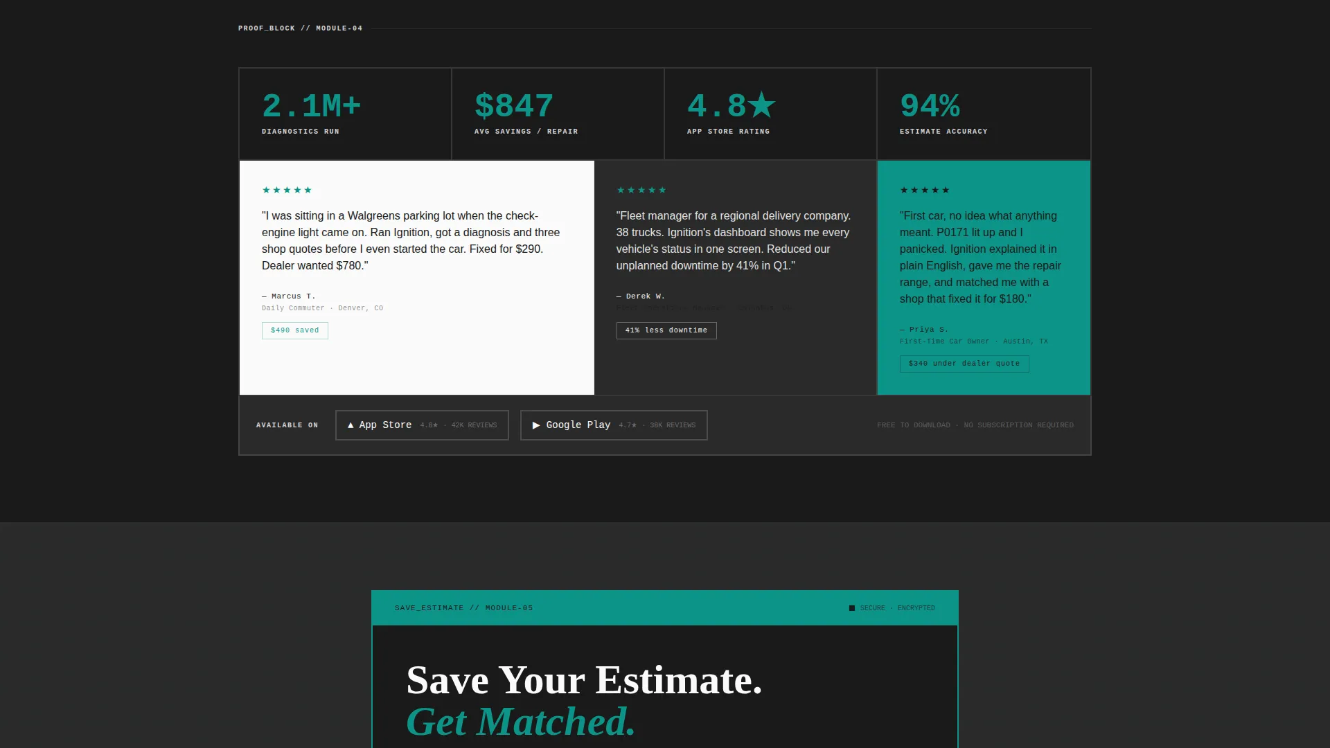
| Mechanic Reviews Ticker | Scrolls five-star independent mechanic reviews horizontally across a wide tile |
| Comparison Tile (first) | Contrasts 3-tap diagnosis against a 14-screen dealership questionnaire |
| Comparison Tile (second) | Highlights independent shop pricing versus dealership markup |
| Comparison Tile (third) | Positions real owner reviews against sponsored platform ratings |
| Sticky call to action Bar | Persists a teal-colored conversion button after the first scroll |
Design & branding system
The visual identity follows a bold brutalist theme. There are no decorative elements, gradients, or rounded corners anywhere in the layout. Every visual decision signals industrial precision.
- Reactor teal (#0D9488) powers all primary actions and active states; asphalt black (#1A1A1A) fills backgrounds and tile borders; exhaust silver (#D4D4D8) handles secondary text and divider lines; hazard white (#FAFAFA) surfaces card backgrounds
- Monospaced typography stamps labels onto tiles like part numbers, reinforcing a mechanical, diagnostic aesthetic
- Thick-bordered input fields and zero-radius tile corners keep the brutalist grid rigid and intentional throughout
Mobile & speed optimization
The bento grid layout is structured for mobile-first use. Drivers are expected to open the app landing page from a parking lot, often on a phone with one hand, right after a warning light appears.
- The estimator header is the first element visible on a small screen, with no full-screen imagery to load before the tool appears
- Tile proportions are designed to reflow into a single-column stack on narrow viewports without losing label hierarchy
- The sticky call to action bar remains visible at the bottom of the screen on mobile, matching the natural thumb-reach zone
How this template helps you convert
The conversion strategy is baked into the layout sequence, not bolted on at the end.
- The repair cost estimator delivers real value before any ask, so the visitor already trusts the product when the email prompt appears
- Comparison tiles woven throughout the grid answer the "why not just use the dealer app" objection repeatedly and naturally
- The sticky bottom bar and the anchor-linked secondary path give two distinct conversion entry points for visitors at different readiness levels
Other information about this template
This template sits inside the Automotive Software and SaaS subcategory under the Technology category. It is designed specifically for the automotive mobile app niche and carries a high intersection match for that context. The bold brutalist theme and bento grid structure make it distinct from standard app landing page templates in the marketplace.
- The template style is classified as Bento Grid with a Launch Energy creative direction, a Calculator/Estimator header concept, and a Comparison/Versus landing page direction
- The Teal Catalyst color system is purpose-built for this template and is not a generic palette swap
- This template works well for teams running paid traffic campaigns, since the estimator header immediately justifies the click before any scroll occurs
Theme
Bold Brutalist
Creative direction
Launch Energy
Color system
Teal Catalyst
Style
Bento Grid
Direction
Comparison/Versus
Page Sections
Repair Cost Estimator Header Block
Asymmetric Bento Grid Layout
Woven Comparison Tile Sequence
Persistent Sticky Conversion Bar
Anchor-linked Secondary Navigation
Launch Energy Scroll Rhythm
Related questions
Can I change the car makes and models in the estimator?
Does the template include the actual repair cost calculation logic?
Is this template suitable for a fleet management product?
Can I remove the comparison tiles if I do not want a versus section?
What file format does this template come in?



