Nonprofit Donor Dashboard Landing Page Template
Impactwelcome is a hub-and-spoke nonprofit donor onboarding dashboard landing page template built for development directors, volunteer coordinators, and small nonprofit marketing teams. It transforms a cold donation receipt into a personalized, impact-driven welcome experience. With a Stats-First layout, Feature Tab Switcher header, and a two-step lead generation form, it immediately communicates value and moves potential donors toward a second gift.
by Rocket studio
Quick summary
The Impactwelcome nonprofit donor onboarding dashboard landing page template is a mission-control-style landing page designed for nonprofit teams who want their first donor email to feel like proof, not paperwork. It uses a Stats-First creative direction, a hub-and-spoke anchor navigation structure, and a two-step progressive form to turn a one-time gift into the start of a committed relationship.
Who this template is for
This template is built for nonprofit professionals who manage donor relationships with limited time and even more limited design resources. It speaks directly to people who know their thank-you emails read like tax forms and want something better without hiring a developer.
- Development directors at mid-size nonprofits handling 50 to 500 new donors each month
- Volunteer coordinators and program staff at community foundations who need a clear, organized first touchpoint
- One-person marketing teams at animal rescues or cause-driven organizations raising funds on a tight timeline
What problem this template solves
Most nonprofit welcome emails do one thing: confirm a transaction. They arrive cold, skip the story, and leave potential donors with no sense of where their money goes or why it matters. The donation landing page experience that follows is often just as disconnected, full of other links and navigation noise that pulls visitors away before they commit to anything deeper.
This template solves the gap between a donor's first gift and their second by giving nonprofits a landing page that immediately communicates impact, builds an emotional connection, and guides new supporters into a personalized onboarding flow.
- First-time donors receive a welcome experience that immediately communicates tangible impact, not just a receipt number
- Development teams stop losing casual visitors who bounce before seeing what their donation actually accomplished
- Small teams replace scattered spreadsheets and half-finished appeals with a single, organized donor cockpit that consolidates data in real time
What you get with this template
This template delivers a full hub-and-spoke landing page with five anchor-navigated spoke sections, a Feature Tab Switcher header, and a two-step lead generation form. Every element is grounded in a Stats-First creative direction, meaning oversized metrics land before the explanatory prose, creating a rhythm of proof followed by context.
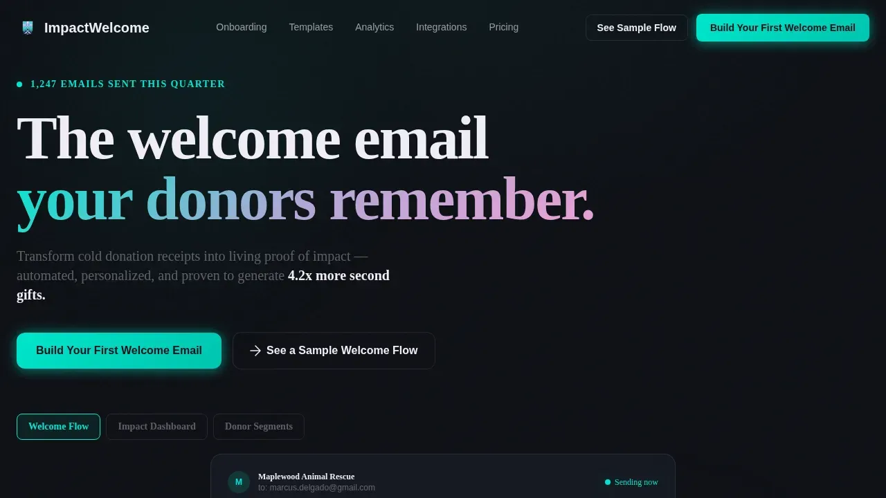
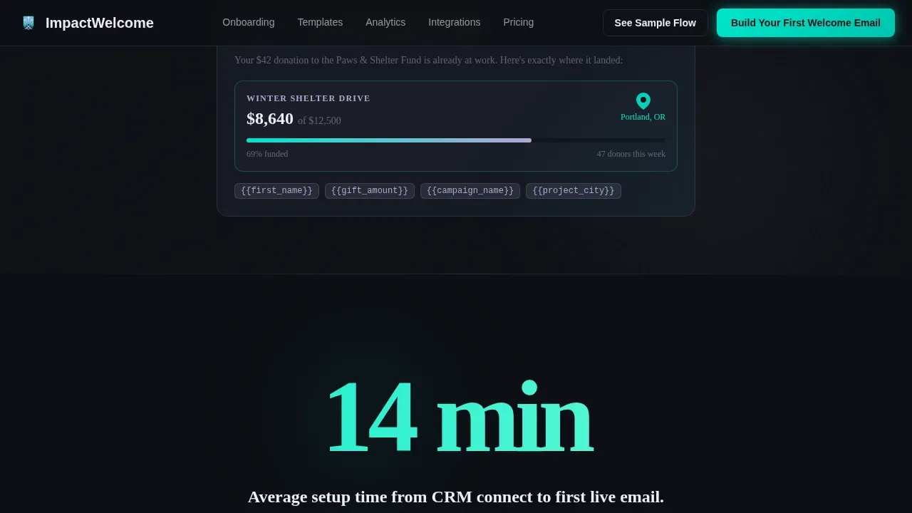
- A Feature Tab Switcher header with three tabs ("Welcome Flow," "Impact Dashboard," "Donor Segments") that swap a live product mockup in real time, showing a donor's name auto-populated, a campaign progress bar, and a map pin dropping on a project site
- Five spoke sections anchored by hub navigation covering Onboarding, Templates, Analytics, Integrations, and Pricing, each opening with its own hero stat
- A two-step progressive disclosure form: step one collects organization name and monthly donor volume; step two asks for email and CRM platform, with a secondary gated PDF path for visitors who want to explore before committing
Feature list
This section describes the core built-in components that make the Impactwelcome landing page function as a donor onboarding cockpit.
Stats-First Scroll Architecture
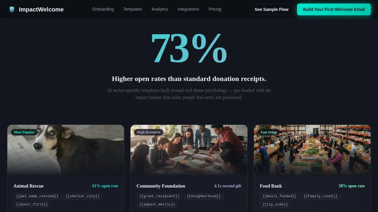
Every scroll transition leads with a single oversized metric before the supporting paragraph slides up beneath it. "73% higher open rates" appears first, then the template personalization explanation follows. "4.2x more second gifts" lands next, then the automated follow-up section unfolds. This rhythm of numbers punching before prose explains keeps visitors engaged as accumulated proof pulls them deeper down the page. It creates a compelling narrative without relying on dense copy blocks.
Feature Tab Switcher Header
The header contains three clickable tabs above a live product mockup. Each tab swaps the screen content in real time, showing a different facet of the platform. The default view renders an email mid-build, with a donor's first name auto-populated, a progress bar filling toward a campaign goal, and a map pin dropping onto a project site. The fictional but plausible data, "$42 average gift," "1,247 emails sent this quarter," makes the dashboard feel already operational.
Hub-and-Spoke Anchor Navigation
Five spoke sections are anchored by a persistent hub navigation bar: Onboarding, Templates, Analytics, Integrations, and Pricing. Each spoke opens with its own hero stat, making guiding visitors through the page feel effortless and purposeful. The distraction-free layout removes other links that would otherwise send page visitors away before they reach the calls to action.
Two-Step Progressive Disclosure Form
The primary lead generation form uses progressive disclosure to lower friction. Step one asks for organization name and monthly donor volume using a dropdown (under 500, 500 to 5,000, 5,000 and above). Step two requests an email address and CRM platform selection (Salesforce, Bloomerang, Little Green Light, or Other). A secondary path offers a gated PDF, "See a Sample Welcome Flow," requiring only an email, allowing donors and decision-makers who are curious but not ready to commit to still enter the funnel.
Calls to Action Placement System
The primary call to action, "Build Your First Welcome Email," appears in three locations: the header, after the third spoke section, and as a sticky bottom bar for mobile users. This triple-placement system ensures calls to action remain visible across the entire scroll journey. Encouraging visitors to act at every logical pause point means no momentum is lost between sections.
AI Iridescent Dashboard Visual System
The page uses a complete visual identity system. Deep void black (#0D0F14) forms the primary background. Electric teal (#00E5CC) highlights live data points and primary buttons. Holographic lavender (#B4A7D6) marks section accents and hover states. Soft pearl (#F0ECF5) handles body text and card surfaces. The result feels like a mission control screen reflected through a prism, clinical enough to trust with donor data, luminous enough to signal that something new has loaded.
Page sections overview
| Section | Purpose |
|---|---|
| Hero Tab Switcher | Show three live product states via clickable tabs with a real-time mockup swap |
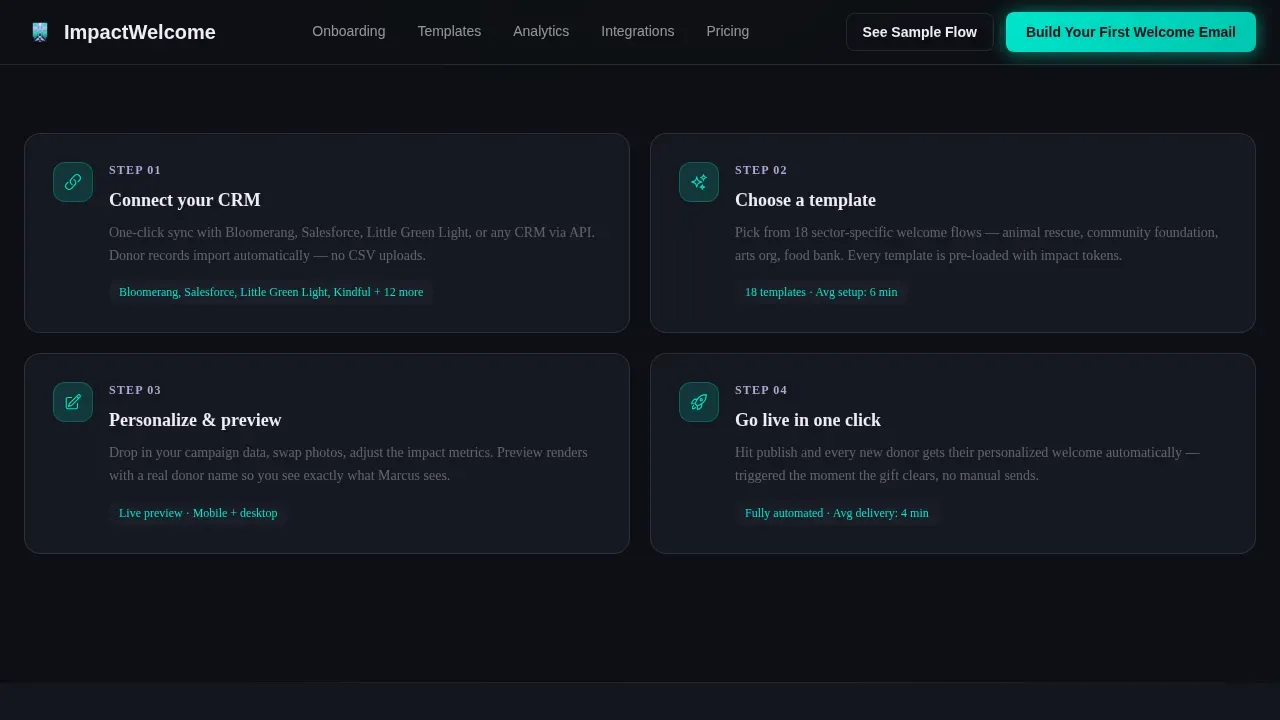
| Onboarding Spoke | Open with "Setup in 14 minutes" hero stat and a step-by-step flow |
| Templates Spoke | Lead with "73% higher open rates" and display a scrollable template gallery |
| Analytics Spoke | Hit "4.2x more second gifts" stat and reveal the dashboard data preview |
| Integrations Spoke | Display CRM logos and compatibility proof for major donor platforms |
| Pricing Spoke | Show transparent nonprofit pricing tiers for every organization size |
| Footer Pattern | Single-row linear footer with brand, navigation, and legal links |
Design & branding system
The design system follows a Dashboard Pro theme built on the AI Iridescent color palette. Every visual choice reinforces a sense of precision and forward motion, making the nonprofit landing page feel trustworthy without being sterile. Typography is set in Plus Jakarta Sans for headings and DM Sans for body text, a pairing that balances sharp clarity with comfortable reading.
- Colors: deep void black (#0D0F14) background, electric teal (#00E5CC) for calls to action and live data points, holographic lavender (#B4A7D6) for section accents and hover states, soft pearl (#F0ECF5) for body text and card surfaces
- Typography: Plus Jakarta Sans headlines for high visual impact, DM Sans body copy for user-friendly readability across all screen sizes
- Visual style: mission control cockpit aesthetic that uses compelling visuals and compelling images to forge an emotional connection with the data, making financial transparency feel designed rather than reported
Mobile & speed optimization
This template is built desktop-first to deliver the full dashboard cockpit experience on larger screens. At the same time, it includes deliberate mobile-specific components that protect conversion rates from mobile users who arrive through digital advertising or search engines. Mobile responsiveness is treated as a conversion priority, not an afterthought.
- A sticky bottom call-to-action bar appears on mobile, keeping the primary "Build Your First Welcome Email" button visible without interrupting scroll behavior
- Interactive elements including the tab switcher, the two-step form, and anchor navigation are handled as client components, while static sections use server components to keep initial load light
- The distraction-free layout on mobile removes other links from the visible viewport, guiding visitors toward the donation form and primary calls to action without competing noise
How this template helps you convert
This landing page is designed around one goal: turn visitors into qualified leads who are ready to build their first nonprofit welcome email. Every section earns its place by moving potential donors and platform users closer to that action.
- The Stats-First scroll pattern builds trust through accumulated proof. Each oversized metric, like "73% higher open rates" or "4.2x more second gifts," lands before the explanation, creating a rhythm that keeps visitors engaged and lowers decision-making friction. Combining clear messaging with emotional appeal makes it harder to scroll past without pausing.
- The two-step form reduces abandonment by splitting commitment into two smaller asks. Step one feels low-stakes; step two arrives only after the visitor has already invested. The secondary gated PDF path catches casual visitors who need more context before they commit, ensuring the page accepts donations of attention even when it cannot yet capture a full sign-up.
- The triple-placement calls to action system, in the header, after the third spoke, and as a sticky mobile bar, means the primary action is always within reach. Whether a visitor reads every section or skips to pricing, the call to action is visible and immediate.
Other information about this template
This template draws on principles found in some of the best donation landing pages studied by the nonprofit sector. Organizations like World Vision use Stats-First emotional storytelling across their donation landing page designs, leading with a single impactful number before the explanatory copy. The Canadian Red Cross is known for urgent messaging and a streamlined donation process that removes friction at every step. Great Ormond Street Hospital uses compelling narrative and visual storytelling to forge a strong emotional connection with donors before presenting a donation form.
The Impactwelcome nonprofit donor onboarding dashboard landing page template applies those same principles to the post-donation moment, which is where most organizations stop investing design attention. The onboarding landing page is where the relationship either deepens or dissolves.
- The dashboard centralizes donor contact information, communication history, and interaction history, ensuring operational efficiency for teams managing hundreds of supporters
- The dashboard eliminates the need for manual reporting by instantly displaying key metrics like donor growth and campaign performance, helping teams move away from spreadsheets toward real-time insights
- Automated milestone alerts built into the onboarding flow remind staff of significant touchpoints in a donor's journey, such as gift anniversaries, allowing donors to feel genuinely recognized
- Suggested amounts and suggested donation tiers shown in the template gallery section illustrate tangible outcomes for each donation amount, helping potential donors understand what their gift accomplishes
- The template supports recurring donations messaging, helping organizations present the value of ongoing giving over a one time gift through transparent reporting on fund usage
- Transparent reporting on where donation amounts go builds financial transparency and helps committed supporters see the direct results of their contributions
- A landing page builder such as Landingi enables nonprofit teams to build and optimize their own nonprofit landing page without writing code, allowing fundraising teams to operate independently
- Platforms like Donorbox allow organizations to create multiple fundraising pages with unique URLs and QR codes, each tailored to a specific fundraising campaign
- Rocket.new is an AI-powered platform that allows teams to spin up production-ready apps from natural-language prompts, making it another option for creating non profit landing pages quickly
- Google Pay and other trusted payment gateways can be connected to reduce friction in the donation process, reassuring new donors during checkout
- Testing and analytics are essential for transforming any nonprofit landing page into a performance-driven asset; tracking visitor behavior and donor behavior over time reveals which calls to action drive donations most effectively
- Real life examples and donation landing page examples from organizations that save lives through streamlined digital marketing show that impactful nonprofit landing pages share three traits: clear messaging, emotional engagement, and a user-friendly donation form
- Social proof, including success stories and testimonials from development directors, inspires visitors to trust the platform and take action
- A well-structured layout influences donor behavior and conversion rates, and this template's hub-and-spoke architecture is designed with that in mind, making every section valuable space that earns its place in the scroll journey
Theme
Dashboard Pro
Creative direction
Stats-First Impact
Color system
AI Iridescent
Style
Hub & Spoke (Anchor Nav)
Direction
Lead Generation
Page Sections
Stats-first Scroll Architecture
Feature Tab Switcher Header
Hub-and-spoke Anchor Navigation
Two-step Progressive Disclosure Form
Triple-placement Calls to Action System
AI Iridescent Dashboard Visual Identity
Related questions
Who is this landing page template designed for?
Can I customize the hero stats and email mockup content?
Does the template include a secondary path for undecided visitors?
How does the two-step form reduce drop-off?
Can this template support recurring donations messaging?



