Nonprofit Case Study Landing Page Template
Impact is a scroll-reveal nonprofit landing page template built around a real case study narrative. It guides visitors from a messy-data problem through a dashboard transformation to clear outcome metrics. Designed for nonprofit leaders, it pairs a Dashboard Pro visual system with progressive reveal animations, a pinned download bar, and a one-field email capture to earn every conversion.
by Rocket studio
Quick summary
Impact is a single-page, scroll-driven landing page template for nonprofit organizations. It tells a case study story from problem to breakthrough using progressive section reveals, a product screenshot hero, and a Slate and Sky color system. The page is built to earn an app download by showing real results before asking for any commitment.
Who this template is for
This template is designed for nonprofit technology teams and digital communicators who need to turn data-driven results into a compelling story. It works especially well for organizations that already have dashboard or reporting tools and want to showcase their impact publicly.
- Executive directors and development officers who need to prove return on investment to boards and grant makers
- Program managers moving beneficiary outcome tracking out of spreadsheets and into shareable formats
- Nonprofit marketing teams launching a dashboard product or reporting tool to peer organizations
What problem this template solves
Most nonprofit landing pages describe features without showing proof. Visitors leave before they trust the product. This template flips that order by leading with someone else's verified success before ever asking for a download or sign-up.
- Scattered donation data, volunteer hour logs, and program outcomes never appear together in one clear story
- Executive directors and development officers have no single page that translates dashboard metrics into board-ready narrative
- Potential users need to see a peer organization's transformation before they commit to a new tool
What you get with this template
You get a fully structured, scroll-reveal landing page that walks visitors through a nonprofit case study from start to finish. Every section is purpose-built to escalate credibility and move the reader toward a clear action.
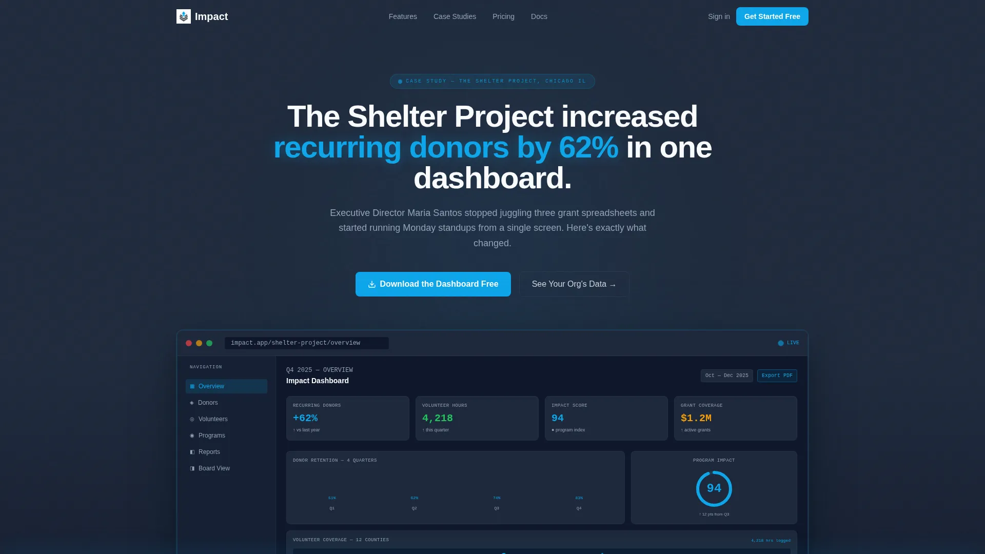
- A full-width product screenshot header showing live dashboard metrics from a real nonprofit case study
- Progressive scroll-reveal sections that move from the problem state through migration and into outcome metrics
- A pinned bottom bar with a primary download call to action and a secondary one-field email capture path
Feature list
This template is built around six tightly coordinated components that work together as one progressive narrative.
Full-Width Product Screenshot Header
The header opens with a pixel-crisp dashboard screenshot mid-use. It shows a donor retention bar chart climbing over three quarters, a volunteer map across twelve counties, and a program impact score of 94 in sky blue. A single headline sits above the screenshot, keeping the product as the hero.
Progressive Scroll-Reveal Story Flow
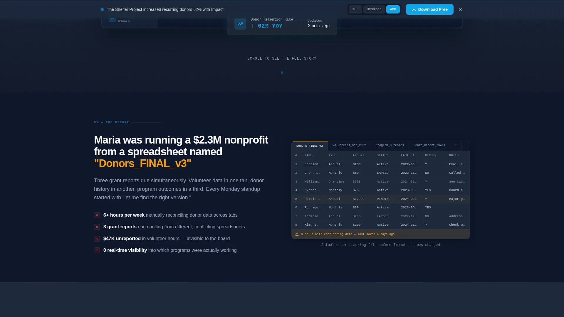
Each section of the page reveals a new layer of the same case study as the visitor scrolls. The sequence moves from a blurred spreadsheet problem state, through an animated row-to-widget transition, to outcome metrics that slide in from below. The pacing feels like a series of good-news notifications arriving one after another.
Pinned App Download Bar
After the first scroll, a slim bottom bar locks into place with the primary call to action: "Download the Dashboard Free." The bar includes platform toggle icons for iOS, desktop, and web app. It stays visible without interrupting the reading experience.
One-Field Email Capture Path
A secondary conversion path offers "See Your Org's Data" as an alternative to the immediate download. Visitors enter a single email address and receive a personalized demo link. This path serves visitors who want proof before committing to a download.
Escalating Outcome Metric Reveals
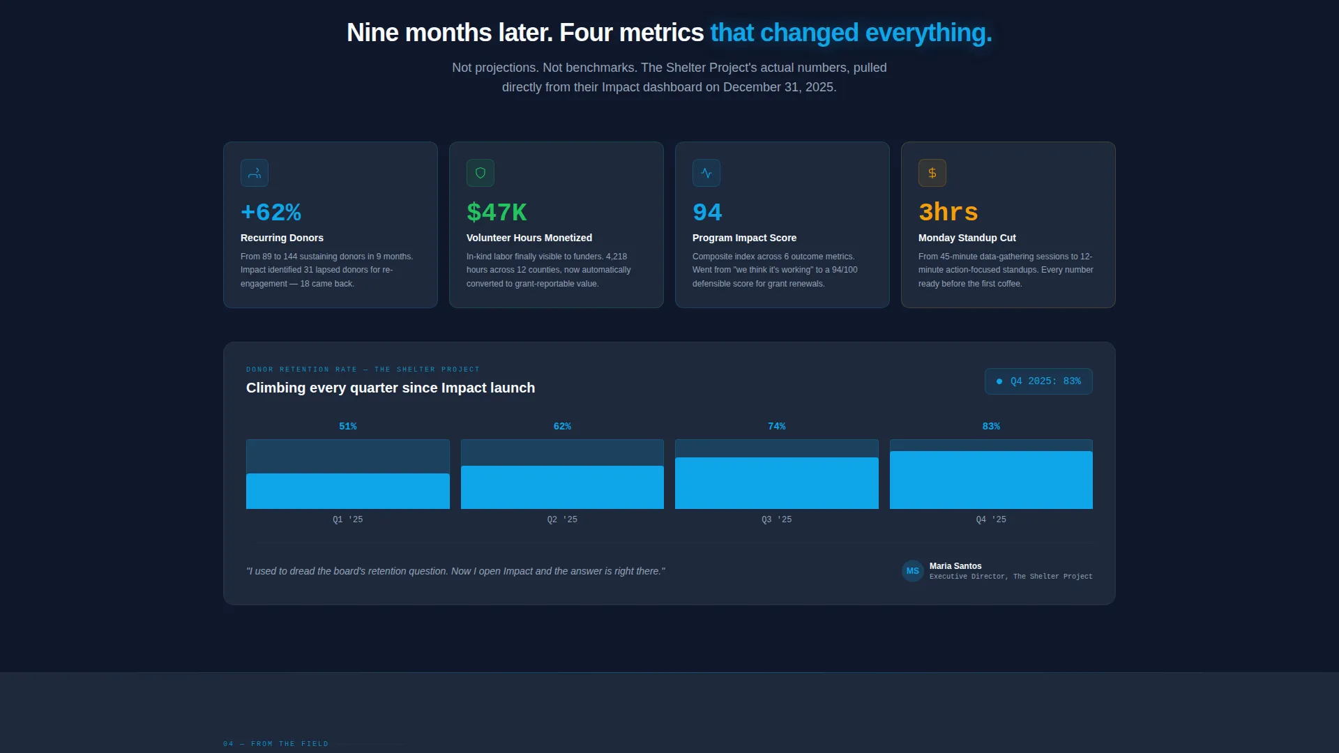
Small wins appear first, followed by headline metrics, then a board member quote. A second case study teases beneath the first, keeping momentum alive. Each metric reveal is timed to feel like a live dashboard updating in real time.
Slate and Sky Color System
The color system uses deep operations slate for backgrounds, mid-tone graphite for supporting text, open-sky blue for active data points and calls to action, and cloud white for card surfaces. The palette creates a clear visual hierarchy that guides the eye from context to insight to action.
Page sections overview
| Section | Purpose |
|---|---|
| Product Screenshot Header | Opens with a full-width dashboard screenshot and a single headline anchoring the case study |
| Problem State Reveal | Shows a blurred messy spreadsheet to establish the before condition |
| Migration Moment | Animates the transition from spreadsheet rows to clean dashboard widgets |
| Small Win Metrics | Introduces early outcome data to build credibility before headline numbers |
| Headline Impact Metrics | Delivers the primary case study results with emphasis and visual weight |
| Board Member Quote | Adds a peer voice to validate the transformation shown above |
| Second Case Study Tease | Hints at a second organization's story to sustain scroll momentum |
| Pinned Download Bar | Locks a slim call to action bar at the bottom after the first scroll |
| Email Capture Section | Offers a one-field alternative path to a personalized demo link |
Design & branding system
The visual identity follows a Dashboard Pro theme that feels like a weather app at dawn. Dark ground tones give way to open atmospheric blues, with every accent of sky blue signaling something active, live, or worth clicking.
- Color palette: deep operations slate (#1E293B), mid-tone graphite (#475569), open-sky blue (#0EA5E9), and cloud white (#F8FAFC) for card surfaces
- No stock imagery or illustrations anywhere on the page; the product screenshot is the only visual hero
- Card surfaces in cloud white provide breathing room against the slate backdrop, keeping data legible at every scroll depth
Mobile & speed optimization
The scroll-reveal structure and pinned bottom bar are designed to work cleanly on small screens. The layout adapts so the product screenshot and metric reveals remain readable without horizontal scrolling.
- The pinned download bar stays accessible on mobile without covering key content
- Progressive reveals are structured so each section loads as a self-contained block, keeping the page responsive as the visitor scrolls
- The one-field email capture is minimal by design, reducing friction on touch keyboards
How this template helps you convert
The page earns its conversion by proving impact through someone else's story before asking anything of the visitor. By the time the reader reaches the final call to action, they have already watched a peer organization transform.
- The product screenshot header leads with real data, not promises, so visitors immediately see what the dashboard delivers rather than reading about it
- The escalating reveal sequence builds trust progressively, moving from a relatable problem through small wins to headline metrics, so the download button feels like catching up rather than taking a risk
Other information about this template
This template fits naturally into the nonprofit technology category and is purpose-built for the nonprofit organization case study page niche. It is designed for teams presenting dashboard or reporting tools to peer organizations and funders.
- The template style is Scroll Reveal (Progressive), meaning each content block appears as the visitor reaches it rather than loading all at once
- The landing page direction is App Download, with the primary call to action focused on getting visitors to download or access the dashboard tool
- The header concept is Product Screenshot, which means no decorative illustration or stock photo is used as the hero visual
- The creative direction is Launch Energy, where the page escalates in excitement from problem statement to headline outcome to final call to action
- The theme is Dashboard Pro, optimized for presenting data-driven tools and reporting products to professional audiences

Theme
Dashboard Pro
Creative direction
Launch Energy
Color system
Slate & Sky
Style
Scroll Reveal (Progressive)
Direction
App Download
Page Sections
Full-width Product Screenshot Header
Progressive Scroll-reveal Story Flow
Pinned App Download Bar
One-field Email Capture Path
Escalating Outcome Metric Reveals
Dashboard Pro Slate and Sky Visual System
Related questions
Who is this landing page template designed for?
Can I replace the case study content with my own organization's data?
What does the scroll-reveal structure mean for this page?
How does the pinned download bar work on this page?
Is this template suitable for sharing with board members or grant reviewers?



