Printing Digital Presence Careers & Recruitment Website Template
Imprint is a split-screen landing page template built for print shop owners who need to launch a polished email newsletter app without hiring a designer. It showcases a drag-and-drop template engine loaded with ink-coverage stats, press schedules, and reorder prompts, and drives app downloads through a Problem-to-Solution scroll flow and live interactive previews.
by Rocket studio
Quick summary
Imprint is a single-page landing page template designed for a printing email newsletter app. It uses a 50/50 split-screen layout, a dark Data Command visual theme, and a Problem-to-Solution Arc narrative to move print shop owners from pain point to app download. The primary call to action sends visitors straight to the app store.
Who this template is for
This template speaks directly to people running print operations who struggle to communicate value to clients on a regular schedule. It targets professionals who need a newsletter tool but lack design time or budget.
- Production managers at commercial print houses juggling dozens of client accounts
- Franchise quick-print operators who promised a monthly newsletter but never delivered one
- In-plant print centers inside universities and hospitals that need to prove their value each quarter
What problem this template solves
Most print businesses lose reorder revenue simply because clients forget to come back. Generic email tools require design skills most print teams do not have, and the result is low open rates and zero reorder prompts.
- Hours wasted building newsletters in general email tools by non-designers
- Revenue lost when clients miss reorder windows because no timely nudge was sent
- No structured way to share ink-coverage stats or press schedules in a client-friendly format
What you get with this template
You get a complete, deployment-ready landing page built around converting visitors into app downloads. Every section is intentional, and the design does the persuasion work before the user ever taps an install button.
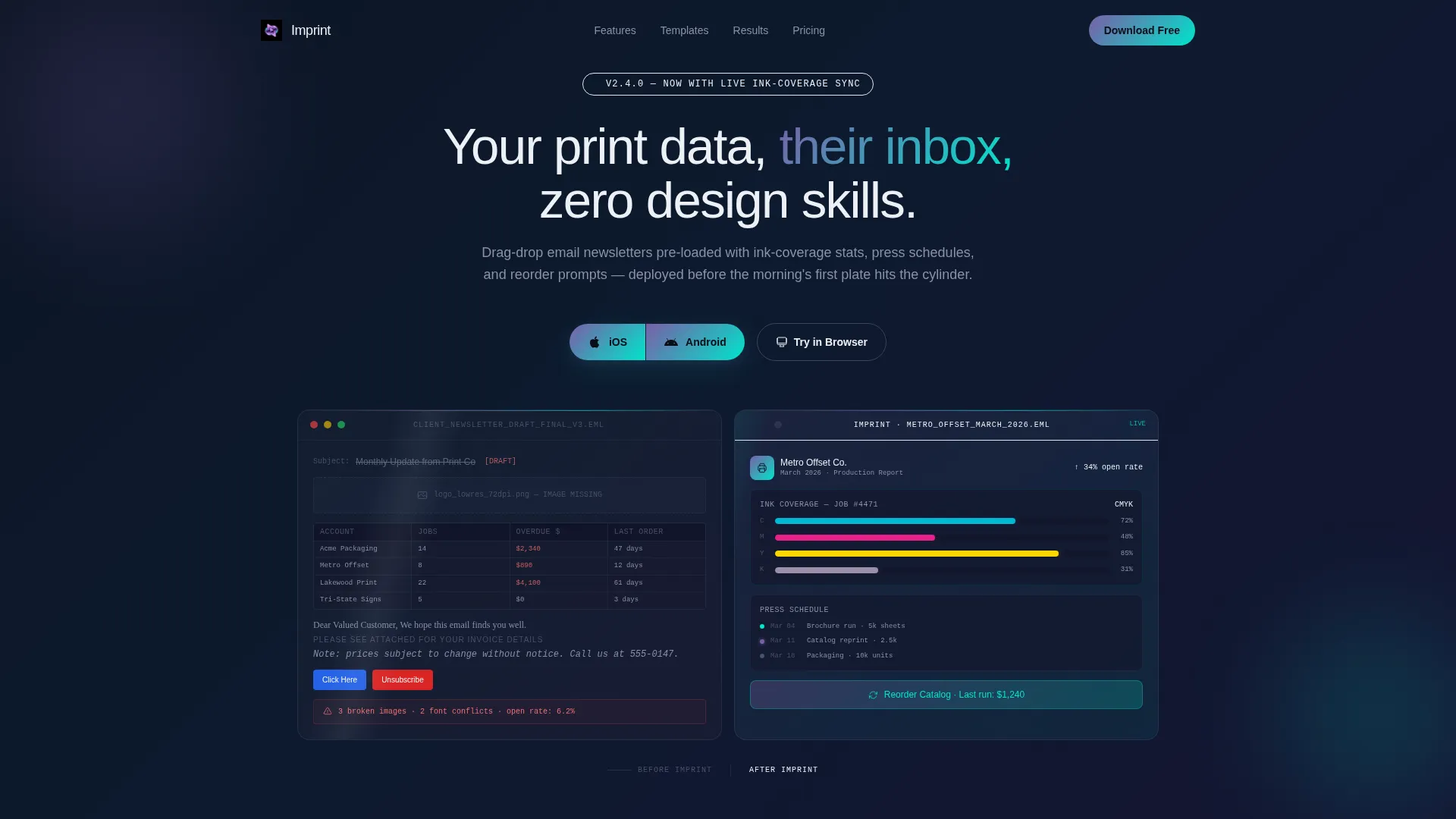
- A split-screen header with before-and-after Dark Glass Panel visuals showing raw versus polished newsletter content
- A three-act scroll narrative moving visitors from recognized pain through template preview to proven results
- Dual call-to-action placements with iOS and Android download buttons and a secondary browser link
Feature list
This template is built around a tight set of prompt-backed capabilities. Each component earns its place by reducing friction on the path to an app download.
Split-Screen Header with Dark Glass Panels
Two frosted-glass rectangles float on a pure-black field. The left panel shows a disorganized raw newsletter; the right shows the same content transformed into a data-rich, client-ready email. An animated light sweep crosses both panels periodically to reinforce the glass effect.
Problem Arc Stat Cards
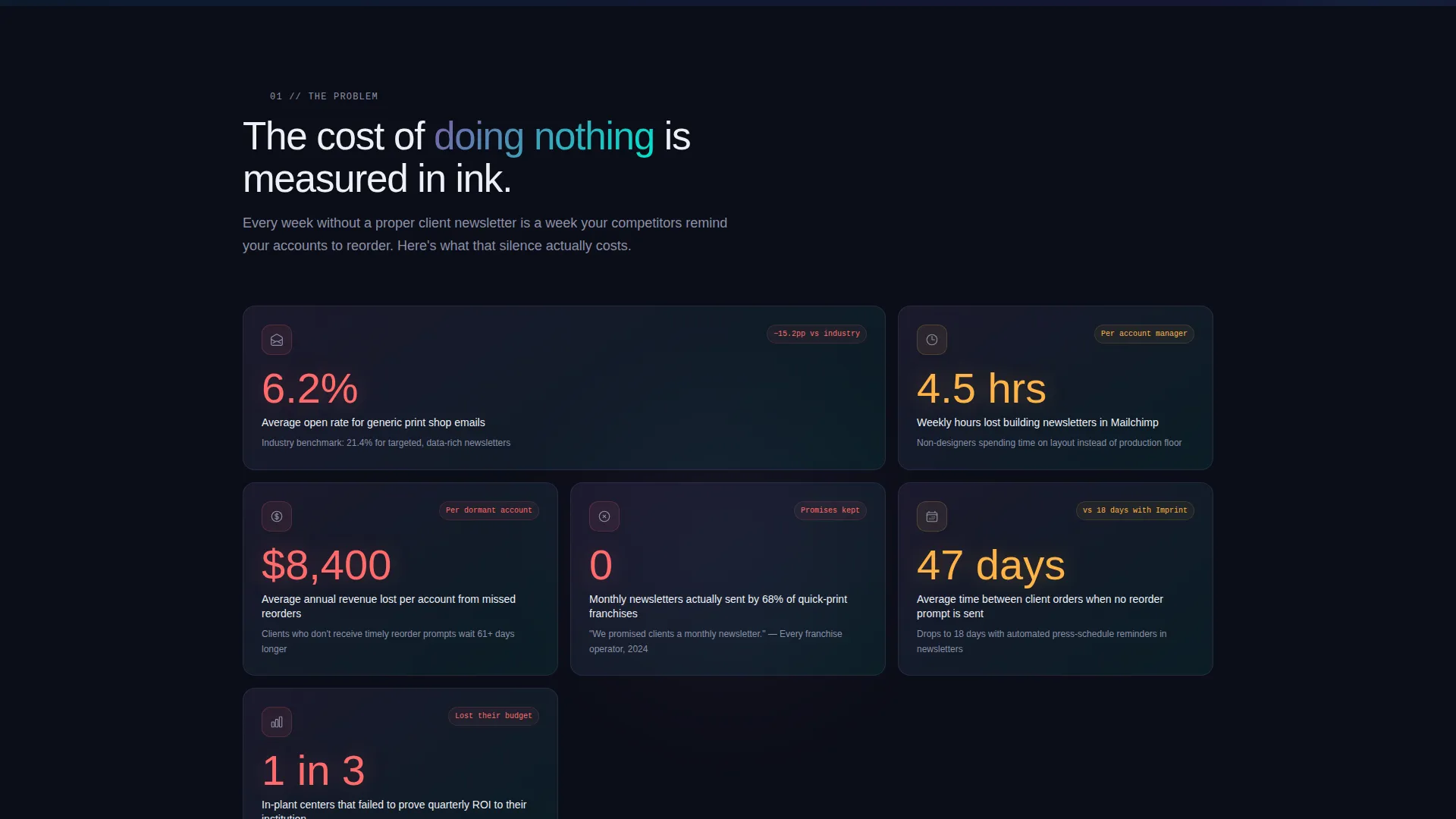
Each core pain point gets its own dark glass card displaying a concrete metric. Open rates for generic print emails, design hours wasted, and revenue lost from missed reorders are each surfaced as a standalone visual unit for maximum impact.
Interactive Template Library Preview
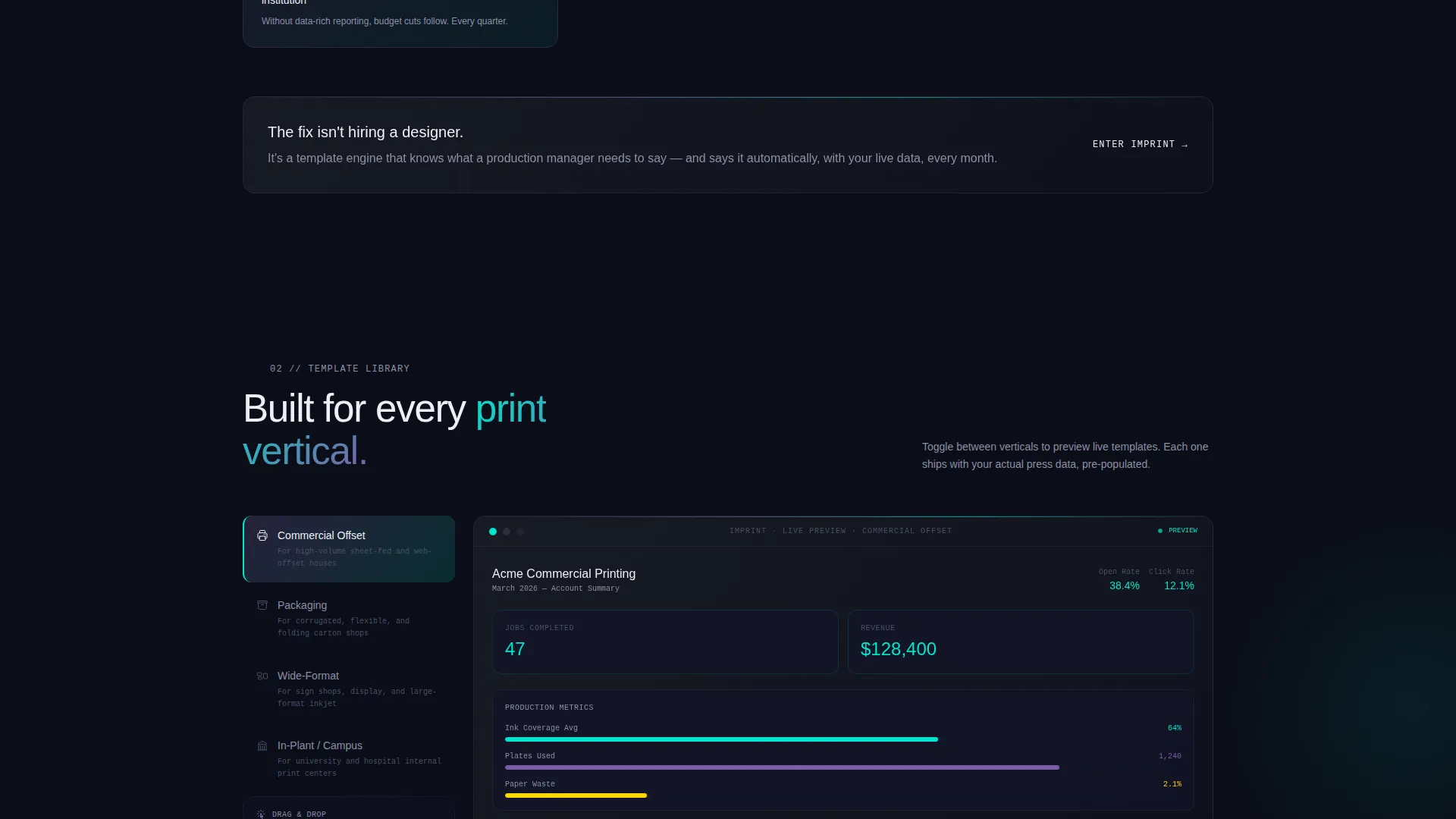
Visitors can toggle live previews across print verticals including packaging, wide-format, and commercial offset. This hands-on interaction builds trust before any install commitment is required.
Results Section with Before-and-After Comparison
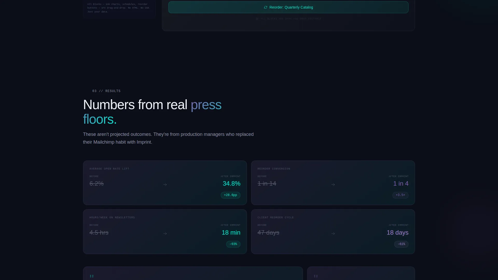
The third scroll act presents real send metrics, reorder conversion lifts, and a side-by-side view of a basic email versus a templated one. Proof arrives at exactly the right moment in the narrative.
Dual App Download Call-to-Action
The primary call to action, "Download and Send Your First Newsletter Free," appears twice on the page. Each instance shows iOS and Android icons side by side as a split button, eliminating hesitation at the conversion point.
Secondary Browser Access Path
A "Try in Browser" link offers desktop users a no-install entry point to the web app. This secondary path captures visitors who are not yet ready to download, without cluttering the main flow.
Page sections overview
| Section | Purpose |
|---|---|
| Split-Screen Header | Reveals before-and-after newsletter contrast with animated glass panels and headline |
| Problem Stat Cards | Displays concrete pain-point metrics on individual dark glass cards |
| Template Library Preview | Lets visitors toggle live previews across print verticals |
| Results and Proof | Shows send metrics, conversion lifts, and before-and-after email comparison |
| Primary App Download call to action | Drives iOS and Android installs with a split download button |
| Secondary Browser call to action | Offers a web app entry point for desktop-first visitors |
Design & branding system
The visual identity follows a Data Command theme built on an AI Iridescent color system. The palette feels synthetic and precise, like light refracting through a misaligned prism onto a matte-black substrate.
- Core colors: void black (#0B0D17) as the base, prismatic violet (#7B5EA7), shift-cyan (#00E5CC), and signal white (#EDF0F5) for body text
- Violet and cyan appear as gradients on cards and hover states, never flat, always shimmering against the dark field
- Typography and spacing reinforce the "holographic proof materializing on a dark light table" visual concept described in the brief
Mobile & speed optimization
The landing page layout is structured to perform cleanly across device sizes. The split-screen format adapts its two-column structure for smaller viewports without losing the dark glass visual effect.
- The no-form-field main flow removes friction on mobile, sending users directly to app store acquisition
- call to action buttons are sized and spaced to accommodate thumb-tap interaction on both iOS and Android screens
How this template helps you convert
Every structural and visual decision in this template is oriented toward a single outcome: getting a print professional to tap the download button before they leave the page.
- The Dark Glass Panel header creates immediate recognition by showing the visitor's own problem and its solution in a single frame, building relevance within the first few seconds.
- The three-act Problem-to-Solution Arc earns trust progressively, so by the time the second call-to-action appears after the results section, the visitor has already seen proof and interacted with the template previews.
Other information about this template
This template is part of a focused set of printing digital presence tools built for the technology category. It is designed to support app-led acquisition without requiring a back-end form or custom integration on the landing page itself.
- The template style is Split Screen (50/50), optimized for a side-by-side visual narrative
- The creative direction follows a Problem-to-Solution Arc, a proven structure for app landing pages in service-focused niches
- The header concept is Dark Glass Panels, a distinctive visual device that communicates transformation at a glance
- The color system is AI Iridescent, producing a luminous, data-driven aesthetic suited to technology-category templates in the printing email newsletter space
Theme
Data Command
Creative direction
Problem→Solution Arc
Color system
AI Iridescent
Style
Split Screen (50/50)
Direction
App Download
Page Sections
Split-screen Dark Glass Header
Problem Arc Stat Cards
Interactive Template Library Preview
Results and Before-and-after Section
Dual App Download Call to Action
Secondary Browser Access Link
Related questions
Who is this landing page template designed for?
Does this template require design skills to use?
How does the app download flow work on this page?
Can I feature multiple print verticals or just one?
What makes the visual design stand out from a standard app landing page?



