Email Marketing Course Landing Page Template
Inbox is a single-page landing page template built for email marketing courses targeting freelancers and small business owners. It leads with a free lesson in the header, uses a three-column comparison table to show why cohort learning beats self-teaching, and drives registrations through a sticky "Save My Seat" call-to-action bar. The design feels warm, credible, and built for conversion.
by Rocket studio
Quick summary
Inbox is a focused landing page template for an email marketing training course. It opens with a free lesson module, moves through a persuasive comparison table, and closes with a cohort registration form. The layout pairs real student stories with data, so every section earns trust before asking for commitment.
Who this template is for
This template is built for course creators and educators selling practical, cohort-based email marketing training. It fits anyone whose audience already has a list but does not know how to use it well.
- Freelancers and independent course instructors launching an email writing cohort
- Agency copywriters and content educators selling skill-based online courses
- Solopreneurs and small business coaches whose students include Etsy sellers, consultants, or service providers with dormant email lists
What problem this template solves
Most online course landing pages ask visitors to commit before giving them any reason to trust the teaching voice. Inbox flips that sequence. The template solves the credibility gap by putting a real, playable lesson in the header before any pricing or registration appears.
- Visitors bounce when a page feels like a sales pitch without proof
- Generic course pages fail to show why a cohort beats self-study
- Leads go cold when there is no low-commitment entry point for undecided visitors
What you get with this template
The template delivers a complete, single-page registration flow with multiple conversion paths baked in. Every section is designed to build trust incrementally, from the free lesson at the top to the cohort seat form at the bottom.
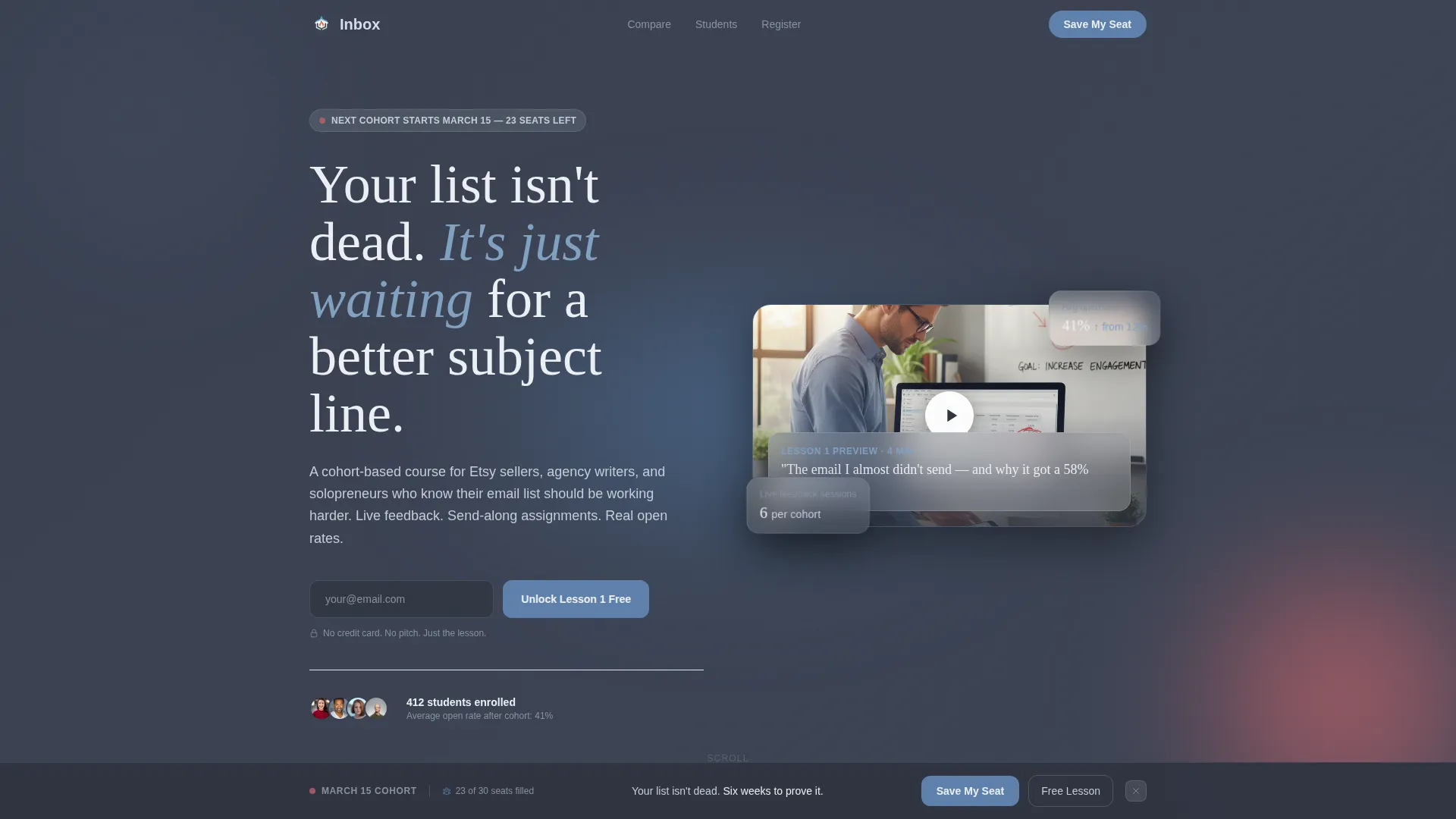
- A header module with a video thumbnail and a single email field to unlock Lesson 1 free
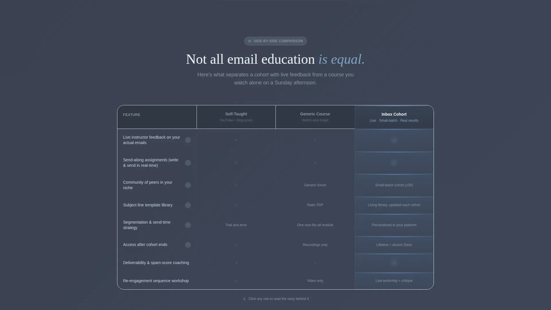
- A three-column comparison table contrasting self-taught learning, a generic course, and the Inbox cohort
- A sticky bottom registration bar with a short form asking for first name, email, and one personalization question
Feature list
This template includes purpose-built components that serve a course registration flow from first impression to final sign-up.
Free Lesson Header Module
The header contains an actual playable lesson thumbnail showing the instructor mid-sentence at a standing desk, with their real email dashboard visible on screen. A frosted-glass headline bar fades in over the image, and a single email field lets visitors unlock the first lesson before committing to anything.
Three-Column Comparison Table
The comparison table lines up "Self-Taught," "Generic Course," and "Inbox Cohort" side by side across rows covering live feedback, community access, template libraries, and send-along assignments. It turns abstract differentiators into a scannable, side-by-side decision aid.
Student Story Expansion Blocks
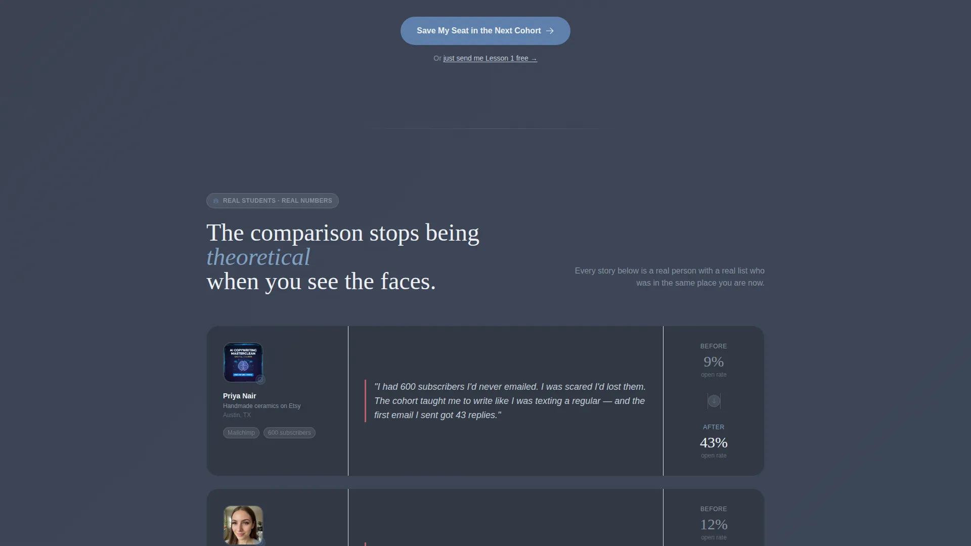
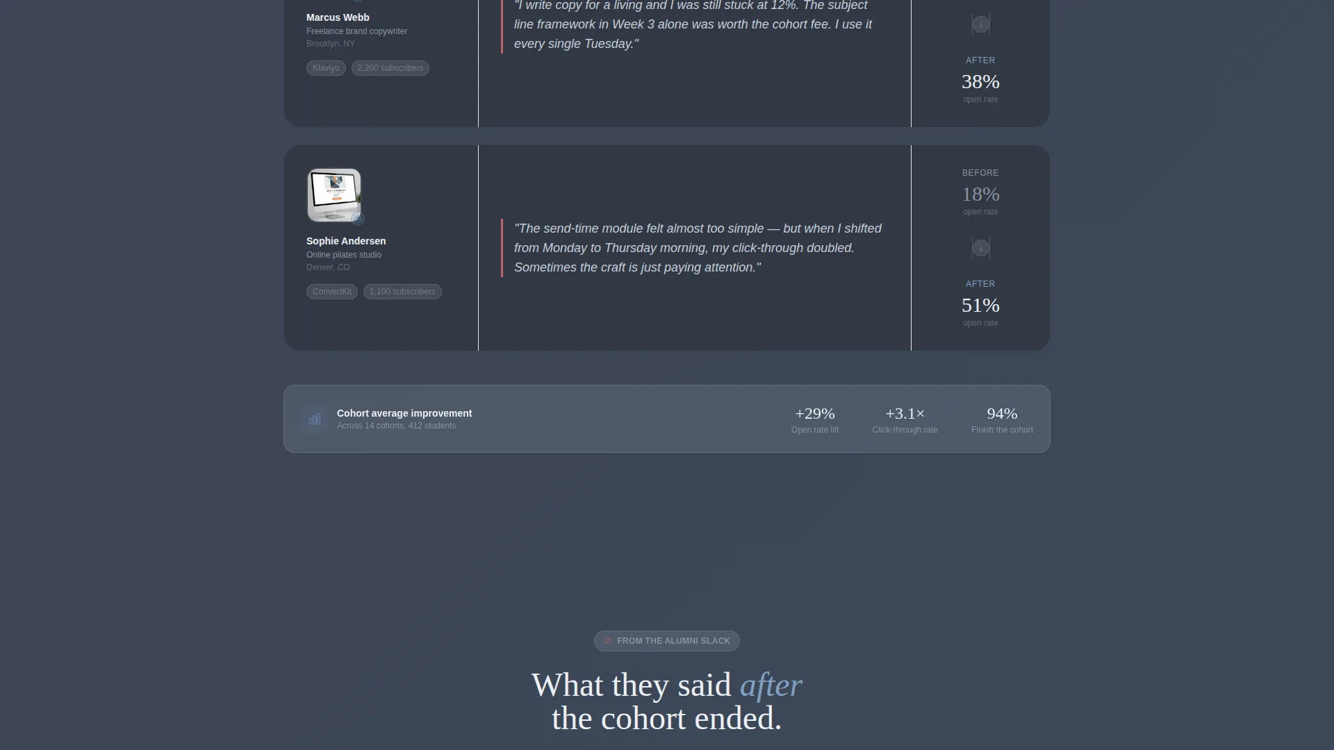
Below the comparison table, each differentiator expands into a short biographical story anchored by a real student: their face, their niche, and their before-and-after open rates. This converts the table from a feature list into a lived experience.
Sticky Cohort Registration Bar
A sticky bottom bar appears after the visitor scrolls past the comparison table. It holds the primary call-to-action "Save My Seat in the Next Cohort" and a short form collecting first name, email, and a single question: "What do you sell?" The question personalizes the onboarding sequence.
Dual Conversion Path Design
Visitors who are not ready to register see a secondary option: "Just Send Me Lesson 1 Free." This captures the email with lower commitment and keeps leads warm rather than losing them entirely.
Community Hearth Visual Theme
The page uses a Slate and Sky color system with a warm co-working loft feel. Deep hearthstone gray grounds the layout, soft chimney smoke panels hold content, open-sky blue drives buttons and active states, and ember warmth appears as a sparing highlight on urgency cues and testimonial accents.
Page sections overview
| Section | Purpose |
|---|---|
| Free Lesson Header | Delivers instant credibility with a playable lesson thumbnail and email capture field |
| Frosted Glass Headline | Fades in a bold reassurance message over the header visual |
| Comparison Table | Shows three learning paths side by side across key course differentiators |
| Student Story Blocks | Expands each table row into a real before-and-after student narrative |
| Sticky Registration Bar | Anchors the primary cohort seat call to action after the comparison table scrolls into view |
| Secondary Opt-In Path | Offers a lower-commitment free lesson email capture for undecided visitors |
| Registration Form | Collects first name, email, and one personalization question for onboarding |
Design & branding system
The visual identity follows a Community Hearth theme that feels like a cozy co-working loft on an overcast morning. Every color choice is intentional: warmth is earned, not applied everywhere.
- Deep hearthstone gray (#3B4252) sets the primary background, keeping the page inviting rather than corporate
- Soft chimney smoke (#D8DEE9) fills content panels for readable contrast, while open-sky blue (#5E81AC) drives all buttons and active states
- Ember warmth (#BF616A) appears sparingly on urgency cues and testimonial accents, so it carries real visual weight when it does appear
Mobile & speed optimization
The layout is structured as a single-page scroll flow, which keeps the experience clean and fast on smaller screens. Each section is self-contained, so the page reads clearly whether a visitor is on a phone or a desktop browser.
- The sticky registration bar is designed to remain accessible at the bottom of the screen during the full scroll
- The video thumbnail in the header and the comparison table are built to stack and reflow cleanly on mobile viewports
How this template helps you convert
The template earns the click rather than demanding it. Every section is sequenced to reduce friction before asking for commitment.
- The free lesson in the header gives visitors an immediate taste of the teaching voice, so trust is built before any call to action appears
- The comparison table removes doubt by making the cohort's advantages visible and concrete against realistic alternatives
- The dual conversion path means visitors who are not ready to register still leave their email, keeping the lead relationship alive
Other information about this template
This template sits in the Education and Training category under Online Skill Courses, with a niche focus on email marketing training. It is a strong fit for any course creator building around practical, craft-first instruction rather than broad marketing theory.
- The template style is a comparison table landing page, making it suitable for any cohort or course that benefits from side-by-side positioning
- The Team and People creative direction means every section is anchored by real faces and real results, not stock illustrations or abstract icons
- The Event Registration landing-page direction prioritizes seat-saving over passive content browsing, making it well suited for cohorts with limited enrollment windows
- The header concept is a Free Trial module, which aligns with the course niche by letting the product demonstrate its own value before the visitor reads a single bullet point
Theme
Community Hearth
Creative direction
Team & People
Color system
Slate & Sky
Style
Comparison Table
Direction
Event Registration
Page Sections
Free Lesson Header Module
Three-column Comparison Table
Student Story Expansion Blocks
Sticky Cohort Registration Bar
Dual Conversion Path Design
Community Hearth Visual Theme
Related questions
Can I customize the comparison table rows for my own course differentiators?
Does the template support two different conversion paths at once?
What does the registration form collect?
Is this template suitable for recurring cohort enrollment cycles?
Can the student story blocks work with written testimonials instead of video?



