Advanced Retail Software Cost Estimator Website Template
The Inbox Recover Abandoned Cart Revenue landing page template is a split-screen, data-forward layout built for retail email marketing platforms targeting DTC ecommerce brands. It opens with a live revenue calculator, moves through a Problem-to-Solution arc, and closes with a minimal email capture form. Every section is designed to turn cart abandonment anxiety into confident action.
by Rocket studio
Quick summary
This template is a 50/50 split-screen landing page built for a retail email marketing platform that helps ecommerce businesses recover revenue from abandoned carts and browse exits. The layout opens with a live calculator, walks visitors through a clear Problem-to-Solution arc, and finishes with a frictionless sign-up form. The Dashboard Pro theme uses a Slate and Sky color system that feels serious, data-forward, and trustworthy.
Who this template is for
This template was designed for teams that know abandoned cart emails should be working harder but have not had the time or tools to fix that. It speaks directly to operators managing real revenue at scale.
- Ecommerce directors at direct-to-consumer brands generating between $2 million and $20 million in annual revenue who are frustrated with overcomplicated email service provider workflows
- Marketing managers at Shopify Plus stores juggling multiple apps and trying to simplify their abandoned cart automation without losing performance
- Retail chief marketing officers watching open rates decay while their current email marketing platform contract quietly auto-renews every year
What problem this template solves
Nearly 70% of people abandon their shopping carts online. That represents a significant volume of lost revenue sitting uncollected inside every online store. The problem is not just cart abandonment itself; it is the friction of building the email sequences that could recover it. Marketers know they need a structured abandoned cart email sequence, but complex legacy tools make it feel harder than it should be.
- Ecommerce teams lose sales because their existing tools require too much setup time before they can send abandoned cart emails effectively, leaving potential customers uncontacted
- Shoppers abandon their carts for reasons including unexpected shipping costs, extra costs at checkout, website errors, and a long or complicated checkout flow, and recovery emails rarely address all of those objections clearly
- Marketing managers cannot easily demonstrate the revenue gap to stakeholders without a live, personalized projection that connects cart abandonment rates to actual dollar estimates
What you get with this template
This template gives you a complete, fully structured landing page layout built around the specific conversion logic of an abandoned cart recovery platform. Every section has a defined role in moving a skeptical buyer from "my current tool is fine" to "I need to switch today."
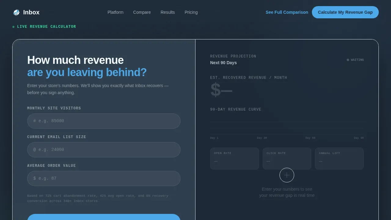
- A hero section featuring a live revenue calculator split 50/50 with a projection dashboard, so visitors input their own data and immediately see estimated recovered revenue, predicted open rates, and a 90-day revenue curve that animates as they type
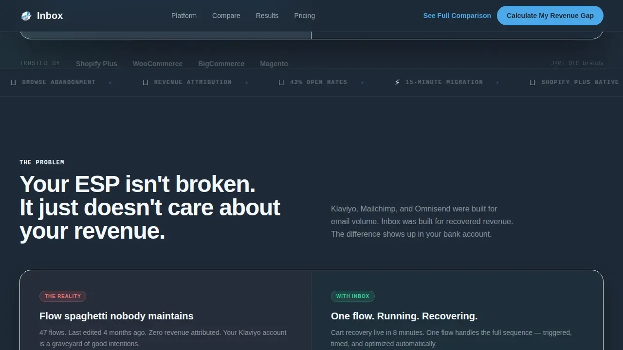
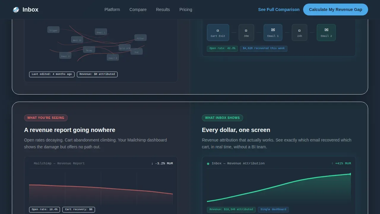
- A scrollable Problem-to-Solution arc with split panels that contrast cluttered legacy email service provider dashboards against the clean, single-view platform equivalent, deepening the contrast with each scroll section
- An interactive platform comparison toggle, a case study section rendered as live dashboard metric cards, and a minimal email capture form with a primary call to action that evolves as visitors scroll
Feature list
This template includes a structured set of sections and interactive components that are fully described in the source brief. Each feature below reflects a directly stated element of the template design.
Live Revenue Calculator Header
The header is a working calculator split into two halves. The left side accepts three inputs: monthly site traffic, current email list size, and average order value. The right side renders a live projection dashboard showing estimated recovered revenue, predicted open rates, and a 90-day revenue curve. Numbers animate upward with each keystroke, making the visitor's own data the hero before they scroll a single pixel. This design immediately connects cart abandonment rates to real dollar projections personalized to each visitor.
Problem-to-Solution Split Panels
Below the calculator, a scrolling split-screen arc presents the pain on the left and the solution on the right. Left panels show real screenshots of cluttered email service provider dashboards, tangled automation flows, and flatlining revenue reports. Right panels mirror each one with clean, single-view equivalents. Each split deepens the contrast. The scroll arc moves from "this is broken" to "this already works" to "here's the proof," guiding visitors through the core argument without requiring a single click.
Interactive Platform Comparison Toggle
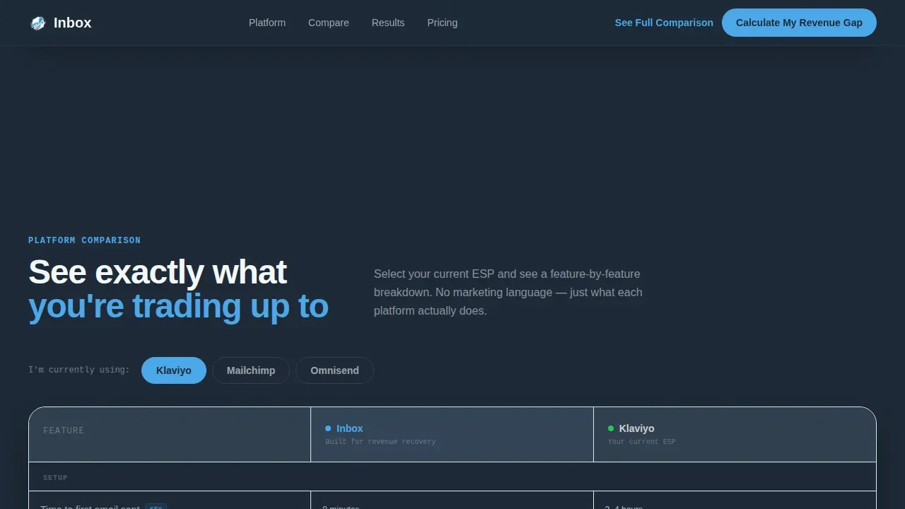
A feature comparison section sits mid-page with an interactive toggle. Visitors select their current platform and see a personalized side-by-side comparison. This directly addresses the migration objection by showing the switch is straightforward. The section functions as a quiet abandoned cart email strategy argument: the visitor's current tool is costing them recovered sales, and the switch takes fifteen minutes. The comparison answers objections before the call to action ever appears.
Case Study Dashboard Cards
Social proof is delivered as live dashboard metric cards from named direct-to-consumer brands showing exact lift percentages. This approach treats social proof as data rather than testimonials. Visitors see recovered revenue figures, open rate improvements, and email sequence performance rendered in the same visual language as the calculator at the top of the page. This consistency builds trust without relying on customer testimonials alone.
Evolving Call to Action with Minimal Form
The primary call to action reads "Calculate My Revenue Gap" at the top of the page. It evolves to "Switch in 15 Minutes" after the comparison section. A secondary path, "See the Full Platform Comparison," exists for visitors still in research mode. The email capture form collects only an email address and current platform name on first touch. This minimal friction approach is intentional: the page earns the click by proving the switch is painless before ever asking for it.
Page sections overview
| Section | Purpose |
|---|---|
| Hero Revenue Calculator | Live split-screen calculator connecting visitor data to projected recovered revenue |
| Problem versus. Solution Panels | Scrolling split contrast between legacy tool chaos and platform clarity |
| Platform Comparison Toggle | Interactive side-by-side benchmarking against visitor's current email service provider |
| Case Study Metric Cards | Social proof rendered as animated dashboard cards with named brand results |
| Switch Call to Action | Evolving call to action with minimal email capture form focused on reducing migration anxiety |
| Linear Footer | Single-row footer pattern with essential navigation and secondary links |
Design & branding system
The visual identity follows a Dashboard Pro theme built on a Slate and Sky color system. The aesthetic is described as a Bloomberg terminal that went to design school: serious enough to handle revenue data, approachable enough to open at 7 AM without dread. Every color choice has a functional role.
- Deep charcoal slate (#1E2A38) serves as the primary background, mid-tone graphite (#3D4F5F) surfaces card elements, sky blue (#4DA8E8) highlights active metrics and every clickable element including the call to action, and cloud white (#F4F7FA) provides clean contrast for text and labels
- Typography uses DM Sans in bold and black weights for all headings and IBM Plex Mono for all metric displays and numbers, reinforcing the data-forward dashboard personality across the abandoned cart recovery sections
- No stock photography or illustration appears anywhere in the layout; the product interface itself is the visual hero, and the visitor's own input data makes the page feel personally relevant from the first second
Mobile & speed optimization
The template is desktop-first by design. The target audience, ecommerce directors and marketing managers, typically reviews analytics dashboards on desktop in the morning. The split-screen 50/50 layout and live calculator are built to take full advantage of wider screens. That said, the template also accounts for the reality that up to 79% of smartphone users make purchases on their devices, and abandoned cart emails are often opened on mobile devices first.
- The layout is structured to support clean rendering on mobile devices, with the 50/50 split collapsing gracefully for smaller viewports so that the calculator inputs and projection dashboard remain accessible without horizontal scrolling
- Scroll-triggered metric reveals and counter animations are implemented with performance-conscious Client Component architecture, keeping static sections rendered server-side for faster initial load while interactive elements load separately
- The minimal form design, single email field plus platform selector, reduces mobile input friction for cart abandoners who click through from a recovery email on their phone and land on this page
How this template helps you convert
An effective abandoned cart recovery landing page must feature clear, personalized, and urgent design elements. This template is built around that principle from the first pixel. The conversion logic is structured around reducing three types of friction: cognitive friction from not understanding the revenue gap, emotional friction from dreading a platform migration, and form friction from a long sign-up process.
- The live calculator creates immediate personal relevance by converting the visitor's own site traffic, list size, and average order value into a real revenue projection, making the cost of inaction visible before any marketing copy is read
- The Problem-to-Solution arc and interactive comparison toggle systematically remove the migration objection by showing that switching platforms is fast, that abandoned cart flows can be built without technical complexity, and that the results from named brands are measurable and real
- The evolving call to action, paired with a two-field capture form, removes sign-up friction entirely by asking only for an email address and current platform on first touch, respecting the visitor's time while gathering the customer data needed to begin a personalized onboarding sequence
Other information about this template
This template was built to serve a specific intersection: a retail email marketing platform competing directly against established tools like Klaviyo, Mailchimp, and Omnisend. The comparison logic is baked into the page structure at every level. Understanding the broader context of abandoned cart email best practices helps clarify why each design decision was made.
- Abandoned cart emails are automated messages sent to customers who leave items in their shopping cart without completing the purchase. These emails serve as reminders to encourage shoppers to return and complete checkout. The average open rate for abandoned cart emails reaches around 45%, significantly higher than the 15% average for regular marketing emails, which makes a well-structured abandoned cart email campaign one of the highest-return activities an online store can run.
- The first abandoned cart email should be sent within 1 to 3 hours after a customer abandons their cart. Sending the first email within a few hours is widely recognized as a best practice. A 3-email sequence is recommended: the first email acts as a friendly reminder, the second email sent 24 hours later focuses on benefits and social proof, and the third email sent 48 to 72 hours later introduces a final incentive to create urgency. Automating this email sequence maximizes recovery while avoiding inbox fatigue.
- A strong email subject line is one of the most important factors in abandoned cart recovery. An interesting subject line grabs attention and drives open rates. Personalized email subject lines that reference the customer's cart contents consistently outperform generic alternatives. The abandoned cart email subject line should feel like a gentle reminder, not a sales push, especially for the first message.
- Including a product image in each abandoned cart email helps remind customers of the specific abandoned items they considered. Showing a high-quality product image alongside the product name, price, size, and color re-sparks interest. Displaying abandoned items with full detail, including quantities and specifications, is proven to improve re-engagement across abandoned cart email examples from leading direct-to-consumer brands.
- Offering a discount code or coupon code in the later messages of an abandoned cart email sequence is a well-established tactic to recover lost sales. A discount coupon introduced in the third email creates a sense of urgency without training shoppers to expect one-off discounts every time they abandon a cart. Some teams choose to offer free shipping instead of a cash discount; free shipping thresholds can be effective because they address one of the primary reasons shoppers abandon their carts: unexpected shipping fees and other fees at checkout.
- Extra costs, including shipping costs, taxes, and other fees, are the leading cause of cart abandonment, accounting for 48% of abandonment events. Website errors or crashes, a complicated checkout flow, and being forced to create an account are also common reasons. A recovery email strategy that addresses these objections directly, whether through social proof, a discount or free shipping offer, or a clear message about the checkout page experience, will consistently outperform one that only reminds customers what they left behind.
- The most successful abandoned cart email strategy combines tailored email sequences with a dedicated, personalized recovery landing page. Directing cart abandoners to a recovery page instead of the standard checkout page removes distractions and reduces friction. An effective recovery page should feature a clear call to action, a visual cart summary with a product image for each abandoned product, and social proof such as customer reviews near the call to action button. Trust signals including security badges and recognizable payment logos reassure customers about completing their purchase.
- Abandoned cart flows built on this template can support discount code delivery, free shipping incentive messaging, countdown timers to create urgency, and exit-intent prompts. The abandoned cart workflow is designed so that each automated message has a specific role. The abandoned cart automation handles timing and personalization, so the marketing team can focus on copy and offer strategy rather than technical setup. An abandoned cart email campaign running a full 3-step sequence with personalized product image blocks, a compelling email subject line, and a clear call to action can recover a significant portion of lost revenue from abandoned shopping carts.
- This is the Inbox recover abandoned cart revenue landing page template, designed specifically for a retail email marketing platform competing in the direct-to-consumer ecommerce space. Teams looking for abandoned cart email templates that double as a platform showcase will find the layout well-suited to that goal. For teams researching abandoned cart email examples from other ecommerce businesses, the case study section renders real results as dashboard cards rather than written testimonials, giving potential customers the data context they need to make a confident decision. A blog post or platform overview page can be linked from the footer to support visitors still in early research mode.
- The comparison toggle allows visitors to benchmark the platform against the tools they are already using, making it easy for repeat customers and current platform users alike to see the revenue gap clearly. The cart recovery strategy demonstrated by the page structure mirrors the abandoned cart email strategy the platform itself delivers: a sequence of clear, personalized, action-oriented messages that remind customers what they left behind, address their objections, and offer a clear path to complete checkout.
Theme
Dashboard Pro
Creative direction
Problem→Solution Arc
Color system
Slate & Sky
Style
Split Screen (50/50)
Direction
Comparison/Versus
Page Sections
Live Revenue Calculator with Animated Dashboard
Problem-to-solution Scrolling Arc
Interactive Platform Comparison Toggle
Case Study Metric Cards
Evolving Call to Action with Minimal Capture Form
Related questions
What sections are included in this landing page template?
Who is this template designed for?
Does the template include a working calculator?
How does the template handle platform comparison?
What design system does this template use?



