Inbox - High-Converting Ecommerce Landing Page Template
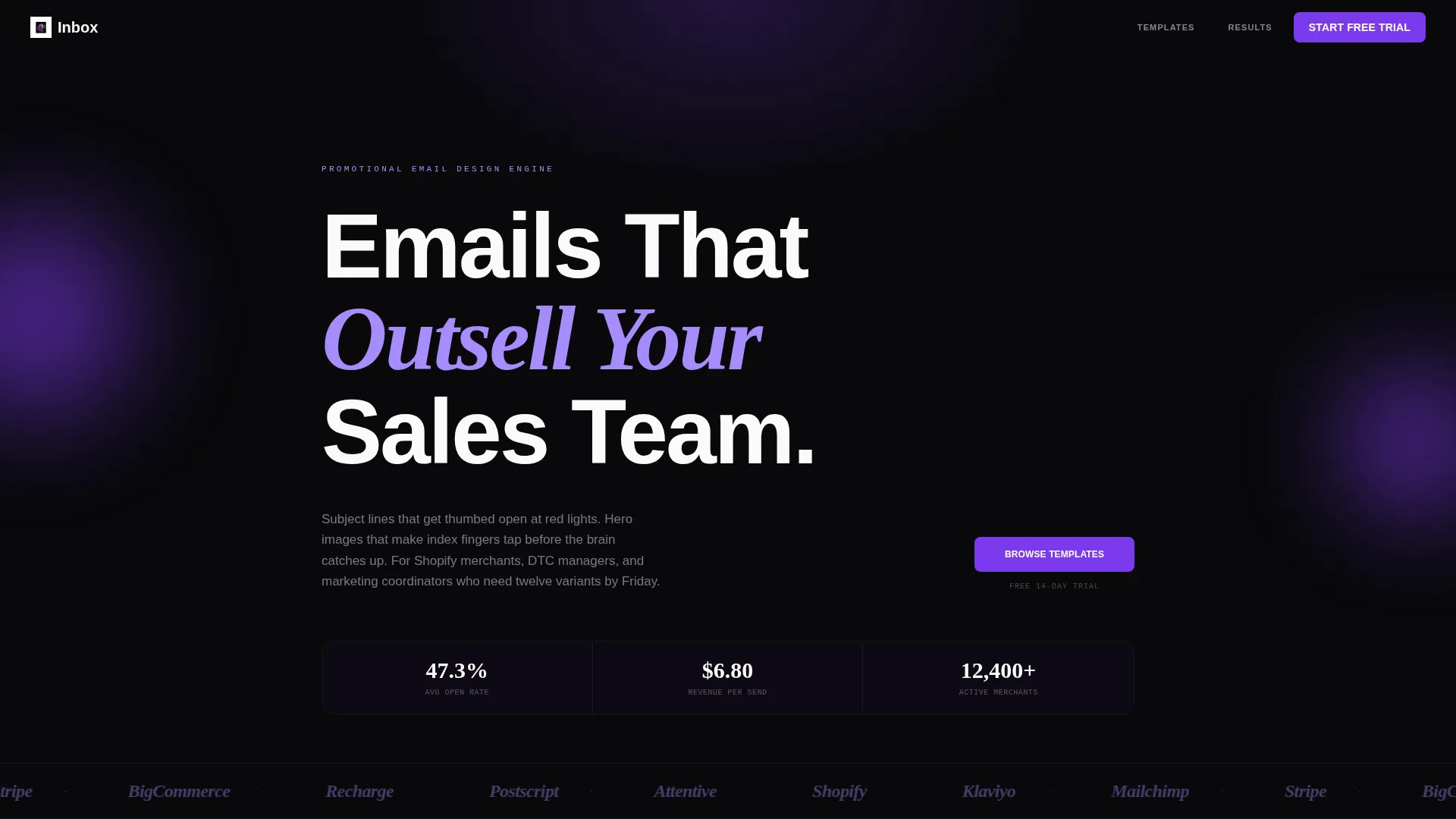
Inbox is a modular card grid landing page built for e-commerce promotional email services. It showcases six email template categories as specimen cards on a void black and electric violet canvas. Each card displays a miniature email render, benchmark data, and a direct preview call to action. The design pulls Shopify merchants, direct-to-consumer brand managers, and retail marketing teams toward a fast, confident purchase decision.
by Rocket studio
Quick summary
Inbox is a single-page, card grid landing page designed to sell promotional email templates to e-commerce teams. It presents six email categories as spec-sheet cards on a dark, violet-accented canvas. Every card carries a miniature email render, benchmark metrics, and a "Preview This Template" call to action. The page converts by letting the data do the persuading.
Who this template is for
This template is built for anyone who sells or licenses e-commerce email templates and needs a landing page that earns trust quickly. It suits teams that run multiple campaign types and need buyers to self-select by category.
- Shopify merchants running flash sales or seasonal product drops
- Direct-to-consumer brand managers who need campaign variants fast
- Marketing coordinators at mid-size retailers managing multiple email series
What problem this template solves
Most email template showcase pages feel like generic galleries. They use adjectives instead of proof, and visitors leave without clicking anything. Inbox replaces vague selling with clinical specificity.
- Buyers cannot easily compare email template types or understand likely performance
- Landing pages with long forms or unclear calls to action create friction before the first preview
- Visual-only showcases fail teams who need data to justify a purchase to stakeholders
What you get with this template
You get a fully structured single-page layout built around a modular card grid. Every core section is ready to populate with your own email renders and benchmark copy.
- A horizontal logo ticker header that establishes ecosystem credibility immediately
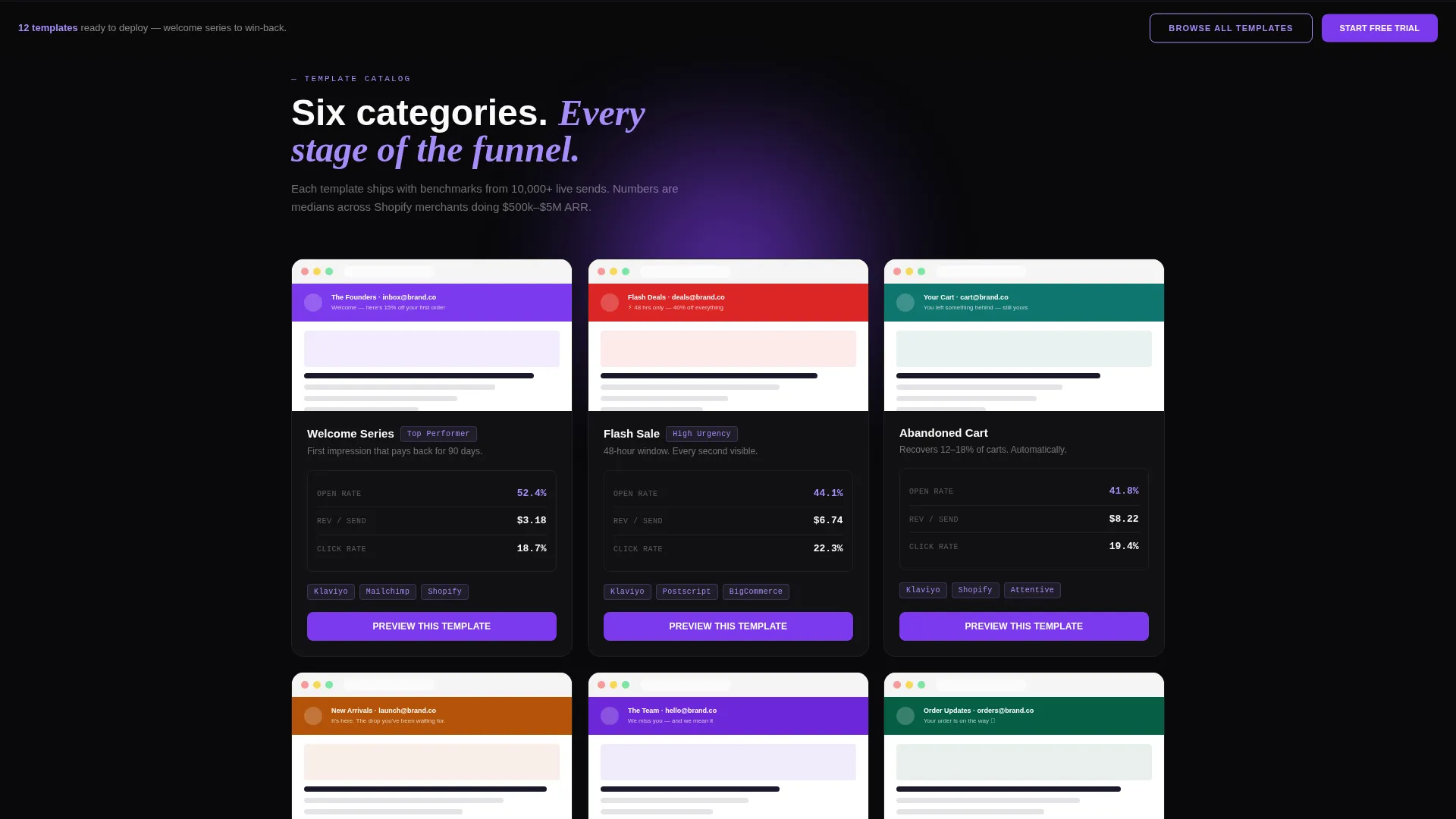
- Six specimen cards, each presenting one email category with metrics and a preview call to action
- A persistent floating bottom bar carrying a secondary "Browse All Templates" call to action
Feature list
This landing page delivers a tightly coordinated set of components drawn directly from the brief. Each one serves a specific conversion role.
Horizontal Logo Ticker Header
A continuous left-to-right scrolling bar of e-commerce ecosystem logos sits beneath the main headline. The logos display in muted orchid monochrome, establishing platform familiarity before the visitor reads a single word of copy.
Modular Specimen Card Grid
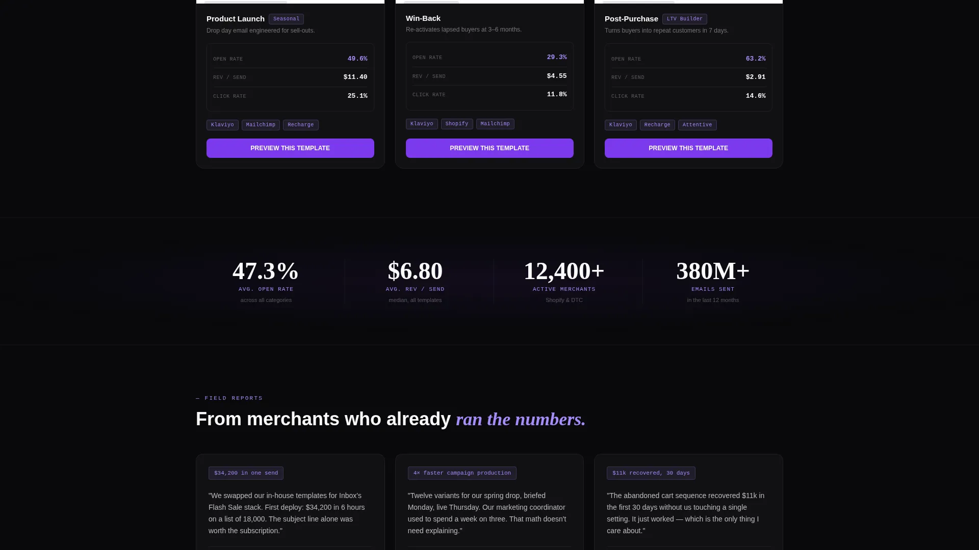
The page body is a grid of six cards, staggered in rows of three with progressive scroll reveal. Each card shows a miniature email render at the top, followed by open rate benchmarks, average revenue-per-send figures, and compatible platform labels in small monospaced type.
Per-Card Preview Call to Action
Every card carries a primary call to action button reading "Preview This Template" in electric violet. The button routes visitors to a full-size interactive email preview where they can explore and purchase the template.
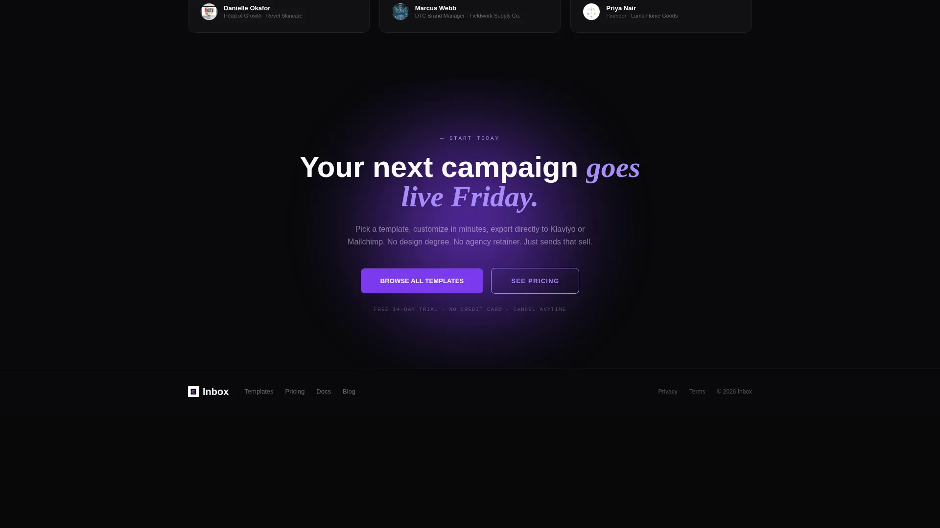
Persistent Floating call to action Bar
A fixed bar anchored to the bottom of the viewport carries a secondary call to action: "Browse All Templates" in orchid outline styling. It stays visible as the visitor scrolls, providing a low-friction escape route to a broader catalog.
Six Email Category Specimens
The grid covers Welcome Series, Flash Sale, Abandoned Cart, Product Launch, Win-Back, and Post-Purchase categories. Each is treated as a self-contained proof point, using numbers and rendered previews rather than marketing adjectives.
Void and Violet Dark-Mode Canvas
The page uses absolute void black as the base, with electric violet borders activating on card hover and muted orchid reserved for metadata and tags. Card surfaces use stark signal white so miniature email renders read with full clarity against the dark background.
Page sections overview
| Section | Purpose |
|---|---|
| Logo ticker header | Establish ecosystem credibility with scrolling platform logos |
| Main headline block | Frame email as a direct revenue channel with a single statement |
| Card grid body | Present six email categories as spec-sheet specimens with metrics |
| Floating call to action bar | Keep catalog navigation persistent across the full scroll depth |
Design & branding system
The visual identity follows a Directory and Discovery theme executed in a Void and Violet color system. The result feels like a flagship dark-mode app viewed at night, where every violet glow signals something worth opening.
- Absolute void black (#09090B) as the page base, electric violet (#7C3AED) for interactive borders and primary calls to action
- Muted orchid (#A78BFA) for metadata labels, tags, and the secondary floating call to action outline
- Stark signal white (#FAFAFA) reserved for card surfaces so miniature email renders remain crisp and readable
Mobile & speed optimization
The card grid layout is designed to reflow naturally across screen sizes. Rows of three adapt to single-column stacks on smaller viewports without losing the specimen card structure.
- Progressive scroll reveal staggers card appearance, keeping the page feeling dynamic on both desktop and mobile
- No hero image competes with the logo bar, reducing visual load at the top of the page
- The floating call to action bar remains anchored to the viewport bottom on all screen sizes, keeping conversion access constant
How this template helps you convert
The page is engineered around one principle: let the spec sheets do the selling. Each element reduces hesitation before asking for a click.
- Benchmark metrics on every card replace subjective claims with open rate and revenue-per-send figures, giving data-driven buyers a concrete reason to proceed.
- The "Preview This Template" call to action on each card routes directly to a full-size interactive preview, removing any gap between interest and evaluation.
- The persistent floating bar ensures a path to the full catalog is always visible, capturing visitors who are browsing rather than ready to buy a specific template.
Other information about this template
This template is categorized under Technology, within the E-Commerce Email Templates subcategory. It is purpose-built for the e-commerce promotional email niche and pairs well with platforms commonly used in that ecosystem.
- The Intersection Match Score for this template is 13, reflecting a strong alignment between the card grid style, Directory and Discovery theme, Spec Sheet creative direction, and Click-Through landing page strategy
- The header concept is a Logo Bar referencing platform logos such as Shopify, Klaviyo, Mailchimp, Stripe, and BigCommerce in muted orchid monochrome
- The template style is Card Grid (Modular), making it straightforward to add or remove email category cards as your product catalog grows
- The Void and Violet color system is designed to evoke a premium dark-mode interface, distinct from the light-background layouts common in e-commerce template marketplaces
Theme
Directory & Discovery
Creative direction
Spec Sheet
Color system
Void & Violet
Style
Card Grid (Modular)
Direction
Click-Through
Page Sections
Horizontal Logo Ticker Header
Modular Specimen Card Grid
Per-card Preview Call to Action
Persistent Floating Call to Action Bar
Six Email Category Specimens
Void and Violet Dark-mode Canvas
Related questions
How many email template categories does this landing page showcase?
Can I add or remove cards from the grid?
Does the page include any forms or sign-up steps?
What is the purpose of the floating bottom bar?



