Index - Powerful Startup Landing Page Template
Index is a bento grid landing page template built for startup directory and listing sites. It features an interactive header that renders a live, filterable startup card grid before visitors scroll. A feature comparison matrix, a sticky call-to-action, and a Void & Violet color system combine to position your directory against competitors and convert analysts, founders, and journalists from first interaction.
by Rocket studio
Quick summary
Index is a single-page bento grid template designed for startup directory and listing sites. It puts a working, filterable startup card grid directly in the hero section. A feature comparison matrix drives the scroll, widening the gap between your product and competitors row by row. The Void & Violet palette and Data Command theme make every data point feel live and urgent.
Who this template is for
This template is built for teams who need to present a startup directory with authority and depth. It speaks directly to users who work with high-volume, time-sensitive data.
- Venture analysts building pipeline lists and tracking funding rounds by stage, sector, and region
- Founders and operators scoping competitive landscapes before board meetings or investor calls
- Journalists and researchers hunting breakout startup stories on tight deadlines
What problem this template solves
Most directory landing pages treat their product like a static catalog. They show a screenshot, list a few bullet points, and hope visitors imagine the value. Index removes that gap entirely.
- Visitors interact with a real, filterable startup card grid before they read a single line of copy
- The comparison matrix exposes competitor gaps row by row, so visitors reach the call-to-action already convinced
- A sticky sign-up prompt with a use-case selector captures intent without forcing a long form up front
What you get with this template
You get a fully structured bento grid landing page designed around one conversion goal: turning a curious visitor into a signed-up user. Every section is purposeful and sequenced.
- An interactive hero section with live search, filter toggles, and a real-time startup counter
- A stacked feature comparison matrix with tooltip data specs on hover
- A pinned bottom call-to-action bar with email capture, a use-case selector, and a secondary PDF gating path
Feature list
This template ships with six distinct interactive and visual systems. Each one is grounded in the brief and serves a specific conversion or orientation role.
Interactive Bento Hero Grid
The header renders a working micro-directory inside the viewport. Startup cards show logo, name, category tag, and funding badge. A live search bar and filter toggles for stage, sector, and region rearrange the cards in real time. A counter in the top-right ticks upward to show index scale.
Feature Comparison Matrix
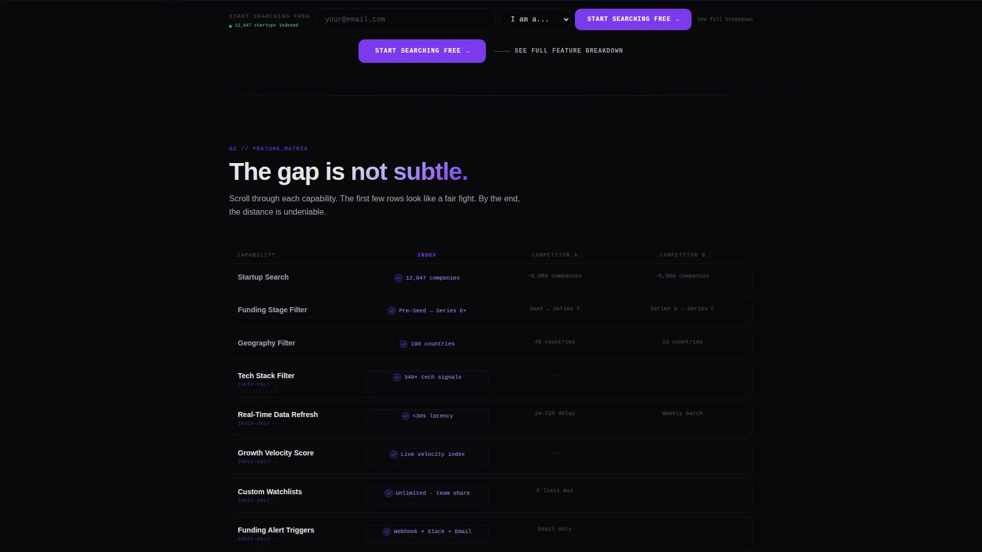
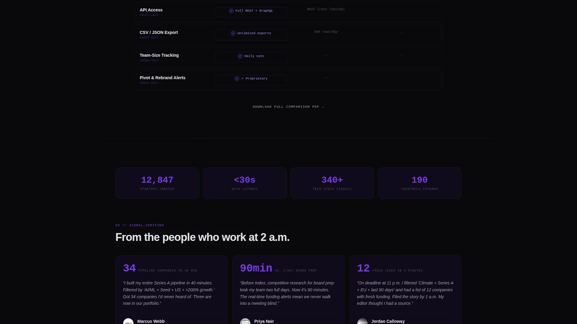
A stacked bento comparison grid places your platform against two unnamed competitors. Each cell isolates a single capability: real-time data refresh, API access, custom watchlists, funding alert triggers, CSV export, and team-size tracking. Early rows show parity; mid-scroll, gaps widen; by the final row, competitors show only empty cells.
Hover Tooltip Data Specs
Every cell in the comparison matrix is interactive. Hovering over a cell reveals a tooltip that displays the actual data specification for that capability. This keeps the grid scannable while rewarding users who want detail.
Sticky Call-to-Action Bar
After the first scroll, a bottom-pinned bar appears and stays visible. It glows violet against void black and presents a minimal email field plus a use-case selector covering investor, founder, journalist, and recruiter roles.
Gated Secondary Conversion Path
A second call-to-action labeled "See Full Feature Breakdown" links to a detailed matrix PDF. The PDF is gated behind the same email capture form, giving power users a deeper reason to convert.
Void & Violet Visual System
The entire page is styled with absolute void black, deep interstellar purple, electric violet on every interactive surface, and cool phosphor white for typography and data labels. The palette creates a satellite-console atmosphere that reinforces the real-time data theme throughout.
Page sections overview
| Section | Purpose |
|---|---|
| Interactive Hero Grid | Renders a live filterable startup card grid as the first visible element |
| Startup Counter Badge | Shows indexed startup volume in real time to establish scale and credibility |
| Feature Comparison Matrix | Stacks your platform against two competitors across six key capabilities |
| Tooltip Spec Overlays | Delivers per-cell data specs on hover without cluttering the grid layout |
| Sticky call to action Bar | Keeps the primary sign-up prompt in view throughout the scroll journey |
| Gated PDF Path | Offers a detailed breakdown download behind a lightweight email gate |
Design & branding system
The template uses a Data Command theme built entirely around the Void & Violet color system. The aesthetic is intentional: it places the user in a high-focus, low-distraction environment where data feels live and trustworthy.
- Colors: absolute void black (#09090B), deep interstellar purple (#1A1035), electric violet (#7C3AED) for interactive states, and cool phosphor white (#E4E4E7) for all type and labels
- Interactive surfaces glow violet on hover, reinforcing that every element is a live control rather than a static display
- Typography and data labels use phosphor white to maintain contrast and readability against the dark bento grid backgrounds
Mobile & speed optimization
The bento grid layout is structured to adapt naturally across screen sizes. The interactive hero and comparison matrix are the heaviest layout elements, and the design accounts for that.
- Bento grid cells reflow into a single-column stack on smaller viewports, keeping cards and matrix rows readable without horizontal scrolling
- The sticky call-to-action bar is designed to remain visible and tappable on mobile without overlapping critical content
- Filter toggles and search inputs in the hero section are sized and spaced for touch interaction on phones and tablets
How this template helps you convert
Index is structured around a Comparison/Versus conversion strategy. Every section earns the next click before asking for anything in return.
- The interactive hero lets visitors experience the product immediately, before any copy asks them to trust your claims.
- The comparison matrix builds conviction row by row, so visitors arrive at the call-to-action having already seen competitors fall behind.
- The sticky bar and gated PDF path offer two distinct conversion entry points, capturing both casual sign-ups and research-driven power users in a single page flow.
Other information about this template
This template is part of a broader set of technology-focused bento grid designs built for startup digital presence use cases. A few additional details worth noting before you customize and launch.
- The template is categorized under Technology, with a subcategory focus on Startup Digital Presence and a niche alignment to Startup Directory and Listing Site products
- The header concept follows an Interactive Preview pattern, meaning the product itself is the hero rather than a static image or illustration
- The creative direction is Feature Matrix, a scroll-driven structure that builds comparative value progressively rather than front-loading all claims
- The landing page direction is Comparison/Versus, optimized for audiences who arrive already evaluating options and need a decisive reason to choose


Theme
Data Command
Creative direction
Feature Matrix
Color system
Void & Violet
Style
Bento Grid
Direction
Comparison/Versus
Page Sections
Interactive Filterable Hero Grid
Progressive Feature Comparison Matrix
Hover Tooltip Capability Specs
Sticky Conversion Bar
Gated Secondary Download Path
Void & Violet Data Command Theme
Related questions
Can I customize the startup card fields shown in the hero grid?
Does the comparison matrix require real competitor names or data?
How does the gated PDF download path work?
Is this template suitable for a directory that is still growing its startup index?
What use-case roles does the call-to-action selector support?



