Serverless Enterprise Software Specialist Professional Website Template
Catalog is a hub-and-spoke landing page template built for a serverless product information management platform. It pairs a Dashboard Pro visual theme with a deep Midnight Blue color system to create an operations-room aesthetic. The layout guides enterprise buyers through Data Onboarding, Enrichment, Channel Syndication, and Governance chapters before presenting a gated benchmark report form.
by Rocket studio
Quick summary
Catalog is a single-page, anchor-nav landing page template designed for a cloud-based product information management platform. It uses a Dashboard Pro theme with a Midnight Blue palette to evoke a live operations center. The scroll reads like an industry report, leading enterprise buyers through four focused chapters before directing them to a gated lead-generation form.
Who this template is for
This template is built for enterprise software teams that need to communicate a technically complex platform to a highly informed audience. It speaks directly to buyers who evaluate tools on data and proof, not personality.
- Ecommerce operations managers who oversee large product catalogs and syndication workflows
- Integration architects connecting enterprise resource planning systems to marketplace and commerce channels
- Merchandising leads preparing tens of thousands of stock-keeping units for new market launches
What problem this template solves
Most enterprise software landing pages bury the proof. They lead with lifestyle imagery, generic headlines, and vague benefit statements that fail to hold the attention of technical buyers. This template solves that mismatch.
- It opens with a real data point to establish credibility before making a single product claim
- It structures the page as a research document, so analytical visitors stay engaged through every section
- It converts through content rather than pressure, making the lead-generation form feel like a natural next step
What you get with this template
You get a complete, structured landing page layout that reflects the full buyer journey for an enterprise product information management platform. Every section is pre-mapped to a specific purpose.
- A sticky anchor navigation bar with four chapter links and a persistent ghost-button call to action
- Four content spoke sections covering Data Onboarding, Enrichment and Validation, Channel Syndication, and Governance and Audit
- A dual conversion architecture with a primary gated form and a secondary demo request path below the header
Feature list
This template includes purposeful layout components drawn directly from the source brief. Each feature is designed to serve the specific audience and conversion goal described.
Full-Width Dashboard Screenshot Header
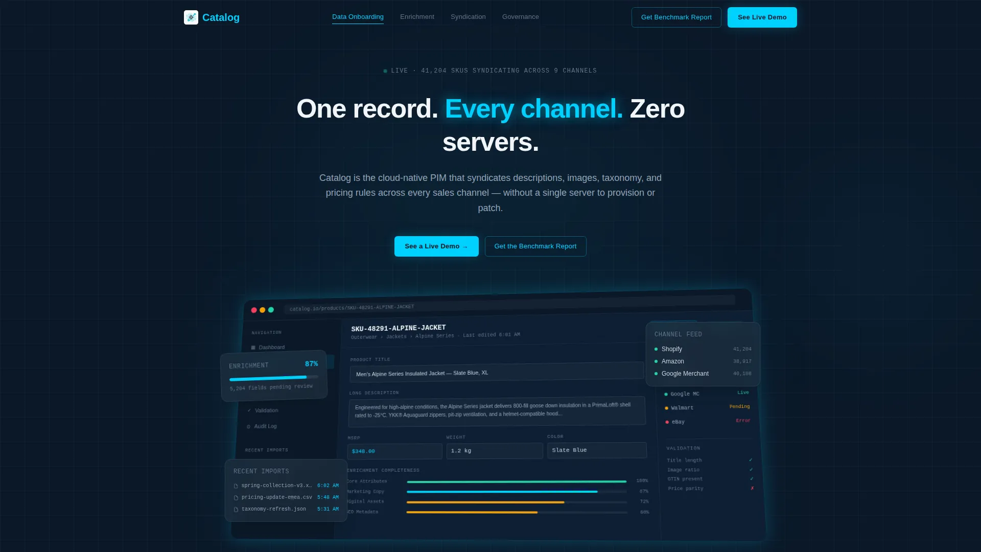
The header presents a pixel-perfect, full-width product screenshot on a subtle isometric tilt against the deep navy background. The visible dashboard shows a product record in the editor pane, enrichment completeness at 87 percent, three channel syndication statuses with green checkmarks, and a sidebar listing recent bulk imports. A single tight headline sits above it.
Sticky Anchor Navigation Bar
A persistent navigation bar anchors the page structure and gives visitors immediate access to each chapter. It includes four spoke links and a ghost-button call to action that follows the visitor throughout the scroll. This keeps the conversion path visible at every reading depth.
Hub-and-Spoke Chapter Layout
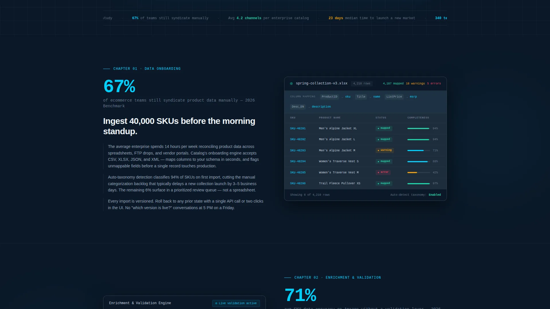
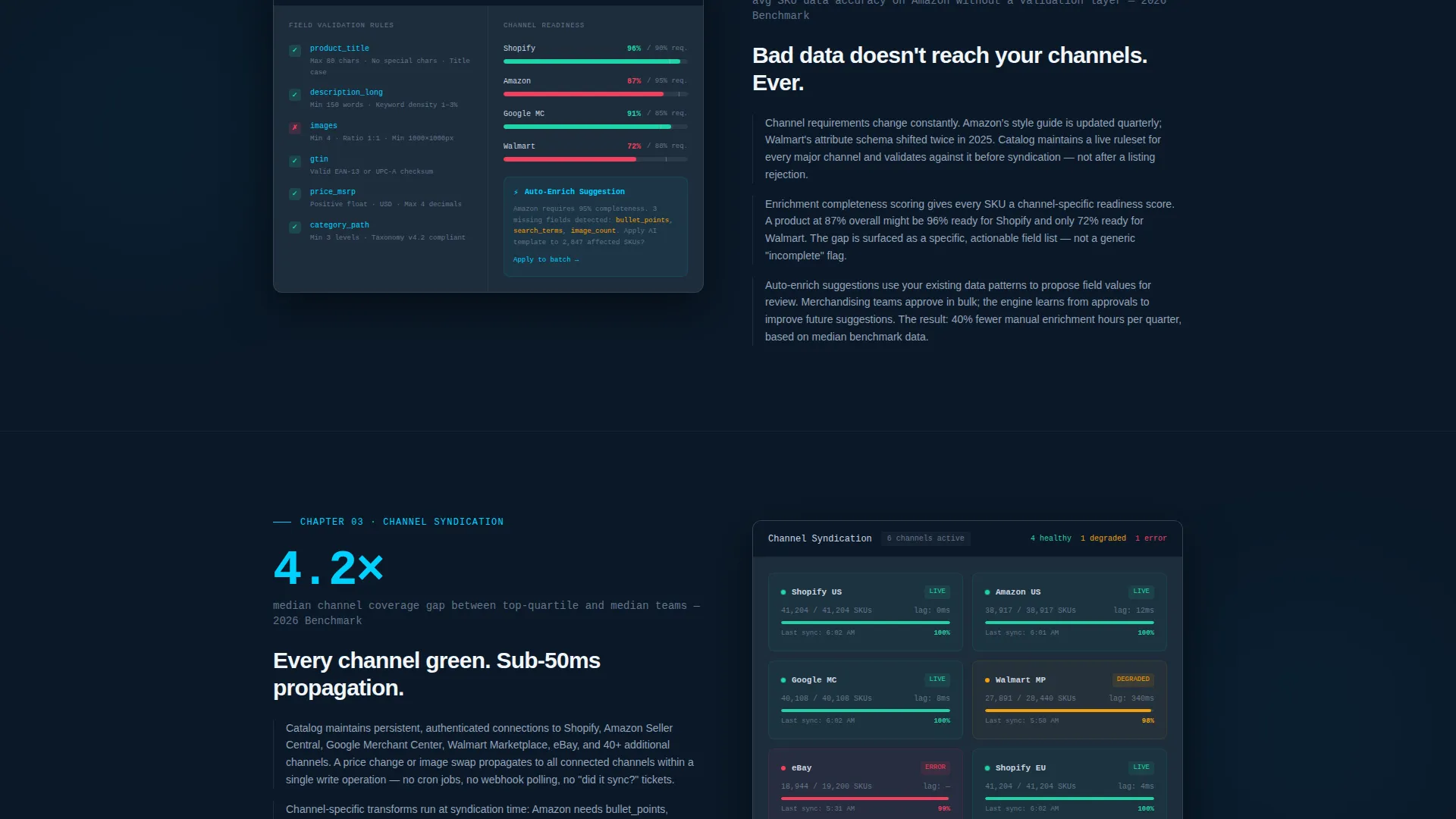
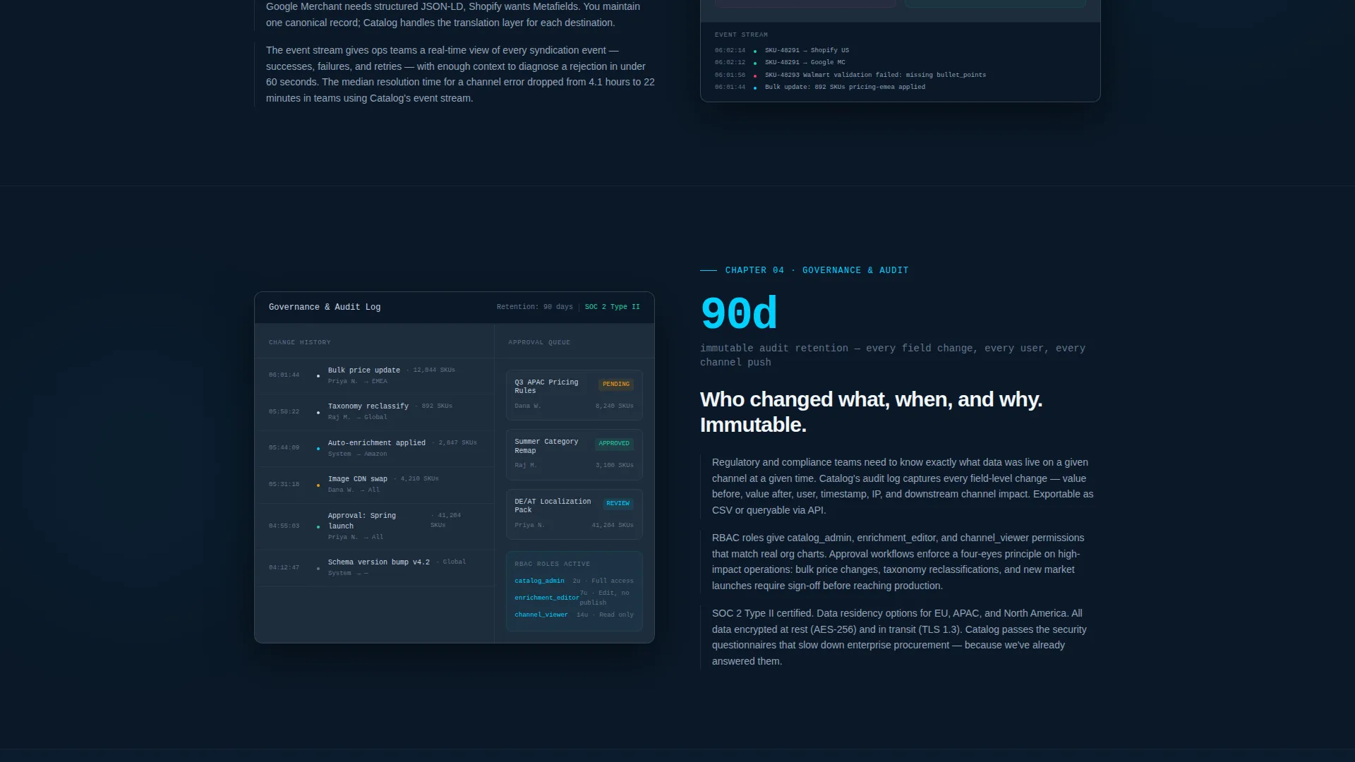
Each of the four spoke sections follows a consistent pattern: a headline statistic, a product screenshot showing that specific workflow, and two or three short analytical paragraphs. This structure mirrors an industry report cadence and keeps technically minded visitors reading rather than scanning for exit points.
Gated Benchmark Report Form
The primary conversion module is an expanded form block placed after the final spoke section. It collects work email, company name, and catalog size via a dropdown with four range options. The form is positioned after all educational content so the visitor arrives at it already convinced of relevance.
Secondary Demo Request Path
A secondary call to action labeled "See a Live Demo" sits directly below the header screenshot. It serves high-intent visitors who are ready to engage without reading the full page, ensuring the template captures demand at both the top and bottom of the content scroll.
Industry Report Content Cadence
The page opens with a proprietary data point stating that 67 percent of ecommerce teams still syndicate product data manually. Each chapter continues this approach by leading with a stat before showing the product. This cadence treats the visitor as a peer and researcher rather than a sales prospect.
Page sections overview
| Section | Purpose |
|---|---|
| Header with Screenshot | Establish platform credibility with a live dashboard visual and primary headline |
| Anchor Navigation Bar | Provide sticky chapter access and persistent ghost-button conversion entry point |
| Opening Data Point | Set the industry problem with a specific statistic before any product claim |
| Data Onboarding Chapter | Show bulk import workflow and position the platform as the solution to manual data entry |
| Enrichment and Validation Chapter | Demonstrate completeness scoring and validation rules across the product record editor |
| Channel Syndication Chapter | Present multi-channel feed status and confirm the platform covers every sales destination |
| Governance and Audit Chapter | Cover change history, role permissions, and data accountability for enterprise buyers |
| Gated Report Form | Capture qualified leads with a three-field form tied to a benchmark content offer |
| Secondary Demo call to action | Convert high-intent visitors with a direct demo request path below the header |
Design & branding system
The visual identity follows a Dashboard Pro theme built entirely around a Midnight Blue color system. The palette is engineered for long reading sessions in technical environments and deliberately avoids lifestyle imagery or illustration.
- Deep terminal navy (#0B1929) serves as the primary background, with desaturated slate (#1E2D3D) used for card surfaces and section breaks
- Cool silver (#CBD5E1) is used for all body text to maintain readability against the dark background
- Electric cyan (#00D1FF) is reserved exclusively for interactive elements, active states, and data highlights throughout the interface
Mobile & speed optimization
The template layout is structured to remain readable and functional across device sizes, reflecting the expectations of a technical audience that moves between desktop workstations and mobile screens during a workday.
- The sticky anchor navigation collapses cleanly on smaller viewports so chapter access remains usable without crowding the reading area
- Product screenshots are treated as primary visual assets and scale within their containers to preserve the legibility of visible data at any screen width
How this template helps you convert
This template is built around a specific lead-generation strategy that earns the click rather than demanding it. The conversion architecture is layered so visitors are guided toward action at the moment they are most ready.
- The opening industry statistic creates immediate relevance for operations and data professionals, framing the rest of the page as a credible research resource rather than a sales pitch
- The gated benchmark report form is positioned only after the visitor has read through four content chapters, so by the time they reach it, downloading the report feels like a logical continuation of their own research process
Other information about this template
This template is well suited for technology companies operating in the serverless enterprise software space. It is particularly effective for platforms that serve data-intensive ecommerce operations where product catalog management is a core workflow.
- The template style is Hub and Spoke with Anchor Navigation, making it easy to adapt the spoke sections for different platform capabilities or audience segments
- The creative direction follows an Industry Report cadence, which is a strong fit for enterprise buyers who respond to data and analysis over promotional messaging
- The header concept uses a Product Screenshot rather than illustration, which reinforces authenticity for technical evaluators comparing multiple platforms
Theme
Dashboard Pro
Creative direction
Industry Report
Color system
Midnight Blue
Style
Hub & Spoke (Anchor Nav)
Direction
Lead Generation
Page Sections
Full-width Dashboard Screenshot Header
Sticky Anchor Navigation Bar
Hub-and-spoke Chapter Sections
Gated Benchmark Report Form
Secondary Demo Request Call to Action
Industry Report Content Cadence
Related questions
Who is the intended visitor for a landing page built with this template?
What does the gated form collect and why?
Can the four spoke chapters be adapted for different platform features?
Why does the page open with a statistic rather than a product headline?
Is this template suited for teams managing very large product catalogs?


