AI & Machine Learning Professional Website Template
Infer is a dark-themed, card grid landing page built for predictive analytics and machine learning platforms. It opens with a syntax-highlighted Python code snippet, then unfolds into a modular feature matrix covering data ingestion, model training, and inference serving. The Dashboard Pro design uses a Carbon Fiber palette to give ML engineers and data science teams an instant sense of a system that simply runs.
by Rocket studio
Quick summary
Infer is a single-page, click-through landing page template for a production-ready predictive analytics platform. It leads with a real Python integration block, then presents capability cards across three pipeline clusters: Ingest, Train, and Serve. A persistent call-to-action bar drives visitors into a free sandbox. No forms, no noise, just proof of a platform that works.
Who this template is for
This template is built for technical founders, product marketers, and growth teams promoting a machine learning or predictive analytics platform. It speaks directly to a technical audience that distrusts hype and responds to evidence.
- ML engineers and data science leads who need to ship models before internal deadlines
- CTOs at mid-market software companies evaluating inference infrastructure
- Platform teams looking to attract developers with a code-first, low-friction signup flow
What problem this template solves
Most landing pages for ML tools are either too abstract or too sales-heavy. Engineers scroll past lifestyle imagery and vague benefit statements before finding anything useful. This template skips all of that.
- It replaces stock imagery with a real, readable code snippet that proves the integration is simple
- It replaces narrative copy with a feature matrix that lets technical visitors scan for the capability they care about
- It removes friction from signup by routing the call-to-action directly to a GitHub or Google single sign-on flow
What you get with this template
You get a fully structured, modular landing page ready to represent a predictive analytics and machine learning platform. Every section is purpose-built for a technical audience.
- A full-width syntax-highlighted Python header block set in JetBrains Mono with a blinking cursor
- A three-cluster feature matrix with interactive capability cards covering the full model lifecycle
- A benchmark strip showing hard performance numbers and a persistent bottom-bar call-to-action
Feature list
This template is built from deliberate design decisions that make a complex ML platform feel accessible and trustworthy at a glance.
Syntax-Highlighted Code Header
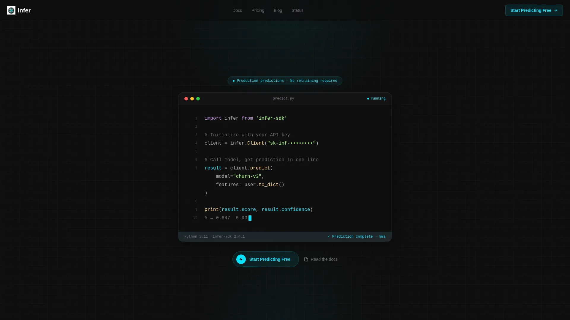
The hero section displays a five-line Python integration: import statement, client initialization, model call, prediction response, and a confidence score printed to standard output. The block uses JetBrains Mono on a pure carbon black background, with electric cyan highlighting on the response object. A blinking cursor at the end signals a live, warm terminal.
Modular Capability Card Grid
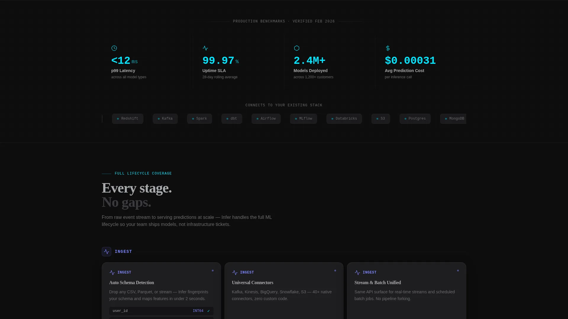
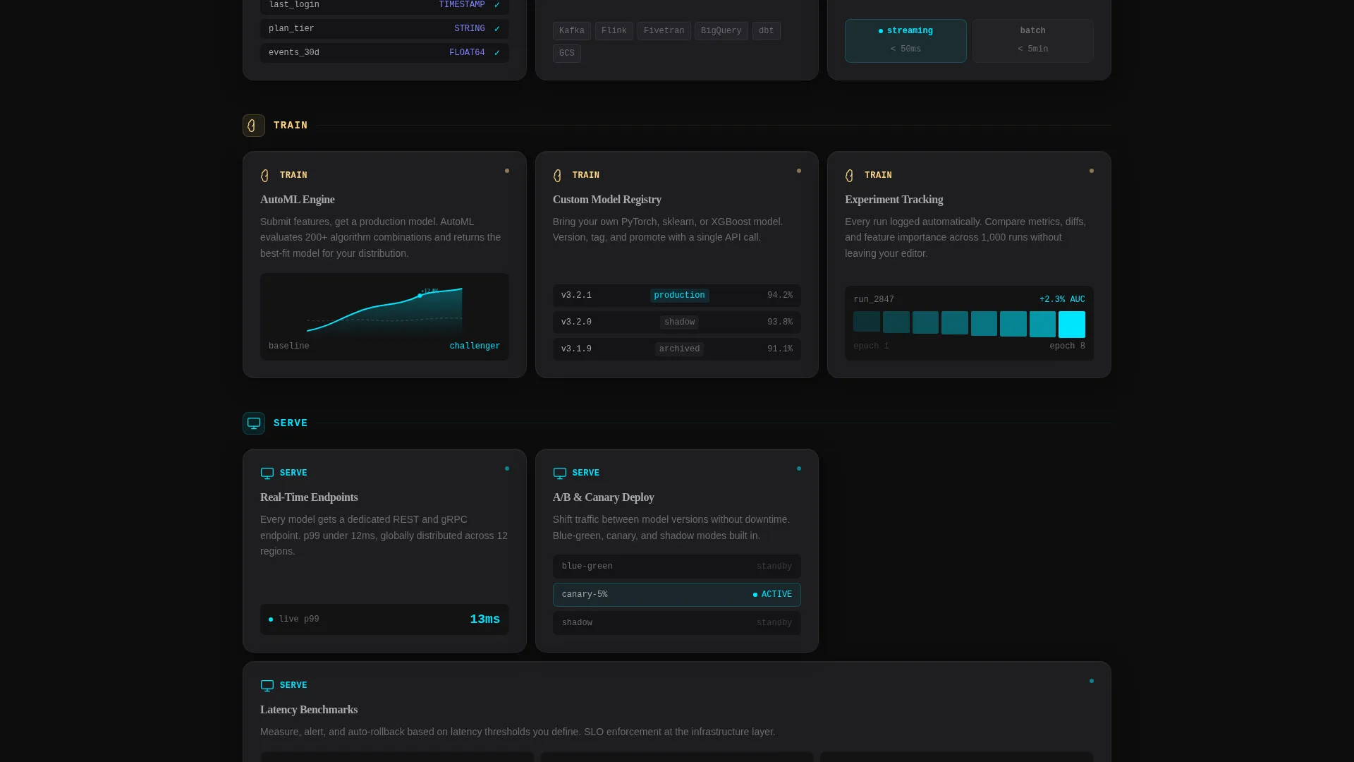
After the header, the page becomes a grid of self-contained capability cards. Each card carries an icon, a three-word label, one sentence, and a micro-interaction such as a ticking latency number, a shuffling connector logo grid, or a pulsing cyan status dot.
Three-Cluster Pipeline Layout
Cards are visually grouped into three pipeline clusters: Ingest, Train, and Serve. Ingest covers connectors, schema detection, and streaming versus batch modes. Train covers AutoML, a custom model registry, and experiment tracking. Serve covers real-time endpoints, A/B deployment, and latency benchmarks.
Benchmark Performance Strip
A dedicated strip between card clusters displays hard numbers: p99 latency, uptime percentage, and total models deployed across the customer base. No testimonials, no logos with vague quotes. Just the kind of data an engineer actually trusts.
Persistent Call-to-Action Bar
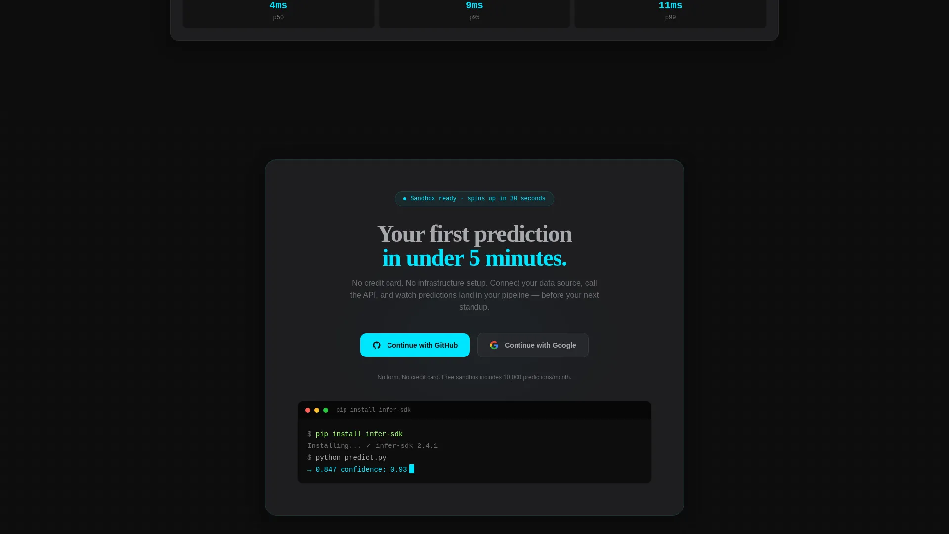
A fixed bottom bar keeps the primary call-to-action visible throughout the entire scroll. The button reads "Start Predicting Free" in electric cyan on carbon black. The click routes to a signup flow with GitHub or Google single sign-on. No form appears on this page.
Carbon Fiber Visual Identity
The entire layout uses a four-value color system: deep carbon black for backgrounds, graphite for card surfaces, brushed aluminum for body text, and electric cyan reserved exclusively for live-state indicators, active toggles, and hover accents. The effect mirrors the interior of a server rack.
Page sections overview
| Section | Purpose |
|---|---|
| Python Code Header | Proves integration simplicity with a real, readable code block |
| Ingest Cards Cluster | Showcases connectors, schema detection, and streaming capabilities |
| Train Cards Cluster | Covers AutoML, model registry, and experiment tracking features |
| Serve Cards Cluster | Highlights real-time endpoints, A/B deployment, and latency data |
| Benchmark Numbers Strip | Builds trust with hard p99 latency, uptime, and deployment stats |
| Persistent call to action Bar | Keeps the free sandbox call-to-action visible on every scroll position |
Design & branding system
The visual identity follows a Dashboard Pro theme built entirely on the Carbon Fiber color system. Every design decision reinforces the feeling of a production environment that is already running.
- Carbon black (#0D0D0D) and graphite (#2A2A2E) handle all backgrounds and card surfaces, with cards lifting slightly through a 1 to 2 percent lighter border
- Brushed aluminum (#A8A9AD) carries all body text for comfortable reading on dark surfaces
- Electric cyan (#00E5FF) appears only on live-state indicators, active toggles, hover accents, and the primary call-to-action button, creating instant visual hierarchy
Mobile & speed optimization
The card grid layout is designed to reflow naturally across screen sizes. The modular structure means each capability card scales independently without breaking the grid logic.
- The three-cluster layout collapses into a single vertical stack on smaller viewports, keeping the pipeline narrative intact
- The fixed bottom-bar call-to-action remains persistent and tappable on mobile, so the signup path is never more than one action away
How this template helps you convert
This template earns trust before asking for any action, and then makes that action as easy as possible. The conversion logic is built into the page structure itself.
- The code snippet in the header reduces perceived integration complexity before the visitor reads a single marketing sentence, making the platform feel approachable to technical evaluators
- The feature matrix lets engineers self-qualify by scanning capability cards at their own pace, so they arrive at the call-to-action already convinced rather than pressured
- The no-form, single sign-on signup path removes the final barrier by letting visitors start immediately with GitHub or Google credentials instead of filling out a contact form
Other information about this template
This template is designed as a standalone, single-page click-through experience. It does not include a blog, documentation hub, or multi-page navigation structure.
- The template is built around a card grid (modular) structure, meaning individual capability cards can be updated or reordered without redesigning the full layout
- The creative direction follows a Feature Matrix logic suited to platforms with multiple distinct capability areas that benefit from side-by-side comparison
- The header concept uses a Code Snippet approach, which is particularly effective for developer-focused platforms where showing real syntax builds more trust than describing features in prose
- The landing page direction is click-through, meaning the page's sole conversion goal is routing qualified visitors to the signup or sandbox environment
Theme
Dashboard Pro
Creative direction
Feature Matrix
Color system
Carbon Fiber
Style
Card Grid (Modular)
Direction
Click-Through
Page Sections
Syntax-highlighted Python Code Header
Modular Capability Card Grid
Three-cluster Pipeline Layout
Benchmark Numbers Strip
Persistent Call-to-action Bottom Bar
Carbon Fiber Visual Identity
Related questions
Can I change the code snippet in the header?
Does this template include a signup form?
Can I add or remove capability cards from the grid?
Is this template suitable for a B2B software-as-a-service platform?
Can the color scheme be updated to match a different brand?



