AI & Machine Learning Professional Website Template
Inference is a hub-and-spoke landing page template built for conversational AI platforms. It uses a Data Command visual theme, a Carbon Fiber color system, and a Spec Sheet creative direction to speak directly to VP-level engineers, product managers, and CX directors. Every section is designed to expose technical specs upfront and earn the demo click without a sales call.
by Rocket studio
Quick summary
Inference is a single-page, anchor-nav landing page template for conversational AI products. It pairs a dark cockpit aesthetic with datasheet-style content sections. The design communicates precision and throughput. The goal is one action: get the right technical buyer to click "Open the Sandbox" before they ever speak to a salesperson.
Who this template is for
This template is built for teams selling middleware-level conversational AI to technical and operational decision-makers. It is not a template for consumer apps or beginner-facing SaaS products. The tone, layout, and content structure assume a sophisticated buyer who evaluates before they engage.
- VP-level engineering leads assessing middleware for their existing stack
- Product managers managing high Zendesk ticket volume who need throughput at scale
- Customer experience directors who have exhausted outsourced support contracts and need a system that holds performance around the clock
What problem this template solves
Most landing pages for AI platforms bury the technical specs behind adjective-heavy copy and gated content. The right buyers, engineers and operations leads, click away the moment they feel they are being pitched instead of informed. This template solves that trust gap.
- It exposes latency benchmarks, uptime SLA, supported languages, and API rate limits in full view, before any form or sales step
- It removes the friction of a lead-capture gate by routing visitors directly into a live sandbox environment
- It signals technical credibility from the first scroll, so buyers assess the product on its merits, not on the strength of a sales deck
What you get with this template
You get a complete, structured landing page built around five anchor-linked spoke sections and a persistent navigation bar. The page is designed to hold a technically demanding reader from the header metrics down to the final call to action.
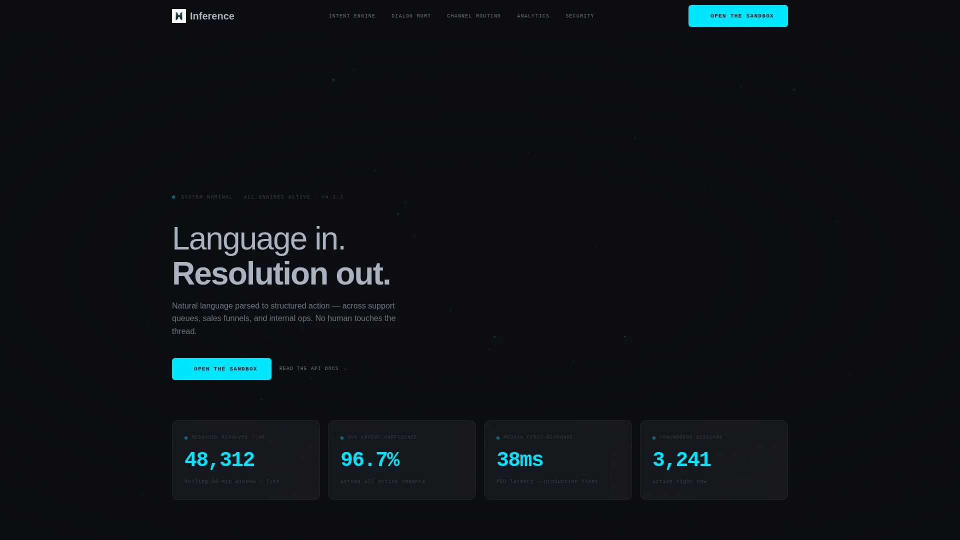
- A Dark Glass Panels header displaying four real-time performance metrics with eased counter animations
- Five fully structured spoke sections: Intent Engine, Dialog Management, Channel Routing, Analytics, and Security
- A sticky anchor navigation bar and repeated "Open the Sandbox" primary calls to action, plus "Read the API Docs" secondary text links at each section close
Feature list
This template ships with a specific set of layout and interaction components described below.
Dark Glass Panel Header
Four translucent metric panels float against a cockpit black background. Each panel displays a distinct live-style counter: messages resolved per hour, average intent confidence score, median first-response latency, and active concurrent sessions. A muted graphite node matrix pulses behind the glass, implying the system running underneath. No hero image or illustration competes for attention.
Persistent Anchor Navigation
A sticky navigation bar links directly to each of the five spoke sections. The primary call to action, "Open the Sandbox," lives inside this nav and stays visible throughout the entire scroll. This keeps the conversion path one click away at any point on the page.
Spec Sheet Section Layout
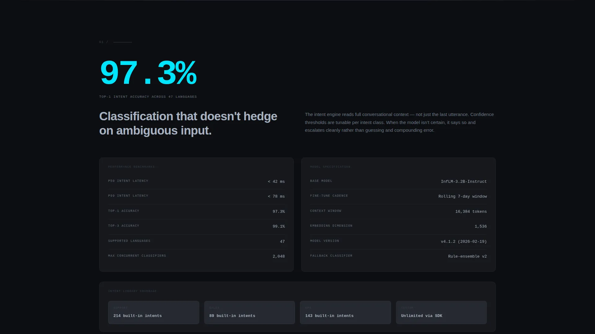
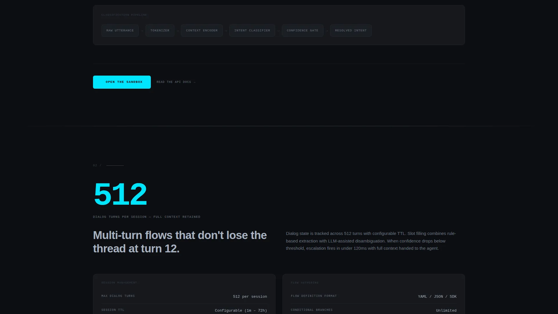
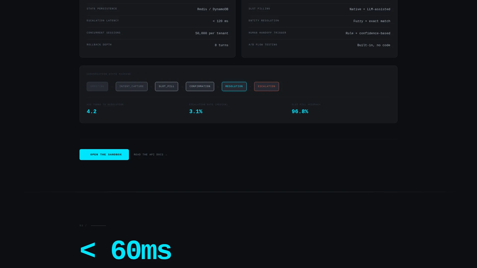
Each spoke section opens with an oversized cyan performance metric, followed by a tight specification grid. The grid covers latency benchmarks, supported languages, API rate limits, and uptime service level agreements. The layout escalates in technical depth as the visitor scrolls, moving from throughput figures to architecture diagrams and compliance certifications.
Dual Call-to-Action Pattern
Every spoke section closes with the primary "Open the Sandbox" button and a secondary "Read the API Docs" text link. The primary click carries UTM context and lands the user in a pre-loaded conversation tree playground. The secondary link serves the engineer who wants to read the documentation before touching anything.
Carbon Fiber Typographic Hierarchy
Text is set in machined aluminum on graphite backgrounds. Signal cyan appears only on interactive states, active navigation indicators, and live data pulses. The typographic hierarchy is designed to feel like reading a semiconductor whitepaper: clean, dense with meaning, and free of decorative noise.
Page sections overview
| Section | Purpose |
|---|---|
| Header Metrics Panel | Display four live performance counters behind dark glass |
| Sticky Anchor Nav | Keep primary call to action and section links persistently visible |
| Intent Engine | Present parsing specs, confidence benchmarks, and supported languages |
| Dialog Management | Show conversation routing logic, thread handling, and latency data |
| Channel Routing | Detail queue distribution, funnel routing, and ops workflow coverage |
| Analytics Overview | Surface throughput stats and reporting depth for technical evaluators |
| Security Specs | Present uptime SLA, compliance certifications, and architecture detail |
Design & branding system
The visual identity follows a Data Command theme built entirely on a Carbon Fiber color system. The palette is engineered to feel precise, dark, and high-performance without relying on imagery or illustration.
- Core colors are cockpit black (#0B0E11) for backgrounds, woven graphite (#1A1D23) for panels and surfaces, machined aluminum (#A8B2C1) for all body text, and signal cyan (#00E5FF) reserved strictly for interactive states, active nav indicators, and live data pulses
- Backgrounds never rise above graphite level; cyan appears only when an element is active or alive
- The typographic system is modeled on technical documentation: hierarchy is expressed through size and weight, not color, keeping the reading experience clean and datasheet-precise
Mobile & speed optimization
The template is designed to translate the cockpit aesthetic cleanly to smaller screens without losing the data-dense layout that technical buyers expect. Performance is treated as a design constraint, not an afterthought.
- The sticky anchor navigation collapses gracefully on mobile so the primary call to action stays reachable without disrupting the reading flow
- Eased counter animations in the header are scoped to load without blocking the initial render, keeping the above-the-fold experience fast
- Specification grids in each spoke section reflow to single-column stacks on narrow viewports, preserving readability of benchmarks and data tables
How this template helps you convert
This template is built around a specific conversion theory: technical buyers convert when they trust what they see, not when they are persuaded by what they read. Every layout decision reinforces that theory.
- Exposing the full specification grid upfront, including latency, SLA, and API limits, removes the most common objection before it forms, so the buyer arrives at the call to action already informed
- Routing the primary click directly into a live sandbox, with no form in between, eliminates the sales-call barrier and lets the product demonstrate itself to an engineer on their own terms
- Pairing each call to action with a "Read the API Docs" secondary link captures the buyer who is not yet ready to touch the demo, keeping them inside the evaluation journey rather than losing them to a back button
Other information about this template
This template was designed specifically for the conversational AI and chatbot platform market, where buyers are evaluating middleware that will sit inside production stacks handling real support queues and sales funnels.
- The hub-and-spoke anchor navigation structure makes it straightforward to adapt the five spoke sections to different product pillars without rebuilding the page layout
- The UTM-aware primary call to action pattern is pre-wired for campaign tracking, so teams running paid or organic acquisition can measure sandbox entry rates by source without additional configuration
- The template fits naturally into evaluation workflows where the buying committee includes both a technical lead reviewing API documentation and an operational lead focused on throughput and SLA coverage
- Teams building on platforms like Webflow will find the Carbon Fiber color system and typographic scale easy to implement using existing style variables and component libraries
Theme
Data Command
Creative direction
Spec Sheet
Color system
Carbon Fiber
Style
Hub & Spoke (Anchor Nav)
Direction
Click-Through
Page Sections
Dark Glass Panel Header
Persistent Anchor Navigation Bar
Spec Sheet Section Layout
Dual Call-to-action Pattern
Carbon Fiber Typographic System
Related questions
Who is this landing page template designed for?
Does the page require visitors to fill out a form?
Can I customize the five spoke sections for my own product?
What makes this template different from a standard SaaS landing page?
Is the dark cockpit visual theme flexible enough for different brand colors?



