Cloud Architecture Open Source Landing Page Template
Infra is a split-screen landing page template built for cloud architecture open-source projects. It pairs a live YAML editor with a real-time diagram preview, letting visitors interact before they ever see a form. The glassmorphic Dashboard Pro design and interactive explorer layout make it ideal for platform engineers, DevOps leads, and engineering leaders evaluating their next infrastructure toolchain.
by Rocket studio
Quick summary
Infra is a high-impact, single-page landing page template designed for cloud architecture open-source projects. It uses a 50/50 split-screen layout, a glassmorphic dark-mode design system, and interactive section mechanics to show engineers exactly what the tool does before asking for anything in return.
Who this template is for
This template is built for technical teams and open-source maintainers who need a landing page that speaks directly to an engineering audience. It communicates infrastructure value without watering it down for a general crowd.
- Platform engineers building internal developer portals who need to demo tooling fast
- DevOps leads standardizing infrastructure across teams and evaluating new frameworks
- CTOs and engineering leaders deciding whether to build or adopt an abstraction layer
What problem this template solves
Most landing pages for developer tools either look too generic or bury the core experience behind walls of marketing copy. Engineers leave before they understand what the tool actually does. This template solves that by putting the live experience front and center.
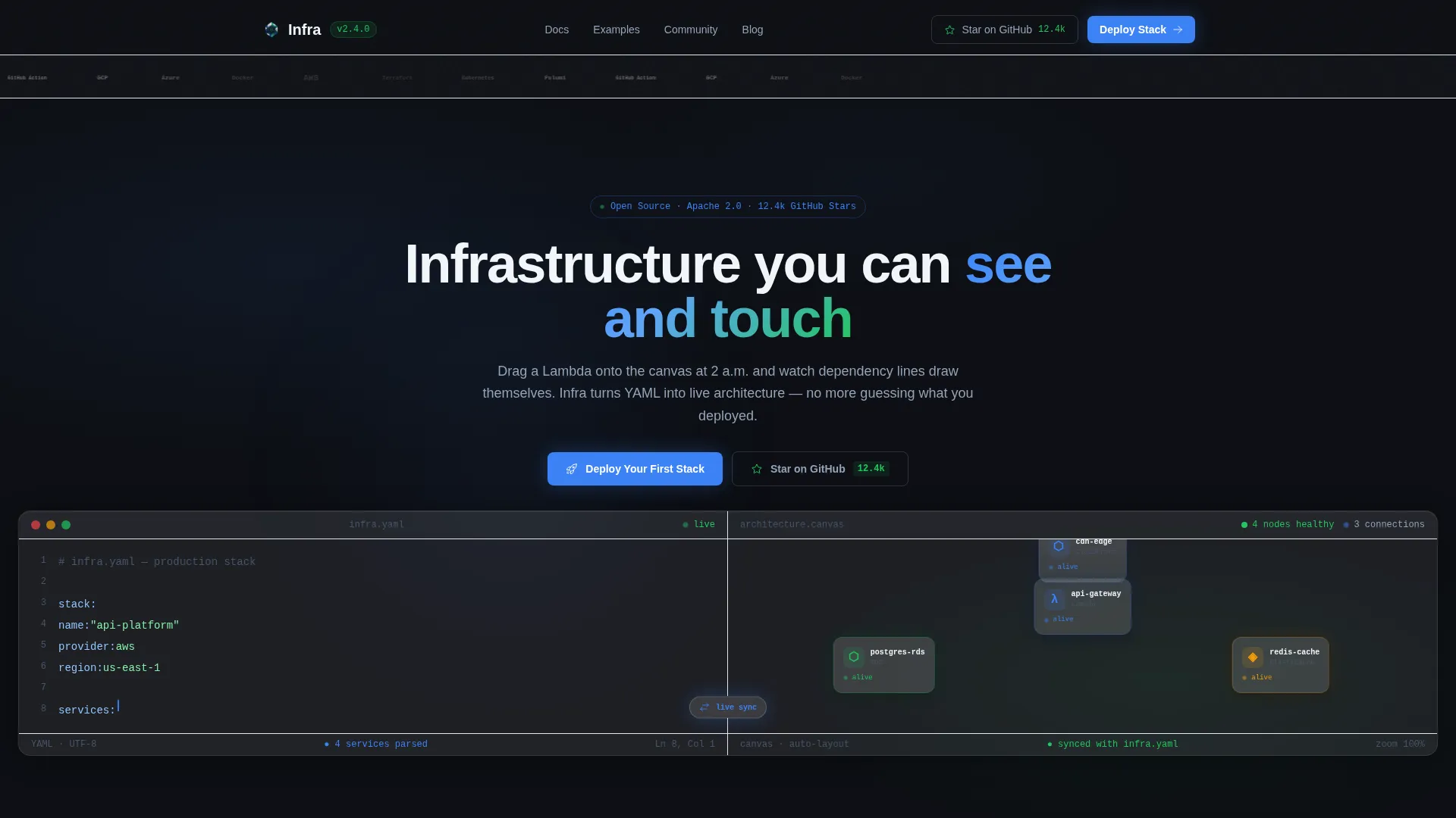
- Visitors see a YAML snippet and its resulting architecture diagram side by side on the first fold
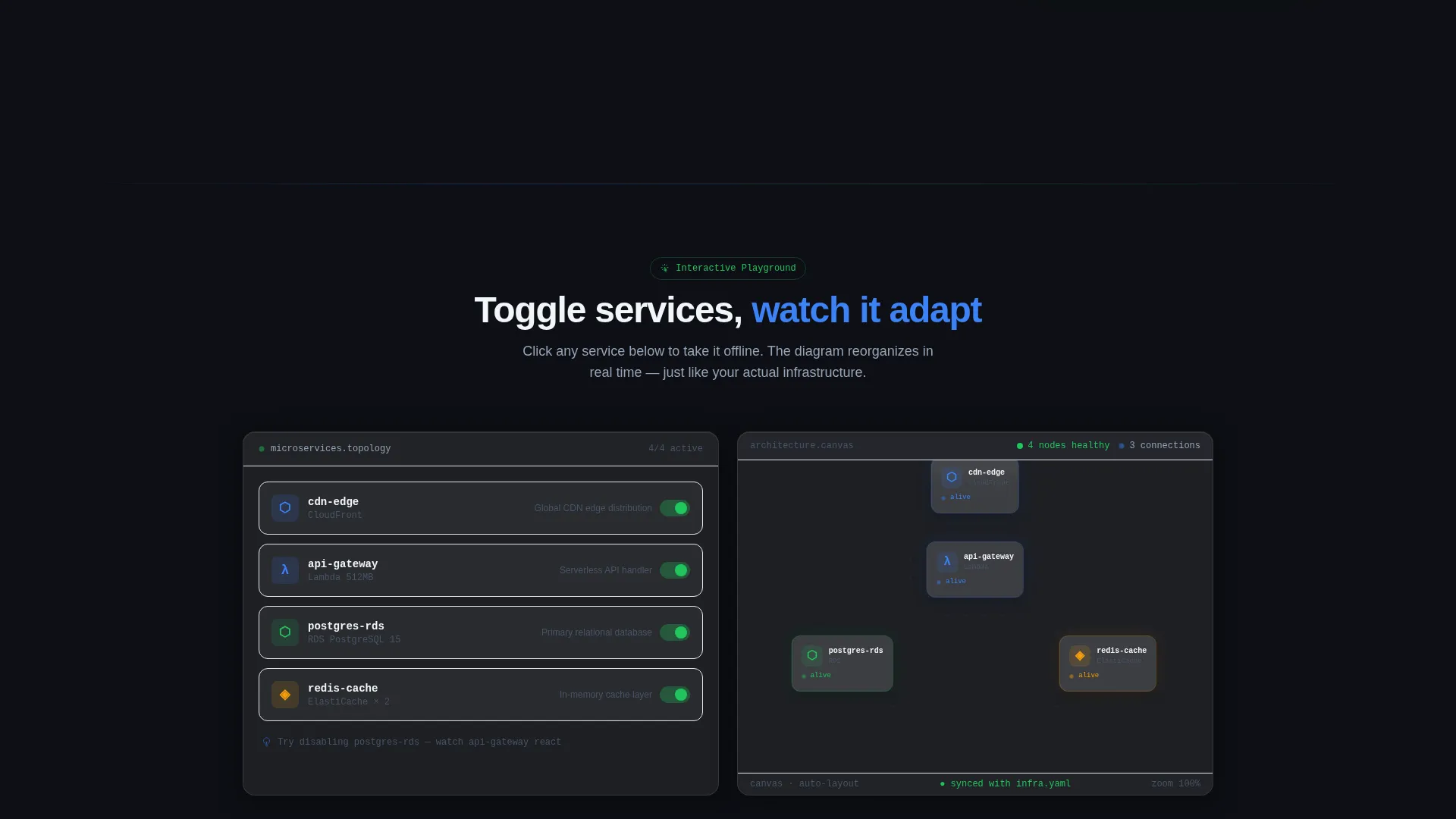
- Interactive topology controls let users toggle microservices on and off without leaving the page
- The form only appears after visitors have already engaged with the tool's core behavior
What you get with this template
You get a fully structured, single-page landing page built around an interactive explorer creative direction. Every section is designed to demonstrate the project's core promise: infrastructure you can see and touch.
- A split-screen hero with a live YAML editor on the left and an animated architecture diagram on the right
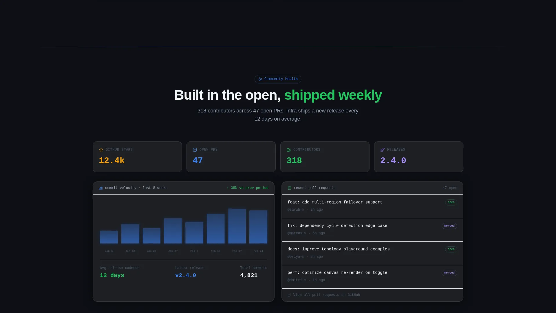
- A contributor graph section showing commit velocity, open pull requests, and release cadence
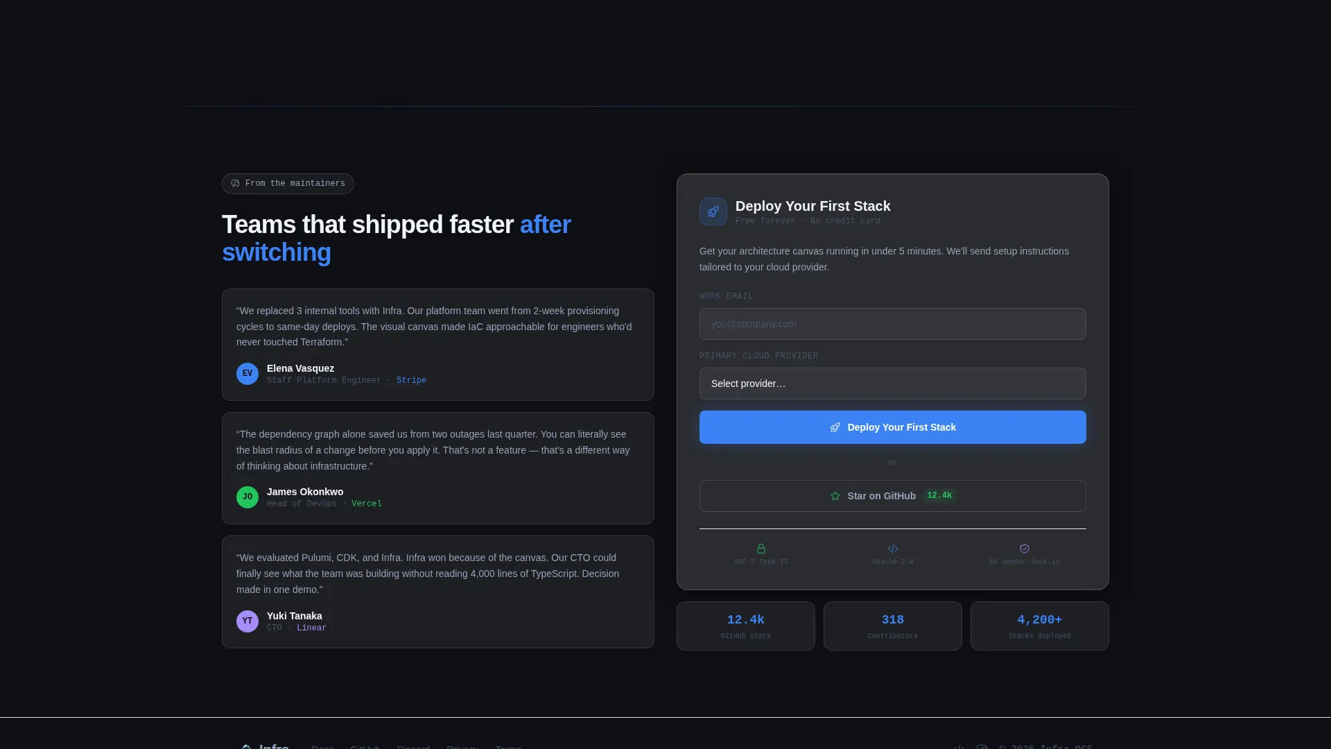
- A lead-generation form with two fields: work email and primary cloud provider dropdown
Feature list
This template delivers a focused set of purpose-built features. Each one directly supports the goal of converting curious engineers into active users and contributors.
Split-Screen Live Preview
The hero section divides the viewport 50/50. The left panel shows a YAML snippet mid-edit with syntax highlighting in electric node blue and signal green. The right panel renders the live architecture diagram that snippet produces, with nodes drawn as frosted-glass cards and animated data-flow lines connecting them.
Interactive Topology Playground
The second fold gives visitors direct control. They can toggle individual microservices on or off in the left panel and watch the architecture diagram on the right reorganize itself in real time. This section turns passive browsing into active exploration.
Contributor Graph Section
The third fold flips the split layout. The right side displays a contributor graph with commit velocity, open pull request counts, and release cadence data. The left side shows testimonials from maintainers at named companies, building credibility through real project activity.
Cloud-Native Logo Bar Header
The page opens with a horizontal ribbon of cloud-native tool logos rendered in monochrome white. Each logo pulses in sequence like a heartbeat monitor, signaling compatibility with the ecosystem the visitor already works in.
Lead-Generation Form with Cloud Dropdown
The primary call to action anchors to a two-field form: work email and a primary cloud provider dropdown with options for major providers and multi-cloud. A ghost-button secondary action sits beside it for lower-commitment engagement.
Glassmorphic Dark-Mode Design System
The entire template uses a frosted-glass visual layer built on a deep void black base. Translucent panel cards float over the dark background with soft light bleed at edges, creating depth without visual clutter.
Page sections overview
| Section | Purpose |
|---|---|
| Cloud Logo Bar | Confirms ecosystem compatibility at a glance |
| Split-Screen Hero | Shows YAML input and live diagram output together |
| Topology Playground | Lets visitors toggle services and see diagram updates |
| Contributor Graph | Displays project activity and maintainer credibility |
| Lead Generation Form | Captures work email and cloud provider preference |
Design & branding system
The template follows a Dashboard Pro theme built on a glassmorphic color system. The visual feel is a frosted-glass heads-up display floating over a dark command center. Layers are semi-transparent, depth is built through opacity rather than shadow, and light bleeds softly at every card and container edge.
- Core palette: deep void black (#0D0F14) base, translucent panel gray at 12% opacity (#FFFFFF1F), electric node blue (#3B82F6) for active elements, and signal green (#22C55E) for status and alive-state accents
- Typography and iconography follow a terminal-inspired system, keeping the visual language consistent with the engineering tools this project sits alongside
- The monochrome white logo bar and syntax-highlighted code panels reinforce the dark-mode aesthetic throughout every fold
Mobile & speed optimization
The template is structured with a responsive layout in mind. The split-screen format adapts gracefully from wide desktop viewports down to smaller screens, keeping the interactive elements accessible without sacrificing the core visual experience.
- The 50/50 split stacks vertically on smaller viewports so YAML and diagram panels remain readable
- Glassmorphic card layers are implemented with CSS opacity and backdrop-filter techniques that keep the visual depth light on rendering overhead
- Interactive elements such as the topology toggle and animated diagram lines are scoped to user interaction, so they do not run continuously in the background
How this template helps you convert
The conversion strategy is built around the idea that engineers trust tools they can touch. The page earns the click by delivering value through interaction before presenting any form.
- Visitors experience the tool's core mechanic in the first two folds, building genuine confidence in the product before any commitment is requested
- The primary call to action, "Deploy Your First Stack," is paired with a minimal two-field form that reduces friction for the most qualified leads
- A ghost-button "Star on GitHub" option provides a lower-commitment secondary path, capturing interest from visitors who are not yet ready to share their email
Other information about this template
This template is a strong fit for open-source cloud architecture projects that need to stand out in a crowded ecosystem. It is designed to work as a standalone landing page for a project launch, a conference demo link, or an ongoing community growth page.
- The interactive explorer creative direction means the page itself demonstrates the product, which is especially effective for infrastructure tooling where seeing is believing
- The template is production-ready as a static front-end page and can be connected to any form backend or deployment workflow you already use
- Teams using cloud infrastructure tools like those in the AWS, Terraform, Kubernetes, Pulumi, and GitHub Actions ecosystems will find the logo bar and topology sections immediately recognizable and relevant
Theme
Dashboard Pro
Creative direction
Interactive Explorer
Color system
Glassmorphic
Style
Split Screen (50/50)
Direction
Lead Generation
Page Sections
Split-screen YAML and Diagram Hero
Interactive Topology Playground
Contributor Graph and Social Proof
Pulsing Cloud-native Logo Bar
Minimal Lead-generation Form
Glassmorphic Dashboard Design System
Related questions
Who is this landing page template designed for?
Can I customize the YAML snippet and architecture diagram?
What makes the split-screen layout effective for a technical audience?
How does the lead-generation form work?
Is this template suitable for a product launch or an ongoing project page?



