Platform Engineering Landing Page Template
Infra is a modular card-grid landing page built for platform engineering research labs. It presents your internal developer platform, service meshes, and CI/CD capabilities as a clean spec sheet, with benchmark metrics, domain-grouped capability cards, and a CLI install flow that converts technical visitors in a single terminal command.
by Rocket studio
Quick summary
Infra is a single-page, card-grid landing page template designed for platform engineering research labs. It organizes your platform's capabilities into domain-grouped spec cards, each displaying a title, one-line description, and a concrete benchmark metric. The page builds trust through evidence, then drives toward a direct CLI install with a clipboard-ready curl command.
Who this template is for
This template is built for technical teams who need to communicate platform capabilities to other engineers, not to marketers or executives. If your audience reads READMEs before sales decks, this page speaks their language.
- Platform teams at growth-stage startups managing Terraform sprawl and internal developer platforms
- Site reliability engineers (SREs) maintaining complex Kubernetes operator ecosystems at enterprise scale
- Developer experience (DevEx) leads who need to demonstrate measurable productivity improvements
What problem this template solves
Most landing pages oversell and underdeliver for technical audiences. Engineers are skeptical of persuasion-first copy. They want specifications, benchmarks, and a fast path to installation.
- Generic marketing pages bury technical detail behind vague promises and hero copy
- Platform teams lack a structured way to present capability breadth across build, deploy, observe, and govern domains
- CLI tools and internal platforms lose potential adopters when the install path is buried or unclear
What you get with this template
You get a fully structured, single-page landing layout that reads like a well-organized README. Every section has a clear job, and the page earns the install before it asks for it.
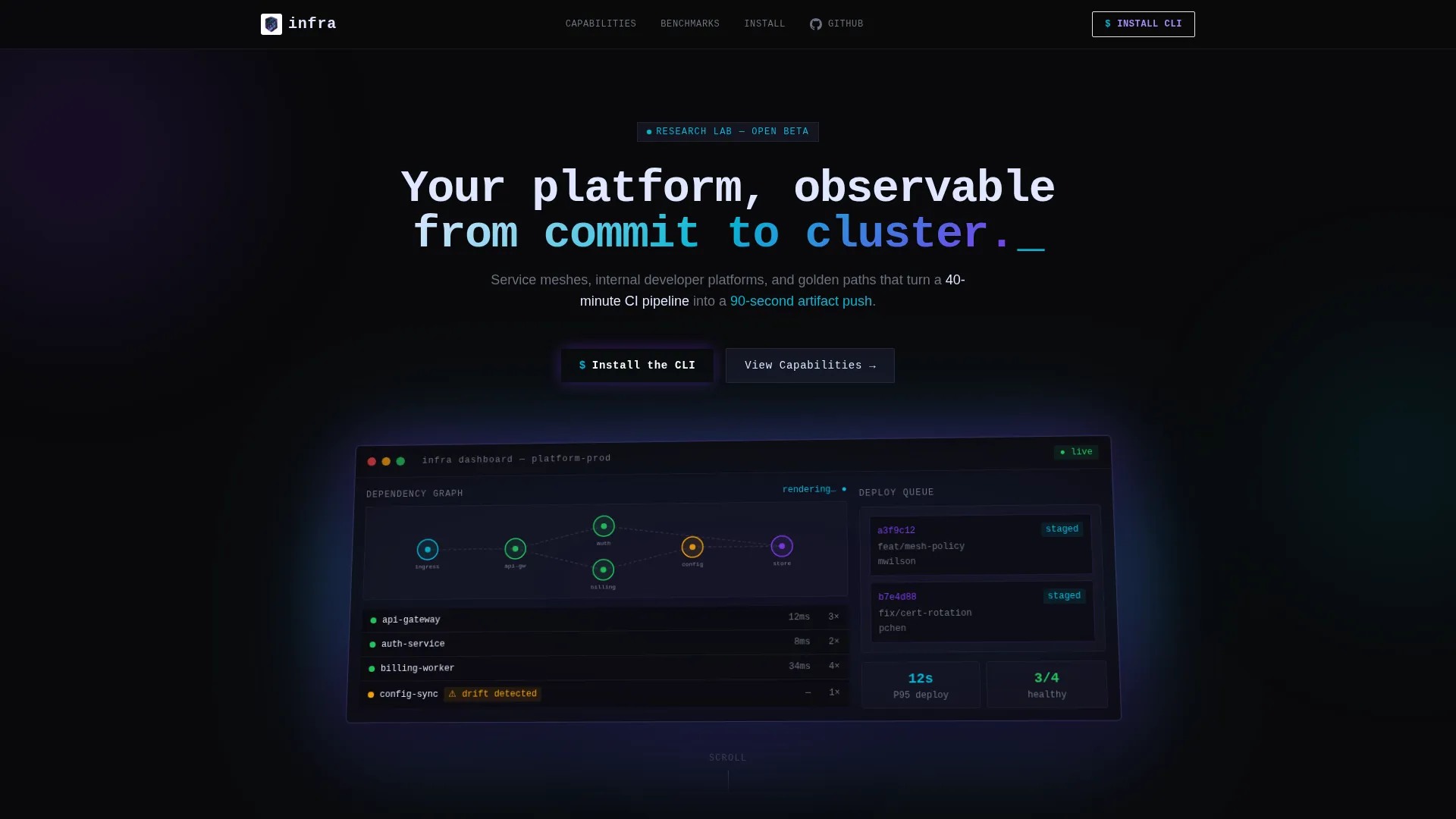
- A full-width product screenshot header with an isometric tilt, iridescent glow, and monospace headline overlay
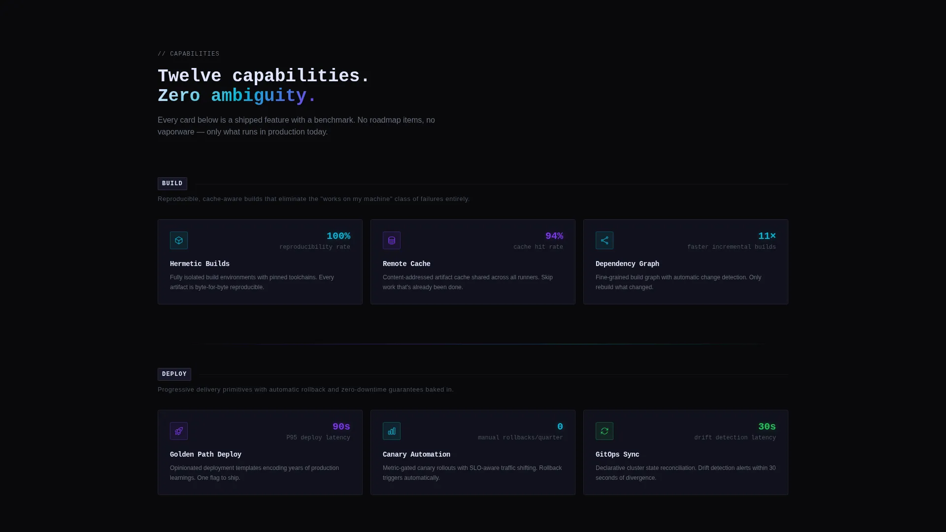
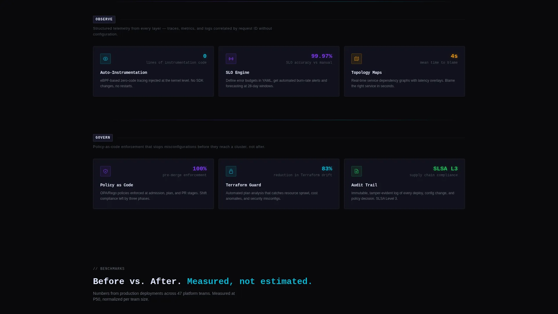
- Domain-grouped capability cards organized into Build, Deploy, Observe, and Govern rows with spec-sheet formatting
- A CLI install block with a one-click clipboard curl command, OS toggle tabs for macOS, Linux, and Docker, and a secondary sandbox path
Feature list
This template includes carefully designed components that match the workflow and expectations of platform engineering audiences.
Domain-Grouped Spec Card Grid
Cards are organized by engineering domain: Build, Deploy, Observe, and Govern. Each row opens with a single muted-type sentence. Every card displays a title, a one-line description, and one benchmark metric such as "P95 deploy latency: 12s". The layout reads like a technical specification sheet, not a marketing brochure.
Product Screenshot Header
The header features a full-width, pixel-perfect dashboard screenshot rendered on a subtle isometric plane tilted five degrees. The screenshot shows a dependency graph, health-check indicators, a drift detection warning, and a staged deploy queue. A soft iridescent glow frames the image, and the headline overlays in monospace type.
CLI Install Block with OS Tabs
The primary call to action presents a curl command in an inline code block with one-click clipboard copy. Three OS toggle tabs let visitors switch between macOS, Linux, and Docker install paths instantly. This reduces friction to a single terminal command for any environment.
Sandbox Access Path
A secondary call-to-action button links visitors to a browser-based playground. The only requirement is a GitHub OAuth login. This lowers the barrier for engineers who want to evaluate the platform before committing to a local install.
Tech Glass Visual System
The template uses a layered dark user interface built on void black, translucent panel gray with sixty percent opacity, holographic violet, spectral cyan, and an iridescent highlight that activates on hover. Cards and dividers carry a frosted glass aesthetic with prismatic color bleeding at edges, giving the user interface a depth that feels native to a terminal-first product.
Monospace Typography and Icon System
Each spec card uses minimal iconography paired with monospace type for metric values. This reinforces the spec-sheet cadence and makes benchmark figures immediately readable against dark backgrounds.
Page sections overview
| Section | Purpose |
|---|---|
| Header Screenshot Block | Anchors the page with a dashboard visual and monospace headline |
| Build Domain Row | Showcases CI pipeline and artifact capabilities with benchmark cards |
| Deploy Domain Row | Presents deployment pipeline specs and latency metrics |
| Observe Domain Row | Covers health checks, drift detection, and observability cards |
| Govern Domain Row | Displays golden path, policy, and access control capability cards |
| CLI Install Block | Delivers the primary call to action with clipboard curl and OS toggle tabs |
| Sandbox call to action Section | Offers a low-friction GitHub OAuth path to the browser playground |
Design & branding system
The visual identity follows a Tech Glass theme powered by an AI Iridescent color system. The palette is dark, layered, and precise, designed to feel like a frosted glass terminal interface with prismatic light at every edge.
- Core colors: void black (#09090B) as base, translucent panel gray (#1A1A2E at 60% opacity) for card surfaces, holographic violet (#7C3AED) and spectral cyan (#06B6D4) as accent tones, and iridescent highlight (#E0E7FF) on hover states
- Typography uses monospace styling for metric values and headline overlays, reinforcing the spec-sheet and terminal aesthetic throughout
- Cards and section dividers carry a frosted glass layering effect, with iridescent color bleeding at edges to create visual depth without clutter
Mobile & speed optimization
The card-grid layout is built to remain readable and functional on smaller screens. Domain rows reflow into single-column stacks without losing the spec-sheet structure.
- Modular card components are individually contained, making them easy to reorder or resize across breakpoints
- The CLI install block with OS toggle tabs is designed to remain interactive and copy-functional on mobile browsers
- The isometric header screenshot scales responsively, maintaining its visual weight without overloading narrow viewports
How this template helps you convert
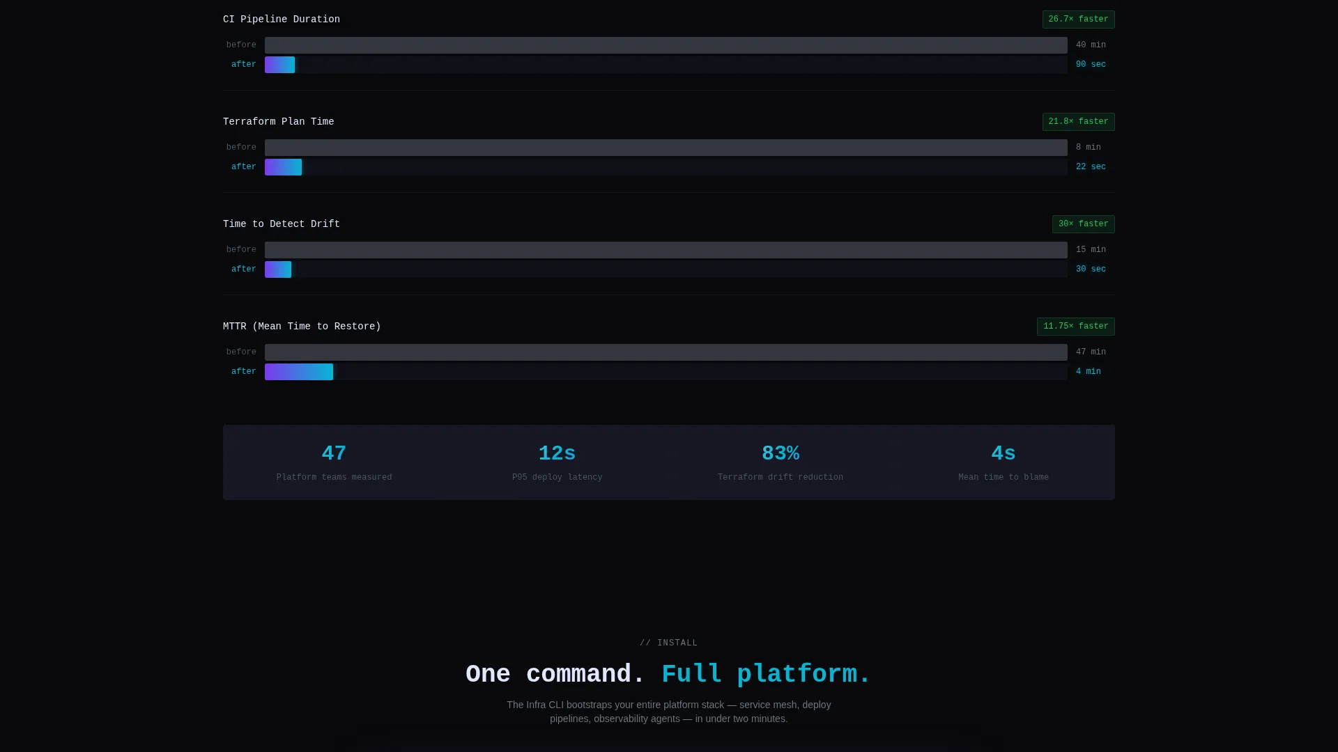
This template earns the install before it asks for it. By the time a visitor reaches the call to action, they have already reviewed twelve concrete capability cards with real benchmark metrics.
- The spec-card grid front-loads evidence across four engineering domains, building credibility without persuasion copy so that skeptical engineers arrive at the call to action already convinced
- The CLI install block removes every possible friction point: the curl command is pre-written, clipboard-ready, and switchable by operating system in one tap
- The sandbox path captures engineers who need to evaluate before installing, using only a GitHub login so no account creation or form filling is required
Other information about this template
This template was built specifically for the platform engineering research lab niche, where the audience values precision and directness over visual spectacle.
- The Spec Sheet creative direction means copy density is intentional: no filler text, no padding paragraphs, just capability titles and benchmark numbers
- The App Download landing page direction makes the CLI install block the structural anchor of the entire page, not an afterthought
- The Card Grid (Modular) template style means individual capability cards can be updated, reordered, or expanded without rebuilding the layout
- The isometric product screenshot header concept is a deliberate choice to show the platform mid-operation, reinforcing that this is a working tool, not a concept
Theme
Tech Glass
Creative direction
Spec Sheet
Color system
AI Iridescent
Style
Card Grid (Modular)
Direction
App Download
Page Sections
Domain-grouped Spec Card Grid
Product Screenshot Header Block
CLI Install Block with OS Tabs
Browser Sandbox Access Path
Tech Glass Visual System
Monospace Type and Minimal Icons
Related questions
Who is this landing page template designed for?
Can I change the capability cards and benchmark metrics?
What is the primary call to action on this page?
How many capability cards does the template include?
Can I adapt the color system to match my own brand?



