IT Services Company Professional Website Template
The Infracore bold brutalist IT services frequently asked question landing page template is a high-contrast, network-operations-center-themed landing page built for managed service providers and IT infrastructure companies. It combines a Feature Matrix comparison layout with a Dark Glass Panel header, three-tier service columns, and a persistent Client Portal app download call to action. The design is bold, direct, and built for technical decision-makers.
by Rocket studio
Quick summary
This template delivers a brutalist landing page built specifically for IT services companies. It uses a Feature Matrix layout to turn every frequently asked question category into a tier comparison row across Essential, Professional, and Enterprise service columns. The visual language draws from a darkened network operations center: abyssal charcoal backgrounds, reactor teal accents, and monospaced fonts that make every answer feel like a system output.
Who this template is for
This template is built for technical and operational decision-makers who need a landing page that communicates depth, reliability, and rigor without wasting a single pixel on decoration.
- Operations managers who have lived through multiple outages this quarter and need a vendor that answers hard questions upfront
- CTOs inheriting legacy architecture who want to evaluate service tiers before committing to a migration conversation
- Office managers and team leads who need straightforward answers about managed services, connectivity, and support response times
What problem this template solves
Most IT service providers bury their answers in a generic help center or a wall of text that feels like a poorly designed website. That raw appearance makes potential clients feel less confident, not more. This template solves a specific problem: how do you prove operational competence before a prospect ever books a call?
- frequently asked question pages that dead-end instead of converting visitors into leads or app downloads
- No tier differentiation visible on the page, forcing prospects to email before they understand what they are buying
- Trust gaps caused by generic design that makes a capable IT operation look like a poorly designed, low-effort site
What you get with this template
You get a fully structured brutalist landing page with every major section pre-built and ready to fill with your own service data. The template ships with a layout that is dense, functional, and built to support the full buyer evaluation journey.
- A five-section brutalist landing page covering hero, feature matrix, SLA deep dive, compliance block, and a full-width call-to-action section with footer
- A three-tier comparison system (Essential, Professional, Enterprise) with interactive column toggles and accordion frequently asked question rows
- Two conversion paths built in: a persistent "Download the Client Portal" bottom bar and a three-field custom SLA quote form
Feature list
This template's key features are derived directly from the project brief. Every element serves the core purpose of turning frequently asked question depth into conversion confidence.
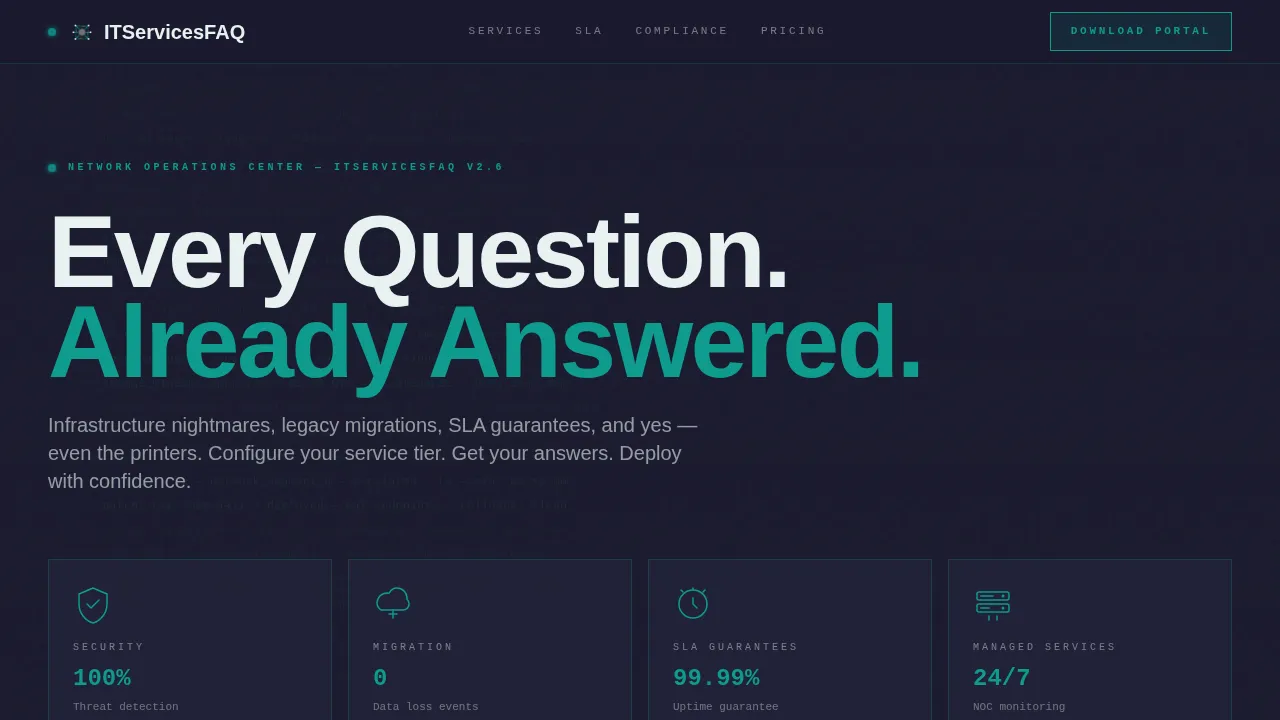
Dark Glass Panel Hero Header
The header uses translucent, smoke-tinted panel blocks arranged in a brutalist grid. Each panel holds a single frequently asked question category icon rendered in thin teal wireframe. A faint scrolling terminal log moves behind the grid, showing fragments like "status: resolved" and "uptime: 99.997%." There is no hero image and no stock photography. The grid itself is the statement, and the brutalist aesthetic hits immediately.
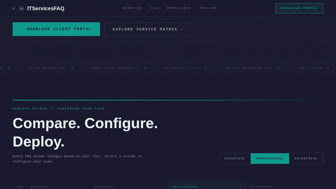
Three-Tier Feature Matrix Table
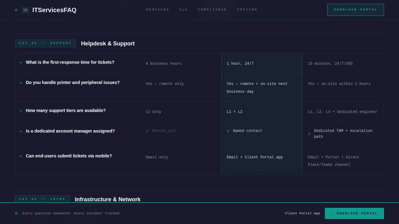
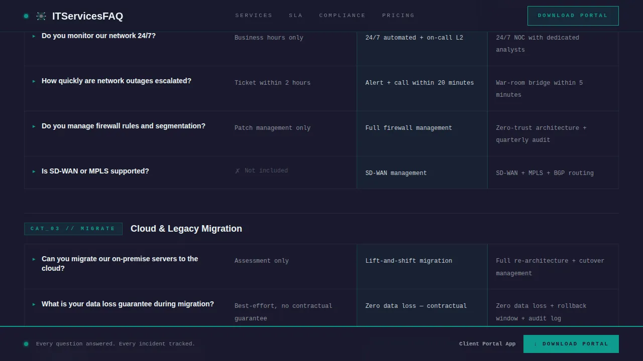
The core of this brutalist landing page is a comparison table that maps every frequently asked question category to a service tier column. Users can toggle between Essential, Professional, and Enterprise columns. Each row escalates in technical depth as the visitor scrolls, moving from general support questions into granular SLA breakdowns, incident response timelines, and compliance posture. This makes scrolling feel like configuring a system rather than reading a help center.
SLA Deep Dive Section
A dedicated section breaks down uptime guarantees, incident response timelines, and support escalation paths per tier. The brutalist design uses oversized monospaced section labels and thick teal horizontal rules to slam each topic into view. The content is structured so that users can compare SLA commitments across tiers in a single glance, building trust through specificity.
Persistent App Download Call to Action
After the second scroll fold, a persistent bottom bar appears with the "Download the Client Portal" call to action. The app is positioned as the answer to every frequently asked question: real-time ticket tracking, SLA dashboards, and direct technician chat. The bar stays visible as the user scrolls through the full comparison matrix, keeping the conversion goal always in frame.
Three-Field Custom Quote Form
A secondary conversion path offers a "Get a Custom SLA Quote" form with three fields: company size, a primary pain point dropdown, and email. This path captures prospects who are not yet ready to download the app but want a tailored proposal. Actionable calls to action placed immediately after frequently asked question content prevent the page from creating dead ends, which is a known risk in brutalist designs.
Compliance and Security Block
A dedicated section presents certifications and security posture per service tier. Compliance details are displayed inline alongside uptime metrics and response time stats. This section reinforces the core value proposition: every answered question is evidence that the operation behind it carries real technical authority.
Page sections overview
| Section | Purpose |
|---|---|
| Hero Panel Grid | Introduces frequently asked question categories via icon panels and scrolling terminal background |
| Feature Matrix Table | Compares all frequently asked question answers across Essential, Professional, and Enterprise tiers |
| SLA Deep Dive | Details uptime guarantees and incident response timelines per tier |
| Compliance Security Block | Displays certifications and security posture for each service tier |
| Call to Action Block | Full-width brutalist section with app download prompt and quote form |
| Footer Row | Single-row linear footer with navigation and contact essentials |
Design & branding system
The design system pulls from a Teal Catalyst color palette applied with strict brutalist principles. The result is a site that feels like a network operations center at 2 AM, stripped of anything that does not carry functional weight. This design style deliberately avoids decorative elements, gradients, and smooth animations in favor of raw, high-contrast clarity.
- Color palette: Abyssal charcoal (#1A1A2E) for background blocks, reactor teal (#0F9B8E) for accents and interactive states, raw slab gray (#3D3D5C) for panel fills, and phosphor white (#E8F1F0) for body text and dividers
- Typography: JetBrains Mono handles all label and data fields, delivering the large typography presence and coded feel central to brutalist web design; Manrope handles body copy and headings for readability
- Motion and interaction: Medium-intensity animation includes terminal scroll in the header background, glass panel hover refraction effects, table row highlight states, and transition animations on tier column toggles
Mobile & speed optimization
This template is built desktop-first to serve CTOs and operations managers on workstations, but mobile support is included. The brutalist design approach naturally supports lean performance because the design style avoids heavy graphics and complex CSS layering.
- Desktop-first layout that retains bold border definition and full matrix visibility on wide screens, with the layout stacking cleanly on smaller devices
- Server Components used for static content sections such as the hero, SLA block, and compliance section, keeping those sections fast to load
- Client-side rendering reserved for interactive elements including the tier toggle, accordion frequently asked question rows, and the persistent download bar
How this template helps you convert
The page is structured so that every answered question builds trust before asking for anything. Visitors arrive skeptical and leave convinced. The design earns the download rather than demanding it.
- Depth before demand: The Feature Matrix presents tier-by-tier answers to the hardest IT service questions first. By the time a visitor reaches the call-to-action block, they have already seen proof of operational rigor across every frequently asked question category.
- Two conversion paths running in parallel: The persistent download bar targets visitors ready to act now. The three-field quote form captures visitors who need a custom conversation. Neither path creates a dead end, which is a critical principle in highly functional brutalist landing page design.
- Social proof embedded inline: Uptime metrics, incident response stats, and compliance certifications appear inside the comparison table rows themselves, not in a separate testimonial block. Proof sits next to every claim, exactly where users need it to make a decision.
Other information about this template
This template sits at the intersection of brutalist web design and serious B2B IT services marketing. It draws inspiration from the broader web brutalism movement, which gained momentum as a reaction against the polished, uniform design language that dominates most sites today. Brutalism in web design traces its roots to the architectural style that emerged after World War II, known by the French term béton brut, meaning raw concrete. Designers like Pascal Deville helped define early principles for applying this sensibility to the web.
The brutalist website tradition has since expanded well beyond its early days. Today it appears across a wide range of contexts, from a portfolio website showcasing experimental creative work to a brutalist site for a creative agency that wants to signal non-conformity. Examples like Studio Otto, Butt Studio, and Luca Porracchia's portfolio website show how the brutalism design style spans from minimalist to maximum-density execution. Sven Soric's personal website is often cited as a case that combines brutalism and minimalism with particular precision.
This template combines brutalism with a highly functional IT services purpose. That combination is rare. The content in IT services design must balance raw aesthetics with authoritative content, because technical buyers are skeptical and the trust factors are complex. A poorly designed website in this space does real damage to credibility. A poorly designed page that buries SLA details or hides tier differences signals operational sloppiness, exactly the opposite of what an IT services provider needs to project.
Brutalist web design applied here is not simply about looking bold or ugly by convention. It is a deliberate choice to strip away anything that does not serve the user's evaluation process. No white background washed in stock photography. No blue links buried in paragraph text. No divided screens hiding the comparison data behind tabs that most sites use to avoid committing to a clear answer. Everything is visible, labeled, and mapped, just like the cables inside a properly managed server rack.
This brutalist landing page template works within platforms and build environments that support component-based architecture. Designers and web designers working in this space will find the layout system straightforward to adapt. The template uses a bento-style feature grid approach for some information blocks, presenting data in boxy, asymmetrical formats that reinforce the brutalist aesthetic while keeping a clear hierarchy across the comparison matrix. Featured images are intentionally excluded from the design system. The header background uses scrolling terminal text rather than photography, which is a direct expression of brutalist principles applied to IT services identity.
The template can serve as inspiration for the next project in a creative agency or internal studio building a client-facing IT services landing page. It also demonstrates how brutalist design principles can be integrated into no-code and low-code platforms when the underlying structure is component-based. Web designers looking to move their next project away from generic SaaS templates will find the design system here a useful reference for what web brutalism looks like when applied with purpose rather than shock value.
- The template's design style is classified under Bold Brutalist and uses the Teal Catalyst color system
- Typography uses JetBrains Mono and Manrope; oversized monospaced fonts deliver the coded sense central to this design style
- The template style is a Comparison Table landing page; it is not a multi-page website or a WordPress theme
- Localization defaults are English, USD currency, and MM/DD/YYYY date format for the United States market
- The landing page direction is App Download, with a secondary quote-form path for custom SLA inquiries
Theme
Bold Brutalist
Creative direction
Feature Matrix
Color system
Teal Catalyst
Style
Comparison Table
Direction
App Download
Page Sections
Dark Glass Panel Hero Header
Three-tier Feature Matrix Comparison Table
SLA Deep Dive Section
Persistent App Download Bar
Three-field Custom SLA Quote Form
Compliance and Security Tier Block
Related questions
Who is this template designed for?
What makes this different from a standard frequently asked question page template?
Can I change the color palette and fonts to match my brand?
Does the template include both conversion paths described in the brief?
Is a brutalist design style a practical choice for an IT services company?