AI for Higher Education Specialist Directory Website Template
Ingest is a hub-and-spoke landing page template built for higher education AI document processing platforms. It guides registrar offices, financial aid directors, and admissions teams through a procurement-grade spec sheet experience. Each section proves processing accuracy, field extraction depth, and system integration readiness before asking for a single contact detail.
by Rocket studio
Quick summary
Ingest is a single-page, anchor-navigated landing page template designed for AI-powered document processing platforms serving higher education. It combines a Data Command visual identity with a spec-sheet content structure. The goal is simple: show institutional buyers hard numbers and integration details early, then earn their contact information with a pilot batch offer.
Who this template is for
This template is built for teams selling or showcasing AI document processing software to higher education institutions. It speaks directly to the people who feel the pain of manual paperwork processing every semester.
- Registrar offices managing large volumes of transfer credit evaluations and transcript processing
- Financial aid directors working against FAFSA verification deadlines with limited staff capacity
- Admissions operations teams whose staff still key fields from scanned PDFs into student information systems
What problem this template solves
Higher education institutions process thousands of documents every enrollment cycle. Manual data entry from scanned forms is slow, error-prone, and staff-intensive. A generic marketing page cannot build the procurement-level trust that institutional buyers require before committing to a platform change.
- Decision-makers need accuracy benchmarks and field-recognition specs before they will engage a vendor
- Technical evaluators need integration details for systems like Banner, PeopleSoft, and Workday Student before they can recommend adoption
- A single undifferentiated call to action fails both audiences; this template serves each with a distinct conversion path
What you get with this template
You get a fully structured, anchor-navigated landing page that walks institutional buyers through document-category-specific proof before presenting any lead capture form. Every section is built to feel like a procurement datasheet, not a brochure.
- A sticky anchor navigation bar linking to four dedicated spoke sections: Transcripts, Financial Aid, Admissions, and Compliance
- A primary lead generation form asking for institution name, document volume, current student information system, and work email
- A secondary email-only gated path offering downloadable integration specs for technical evaluators
Feature list
This template is built around a tightly controlled set of components. Each one earns its place by moving a skeptical institutional buyer closer to a decision.
Product Screenshot Header
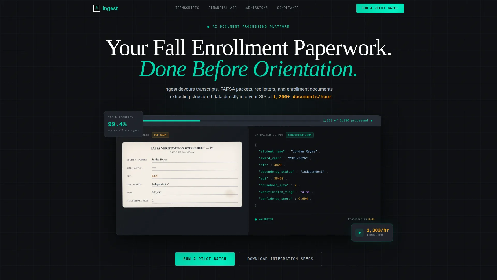
The header centers on a pixel-perfect platform screenshot mid-processing. A split view shows a scanned financial aid document on the left alongside clean extracted JSON data on the right. A real-time progress bar reading "1,247 of 3,800 documents processed" anchors the opening impression with a concrete throughput metric.
Hub and Spoke Anchor Navigation
A sticky navigation bar stays visible throughout the scroll. Each label represents a document category spoke: Transcripts, Financial Aid, Admissions, and Compliance. Clicking any label jumps directly to the corresponding spec panel, letting buyers navigate to their exact document type without reading sections irrelevant to their role.
Document Category Spec Panels
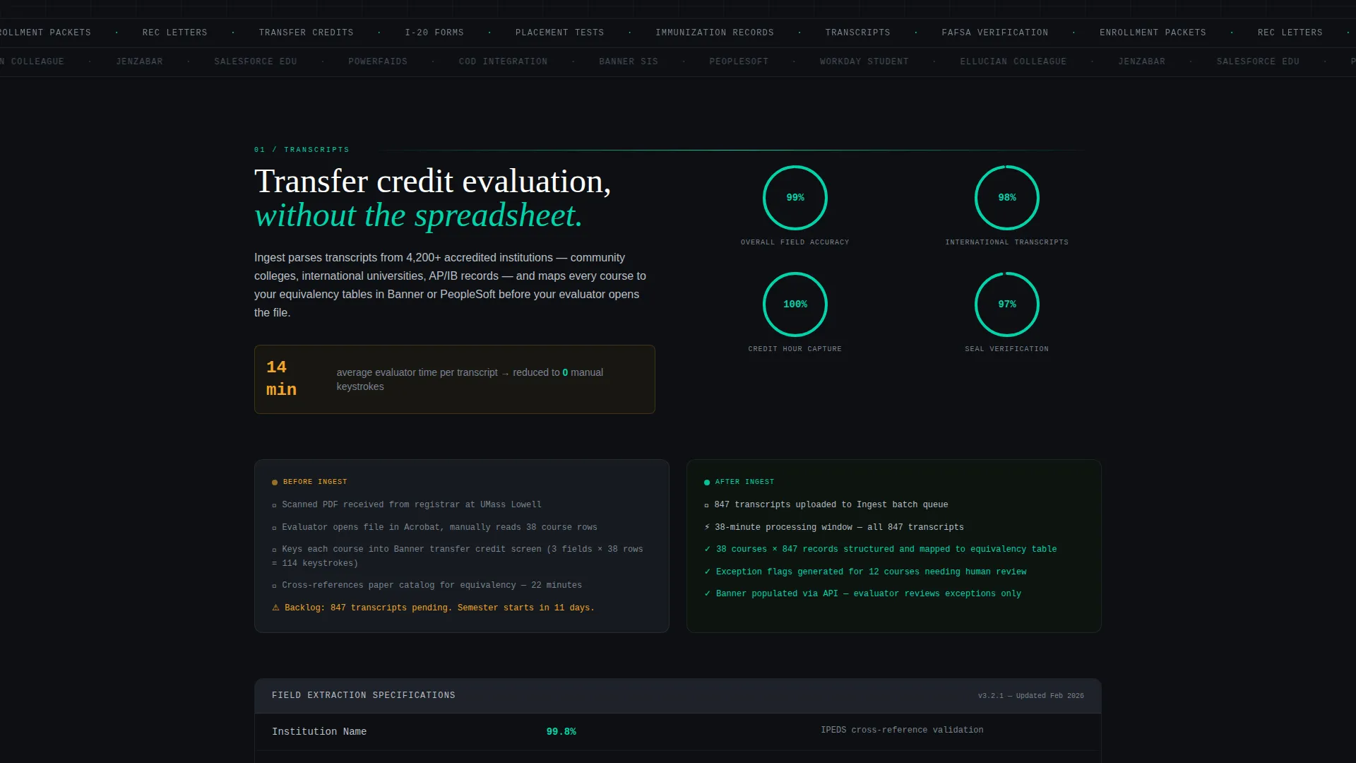
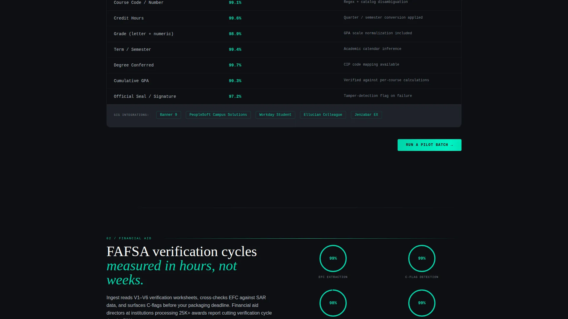
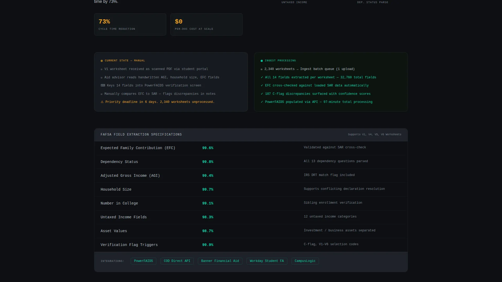
Each spoke section opens with a before-and-after layout. A messy source document sits beside its structured output. Below that, a data table presents extraction accuracy percentages, field counts, supported integrations, and processing speed for that specific document type.
Dual Conversion Path Design
The primary call to action, "Run a Pilot Batch," appears in the sticky nav and repeats at the close of every spoke section. A secondary path offers "Download Integration Specs" behind email-only capture. This serves both decision-makers and technical evaluators without forcing either into the wrong funnel.
Metric-First Lead Generation Form
The pilot batch form collects institution name, a document volume dropdown (under 5K, 5K to 25K, 25K to 100K, and 100K and above), current student information system platform, and work email. The form appears only after processing metrics and accuracy benchmarks have been presented, so the ask feels earned.
Data Command Visual Identity
The Carbon Fiber color system uses cockpit black and woven graphite as background surfaces. Status-light teal marks active states and data highlights. Warning amber is reserved strictly for metric callouts and key performance indicator numbers. Every color signals function, not decoration.
Page sections overview
| Section | Purpose |
|---|---|
| Hero Header | Anchors attention with a live-processing product screenshot and a throughput progress bar |
| Sticky Anchor Nav | Keeps document-category spokes accessible throughout the full page scroll |
| Transcripts Spoke | Delivers extraction specs, field counts, and speed data for transcript processing |
| Financial Aid Spoke | Shows FAFSA verification extraction accuracy and deadline-relevant processing metrics |
| Admissions Spoke | Covers recommendation letter and enrollment packet field recognition specifications |
| Compliance Spoke | Presents structured output specs for compliance-critical document categories |
| Pilot Batch Form | Captures institution name, volume tier, current platform, and work email |
| Integration Specs Gate | Collects email-only in exchange for downloadable technical integration documentation |
Design & branding system
The visual language is built around a Data Command theme. Every design choice reinforces the idea that color means something is alive and working, not simply decorative. The palette reads like the interior of a mission control console.
- Backgrounds stay in the cockpit black (#0D0F12) to woven graphite (#1E2229) range; teal (#00D4AA) traces data flows and interactive states; cool aluminum (#B8BFC6) carries body text; warning amber (#F5A623) is reserved exclusively for metric callouts and key performance indicator numbers
- The Carbon Fiber color system creates matte dark surfaces where teal and amber carry full visual weight, making every active element and data point immediately legible
- Device chrome frames the header screenshot against the cockpit-black background, separating the platform interface from the page itself without breaking the immersive dark aesthetic
Mobile & speed optimization
The template is structured to translate the spec-sheet experience cleanly across screen sizes. Procurement-grade content must remain readable and navigable on any device a department head might use during an evaluation.
- The sticky anchor navigation collapses appropriately for smaller viewports, keeping document-category spoke access available without crowding the screen
- Data tables inside each spoke section are formatted to remain scannable at mobile widths, preserving the technical credibility of the spec content
- The split before-and-after document layouts within each spoke section are designed to restack vertically on narrower screens without losing their comparative impact
How this template helps you convert
The conversion architecture in this template is deliberate. Proof comes before the ask. By the time a visitor sees a form, they have already seen the platform handle their exact document type at their exact volume.
- The sticky anchor nav and per-spoke "Run a Pilot Batch" calls to action keep the primary conversion path visible at every stage of the scroll, reducing friction for decision-makers who are ready to act mid-read
- The secondary "Download Integration Specs" gate captures technical evaluators at their natural decision point, building a pipeline of informed internal advocates who are not yet the final buyer
- The metric-first form sequence, starting with institution name and document volume before asking for contact details, signals that the platform conversation is about fit and scale, not just lead capture
Other information about this template
This template is a strong fit for vendors positioning AI document processing as a direct replacement for manual data entry workflows in higher education. It is also well suited for showcasing integrations with student information systems commonly used across institutional settings.
- The template style is Hub and Spoke with Anchor Navigation, a structure that suits procurement-oriented buyers who want to jump directly to the document category most relevant to their department
- The Spec Sheet creative direction is intentionally chosen to build confidence with both operational decision-makers and the technical evaluators who support them
- The Lead Generation page direction prioritizes proof delivery before contact capture, which aligns well with longer institutional sales cycles where trust must be established before a conversation begins
- The header concept is a Product Screenshot, chosen to make the platform's processing capability immediately concrete and verifiable rather than abstract or aspirational
Theme
Data Command
Creative direction
Spec Sheet
Color system
Carbon Fiber
Style
Hub & Spoke (Anchor Nav)
Direction
Lead Generation
Page Sections
Product Screenshot Hero with Live Metrics
Sticky Anchor Navigation by Document Type
Spoke-level Specification Panels
Metric-first Lead Generation Form
Gated Integration Specs Download
Data Command Carbon Fiber Color System
Related questions
Who is this landing page template designed for?
What document categories does the template cover?
How does the two-path conversion structure work?
What information does the lead generation form collect?
Can this template support platforms that integrate with multiple student information systems?



