AI Real Estate Document Processing Landing Page
Ingest is a scroll-reveal landing page template built for AI-powered real estate document processing platforms. It opens with a live dashboard hero showing a commercial lease being analyzed in real time, then guides visitors through a problem-to-solution arc that ends at a low-friction signup form. The template is sharp, clinical, and built to convert analysts and acquisition teams.
by Rocket studio
Quick summary
Ingest is a single-page, scroll-reveal landing page template designed for AI real estate document processing platforms. It opens with a live dashboard preview, walks visitors through a compelling problem-to-solution arc, and anchors conversion with a seven-metric comparison table. The layout turns complex document intelligence into a clear, scrollable case for why manual review is no longer competitive.
Who this template is for
This template is built for teams and founders who sell AI-powered document tools to commercial real estate professionals. If your platform extracts structured data from leases, appraisals, rent rolls, or closing packages, this layout speaks directly to your buyers.
- Commercial real estate AI platforms targeting analysts and acquisition teams
- Property technology founders pitching document automation to portfolio managers
- Sales and marketing teams who need a high-trust landing page before a product demo
What problem this template solves
Manual document review in commercial real estate is slow, expensive, and error-prone. Analysts spend hours combing through lease agreements line by line, and due diligence timelines stretch across days when deals demand hours.
- No clear visual contrast between the old manual process and what AI can replace
- Generic SaaS landing pages fail to connect with the specific pain of due diligence overload
- Friction-heavy signup flows lose qualified buyers before they ever see the product
What you get with this template
You get a fully structured, scroll-reveal landing page that builds a layered case for your product section by section. Every part of the layout is designed around the real estate document processing use case, from the opening dashboard hero to the final call to action.
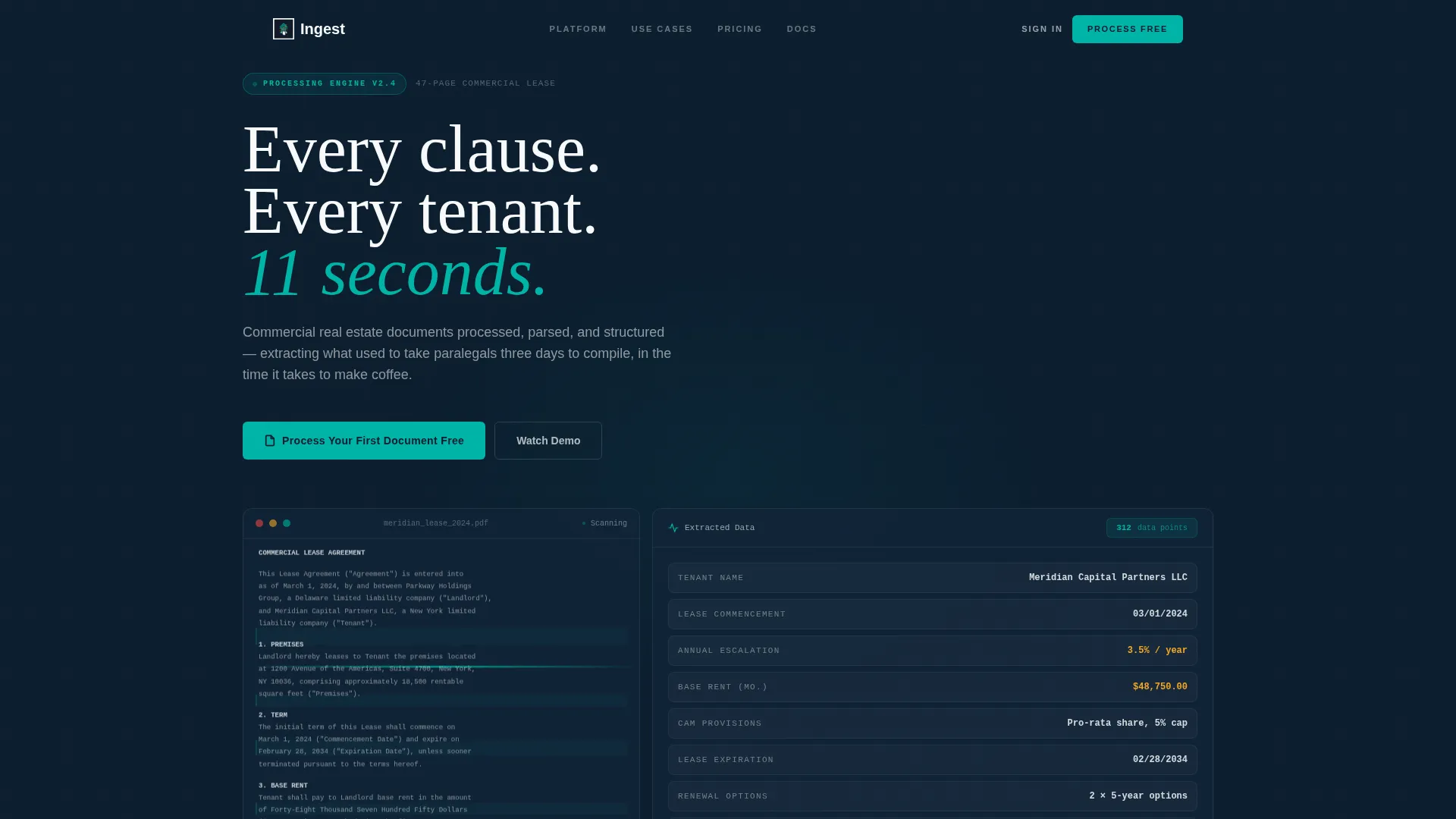
- A dashboard-style hero section with animated data extraction and a live progress bar
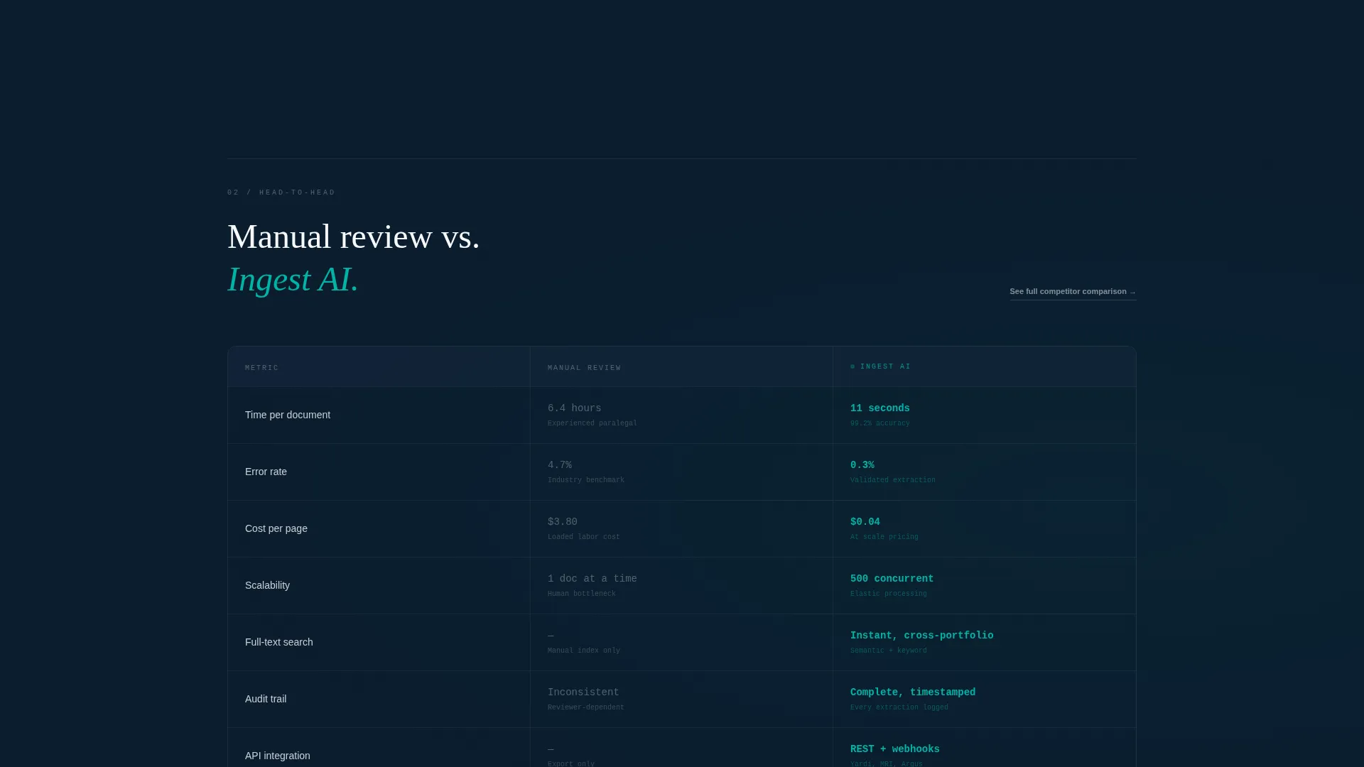
- A persistent split-view comparison table contrasting manual review against AI processing across seven metrics
- A low-friction lead capture form that asks only for work email and document type
Feature list
This template includes purpose-built sections and design patterns tuned for real estate AI document platforms. Each feature reinforces product credibility and guides the visitor toward a confident first action.
Live Dashboard Hero Section
The header opens with a rendered user interface showing a 47-page commercial lease being processed in real time. Extracted fields snap into the right panel with micro-animations, and a progress bar reads "Processing... 94%" to communicate speed and precision immediately.
Scroll-Triggered Progressive Reveal
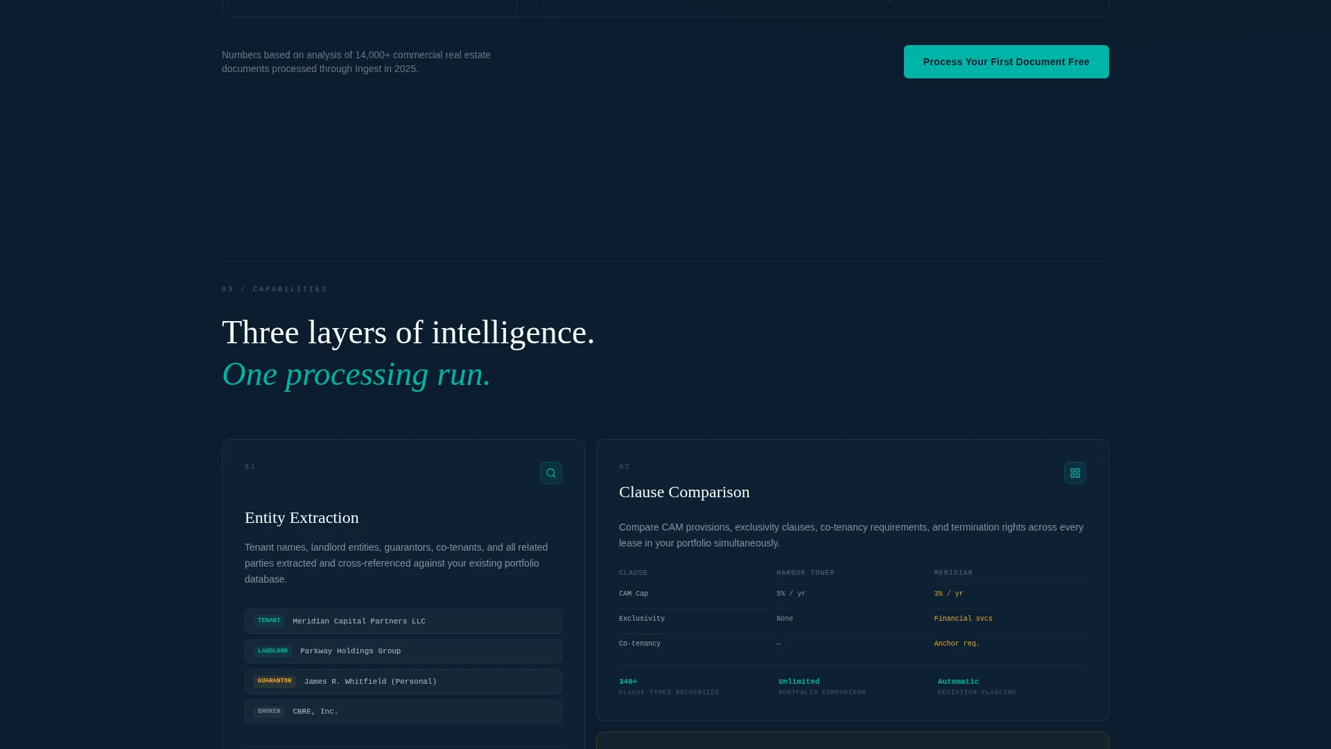
Each capability section is hidden until the visitor scrolls into it. The reveal sequence mirrors a due diligence report: entity extraction first, then clause comparison, then anomaly flagging for missing estoppels or expired insurance certificates.
Seven-Metric Comparison Table
A persistent split-view section compares manual review against AI processing across time per document, error rate, cost per page, scalability, search capability, audit trail, and integration depth. Each row animates into view as it enters the viewport.
Problem-to-Solution Arc Layout
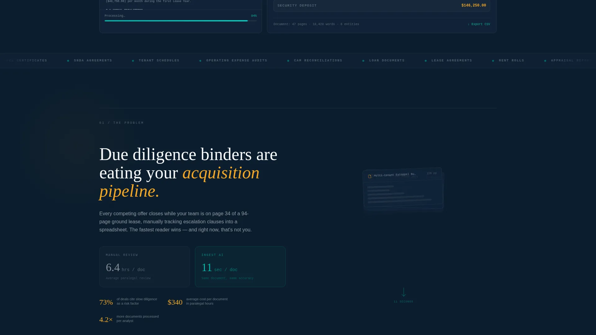
The scroll begins in the pain. A time-lapse counter shows "Average manual review: 6.4 hours per document" beside a growing stack of blurred PDFs. The next reveal shows the AI processing that same stack in 11 seconds, with fields cascading into organized columns.
Multi-Placement Call to Action
The primary call to action, "Process Your First Document Free," appears at the header, after the comparison table, and again at the page footer. A secondary path opens a detailed feature matrix modal for visitors who want a deeper side-by-side comparison.
Minimal Friction Lead Capture
The signup form asks only for work email and document type, with four document-type options: lease, appraisal, closing package, and rent roll. This single qualifying question reduces drop-off while still segmenting leads by intent.
Page sections overview
| Section | Purpose |
|---|---|
| Dashboard Hero | Shows live document processing with animated extracted fields and progress bar |
| Pain State Reveal | Displays manual review time counter beside a growing stack of blurred PDFs |
| AI Processing Demo | Contrasts the 11-second AI result against the 6.4-hour manual baseline |
| Entity Extraction | Introduces structured data output: tenant names, lease dates, escalation schedules |
| Clause Comparison | Demonstrates cross-portfolio clause comparison as a core platform capability |
| Anomaly Flagging | Highlights detection of missing estoppels and expired insurance certificates |
| Comparison Table | Splits manual versus AI across seven measurable metrics with row-by-row animation |
| Lead Capture Form | Collects work email and document type to grant sandbox access |
| Page Footer call to action | Repeats the primary call to action to capture late-scroll conversions |
Design & branding system
The visual identity follows a Directory and Discovery theme using the Teal Catalyst color system. The palette feels clinical and precise, like a freshly indexed database glowing on a monitor after hours.
- Deep document navy (#0B1D2E) as the primary background, clean paper white (#F7F9FA) for content surfaces, and catalyst teal (#00B4A6) pulsing on every interactive element like a live processing indicator
- Warm highlight amber (#F5A623) reserved specifically for extracted data points and field values, making AI output visually distinct from interface chrome
- No stock photography and no illustration; the product user interface is the hero visual throughout the entire page
Mobile & speed optimization
The scroll-reveal layout is structured to remain readable and engaging on smaller screens. Progressive disclosure keeps the page feeling uncluttered even on mobile viewports where a dense dashboard would otherwise overwhelm.
- Micro-animations and viewport-triggered reveals are scoped to avoid layout thrash on smaller devices
- The comparison table is designed to adapt its split-view layout for narrower screen widths
- The lead capture form is minimal by design, keeping tap targets clean and the conversion path short
How this template helps you convert
Every design and copy decision in this template is built around moving a skeptical real estate professional from "interesting" to "I need to try this."
- The dashboard hero places the product front and center within the first viewport, showing processing in action before a single word of marketing copy is read.
- The problem-to-solution arc earns trust progressively, matching how analysts actually evaluate tools: pain acknowledged first, proof delivered second.
- Three placements of the primary call to action combined with a two-field form mean that any visitor who reaches decision intent encounters zero unnecessary barriers.
Other information about this template
This template is built as a single-page scroll-reveal layout, not a multi-page site. It is designed to function as a standalone campaign or product launch page for AI real estate document platforms.
- The template style is classified as Scroll Reveal (Progressive), meaning sections animate into view as the visitor scrolls rather than loading all at once
- The creative direction follows a Problem to Solution Arc, a structure well-suited to technical products where buyer skepticism is high and proof must be layered
- The header concept is a Dashboard Preview, placing the product interface directly in the hero rather than relying on lifestyle imagery or abstract graphics
- The landing page direction is Comparison and Versus, making it particularly effective for platforms competing against established manual workflows or legacy review tools
- The theme is Directory and Discovery, which informs the structured, data-forward visual language used throughout the layout
Theme
Directory & Discovery
Creative direction
Problem→Solution Arc
Color system
Teal Catalyst
Style
Scroll Reveal (Progressive)
Direction
Comparison/Versus
Page Sections
Live Dashboard Hero with Micro-animations
Scroll-triggered Progressive Section Reveals
Seven-metric AI Versus. Manual Comparison Table
Problem-to-solution Arc with Time-lapse Counter
Three-placement Primary Call to Action
Two-field Minimal Lead Capture Form
Related questions
What type of product is this template designed for?
Can I adapt the comparison table metrics to fit my own platform?
Does the template include the animated dashboard visuals?
Who is the primary audience this landing page targets?
What does the lead capture form collect?



