Restaurant AI Document Processing Landing Page
Ingest is a split-screen landing page template built for a restaurant AI document processing platform. It opens with animated stat counters, walks visitors through live document transformations, and drives app downloads with a sticky call-to-action bar. The design uses an Acid Digital color palette to make data extraction feel fast, credible, and unmissable.
by Rocket studio
Quick summary
Ingest is a single-page landing page template designed for a restaurant AI document processing platform. It pairs a Feature Tab Switcher header with a Stats-First Impact layout to move visitors from skepticism to download in one scroll. The Acid Digital color system makes every metric pop. The primary goal is a clear, confident app download prompt.
Who this template is for
This template is built for teams launching or marketing an AI-powered document processing tool aimed at the restaurant industry. It speaks directly to buyers who already know their audience has a paper problem.
- Multi-unit restaurant operators who manage invoices and permits across several locations
- Independent restaurant owners who lose track of delivery slips and vendor contracts
- Accountants and finance teams spending dozens of hours monthly reconciling food costs
What problem this template solves
Restaurant back-office operations are buried in paper. Invoices get lost between the walk-in cooler and the office desk. Health permits pile up in folders. Vendor contracts go unsigned or unfiled. This template gives a platform like Ingest a landing page that makes the chaos visible and the solution obvious before the visitor scrolls past the first section.
- Visitors arrive skeptical; the stat counter hits them with 2.4 million documents processed before they read a word
- The tab switcher proves breadth across invoices, permits, and contracts in three clicks
- The sticky download bar keeps the app call-to-action present without interrupting the scroll
What you get with this template
You get a fully structured, single-page landing page layout designed around conversion through proof. Every section is sequenced deliberately: stats first, visual evidence second, download prompt last.
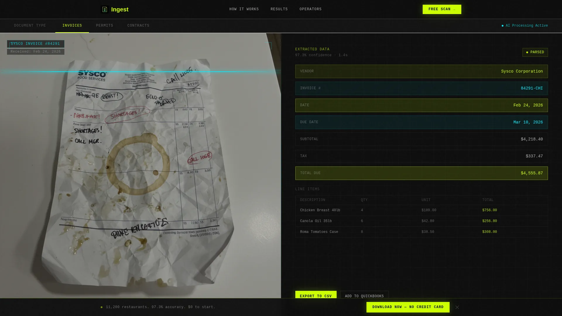
- A 50/50 split-screen header with a Feature Tab Switcher showing real document photography alongside extracted data fields
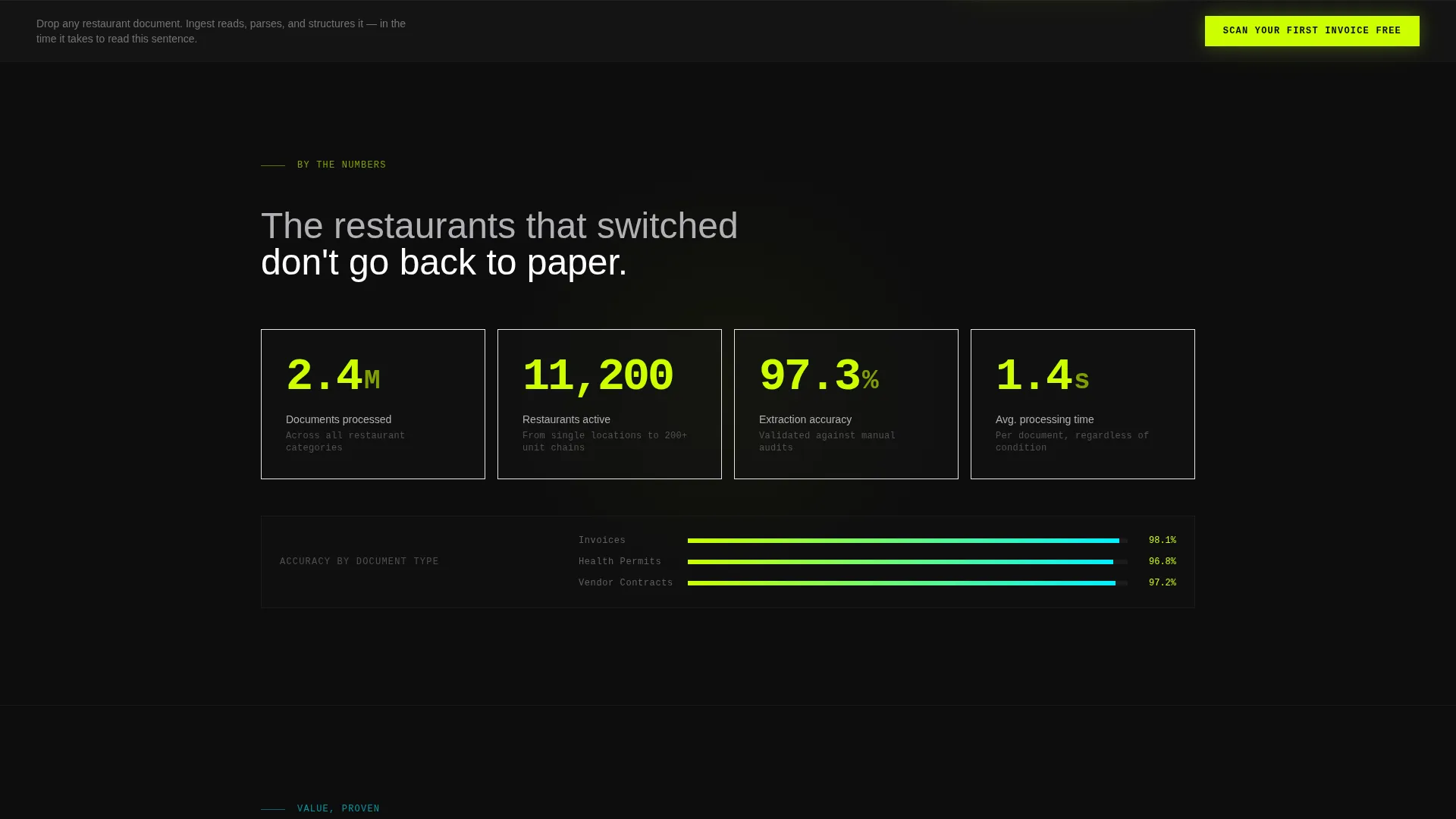
- An animated stat counter opening section with three headline metrics rendered in chartreuse on black
- A sticky secondary call-to-action bar that appears after the second scroll section and persists through the rest of the page
Feature list
This template is built around a small number of high-impact layout components. Each one earns its place by advancing the visitor toward the download tap.
Feature Tab Switcher Header
Three clickable tabs labeled "Invoices," "Permits," and "Contracts" sit above a split viewport. The left side shows a photograph of the actual document. The right side shows the parsed, structured data output. Switching tabs updates both sides at once, proving document coverage in three clicks.
Animated Stat Counter Section
The page opens with three large animated counters: 2.4 million documents processed, 11,200 restaurants served, and 97.3 percent extraction accuracy. Numbers count upward on entry using chartreuse digits on a void black background. This section creates immediate credibility before the visitor reads any descriptive copy.
Stats-First Proof Rhythm Layout
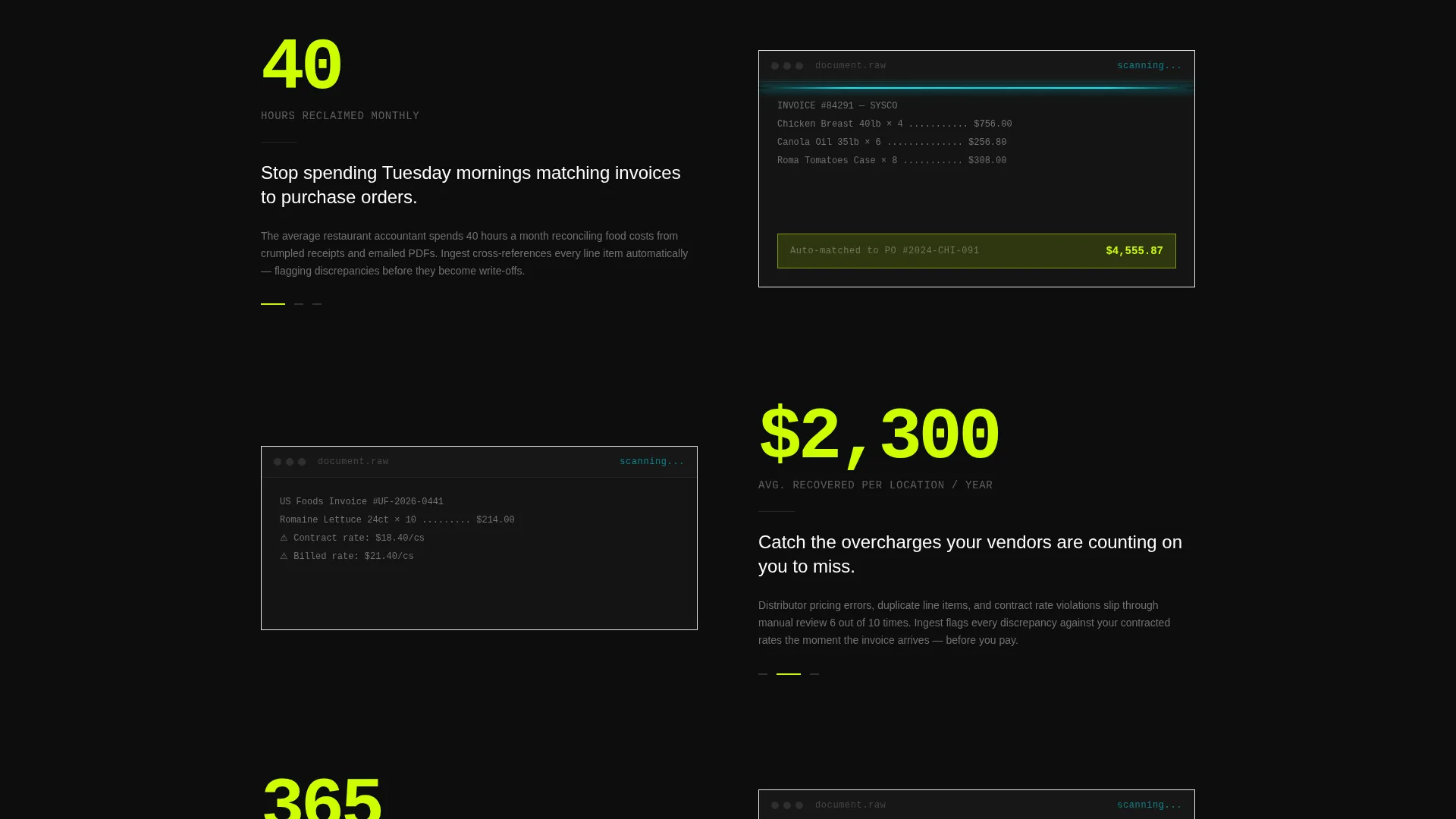
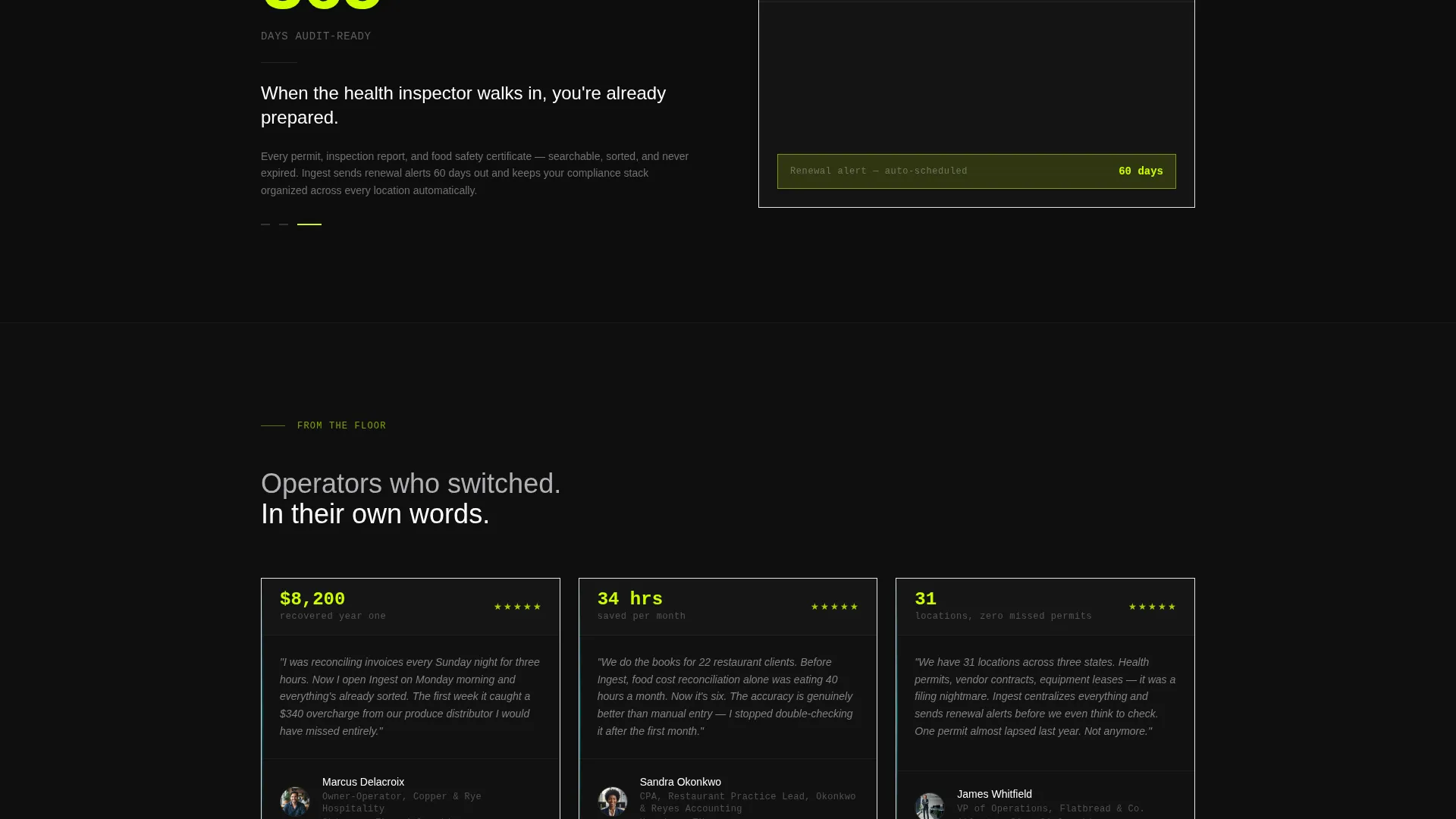
Each subsequent section pairs a bold single metric on the left with a looping visual on the right. Metrics escalate from average processing time to cost savings per location to hours reclaimed monthly. The rhythm is consistent: number-hit, then proof, then the next number-hit.
Primary App Download Call-to-Action
The main call-to-action reads "Scan Your First Invoice Free" and sits above paired App Store and Google Play badges. This placement comes after six stats and three document transformation visuals, reducing perceived risk before the visitor taps.
Sticky Secondary Call-to-Action Bar
After the second scroll section, a sticky bar appears at the top of the viewport. It reinforces the download message with "Download Now - No Credit Card." It stays visible for the remainder of the scroll without blocking content.
Split-Screen Document Proof Sections
Each proof section uses the 50/50 split layout. One side shows a looping animation of a document being scanned, parsed, and filed. The other side presents the extracted output in clean, labeled fields with acid-green highlights pulsing on recognized elements.
Page sections overview
| Section | Purpose |
|---|---|
| Tab Switcher Header | Introduce document categories and show live data extraction side by side |
| Animated Stat Counter | Open with three headline metrics to establish immediate platform credibility |
| Processing Time Proof | Pair average processing time metric with a scanning animation |
| Cost Savings Proof | Show per-location cost recovery metric alongside visual document output |
| Hours Reclaimed Proof | Highlight monthly time savings metric with a document-filed animation |
| Primary call to action Block | Present the main app download prompt with App Store and Google Play badges |
| Sticky Download Bar | Reinforce the download call-to-action persistently from scroll section two onward |
Design & branding system
The Acid Digital color system is built around contrast and legibility. Void black dominates every background, making the neon accents impossible to miss. The overall feel is a document passing under a flatbed scanner at midnight.
- Void black (#0D0D0D) fills all backgrounds; electric chartreuse (#CCFF00) fires on call-to-action buttons, stat digits, and key metric labels
- Scanner-line cyan (#00F0FF) traces progress bars, document outlines, and extraction highlights throughout the proof sections
- Soft terminal gray (#B0B0B4) handles all body paragraph text, keeping prose readable without competing with neon accents
Mobile & speed optimization
The layout is structured so that the 50/50 split collapses cleanly into a single-column stack on smaller screens. The sticky call-to-action bar is designed to remain functional and visible on mobile viewports throughout the scroll.
- Split-screen sections reflow to full-width stacked blocks on narrow screens, keeping document photography and extracted data both legible
- The sticky download bar is positioned to avoid blocking the main content column on mobile displays
- Animated counters and looping document visuals are designed as lightweight layout components to keep the scroll experience smooth
How this template helps you convert
This template sequences proof before the ask. By the time a visitor reaches the app download prompt, they have already seen six data points and three live document transformations.
- The stat counter section establishes volume and accuracy claims in the first viewport, removing the most common early objection before the visitor scrolls
- The escalating proof rhythm builds cumulative trust across time saved, money recovered, and audit readiness, so each section adds weight to the final download tap
- The sticky call-to-action bar ensures the download prompt is always one tap away without requiring the visitor to scroll back up
Other information about this template
This template fits within the broader category of AI for restaurant technology landing pages. It is designed specifically for platforms operating in the restaurant AI document processing niche, where the audience is often time-poor and skeptical of new software.
- The Directory and Discovery theme keeps the layout clean and navigable despite a high volume of visual proof elements
- The template style is a true 50/50 split screen, meaning both halves carry equal visual weight and neither side dominates the layout
- The page is designed to drive app downloads as the single conversion goal, with no competing secondary offers or navigation links that might pull visitors away
Theme
Directory & Discovery
Creative direction
Stats-First Impact
Color system
Acid Digital
Style
Split Screen (50/50)
Direction
App Download
Page Sections
Feature Tab Switcher Header
Animated Stat Counter Opening
Stats-first Proof Rhythm Layout
Primary App Download Block
Sticky Secondary Call-to-action Bar
Split-screen Document Proof Sections
Related questions
What type of platform is this template designed for?
Can I change the tab labels in the Feature Tab Switcher?
Does this template support both App Store and Google Play download links?
How does the sticky call-to-action bar behave on scroll?
Is this a single-page layout or a multi-page template?



