Ingest - Powerful Streamprocessing Landing Page Template
Ingest is a stream processing newsletter landing page built for senior data engineers and platform teams who need signal, not noise. The hub and spoke layout guides visitors from the problem of information overload through a curation methodology, an interactive stack comparison table, community proof, and a gated subscribe form, all wrapped in a purposeful dark terminal aesthetic.
by Rocket studio
Quick summary
Ingest is a single-page newsletter and community landing page for the stream processing ecosystem. It turns the chaos of changelogs, benchmarks, and migration debates into a five-minute weekly read. The layout uses anchor navigation to guide visitors through five focused spokes, ending at a conversion-optimized subscribe form with progressive email capture.
Who this template is for
This template is built for creators and operators running technically focused newsletters or communities in the data infrastructure space. It speaks directly to audiences who evaluate tooling seriously and want substance before they subscribe.
- Senior data engineers who track stream processing releases and need a reliable filter
- Platform teams deciding whether to replace legacy messaging infrastructure
- Startup technical leads who must choose a streaming backbone before fundraising pressure forces a rushed call
What problem this template solves
Most newsletter landing pages fail technical audiences. They lead with vague value propositions and generic hero images. Engineers want evidence, not enthusiasm. This template makes the information overload problem visible and then demonstrates exactly how it is solved.
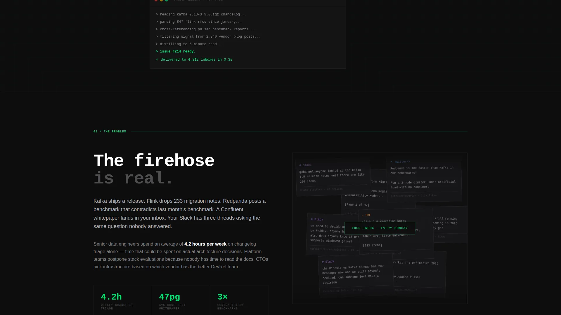
- Visitors immediately recognize the noise problem through a visual wall of real clutter: overlapping threads, long whitepapers, contradictory benchmarks
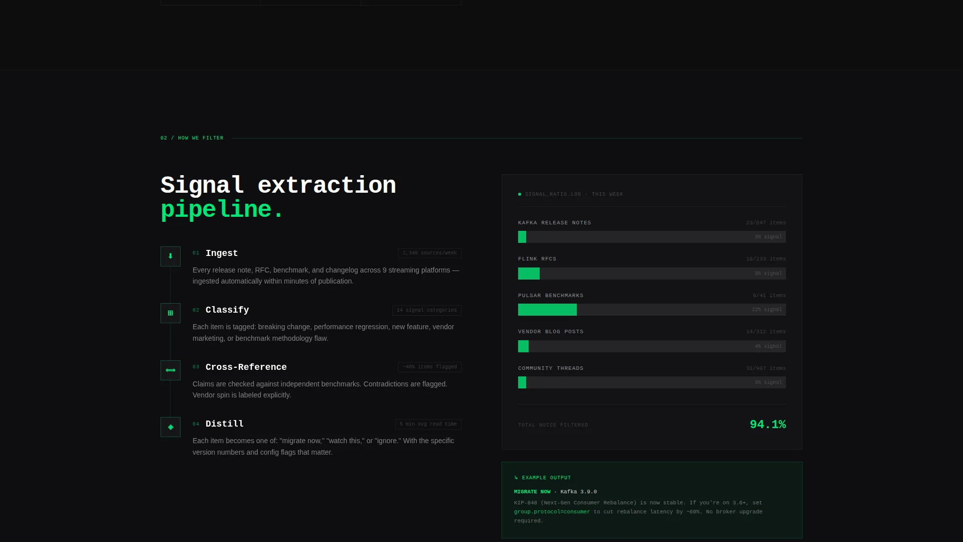
- The curation methodology spoke gives the newsletter credibility before asking for an email
- The gated comparison table creates a direct incentive to subscribe rather than just browsing
What you get with this template
You get a complete, section-led landing page with five anchor-navigated spokes, a dark terminal visual identity, and a conversion path built around a gated interactive table. Every component serves the newsletter's core promise of signal over noise.
- A sticky anchor nav with five labeled spokes that pin to the top on scroll
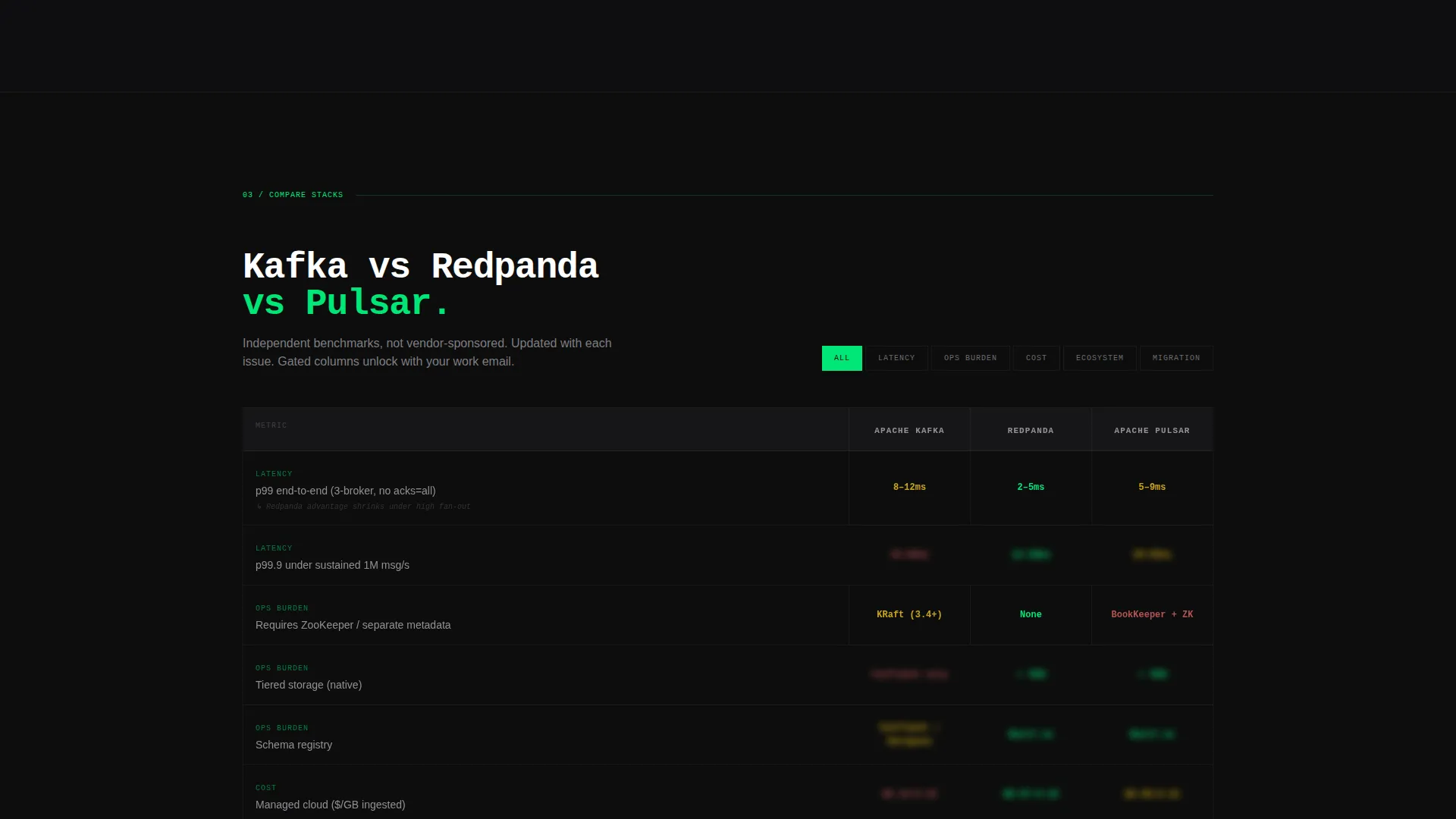
- An interactive stack comparison table with blurred columns that unlock after email entry
- A two-path subscribe form using progressive disclosure: work email first, then optional company size and current stack
Feature list
This template ships with the following built-in components and design features derived directly from the source brief.
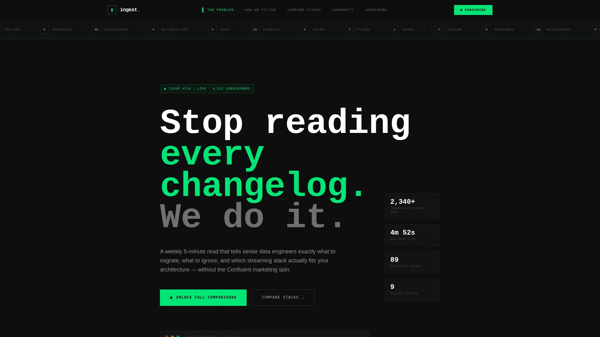
Sticky Anchor Navigation Bar
Five spoke labels pin to the top of the viewport as visitors scroll. Each label links directly to its section: The Problem, How We Filter, Compare Stacks, Community, and Subscribe. The telemetry green highlight tracks the active spoke.
Logo Bar Header
A horizontal ticker displays clean monochrome logos for every stream processing technology the newsletter covers. The ticker scrolls once and then locks into a static grid. No hero image is used, keeping focus on the ecosystem itself.
Interactive Stack Comparison Table
Visitors can toggle between streaming platforms across latency, operational burden, and cost columns. The full benchmark data is blurred by default. Entering a work email unlocks all columns, making the table the primary conversion engine on the page.
Visual Information Overload Section
The first content spoke renders a deliberate wall of clutter: overlapping message threads, multi-page whitepapers, and contradictory benchmark screenshots. The effect is visceral and immediate, making the newsletter's value obvious without a single word of explanation.
Progressive Disclosure Subscribe Form
The form asks for work email first. A second step optionally collects company size and current streaming stack. This qualifies subscribers without creating friction at the point of entry.
Dual Call-to-Action Path
The primary call to action, "Unlock Full Comparisons," sits in telemetry green directly on the blurred table columns. A secondary option, "Just the Newsletter," is styled in an aluminum outline below for visitors who want the weekly digest without the tooling deep-dives.
Page sections overview
| Section | Purpose |
|---|---|
| Logo Bar Header | Displays covered stream processing technologies as a static monochrome grid |
| Tagline Strip | Delivers the single-line newsletter promise beneath the logo bar |
| The Problem | Visualizes information overload with screenshot clutter to build immediate empathy |
| How We Filter | Explains the curation methodology to establish editorial credibility |
| Compare Stacks | Houses the interactive, gated comparison table as the main conversion engine |
| Community Proof | Shows engineer testimonials from readers who made stack decisions based on the newsletter |
| Subscribe Form | Captures work email with optional progressive fields for company size and current stack |
Design & branding system
The visual identity follows a Directory and Discovery theme using a Carbon Fiber color system. Every color decision reinforces the terminal environment metaphor: dark backgrounds, purposeful accents, and readable prose that never competes with the interface.
- Deep chassis black (#0D0D0D) and brushed graphite (#2A2A2E) lock all backgrounds in darkness, giving the page the feel of a rack-mounted server environment at night
- Telemetry green (#00E676) drives all live accents, including call-to-action buttons, hover states, and the active anchor nav indicator
- Muted aluminum (#B0B0B8) carries all body text and secondary labels, keeping prose readable without pulling attention away from green highlights
Mobile & speed optimization
The layout is built as a single-page flow with section-anchored navigation, which keeps the structure lean and scroll-friendly on any screen size. The dark background system avoids heavy image loading, and the logo bar transitions from a scrolling ticker to a static grid to reduce motion on smaller viewports.
- The sticky anchor nav compresses cleanly for narrow screens, keeping spoke labels accessible throughout the scroll journey
- The comparison table is designed for toggle interaction, which works with both mouse and touch input
- The progressive disclosure form limits visible fields on first render, reducing visual complexity on mobile
How this template helps you convert
The entire page is structured as a Problem to Solution arc that builds trust before it asks for anything. Conversion is not a single moment; it is the result of each spoke doing its job in sequence.
- The visual overload section creates immediate recognition of the pain, making visitors feel understood before the newsletter even introduces itself
- The curation methodology spoke earns credibility by showing the editorial process, so the subscribe ask feels earned rather than cold
- The gated comparison table gives technically minded visitors a concrete, self-interested reason to enter their email rather than just lurking
Other information about this template
This template is part of the Hub and Spoke landing page family, which uses a sticky anchor navigation structure to organize long-form single-page content into scannable, jump-friendly segments. It is suited to technically focused newsletter operators who want their page to reflect the quality and discipline of their editorial work.
- The template style is classified as Hub and Spoke with Anchor Nav, making it well suited for content-rich single-page experiences that need clear wayfinding
- The creative direction follows a Problem to Solution Arc, a narrative structure that works particularly well for niche infrastructure and developer tooling newsletters
- The Comparison and Versus landing page direction means the interactive table is the structural centerpiece, not a secondary feature
- This template fits naturally within the broader stream processing newsletter and community niche, where audiences are comparison-driven and skeptical of generic marketing copy
Theme
Directory & Discovery
Creative direction
Problem→Solution Arc
Color system
Carbon Fiber
Style
Hub & Spoke (Anchor Nav)
Direction
Comparison/Versus
Page Sections
Sticky Anchor Navigation with Five Spokes
Logo Bar with Ecosystem Grid
Gated Interactive Stack Comparison Table
Visual Information Overload Section
Progressive Disclosure Subscribe Form
Dual Call-to-action Design
Related questions
Who is this landing page template designed for?
How does the gated comparison table work?
Can I customize the streaming technologies shown in the logo bar?
Is this template only for newsletters, or does it support a community as well?
Do I need coding knowledge to edit this template?



