Ingest - Powerful Time Series Database Landing Page Template
Ingest is a card grid landing page template built for a time series database newsletter and community. It combines a Data Command visual theme with glassmorphic panels, an animated dashboard header, and a Problem-to-Solution scroll arc. The design guides engineers from pain point to community resource, ending with a clear app download call to action.
by Rocket studio
Quick summary
Ingest is a single-page, modular card grid template designed for a time series database newsletter and community hub. It opens with an animated monitoring dashboard, walks visitors through a Problem-to-Solution content arc, and closes with a dual call to action for app download and email subscription. The result feels like a well-tuned observability interface: structured, purposeful, and alive.
Who this template is for
This template is built for the engineers and technical operators who live inside observability pipelines. If you publish content for people who debug infrastructure at odd hours, this layout speaks their language.
- Site reliability engineers (SREs) who manage time series database clusters and respond to on-call alerts
- Platform engineers evaluating database migration paths and benchmarking competing tools
- Data architects and newsletter operators serving a technically demanding, infrastructure-focused audience
What problem this template solves
The time series database space is dense. Dozens of competing tools, shifting benchmarking standards, and a constant flood of timestamped data make it hard for practitioners to know what actually matters. A generic newsletter page would not earn trust from this audience.
- Readers need a landing page that signals technical depth before they commit to a download or subscription
- Standard templates lack the visual language that resonates with infrastructure engineers and on-call operators
- There is no obvious single page that connects a painful industry problem to a structured community solution
What you get with this template
You get a fully structured, single-page layout that moves visitors deliberately from problem recognition to conversion. Every section has a clear job, and the visual system reinforces the content arc without distraction.
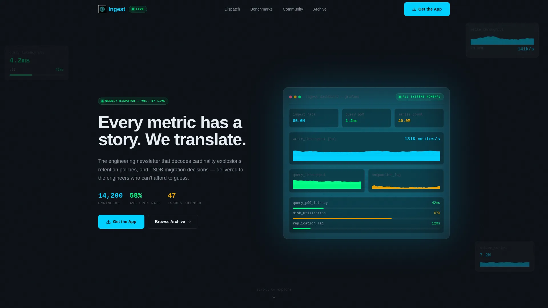
- An animated dashboard header with live-style ingestion counters, sparkline charts, and a self-typing headline
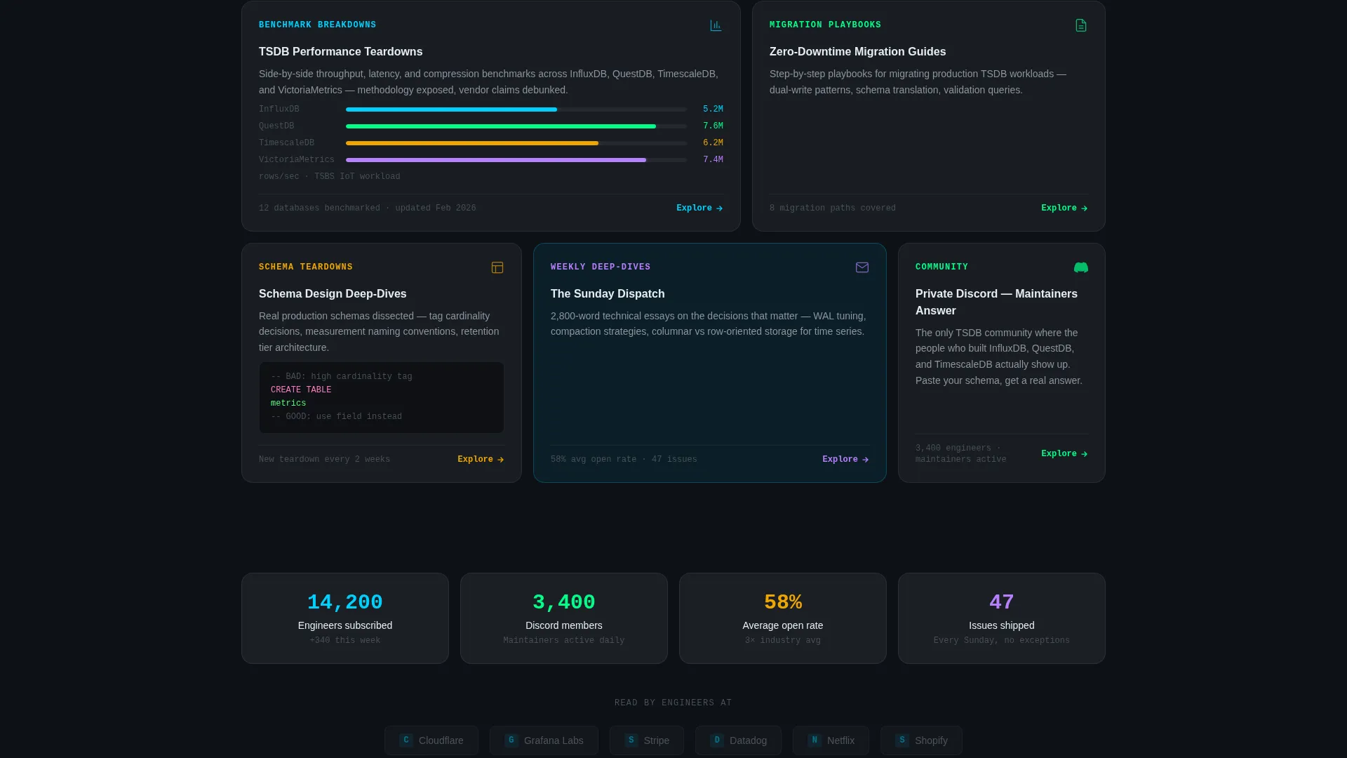
- A modular card grid where each frosted glass panel introduces one community resource or content category
- A dual conversion section with app download platform toggles and an inline email subscription option, plus three newsletter preview cards
Feature list
This template packs several purpose-built design and layout features, all drawn from the Data Command brief.
Animated Dashboard Header
The full-viewport header renders a stylized monitoring dashboard with sparkline charts ticking upward, ingestion rate counters incrementing, and query latency gauges holding in the green. A self-typing headline overlays the dashboard: "Every metric has a story. We translate." The header does not use a static screenshot; it animates on load and breathes as the visitor arrives.
Glassmorphic Card Grid
Each content card is built as a frosted translucent panel using deep terminal black as the base and white fills at very low opacity with soft blur backdrops. Cards overlap at staggered depths and parallax-shift subtly on scroll, giving the grid a layered, mission-control feel without cluttering the layout.
Problem-to-Solution Scroll Arc
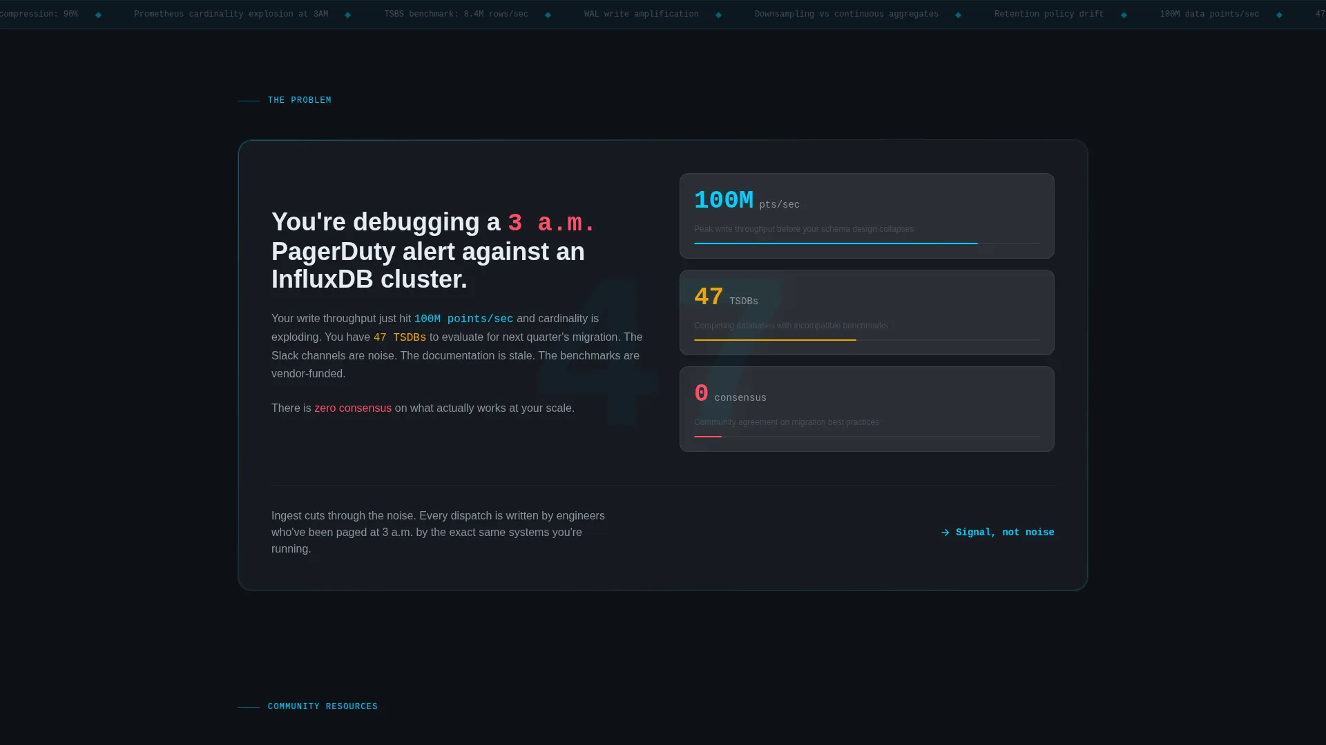
The page is structured as a deliberate narrative. Scrolling past the header places the visitor in front of a single "The Problem" card that anchors the stakes with a sharp data point. Subsequent cards each resolve one layer of complexity, from benchmark breakdowns to migration playbooks, building toward the conversion section.
Stagger-Reveal Card Animation
Cards reveal progressively as the visitor scrolls, with each panel appearing slightly more luminous than the previous one. This visual progression reinforces the editorial concept of signal emerging from noise, keeping readers engaged through the full page length.
Newsletter Preview Cards
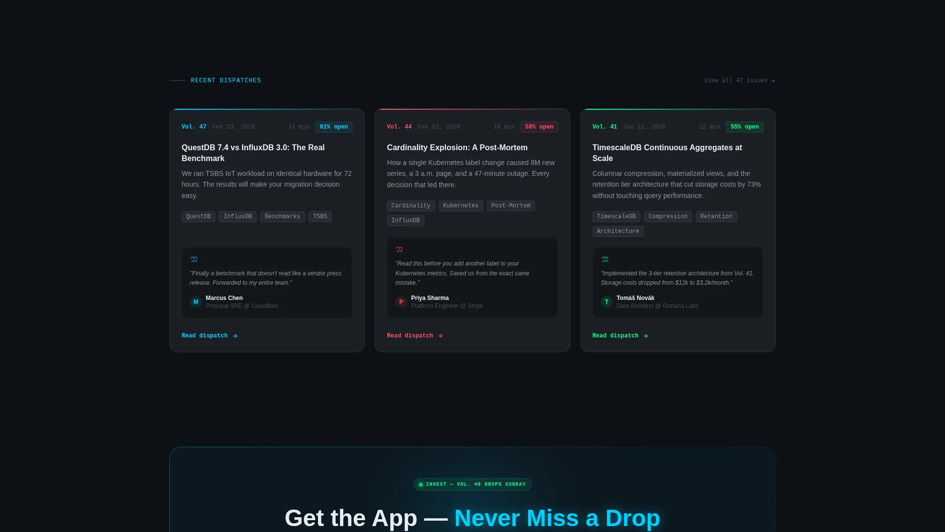
Three sample newsletter edition cards are embedded above the primary call to action. Each card surfaces an edition title, open rate, and a reader quote. This section builds credibility and proves content value before asking for an app install or subscription.
Dual Conversion Section
The conversion area offers two paths. The primary call to action uses frosted pill-shaped toggle buttons for iOS and Android app downloads. A secondary inline option captures email subscribers who prefer the web digest format.
Page sections overview
| Section | Purpose |
|---|---|
| Animated Dashboard Header | Opens with live-style charts and a self-typing headline to establish tone |
| The Problem Card | Anchors reader pain with a single sharp metric to set the stakes |
| Community Resource Cards | Each card resolves one layer of complexity through curated content types |
| Newsletter Preview Cards | Shows real edition samples with open rates and reader quotes to build trust |
| App Download Section | Primary call to action with iOS and Android toggles and a secondary email subscribe option |
Design & branding system
The visual identity follows a Data Command theme built on a glassmorphic color system. Every color choice has a functional meaning, mimicking a live monitoring interface rather than a decorative design.
- Deep terminal black (#0D1117) as the primary background, electric cyan (#00D1FF) for interactive accents and live-state highlights, and muted signal gray (#8B949E) for secondary text and gridline elements
- Frosted translucent panels at 6 to 8 percent white opacity with soft blur backdrops form each card, creating layered depth without visual noise
- Staggered card depths and subtle parallax scrolling reinforce the mission-control aesthetic throughout the page
Mobile & speed optimization
The modular card grid layout adapts across screen sizes by design. The stacked structure of the cards and the section-led scroll arc translate naturally from desktop to mobile without losing hierarchy.
- Frosted glass panels and the card grid reflow cleanly for smaller viewports, keeping the content arc intact on mobile
- Animated elements in the header, including sparklines and counters, are scoped to the viewport to avoid layout disruption on narrower screens
How this template helps you convert
The page is built around a single conversion goal: earn the app download before asking for it. Every design and content decision serves that goal.
- The animated dashboard header immediately signals technical credibility, so skeptical engineers do not bounce before reading the value proposition
- The Problem-to-Solution card arc walks visitors through the community's full value before the call to action appears, reducing friction at the conversion point
- Newsletter preview cards with open rates and reader quotes provide social proof specific to this audience, making the final app download or email subscribe decision feel low-risk
Other information about this template
This template is categorized under Technology, with a focus on the time series database technology subcategory and the time series database newsletter and community niche. It is a strong fit for publishers and community operators working in observability, infrastructure tooling, and developer-focused media.
- The template style is a card grid (modular) layout, making it straightforward to add, remove, or reorder resource cards as a community grows
- The theme and creative direction are intentionally opinionated: Data Command aesthetics and a Problem-to-Solution arc are built in, not bolted on
- This template suits operators building content properties around topics like cardinality management, retention policies, downsampling strategies, schema design, and benchmarking in the time series database space
Theme
Data Command
Creative direction
Problem→Solution Arc
Color system
Glassmorphic
Style
Card Grid (Modular)
Direction
App Download
Page Sections
Animated Live-style Dashboard Header
Glassmorphic Card Grid Layout
Problem-to-solution Content Arc
Stagger-reveal Scroll Animation
Newsletter Edition Preview Cards
Dual Conversion Call to Action
Related questions
Can I update the newsletter preview cards with my own edition content?
Does this template support both app download and email subscription options?
Is this template a good fit if I do not have a mobile app yet?
How does the Problem-to-Solution scroll arc work?
Can I add more resource cards to the grid as my community grows?



