Advanced Tech & AI Platforms Comparison Website Template
Ingest is a bento grid landing page template built for data management platforms. It uses a dark Data Command visual theme to set up a sharp comparison between legacy data workflows and modern streaming pipelines. Every tile in the grid quantifies the gap, so visitors understand the cost of standing still before they ever reach the call to action.
by Rocket studio
Quick summary
Ingest is a single-page, bento grid landing page template designed for data management platforms. It frames every section as a direct confrontation between the old way of handling data and a faster, smarter alternative. The dark cockpit aesthetic and metric-driven versus tiles build credibility fast, guiding adtech directors, marketing operations leads, and enterprise data executives toward a demo request.
Who this template is for
This template is built for companies selling data management platform solutions to sophisticated enterprise buyers. If your audience already lives inside fragmented data pipelines and knows the pain firsthand, this template speaks their language without needing to explain the basics.
- Adtech directors managing fragmented audience taxonomies across multiple ad servers
- Marketing operations professionals who currently stitch data exports together manually
- Enterprise Chief Data Officers who need a single consolidated view before presenting to leadership
What problem this template solves
Most data platform landing pages describe features. This template quantifies the cost of not switching. Each bento tile in the grid pairs a legacy workflow problem with a concrete metric delta, so the visitor builds a mental cost calculation as they scroll.
- Batch processing delays and 48-hour segment refresh cycles make real-time activation impossible
- Manual taxonomy mapping burns engineering and operations hours that compound over time
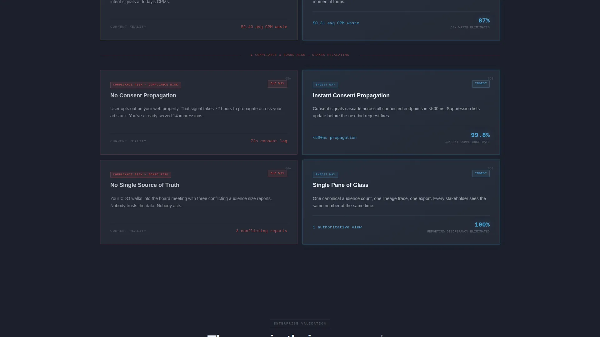
- Fragmented data sources prevent unified audience views, creating compliance and revenue risk
What you get with this template
You get a fully structured bento grid landing page that uses escalating confrontation as its scroll mechanic. The layout is purpose-built for a Comparison/Versus conversion strategy, with two distinct calls to action and a secondary lead capture path for visitors who are not yet ready to talk.
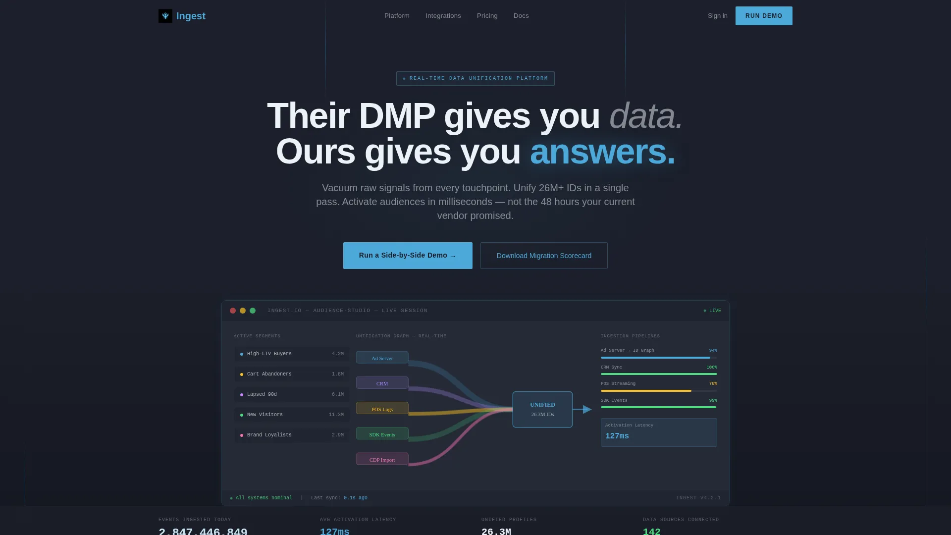
- A full-width product screenshot header with an isometric-tilted dashboard visual and a bold headline
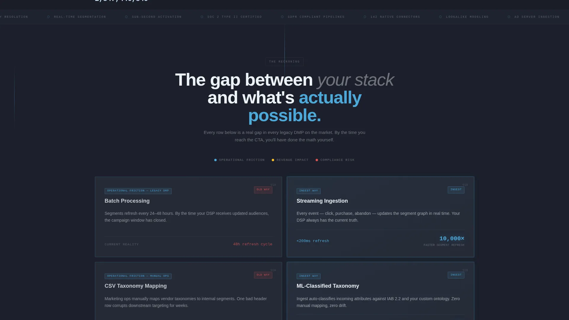
- A multi-row bento grid of versus tiles, each with a concrete metric delta comparing old workflows to the Ingest approach
- Two primary call-to-action placements for demo requests, plus a gated PDF download path for mid-funnel visitors
Feature list
This section describes the core design and structural features included in the Ingest template.
Versus Bento Grid Layout
The page is structured as a bento grid where each tile is a direct head-to-head comparison. Left cells show the legacy approach. Right cells show the modern alternative. Every row raises the stakes, moving from inconvenience to revenue loss to compliance risk as the visitor scrolls deeper.
Metric-Driven Tile Copy
Each versus tile includes a concrete metric delta rather than a vague claim. Specific numbers anchor the comparison, so visitors calculate the business gap themselves before the call to action appears. This structure removes the need for aggressive sales copy.
Product Screenshot Hero Header
The header uses a full-width, isometric-tilted screenshot of a live data management platform dashboard. The visual shows audience segments in a Sankey diagram, ingestion pipelines, and a real-time unification counter. The product image serves as the primary credibility signal, not decorative illustration.
Dual Call-to-Action Architecture
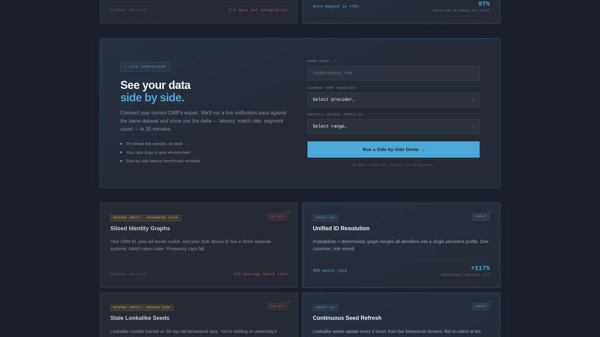
The primary call to action, a side-by-side demo request form, appears after the third bento row and again at the base of the page. The form collects work email, current platform provider, and estimated monthly unique profile volume. A secondary path offers a gated PDF migration scorecard for visitors who prefer to evaluate before committing.
Launch Energy Scroll Mechanic
The page uses escalating confrontation as its scroll narrative. Each bento row increases urgency, turning a product comparison into a decision framework. By the time a visitor reaches the bottom call to action, they have already processed the cost of their current setup.
Data Command Visual Theme
The entire layout uses a dark, operations-room color system built from deep charcoal, gunmetal slate, sky blue active states, and ice white card surfaces. Typography and data highlights feel like a radar screen at altitude, calm and precise, where every flash of blue signals something meaningful.
Page sections overview
| Section | Purpose |
|---|---|
| Hero Header | Displays product screenshot with bold headline to establish immediate credibility |
| Versus Row One | Contrasts batch processing with streaming ingestion using a specific metric delta |
| Versus Row Two | Compares manual taxonomy mapping with machine learning classification and time savings |
| Versus Row Three | Frames 48-hour segment refresh against sub-second activation with revenue framing |
| Primary call to action Block | Collects demo request with work email, provider dropdown, and profile volume estimate |
| Versus Row Four | Escalates comparison to compliance risk territory to close the urgency argument |
| Gated PDF Path | Offers migration scorecard download for mid-funnel visitors not ready for a demo |
| Footer call to action | Repeats primary demo request form at page base to capture late-scroll conversions |
Design & branding system
The Slate and Sky color system gives this template the feel of a high-altitude operations room. Every color choice serves a functional purpose. Nothing is decorative for its own sake.
- Deep operations-room charcoal (#1B1F2A) as the primary background, gunmetal slate (#3A3F4B) for card and tile surfaces
- Clear-altitude sky blue (#4DA8DA) for active states, data highlights, and call-to-action elements
- Ice white (#EDF2F7) for card surfaces, body typography, and headline contrast against dark backgrounds
Mobile & speed optimization
The bento grid layout is structured to reflow cleanly across smaller viewports. Versus tiles stack vertically on mobile so the left-column versus right-column logic remains readable without horizontal scrolling.
- Tile stacking on smaller screens preserves the versus structure without breaking the comparison narrative
- The isometric product screenshot in the header is positioned to remain legible and centered on narrower displays
How this template helps you convert
The page is engineered to earn the click rather than ask for it. Visitors arrive skeptical. The template removes that skepticism tile by tile before presenting a choice.
- The product screenshot hero leads with tangible proof. The dashboard visual communicates platform depth in the first second, before a single word of copy is processed.
- The escalating versus grid builds a cost argument over multiple rows. By the third row, visitors have already done the math on what their current setup is costing them.
- The dual call-to-action structure offers two commitment levels. Visitors ready to move book a demo. Visitors still evaluating download the migration scorecard, staying in the funnel either way.
Other information about this template
The Ingest template is built specifically for the data management platform category inside the Advanced Tech and Artificial Intelligence Platforms subcategory. It is suited for teams that sell to enterprise buyers with existing data infrastructure and a working knowledge of audience segmentation and pipeline architecture.
- Template style is Bento Grid, optimized for a Comparison/Versus landing page direction
- The Data Command theme and Slate and Sky palette work well for platforms positioning against legacy data management vendors
- The page structure supports positioning against any existing data management setup, whether a named vendor solution or a built-in-house system
- The provider dropdown in the demo form includes an option for visitors using no dedicated platform or a custom-built internal solution
- This template fits naturally within a broader category that includes enterprise customer data platforms, audience management tools, and data activation layers
Theme
Data Command
Creative direction
Launch Energy
Color system
Slate & Sky
Style
Bento Grid
Direction
Comparison/Versus
Page Sections
Versus Bento Grid Layout
Metric-driven Tile Copy
Product Screenshot Hero Header
Dual Call-to-action Architecture
Launch Energy Scroll Narrative
Data Command Visual Theme
Related questions
Who is the primary audience for this template?
Can I adapt the versus tile content for my own platform comparisons?
What does the demo request form collect?
What is the migration scorecard download path for?
Does this template work if I have no named competitor to compare against?



