College & University FAQ Website Template
The Inquiry landing page template is built for research universities that need to turn prospective student curiosity into real enrollment leads. A three-step header form, an anchor navigation system, and FAQ-driven spoke sections work together to answer every hard question a student or parent carries before they ever reach the apply button.
by Rocket studio
Quick summary
This is a hub and spoke landing page template designed for research universities. It opens with a respectful multi-step inquiry form, then guides visitors through a series of FAQ-driven sections that address cost, admissions, research opportunities, and career outcomes. The Soft Mist color system and Institutional Authority theme give the page a measured, trustworthy weight throughout.
Who this template is for
This template is built for university admissions and enrollment marketing teams who need a single, structured page that speaks to several audiences at once. It is equally useful for a flagship research university launching a new inquiry campaign and for a graduate school refreshing its prospective student experience.
- High school juniors and seniors researching their first university application
- Parents and families comparing tuition, financial aid, and outcomes
- International prospective students navigating program options and virtual information sessions
What problem this template solves
Prospective students arrive at a university page carrying specific anxieties: Can I afford this? Will I get in? What will my life look like after? Most university pages answer none of these questions directly and lose the visitor before trust is built. This template reframes the page as a conversation rather than a brochure.
- Scattered information forces visitors to click across multiple pages before finding reassurance
- Generic hero imagery and broad mission statements fail to address real applicant concerns
- Inquiry forms placed before trust is established produce low submission rates
What you get with this template
You get a fully structured, single-page lead generation experience built around a hub and spoke layout with an anchor navigation bar. Every component described below is part of the template design and ready to be customized with your university's content.
- A three-step multi-step inquiry form in the header with audience selection cards, a searchable department interest grid, and a name and email capture step
- An anchor navigation bar with a persistent gold "Start Your Inquiry" call-to-action button that scrolls visitors back to the form
- Five FAQ-driven spoke sections, each opening with a real prospective student question and answering it with a statistic, a narrative paragraph, and a supporting visual component
Feature list
This template is built around deliberate structural and visual decisions that serve one goal: moving a curious prospect toward submitting their information with confidence.
Three-Step Inquiry Form Header
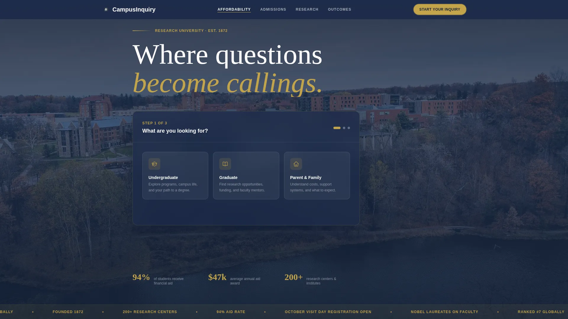
The header replaces a traditional hero image with a guided multi-step form. Step one presents three audience cards: Undergraduate, Graduate, and Parent and Family. Step two displays a searchable grid of department icons. Step three collects name and email. A Ken Burns aerial campus photograph plays softly behind the form without competing for attention.
Hub and Spoke Anchor Navigation
A sticky anchor navigation bar sits below the header and links directly to each FAQ-driven spoke section below. It keeps orientation clear on a long-scrolling page and holds the persistent gold "Start Your Inquiry" button in view at all times.
FAQ-Driven Spoke Sections
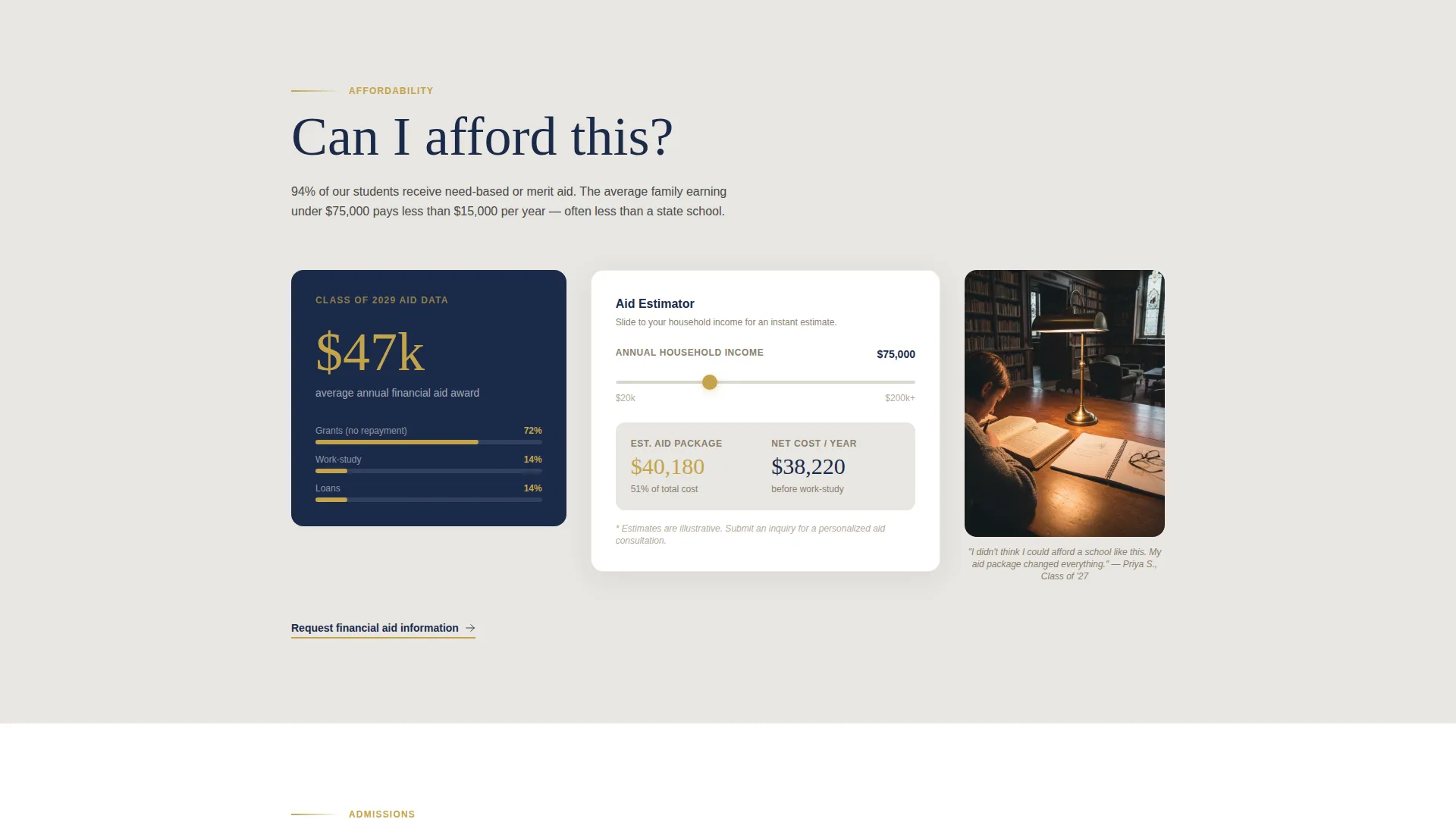
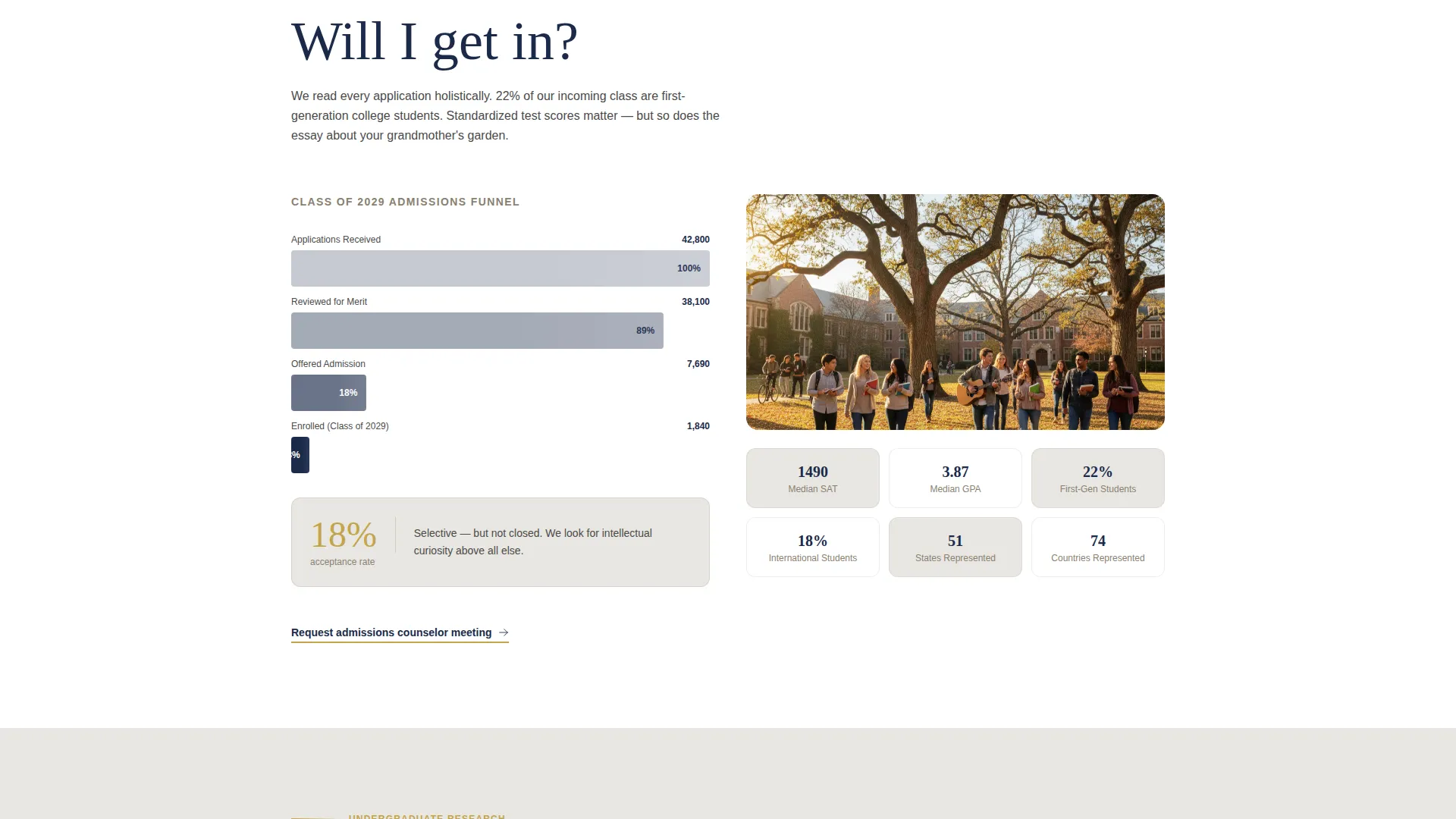
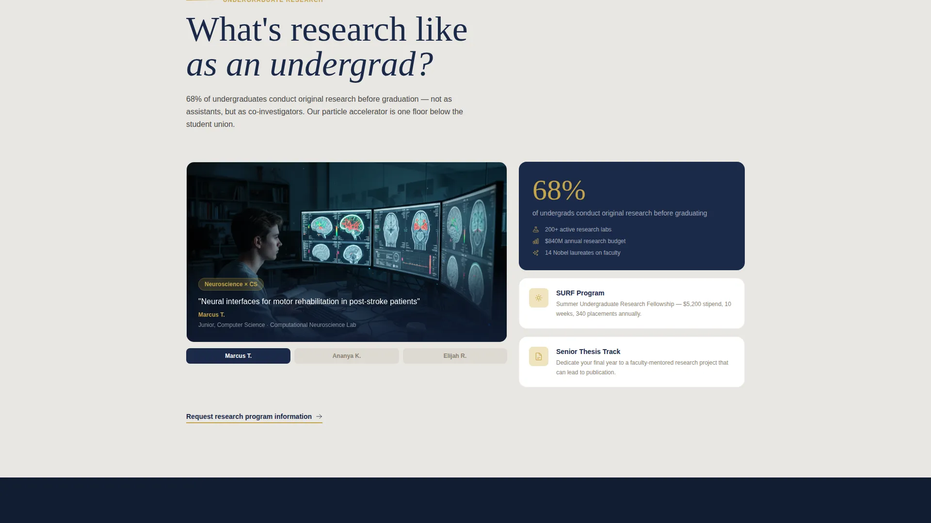
Each spoke section below the nav opens with a real question a prospective student might search online. The question appears in large serif type, followed by a single compelling statistic, a short narrative paragraph, and a supporting visual such as a financial aid calculator widget, an admissions funnel graphic, a lab photograph, or an employment outcome map.
Personalized Secondary Calls to Action
At the bottom of each spoke section, a secondary call-to-action button reads "Request Info About [Department Name]." This field auto-fills based on the visitor's earlier department selection in the header form, creating a coherent and personal experience across the full page.
Soft Mist Color System with Archival Gold Accents
The palette uses morning fog gray for section backgrounds, deep academic navy for headers and navigation, library stone for body text and secondary interface elements, and archival gold reserved strictly for calls to action, progress indicators, and key statistics. The restraint with gold means every appearance of it carries visual weight.
Institutional Authority Visual Theme
Typography is set in serif for question headings to give the page an academic register. The overall design feels measured and credible. The combination of the Ken Burns campus photograph, parchment-like color tones, and question-led content organization communicates institutional seriousness without feeling cold.
Page sections overview
| Section | Purpose |
|---|---|
| Multi-Step Form Header | Greets visitors and captures audience type, department interest, and contact details across three guided steps |
| Anchor Navigation Bar | Provides persistent page orientation and holds the primary "Start Your Inquiry" call-to-action button |
| Affordability FAQ Section | Answers "Can I afford this?" with a financial aid statistic, a short narrative, and a financial aid calculator widget |
| Admissions FAQ Section | Answers "Will I get in?" with an admissions funnel graphic and transparent process narrative |
| Research FAQ Section | Answers "What is research like as an undergrad?" with a lab photograph, a student project title, and a supporting narrative |
| Career Outcomes FAQ Section | Answers "Where do graduates end up?" with an employment outcome map and outcome statistics |
| Section-Level calls to action | Closes each spoke section with a personalized "Request Info About [Department Name]" secondary action |
Design & branding system
The Soft Mist palette is the visual backbone of this template. Every color decision is intentional and restrained, creating the feeling of a rare books reading room: hushed and authoritative, luminous only where it matters.
- Morning fog gray (#E8E6E1) washes section backgrounds so content can breathe without visual noise
- Deep academic navy (#1B2A4A) dominates headers and navigation to establish institutional weight; library stone (#B5AA9A) anchors body text and secondary interface elements
- Archival gold (#C4A44A) appears only on calls to action, progress indicators, and key statistics, so every instance feels earned rather than decorative
Mobile & speed optimization
The template layout is designed to translate clearly across screen sizes. The multi-step form, the anchor navigation, and the spoke sections are each structured so that they remain usable and legible on smaller displays.
- The three-step form condenses gracefully, keeping each step on a single focused screen rather than overwhelming the visitor
- The anchor navigation collapses appropriately on narrow viewports so the persistent call-to-action button remains accessible
- The spoke sections stack vertically with their statistic, paragraph, and supporting visual in a natural reading order on mobile
How this template helps you convert
Every structural decision in this template is oriented toward a single outcome: earning the visitor's email address after their trust has been built, not before.
- The multi-step form opens with a question rather than a demand, which reduces friction and signals that the university values the visitor's specific situation before asking for anything in return.
- Each FAQ-driven spoke section addresses a named anxiety directly, replacing vague institutional copy with a statistic, a narrative, and a visual that together make the next step feel obvious and safe.
- The personalized secondary call-to-action at the bottom of each section reinforces the department selection the visitor made in step two of the header form, so every subsequent ask feels tailored rather than generic.
Other information about this template
This template is categorized under Education and Training, specifically within the College and University subcategory and the Research University niche. It is a strong fit for any institution that competes on prestige, research output, and student outcomes rather than on price alone.
- The hub and spoke layout with anchor navigation is well suited to pages that need to serve multiple audience types, including undergraduates, graduate students, and parents, without requiring separate landing pages for each
- The FAQ-driven creative direction is particularly effective for research universities because it mirrors the actual search behavior of prospective students who arrive with specific questions already formed
- The Institutional Authority theme and Soft Mist color system are designed to communicate credibility and calm rather than urgency, which suits institutions where trust is the primary conversion driver
- This template is built as a single-page lead generation experience, so all inquiry capture happens in one place without redirecting visitors to external forms or separate pages
Theme
Institutional Authority
Creative direction
FAQ-Driven
Color system
Soft Mist
Style
Hub & Spoke (Anchor Nav)
Direction
Lead Generation
Page Sections
Three-step Multi-step Inquiry Form
Hub and Spoke Anchor Navigation
Faq-driven Spoke Sections
Personalized Department Call to Action
Soft Mist Color System
Related questions
Can this template serve both undergraduate and graduate prospects on the same page?
How many spoke sections does the template include?
Is the archival gold color used throughout the entire page?
What is the primary call to action on this landing page?
Does the template require visitors to fill out the form before reading the page content?



