Consulting Digital Presence Professional Website Template
Codex is a Bold Brutalist comparison landing page template built for consulting knowledge base platforms. It leads with a full-width product screenshot, stats-first impact blocks, and an interactive comparison table that toggles between three versus opponents. Designed for independent consultants and boutique firm founders, it drives sign-ups through cumulative proof before a single persuasion word lands.
by Rocket studio
Quick summary
Codex is a single-page comparison landing page template for a consulting knowledge base product. It opens with a pixel-sharp product screenshot and oversized monospaced stats, then walks visitors through a toggleable comparison table, a feature bento grid, and a testimonial carousel. Every section leads with a number before context appears.
Who this template is for
This template is built for teams and founders who need to convert skeptical, data-literate consulting professionals. It suits anyone launching or marketing a knowledge management product in the professional services space.
- Independent consultants running one-to-five person practices who need to communicate credibility quickly
- Boutique firm founders onboarding new analysts and looking for a consistent methodology tool
- In-house strategy teams evaluating subscription tools against their current do-it-yourself library setup
What problem this template solves
Consulting buyers do not convert on vague promises. They compare, benchmark, and expect proof before they click anything. A generic landing page cannot hold that audience past the first scroll.
- Visitors need to see hard numbers before they read a single sentence of marketing copy
- The comparison between your platform and a do-it-yourself library or alumni network is never made explicit on most product pages
- There is no structured moment where the visitor can personalize the competitive matchup to their own situation
What you get with this template
You get a fully structured, single-page layout that carries a consulting buyer from first impression to sign-up through accumulated proof. Every section is designed to earn the click before the call to action ever appears.
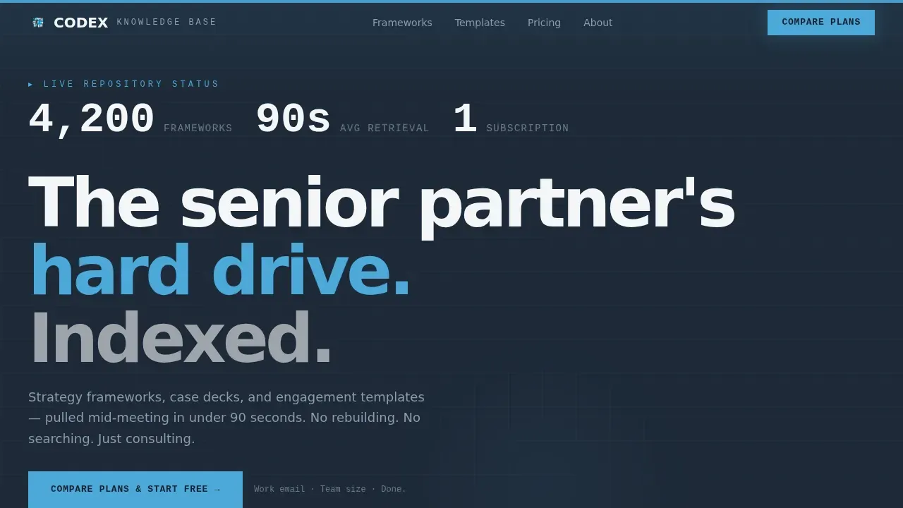
- A hero section with a full-width product screenshot, a raw-shadow slab background, and a bold monospaced stat line above the interface capture
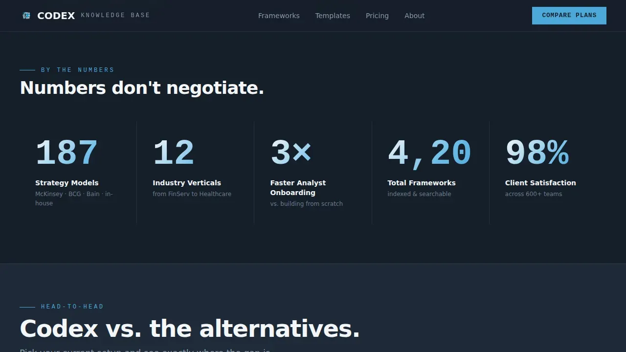
- A stats impact bar with brutally large numbers introducing each new section before any explanatory copy
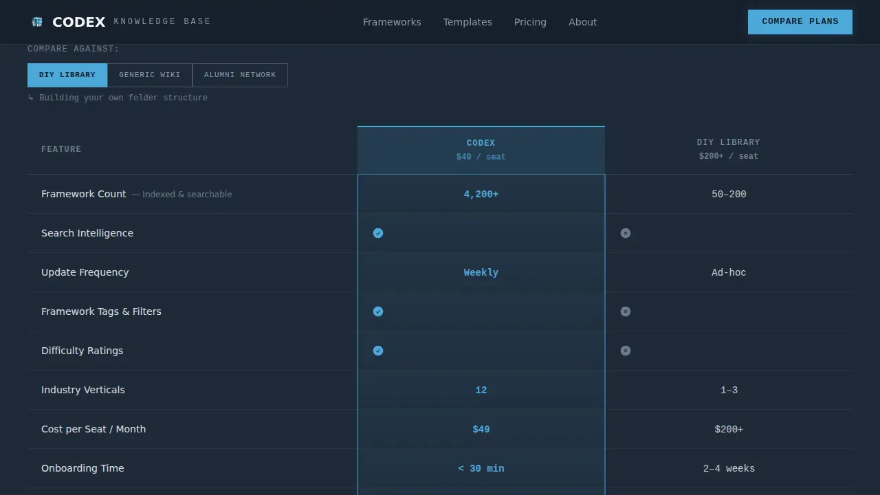
- A centerpiece comparison table with a versus toggle, winning-column highlights, and a locked call-to-action button anchored below the final row
- A feature bento grid, a testimonial carousel, and a linear single-row footer rounding out the full page flow
Feature list
This template includes six core design and interaction features drawn directly from its brief.
Full-Width Product Screenshot Hero
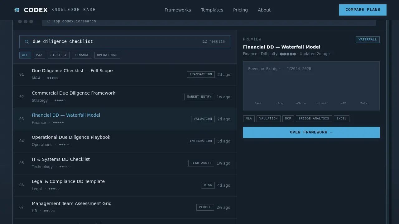
The hero section displays a pixel-sharp, full-width interface capture on a flat gunmetal slab with zero border-radius and a raw drop-shadow. A single oversized monospaced stat line sits above the screenshot, delivering the platform's core value proposition before the visitor reads anything else.
Stats-First Impact Bar
Each major section opens with a brutally large number in JetBrains Mono typeface. The number lands first, the explanation follows. This pacing keeps the eye anchored to proof and prevents the page from reading like standard marketing copy.
Interactive Comparison Table with Toggle
The comparison table is the page centerpiece. A toggle above the table lets visitors switch the versus opponent between a do-it-yourself library, a generic wiki, and an alumni network. Winning-column cells are highlighted in open-sky blue, and the primary call-to-action button stays locked to the bottom of the table.
Asymmetric Feature Bento Grid
Below the comparison table, an asymmetric bento grid showcases the platform's search intelligence and content depth. Cells vary in size to create visual hierarchy without adding extra copy weight.
Testimonial Swiper Carousel
A swiper carousel presents named consultants with firm titles and specific performance metrics. Social proof is rendered with company logos and real attribution rather than anonymous quotes.
Scroll-Linked Animations and Staggered Reveals
The template includes medium-to-high animation intensity using scroll-linked blur effects, staggered section reveals, and intersection observer triggers. Interactive elements such as the comparison toggle and table highlight switching are handled as client-side components.
Page sections overview
| Section | Purpose |
|---|---|
| Hero Screenshot | Opens with product interface capture, oversized stat line, and primary call to action |
| Stats Impact Bar | Delivers key platform numbers before any explanatory copy appears |
| Comparison Table | Toggleable versus matchup with locked call-to-action button below final row |
| Feature Bento Grid | Asymmetric layout showcasing search depth and intelligence features |
| Testimonials Carousel | Named social proof with firm titles, metrics, and company logos |
| Single-Row Footer | Linear footer pattern closing the page cleanly |
Design & branding system
The visual identity follows a Bold Brutalist direction built on a Slate & Sky color system. The palette feels like a glass-and-steel office tower at dawn: heavy, unapologetic structure below with a single stripe of bright sky cutting across the top.
- Colors: deep gunmetal (#1E2A38) for primary backgrounds, exposed-concrete mid-gray (#6B7B8D) for table borders, open-sky blue (#4DA8DA) for calls to action and winning-column highlights, chalk white (#F4F6F8) for cell text and negative space
- Typography: JetBrains Mono is used for all stats and numbers; DM Sans handles all body and label copy
- Structural details: zero border-radius on the hero slab, raw drop-shadows throughout, and no decorative softening anywhere on the page
Mobile & speed optimization
The template is desktop-first by design, reflecting how consulting professionals use it: on a laptop, mid-meeting, scanning columns and numbers before a decision. Responsive behavior is still included for smaller viewports.
- Static sections such as the hero, stats bar, bento grid, and footer are built as server components for faster initial load
- Interactive elements including the comparison toggle and table highlight switching are isolated as client-side components to keep the rest of the page lightweight
- The page architecture separates static from interactive rendering so the comparison table loads and responds without blocking other content
How this template helps you convert
Codex converts by removing every moment of doubt before the call to action appears. The page is engineered so that by the time a visitor reaches "Compare Plans & Start Free," they have already absorbed a stack of proof that makes the click feel inevitable.
- Stats land before copy, so the first impression is always a number rather than a claim, which disarms skepticism in data-literate consulting audiences
- The comparison toggle makes the matchup personal, letting visitors benchmark the platform against their specific current setup rather than a generic competitor
- The sign-up form asks only for work email and team size with no credit card field, so the final step feels proportionate to the trust already built on the way down
Other information about this template
This template is part of a broader Bold Brutalist design direction suited to professional services digital presence. A few additional details are worth noting for teams evaluating it.
- The localization is set for the United States market, priced in USD, and written in American English
- Animation intensity is medium-to-high, relying on scroll-linked blur, staggered reveals, and intersection observer logic
- The page is categorized under Technology, specifically Consulting Digital Presence within the Consulting Knowledge Base niche
- The template style is a Comparison Table layout and the landing page direction is Comparison/Versus conversion
Theme
Bold Brutalist
Creative direction
Stats-First Impact
Color system
Slate & Sky
Style
Comparison Table
Direction
Comparison/Versus
Page Sections
Full-width Product Screenshot Hero
Stats-first Impact Bar
Interactive Comparison Table with Toggle
Asymmetric Feature Bento Grid
Testimonial Swiper Carousel
Scroll-linked Animations and Staggered Reveals
Related questions
What type of product is this template designed to promote?
Can I change which competitors appear in the comparison table?
Does the sign-up flow require a credit card upfront?
Is this template suited for a solo consultant or a full team?
What design system does this template use?



