Powerful Government Training Landing Page Template
Mandate is a bold brutalist government training platform landing page template built for federal agencies, state compliance officers, and municipal planners. It uses a 50/50 split-screen layout, a Teal Catalyst color system, and a Spec Sheet scroll-snap cadence to present compliance credentials with authority. The design embraces raw functionality over decoration, driving users straight to an app download with zero form friction.
by Rocket studio
Quick summary
Mandate is a single-page brutalist landing page template for a government workforce training platform. It combines a scrolling agency logo bar, four scroll-snap Spec Sheet panels, and a two-path app download call to action. The design style is Bold Brutalist, raw, authoritative, and built to move compliance-focused visitors from first impression to app install without a single wasted element.
Who this template is for
This template is built for teams and individuals who need to present a government-grade learning management system with instant credibility. The design speaks directly to procurement decision-makers and field-level users in equal measure.
- GS-12 program managers and agency Chief Information Officers who evaluate training software for large-scale federal deployment
- Compliance officers and municipal planners who need to demonstrate regulatory readiness to their leadership
- GovTech product teams and designers who want a creative, authority-driven landing page without building from scratch
What problem this template solves
Government training platforms often look like every other polished enterprise software site. They blend together. Visitors who need clear, fast answers about compliance capabilities have to dig through generic marketing copy before they find anything useful. Mandate solves that directly.
- Program managers cannot quickly confirm whether a platform is SCORM 2004 ready, FedRAMP authorized, or Section 508 compliant from a typical landing page
- Agency CIOs face a slow procurement process partly because vendor pages bury technical specs inside brochure-style web design
- Field inspectors on tablets need a web page that loads fast, reads clearly, and gets them to the app download without scrolling through walls of decoration
What you get with this template
This template delivers a complete, production-ready brutalist landing page structured around a federal audience. Every section is purposeful. Every design decision reinforces authority and simplicity.
- A full 50/50 split-screen layout with four scroll-snap Spec Sheet panels, each pairing large block typography on the left with a technical visual on the right
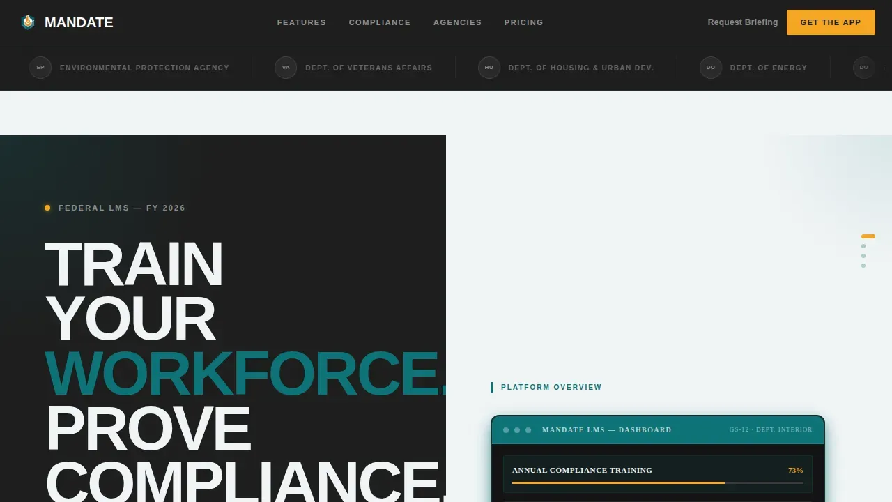
- A scrolling logo bar header featuring agency seals in monochrome, a bold oversized headline, and a two-path app download call to action with a persistent mobile bottom bar
- A Teal Catalyst color system with deep command teal, slab charcoal, signal white, and catalyst amber used exclusively for interactive elements
Feature list
This template includes several carefully designed features drawn directly from its brief. Each one serves a specific purpose in the government training context.
Scroll-Snap Spec Sheet Panels
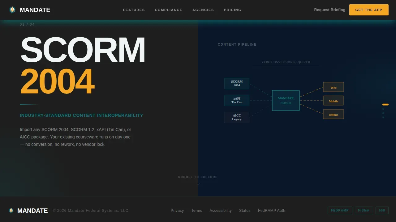
Four full-screen panels use scroll-snap behavior to flip through compliance credentials one at a time. The left side locks a single feature name in enormous stacked block type. The right side shows the matching technical detail, compliance badge, or device mockup. The rhythm feels like turning pages in a procurement binder, dense and authoritative, but still punchy enough for a deputy director skimming on a phone.
Two-Path App Download Call to Action
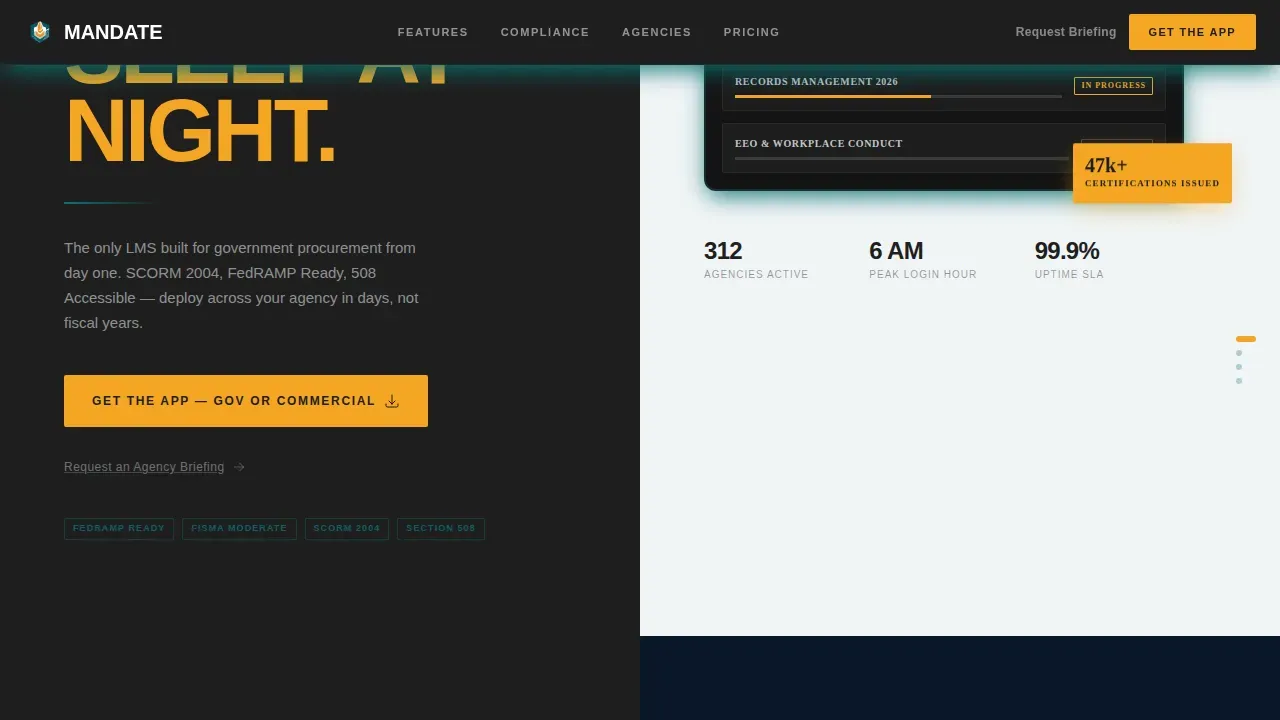
The primary call to action reads "Get the App, Gov or Commercial." It appears first beneath the logo bar, then again as a persistent bottom bar on mobile. Tapping opens a two-path fork: one path leads to the government app store link with a compliance badge, the other to the commercial marketplace. No form fields, no friction. A secondary text link, "Request an Agency Briefing," captures procurement leads who need a live walkthrough.
Marquee Agency Logo Bar
The header features a horizontal scrolling parade of agency seals and department wordmarks rendered in monochrome against slab charcoal. The marquee moves at a deliberate, unhurried pace. The logos create instant credibility for visitors evaluating the platform. Above the bar, an oversized grotesque headline delivers the emotional message in bold typography that could be chiseled into a courthouse lintel.
Teal Catalyst Color System
The color system uses deep command teal (#0D7377) for primary surfaces, slab charcoal (#1E1E1E) for typographic blocks and structural dividers, and signal white (#F0F4F5) for breathing space. Catalyst amber (#F5A623) is reserved exclusively for buttons, progress indicators, and interactive hotspots. The combination creates high contrast across every visible element without relying on bright colors or unnecessary decoration.
Bold Brutalist Typography System
Headlines are set in DM Sans, a grotesque typeface with a slab-like authority suited to the design concept. Body copy uses Manrope for clarity at small sizes. The fonts work together to create a hierarchy where key compliance terms and feature names stand out immediately. Bold typography gives text stronger weight and keeps the audience focused on what matters.
Static Component Architecture
The template is built with Static Server Components and minimal JavaScript, used only for scroll behavior and the marquee animation. Transition animations are kept to a medium intensity: scroll-linked panel transitions and the logo marquee are the primary motion elements. This keeps the pages lean and the layout stable across devices.
Page sections overview
| Section | Purpose |
|---|---|
| Hero Logo Bar | Scrolling agency seals build instant credibility above the headline |
| Headline Call to Action | Oversized grotesque headline and two-path app download button |
| Spec Sheet: SCORM 2004 | Block type left panel paired with architecture diagram right panel |
| Spec Sheet: FedRAMP Ready | Block type left panel paired with compliance badge display right panel |
| Spec Sheet: 508 Compliant | Block type left panel paired with accessibility device mockup right panel |
| Spec Sheet: Offline Mode | Block type left panel paired with field inspector mockup right panel |
| Footer Linear Row | Single-row footer with minimal links and brand anchoring |
Design & branding system
The design style is Bold Brutalist, a web design approach that embraces raw, unpolished aesthetics and prioritizes function over visual decoration. Brutalism in web design is a reaction against the polished, conventional aesthetics of mainstream sites. It conveys clarity and authority in the same way brutalist architecture does, through visible structure, raw materials used honestly, and forms that make no apologies for their purpose.
- Color palette: deep command teal (#0D7377), slab charcoal (#1E1E1E), signal white (#F0F4F5) as the background, and catalyst amber (#F5A623) exclusively for interactive hotspots
- Typography: DM Sans for headlines with an oversized grotesque weight, Manrope for body copy; both fonts are used at large scales to maintain bold, readable hierarchy across the site
- Layout approach: 50/50 split-screen panels with visible structural dividers, repeating shapes in a modular grid, and no superfluous decoration on any web page element
Mobile & speed optimization
The template is designed mobile-first, with field inspectors on tablets as the primary use case. The persistent bottom bar call to action ensures users on smaller screens never lose sight of the primary action. Brutalist web design naturally supports fast-loading pages because it avoids heavy graphics, complex CSS layers, and ornamental imagery.
- Scroll-snap panels reflow cleanly for tablet and mobile viewports, keeping the split-screen concept intact without horizontal overflow
- The persistent mobile bottom bar mirrors the desktop call to action, so visitors on any device reach the app download path in one tap
- Static Server Components with minimal JavaScript keep the page lean; transition animations are limited to scroll-linked panel changes and the marquee, reducing render complexity
How this template helps you convert
This template converts because it removes every obstacle between a skeptical government buyer and the download action. Brutalist design maintains a clear information hierarchy that makes key actions obvious. The Spec Sheet cadence does the convincing before the call to action even appears.
- The scrolling logo bar establishes immediate social proof with recognizable agency seals, so visitors trust the platform before reading a single line of feature copy
- Each Spec Sheet panel presents one compliance credential in enormous block type, giving decision-makers a scannable procurement checklist they can absorb in seconds on any device
- The two-path call to action removes ambiguity, government users go to the government path, commercial users go to the commercial path, and procurement leads have a direct route to an agency briefing
Other information about this template
Mandate sits at the intersection of brutalism and federal authority. The concept draws directly from brutalist architecture, the idea that raw materials and exposed structure are not flaws but features. The same logic applies to web brutalism: visible gridlines, unstyled structural elements, and an absence of decoration are deliberate creative choices, not shortcuts.
Brutalism website examples in the broader design world range from personal portfolio website projects to experimental agency sites. The mandate bold brutalist government training platform landing page template takes that raw design concept and applies it to a serious, compliance-driven context where the aesthetics serve a real function. Designers who embrace brutalism for a portfolio website often do so to stand out. Here, the choice carries institutional weight.
- Brutalism is a French word adapted from the architectural term "béton brut," meaning raw concrete, and it signals honesty of materials and purpose
- In web design, brutalist elements include exposed gridlines, unstyled components, bold monospace or sans-serif fonts, and high-contrast color blocks rather than a soft white background
- This template follows those principles while keeping the layout navigable: the audience is procurement-focused, so clarity and simplicity are non-negotiable
- Designers working on a redesign of an existing government training site will find this template offers a strong creative inspiration point for breaking away from generic enterprise web design
- The brutalist landing pages in this design style do not rely on bright colors or decorative imagery; the catalog of agency seals, compliance badges, and device mockups serve as the only visual content
- Art director level decisions, typeface selection, color restraint, structural exposure, are baked into the template so teams can move directly from concept to production
- The template showcases what a minimalist but bold brutalist website can achieve when the design style is matched precisely to the audience and function

Theme
Bold Brutalist
Creative direction
Spec Sheet
Color system
Teal Catalyst
Style
Split Screen (50/50)
Direction
App Download
Page Sections
Scroll-snap Spec Sheet Layout
Two-path App Download Call to Action
Marquee Agency Logo Bar
Teal Catalyst Color System
Bold Brutalist Typography Pairing
Static Architecture with Focused Animations
Related questions
Who is the target audience for this template?
Does the template include the app store links and compliance badges?
Why does this template use a brutalist design style instead of a standard enterprise look?
Can I customize the Spec Sheet panels for different compliance features?
Is this template suitable for a non-government software product?



