Veterinary Software Professional Website Template
Triage is a split-screen landing page template built for veterinary order management platforms. It uses a glassmorphic Data Command visual style to display a live-feeling ops interface: tabbed user interface mockups, a feature matrix with real veterinary data, and a sticky call-to-action bar. Clinics, practice managers, and procurement teams are the primary audience.
by Rocket studio
Quick summary
This triage command center veterinary order management landing page template gives SaaS teams a desktop-first, glassmorphic landing page that converts practice managers into demo bookings. It leads with an interactive tab switcher, walks visitors through a structured feature matrix, and closes with a sticky call-to-action bar. No form lives on the page; every element earns the click first.
Who this template is for
Veterinary practices generate enormous volumes of data daily, from electronic health records to supplier orders. This template is designed for the SaaS teams selling order management tools to those clinics and hospital groups.
- Multi-location veterinary practice managers juggling multiple supplier portals before their first surgery each morning
- Corporate animal hospital procurement directors reconciling invoices against formulary lists across dozens of sites
- Independent veterinarians and rural clinics reordering supplies by memory who need a better system
What problem this template solves
Urgent procurement delays put patient care at risk. When staff cannot quickly track orders or flag low stock, clinics face stockouts that slow treatment and increase error rates. A generic landing page cannot convey the precision this software delivers.
- Visitors need to see real veterinary data, not stock imagery, to trust the product
- Practice managers have limited time; the page must communicate value in under a minute
- The buy decision requires proof that the platform handles urgent cases, formulary compliance, and multi-location sync
What you get with this template
This template gives development teams every layout component needed to display a polished, high-converting ops-software landing page without building from scratch.
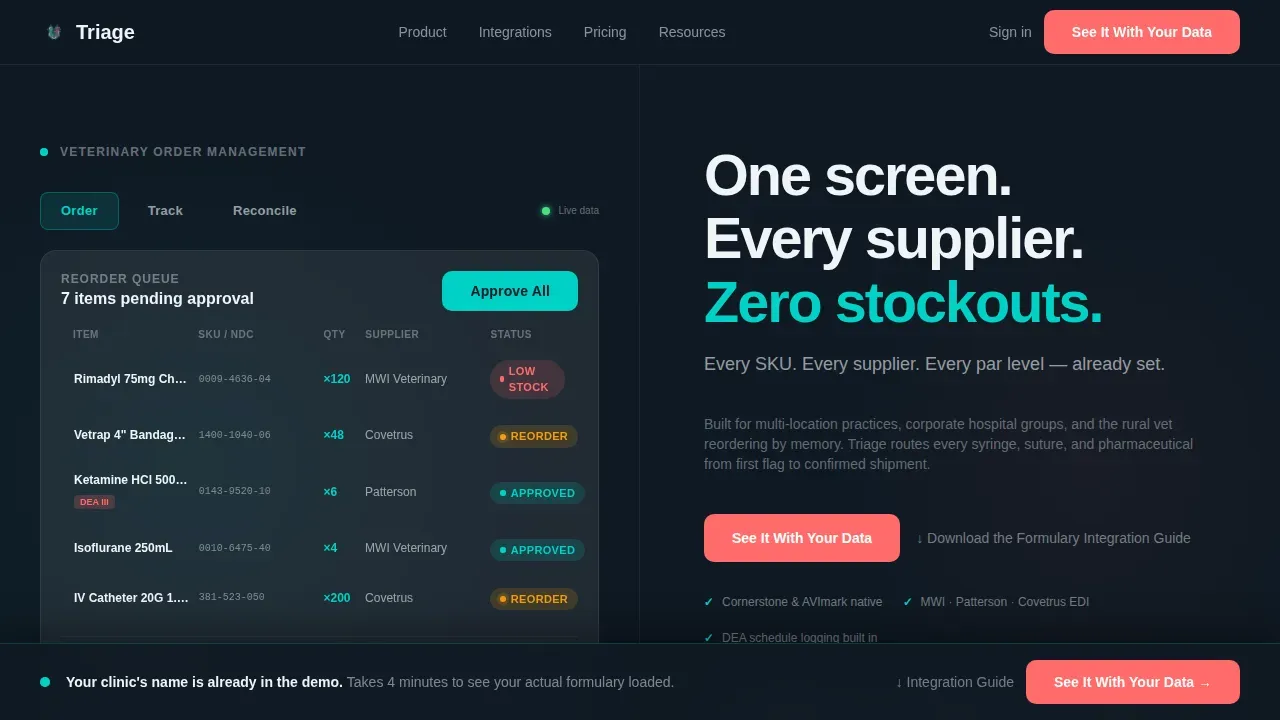
- A 50/50 split-screen hero with three-tab switcher displaying Order, Track, and Reconcile user interface mockups
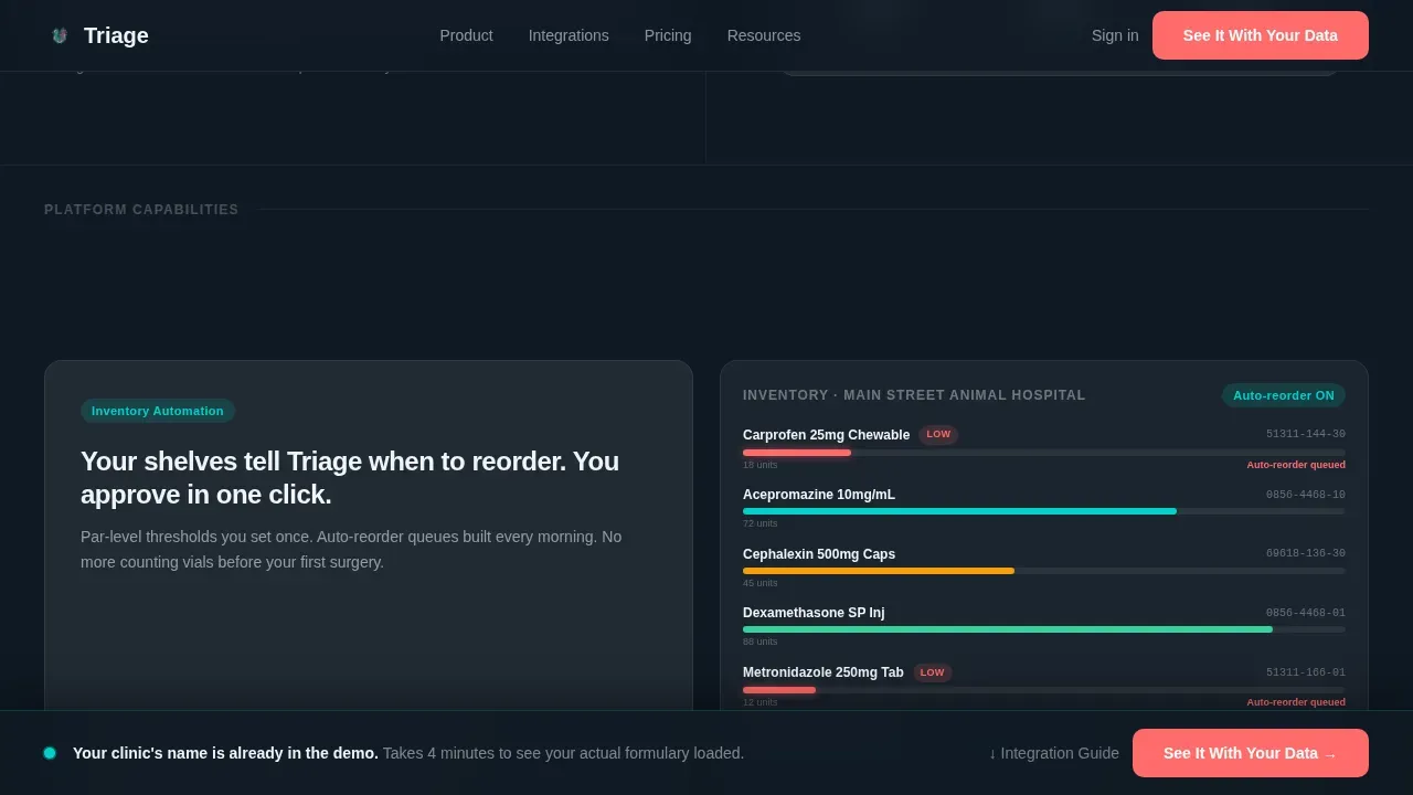
- A scrolling feature matrix with alternating frosted-card and user interface-in-situ columns, populated with veterinary-specific data
- A sticky frosted-glass call-to-action bar that appears after the third feature section and persists on scroll
Feature list
This template is built around six core design and layout capabilities grounded in the source brief.
Interactive Tab Switcher Hero
The header splits the screen evenly. The left side holds three clickable tabs, Order, Track, Reconcile, each swapping in a glassmorphic user interface mockup showing real veterinary data: reorder queues, shipment trackers with distributor names and estimated arrival times, and reconciliation dashboards matching purchase order numbers against packing slips. The right side displays a headline and a contextual subline that updates with each tab.
Scrolling Feature Matrix Layout
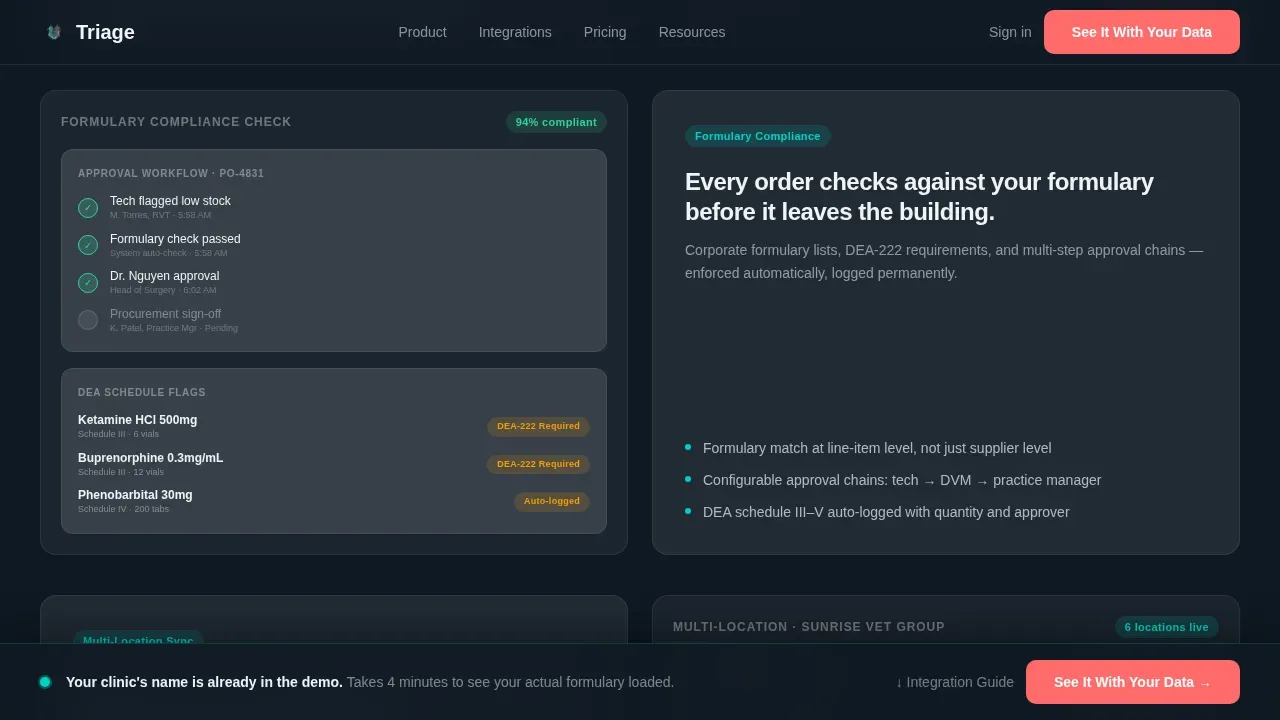
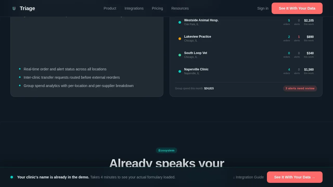
After the hero, the page becomes a structured descent through capability columns. Each row pairs a frosted feature card on one side with a live-data user interface mockup on the other. The complexity escalates intentionally: simple reordering gives way to approval workflows, then analytics dashboards, then integration maps. Staff and practice managers can follow the logic without long explanations.
Sticky Call-to-Action Bar
A frosted-glass bar locks to the bottom of the viewport after the visitor scrolls past the third feature section. It displays the primary call-to-action and persists through the rest of the page. This ensures urgent buyers always have a clear path to the demo environment without calling back up to the hero.
Glassmorphic user interface Mockups with Live-Feel Data
Every interface panel in this template is populated with veterinary-specific information: NDC codes, DEA schedule flags, clinic location names, and real SKU names like Rimadyl 75mg. Cursor hover states, row highlights, and pulsing status pills make the mockups feel operable rather than decorative.
Dual Call-to-Action Architecture
The primary button, "See It With Your Data," appears beneath the hero tabs and again in the sticky bar. A secondary text link, "Download the Formulary Integration Guide," captures higher-funnel visitors who want proof before booking a demo. Neither action requires a form on this page.
Social Proof Section with Clinic Personas
Three clinic persona cards display specific outcomes: stockout reduction percentages, hours saved per week, and direct quotes from practice managers. This gives pet owners' care teams and procurement specialists the peer evidence needed to feel confident before clicking.
Page sections overview
| Section | Purpose |
|---|---|
| Hero Tab Switcher | Display tabbed user interface mockups and headline |
| Feature Matrix Row 1 | Showcase inventory automation with live data |
| Feature Matrix Row 2 | Address formulary compliance and multi-location sync |
| Integrations Map | Display PIMS ecosystem and distributor network |
| Social Proof Cards | Show clinic outcomes and practice manager quotes |
| Sticky call to action Bar | Keep demo call-to-action visible during scroll |
| Linear Footer | Provide single-row site links and contact information |
Design & branding system
The visual identity follows a Data Command theme. Every color choice is deliberate: attention goes only where urgency demands it.
- Deep surgical slate (#0F1923) as the primary background, frosted-panel cards at 12% white opacity for layered depth, clinical teal (#00D2C6) for active states and data highlights
- Sharp alert coral (#FF6B6B) reserved for low-stock warnings and call-to-action buttons, ensuring urgent prompts are impossible to miss
- Plus Jakarta Sans typography throughout, keeping the interface clean, clinical, and authoritative across all display sizes
Mobile & speed optimization
This template is desktop-first by design. Target users are at an ops desk running the platform during clinic hours, so the layout prioritizes wide-screen clarity and multi-column display.
- Client Components handle the tab switcher and sticky call-to-action bar; Server Components render all static sections to keep the page running efficiently
- The layout adapts for mobile viewports while preserving the core information hierarchy, so staff can review key details on any device
How this template helps you convert
The page is engineered to ensure visitors understand the product's depth before any commitment is requested.
- The tab switcher in the hero immediately shows three distinct workflow states, letting practice managers self-identify with the use case that matches their most urgent pain point
- The escalating feature matrix builds confidence section by section, moving from simple reorder queues to complex approval workflows, so veterinarians and procurement directors see the full breadth of the platform without needing to read long documentation
- The sticky call-to-action bar and dual-call to action architecture keep conversion paths visible at all times, while the secondary download link captures leads from buyers who need more time
Other information about this template
This template is tailored for B2B SaaS teams in the veterinary software space. Several additional details are worth noting for teams evaluating this template for their practice management or procurement platform.
- Triage command centers in veterinary practice evaluate and prioritize patient care based on medical urgency, not arrival time; this template's design language mirrors that same urgency-first logic in its visual hierarchy
- A triage AI-agent concept is reflected in the template's user interface mockups, which display automated case prioritization and alert-style status pills to help staff identify urgent cases at a glance
- Incoming appointments and triage cases are displayed on-screen in the mockups, reflecting how real veterinary facilities use large-screen displays to keep all staff informed
- Digital triage forms shown in the interface panels illustrate how clinics can streamline urgent care intake and reduce bottlenecks from paper-based systems
- Standardized triage protocols categorizing patients into urgency tiers (Red, Yellow, Green) are reflected in the status pill color system within the user interface mockups
- The social proof section can display outcomes such as reduced wait times, fewer stockout errors, and hours saved weekly, giving pet owners' care teams context on real-world impact
- Teletriage platforms like Petriage or VetDispatch.ai represent the broader ecosystem this template is designed to serve, connecting pre-arrival information and treatment orders to clinic workflows
Theme
Data Command
Creative direction
Feature Matrix
Color system
Glassmorphic
Style
Split Screen (50/50)
Direction
Click-Through
Page Sections
Interactive Three-tab Hero Switcher
Escalating Feature Matrix Layout
Sticky Frosted-glass Call to Action Bar
Live-feel Veterinary User Interface Mockups
Dual Call-to-action Architecture
Social Proof Clinic Persona Cards
Related questions
Does this template include a contact or intake form?
Can the tab switcher user interface mockups be updated with my own data?
Is this template suitable for multi-location veterinary clinic clients?
How does the sticky call-to-action bar behave?
Can I customize the urgency color system in this template?



