Expert Dental Software Professional Website Template
Intake is a bento grid landing page template built for dental order management platforms. It uses a dark glassmorphic visual system to present case tracking, shade matching, and lab network features as interactive, glowing panel tiles. The design speaks directly to dental service organizations, solo practitioners, and lab owners who need clarity across every open case.
by Rocket studio
Quick summary
Intake is a single-page bento grid landing page template designed for dental lab order management platforms. It pairs a dark Tech Glass visual identity with an Interactive Explorer structure, turning each bento tile into a clickable demonstration of real product value. The layout moves visitors from individual case control to multi-location fleet visibility, building trust through the product itself.
Who this template is for
This template is built for dental technology platforms that need to communicate complex workflow value quickly and clearly. If your product sits at the intersection of dental operations and software, Intake speaks your audience's language before they read a single word of copy.
- Multi-location dental service organizations (DSOs) managing hundreds of open cases across multiple labs
- Solo dental practitioners who lose time chasing remake and delivery statuses by phone
- Dental lab owners handling unstructured order documents and handwritten shade notes
What problem this template solves
Dental order management platforms face a specific credibility problem: the product's value is invisible until someone uses it. A static landing page with stock photography cannot convey the clarity a live dashboard delivers. Intake solves this by making the product the visual centerpiece from the first scroll.
- Visitors cannot experience dashboard clarity from a brochure-style hero image, so the template removes the image and replaces it with live-data ghost panels
- Prospects abandon forms before they understand the product, so a dummy case number field lets them simulate real tracking before committing
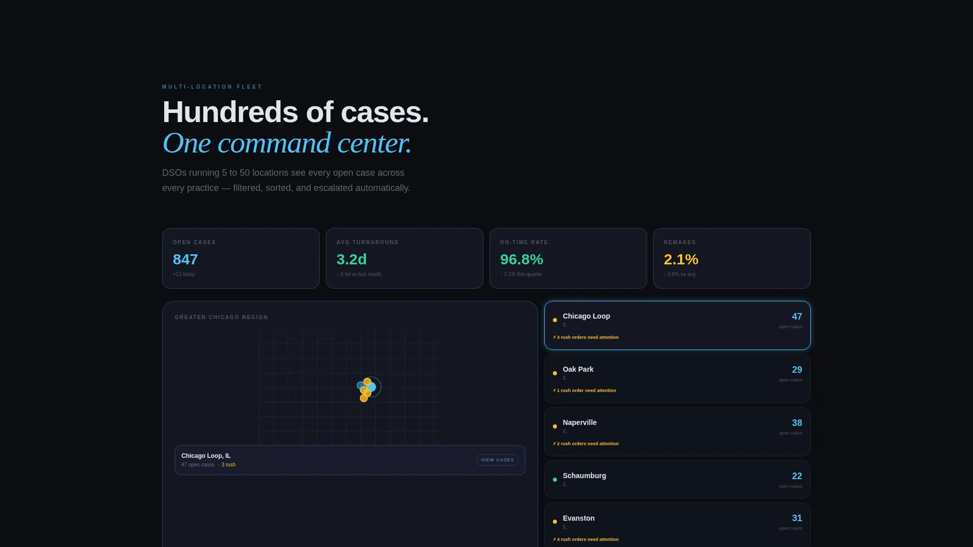
- Decision-makers at DSOs need to see fleet-level intelligence, not just single-case features, so the bento grid escalates from individual tracking to multi-location analytics row by row
What you get with this template
Intake delivers a fully structured landing page with every section, component, and interaction pattern pre-built and ready to customize. The layout is section-led and follows a single-page flow from the dark full-bleed header through interactive feature tiles to a persistent lead capture bar.
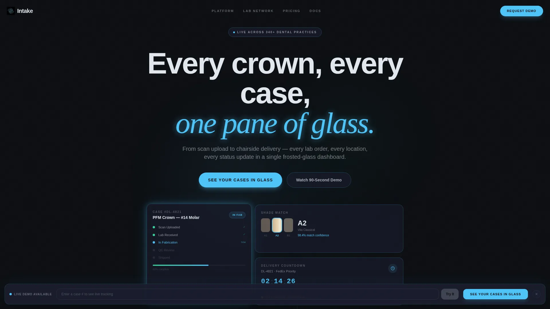
- A dark full-bleed header with a floating bento card cluster showing a live case status tracker, a shade-match thumbnail, and a delivery countdown panel
- Interactive bento tiles for Order Tracking, Shade Matching, and Lab Network, each with its own expand, rotate, or map-ping interaction
- A persistent frosted-glass lead capture bar that slides into view after the third visitor interaction, with a two-step modal and a secondary demo-entry field
Feature list
This section describes the core functional components built into the Intake template as stated in the source brief.
Floating Header Bento Cluster
The header holds a cluster of frosted glass cards positioned center-frame against a void black background. Each card displays a live-data ghost: a case status tracker in progress, a shade-match thumbnail, and a delivery countdown rendered in clinical ice-blue. Edges glow softly as if backlit, making the product itself the first visual impression.
Interactive Bento Tile Grid
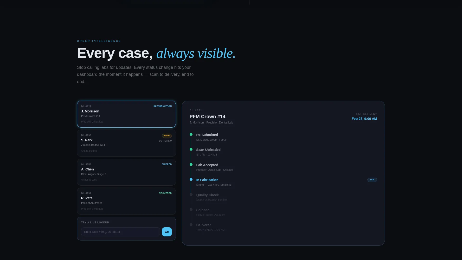
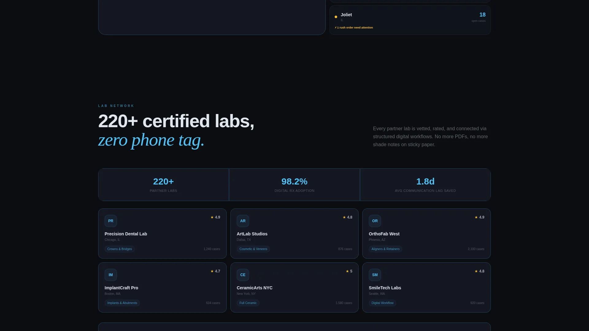
Each tile below the fold is a clickable micro-experience. Tapping the Order Tracking tile expands it to show an animated shipment timeline with status nodes. Hovering Shade Matching rotates a three-dimensional tooth model under studio lighting. Scrolling into Lab Network triggers a live map that pings partner lab locations.
Persistent Lead Capture Bar
A frosted-glass bar anchors to the bottom of the viewport and slides up after the visitor's third interaction. The primary call to action reads "See Your Cases in Glass." Clicking it opens a two-step modal that collects practice name, location count, and monthly case volume in step one, then email and preferred demo time in step two.
Dummy Case Tracking Simulation
A secondary conversion path sits alongside the primary call to action. Visitors can enter a dummy case number into an inline field and experience a live tracking simulation without signing up. This interaction lets the product demonstrate its own value before any form commitment is made.
Escalating Narrative Grid Layout
The bento grid is structured so each row proves a deeper layer of platform intelligence. The first row focuses on individual case control. The middle rows introduce multi-location visibility. The final rows present analytics, rewarding visitors who scroll further with progressively richer product proof.
Page sections overview
| Section | Purpose |
|---|---|
| Dark Header Cluster | Introduces the platform through glowing live-data ghost cards |
| Order Tracking Tile | Expands to show an animated case shipment timeline |
| Shade Matching Tile | Rotates a 3D tooth model on hover under studio lighting |
| Lab Network Tile | Pings partner lab locations on a live map on scroll |
| Analytics Row | Demonstrates multi-location fleet intelligence at a glance |
| Persistent Capture Bar | Slides into view after interaction three to collect leads |
| Two-Step Modal | Gathers practice details, then email and demo time preference |
| Demo Entry Field | Lets visitors simulate case tracking before committing |
Design & branding system
The visual identity follows a Tech Glass theme built on a glassmorphic color system. Every surface is designed to feel like a surgical-grade touchscreen in a dim operatory: translucent, precise, and quietly authoritative.
- Core palette: void black (#0B0D11) for backgrounds, frosted panel (#1A1D2E at 60% opacity with a 12-pixel blur) for cards, clinical ice-blue (#4FC3F7) for glowing accents and active states, and muted pearl (#E0E6ED) for all body and headline typography
- Card edges catch light like beveled glass; depth comes from translucency and layered blur rather than drop shadows
- Headline copy materializes in pearl type with the opening line "Every crown, every case, one pane of glass" setting the product tone immediately
Mobile & speed optimization
The bento grid layout is built to reorder and resize responsively, so the interactive experience remains coherent on smaller screens. Cards that expand or rotate on desktop adapt to tap interactions on mobile without losing their core demonstration value.
- Bento tiles resize and reorder fluidly so the escalating narrative row structure is preserved on any screen width
- The persistent capture bar and two-step modal are sized for thumb-friendly input on mobile viewports
- Parallax drift in the header cluster is designed to complement device motion without creating visual instability on smaller displays
How this template helps you convert
Intake is built around progressive commitment: visitors engage with the product before they ever see a form. Each interaction layer removes a reason to leave and adds a reason to trust the platform.
- The dummy case number field lets prospects simulate a real tracking experience before entering any personal information, lowering the barrier to first engagement significantly
- The persistent capture bar appears only after three interactions, targeting visitors who have already demonstrated intent rather than interrupting cold arrivals
- The two-step modal breaks the sign-up ask into two small questions, reducing perceived effort and making each step feel lightweight and specific
Other information about this template
Intake is a purpose-built template for dental software platforms operating in the dental order management niche. It is designed as a Technology category template under the Dental Software subcategory, making it directly relevant to platforms managing crowns, bridges, implants, and aligner cases end to end.
- The template style is Bento Grid, which suits product-led growth narratives where the interface itself is the primary proof of value
- The creative direction is Interactive Explorer, meaning the page rewards curiosity and progressive scroll with expanding content and animated demonstrations
- The header concept is Dark Full-Bleed with Glow, establishing an immediate premium and clinical tone that differentiates the platform from conventional dental software marketing
- The landing page direction is Lead Generation, with every interaction layer designed to move visitors toward the two-step modal or the demo simulation field
Theme
Tech Glass
Creative direction
Interactive Explorer
Color system
Glassmorphic
Style
Bento Grid
Direction
Lead Generation
Page Sections
Floating Header Bento Card Cluster
Interactive Bento Tile Micro-experiences
Persistent Frosted-glass Lead Capture Bar
Dummy Case Tracking Simulation Field
Escalating Narrative Row Structure
Related questions
Who is this landing page template designed for?
Does the template include the two-step lead capture modal?
How does the dummy case tracking field work?
Can I use this template without changing the visual style?
Is this template suitable for a single-location dental practice?



