Nonprofit Software Professional Website Template
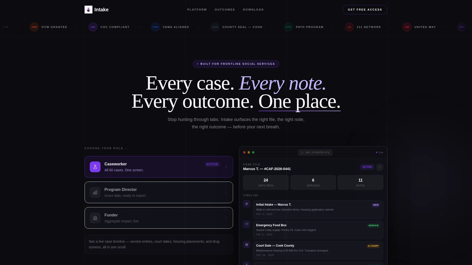
Intake is a split-screen nonprofit case management landing page built for teams that track every client touchpoint from first contact to stable outcome. The Dynamic Motion design and Interactive Explorer layout let visitors step into the product before they download it. Role-based demos, a scrolling logo bar, and a clear app download call to action make the page feel as focused as the platform it represents.
by Rocket studio
Quick summary
Intake is a single-page template built for a nonprofit case management platform. It uses a 50/50 split-screen layout, a Dynamic Motion theme, and a Void and Violet color system. Visitors can explore role-based product demos before reaching the app download call to action. The result is a page that earns trust and drives action without asking for anything first.
Who this template is for
This template is built for nonprofit technology teams that need a focused, credible landing page for a client-tracking platform. It speaks directly to the people who use the product every day.
- Frontline caseworkers managing large caseloads at community action agencies
- Program directors at domestic violence shelters pulling outcome data for grant renewals
- Intake coordinators at reentry nonprofits who need instant client status lookups
What problem this template solves
Nonprofit software often lacks a landing page that communicates value to multiple roles at once. Caseworkers, program directors, and funders all need to see something different. Generic pages fail them all.
- Visitors leave before understanding how the product fits their specific role
- Dense feature lists replace the direct, relief-giving clarity the audience needs
- No single page earns the download before asking for it
What you get with this template
You get a fully structured single-page layout that guides every visitor from logo trust to interactive demo to download. Every section has a clear job to do.
- A scrolling nonprofit logo bar that builds credibility before a single feature is mentioned
- A role-selector split screen that shows each persona their actual product view
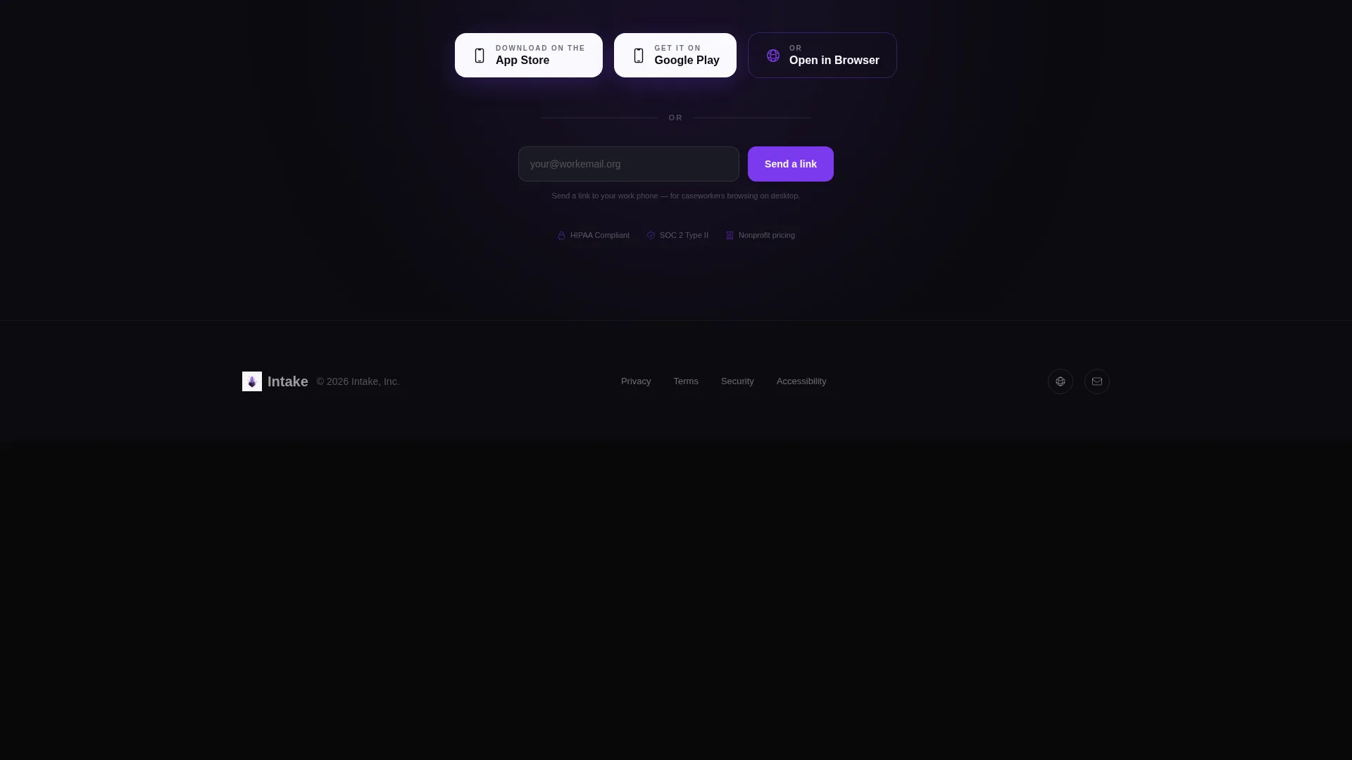
- A multi-option app download call to action with an email capture field below it
Feature list
This template ships with six purpose-built sections and interaction patterns drawn directly from the product experience it promotes.
Scrolling Logo Trust Bar
A horizontal ribbon of recognizable nonprofit and funder logos loops in a smooth infinite scroll against the void-black background. The motion is calibrated to feel alive but readable, establishing social proof through association before any feature copy appears.
Role-Based Interactive Explorer
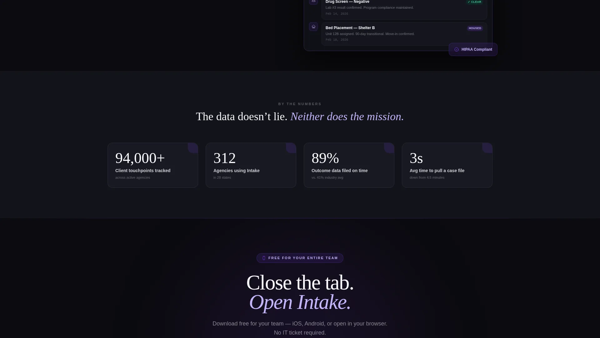
The split screen divides the viewport into a left-side role selector and a right-side live demo panel. Clicking "Caseworker," "Program Director," or "Funder" morphs the right panel to show that persona's actual screen, with animated service entries, ticking outcome percentages, or self-drawing impact charts.
Animated Product Panels
Each role selection triggers fluid motion: panels slide into position, numbers count upward, and cards shuffle into view. The visitor experiences the product's responsiveness firsthand rather than reading a description of it.
Multi-Option App Download Call to Action
The primary call to action offers three paths: App Store badge, Google Play badge, and an "Open in Browser" option for desktop-first organizations. This removes friction for teams whose caseworkers carry agency-issued mobile devices alongside desktop setups.
Single-Field Email Capture
A single email input sits below the download badges with the microcopy "Send a link to your work phone." This low-friction capture targets caseworkers who are browsing on desktop but need the app on a mobile device.
Dynamic Motion Theme System
Every interactive state in the template uses the Void and Violet palette purposefully. Electric violet pulses on active states and notification badges. Void black anchors every background so content elements appear to float forward like lit windows in a dark building.
Page sections overview
| Section | Purpose |
|---|---|
| Logo Trust Bar | Scroll-looping funder and nonprofit logos establish credibility instantly |
| Role Selector Panel | Left-side persona picker drives the interactive split-screen experience |
| Live Demo Panel | Right-side display morphs per role with animated product screens |
| App Download call to action | Three-path download block converts visitors across device types |
| Email Capture Field | Single-field input sends an app link to the visitor's work phone |
Design & branding system
The Void and Violet color system gives this template a visual identity that feels serious and calm at the same time. It is built for an audience that works long hours under pressure and needs a user interface that does not add to the noise.
- Absolute void black (#0B0B0F) anchors every background, making content elements appear to glow forward
- Electric violet (#7C3AED) pulses on active states, role selections, and notification badges to guide attention
- Muted lavender mist (#C4B5FD) softens secondary surfaces, and ultrawhite (#FAFAFE) carries all primary text and card faces
Mobile & speed optimization
The template is designed with mobile-first caseworkers in mind. The download call to action and email capture are both optimized for quick interaction on smaller screens.
- Split-screen layout adapts cleanly so role selectors and demo panels stack gracefully on mobile viewports
- App Store, Google Play, and browser options are all tap-friendly targets sized for thumb navigation
How this template helps you convert
This template earns the conversion by letting visitors experience the product before committing to anything. Every design decision reduces hesitation.
- The scrolling logo bar immediately signals that the platform is trusted by recognizable organizations, lowering skepticism before the visitor reads a single line of feature copy.
- The Interactive Explorer places each visitor inside their own product view, making the value feel personal and immediate rather than abstract.
- The three-path download block and single-field email capture remove every barrier between the "I want this" moment and the actual app download.
Other information about this template
This template is built on the Split Screen (50/50) layout structure using the Dynamic Motion theme. It is a single landing page, not a multi-page website, and is intended to be the full conversion surface for the platform.
- The Interactive Explorer creative direction makes the page behave like the product itself, not a brochure about it
- The Logo Bar header concept is designed to carry recognizable sector logos such as United Way shields, HMIS (Homeless Management Information System) badges, county seals, and OVW (Office on Violence Against Women) medallions
- The template fits the nonprofit software and nonprofit case management category, targeting technology buyers inside mission-driven organizations
- The app download landing page direction means the page is purpose-built to drive installs across iOS, Android, and browser access points

Theme
Dynamic Motion
Creative direction
Interactive Explorer
Color system
Void & Violet
Style
Split Screen (50/50)
Direction
App Download
Page Sections
Scrolling Nonprofit Logo Trust Bar
Role-based Split-screen Explorer
Animated Product Interaction Panels
Three-path App Download Call to Action
Single-field Email Capture
Void and Violet Dynamic Motion Theme
Related questions
Can I customize the role selector to match our organization's user types?
Does the template support both mobile app and browser-based product promotion?
How does the scrolling logo bar work?
Is this template right for a platform that serves multiple programs or client populations?
What makes this template different from a standard software landing page?



