Intake - Powerful Seniorcare Landing Page Template
Intake is a senior care client management landing page template built on a Tech Glass visual system. It features a live interactive header dashboard, a modular spec-card grid, and two clear conversion paths. The design communicates urgency and clarity at once, making it ideal for care agency owners, family members, and professional caregivers who need to see the product working before they commit.
by Rocket studio
Quick summary
Intake is a single-page landing page template for senior care client management software. It opens with a functioning browser-rendered dashboard preview, then walks visitors through a modular card grid that dissects each core capability. The visual language borrows from medical-grade screens: dark, deliberate, and alive with data. Every section earns trust before asking for a download.
Who this template is for
This template is built for teams and individuals who manage complex care schedules and need to show prospective users exactly what the platform does. It speaks to people who make decisions based on evidence, not emotion.
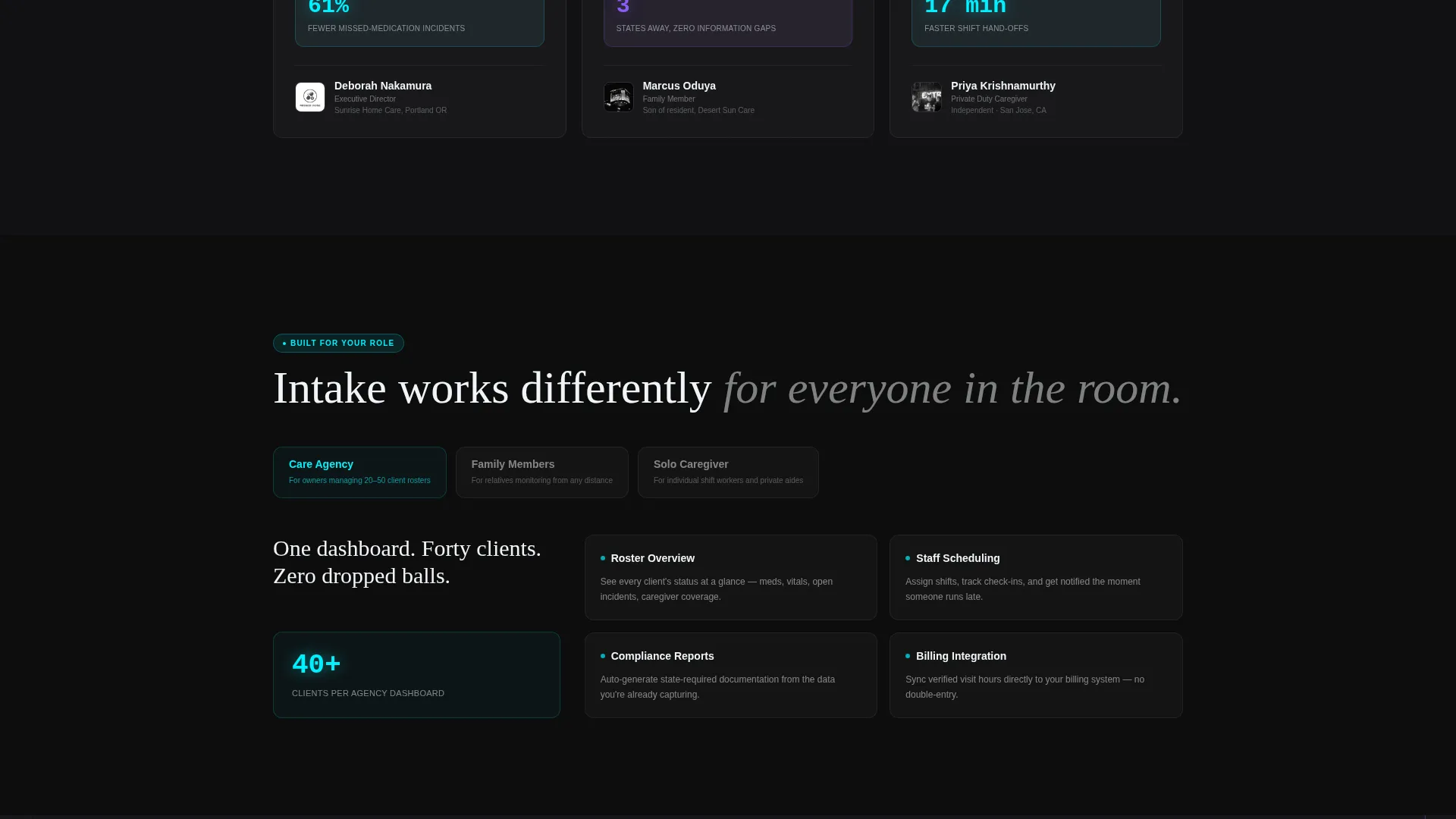
- Care agency owners managing rosters of forty or more clients who need a platform pitch that matches the scale of their work
- Family members monitoring a loved one remotely who want to see real-time data handling before downloading anything
- Solo caregivers and shift workers who need shift-note sync and incident documentation that actually works across handoffs
What problem this template solves
Care coordination is fragmented. Medication schedules live in one place, check-in logs in another, and family updates in a group text that nobody can search. A landing page for a senior care app has to replace all of that noise with one calm, clear picture. This template solves the trust gap between "I heard about this app" and "I just downloaded it."
- Visitors arrive skeptical and leave informed, because the interactive header puts the product directly in their hands before they scroll
- Generic SaaS templates do not communicate care-specific urgency; this template is built around real care workflow signals like fall risk alerts and hydration tracking
- The spec-card grid removes vague marketing language and replaces it with precise, one-line capability statements that answer the questions care professionals actually ask
What you get with this template
You get a fully structured single-page layout with a functional interactive preview, a modular card grid, and two distinct conversion paths. Every section is designed to reduce hesitation and increase download intent.
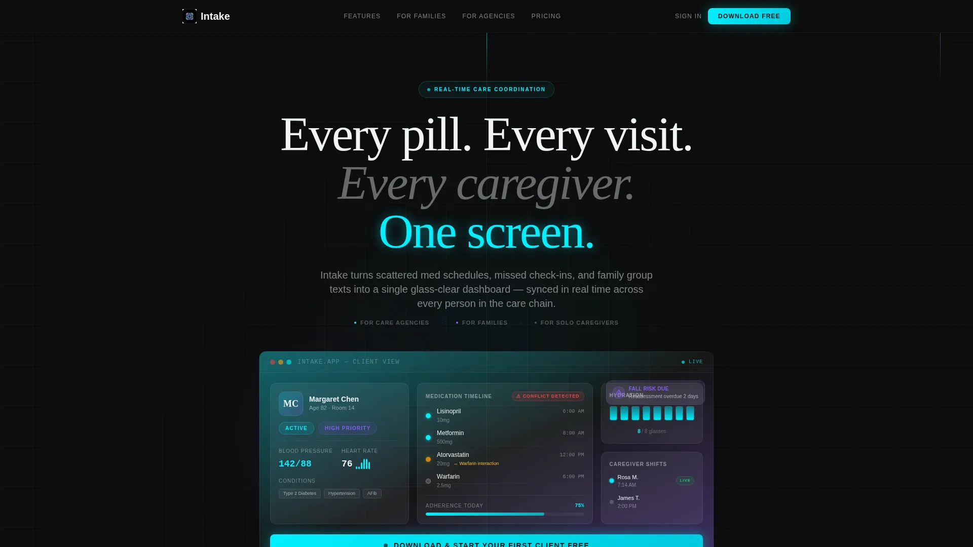
- An interactive browser-rendered header showing a fictional client profile with live ticking metrics, a caregiver check-in indicator, a medication timeline, and a hydration tracker
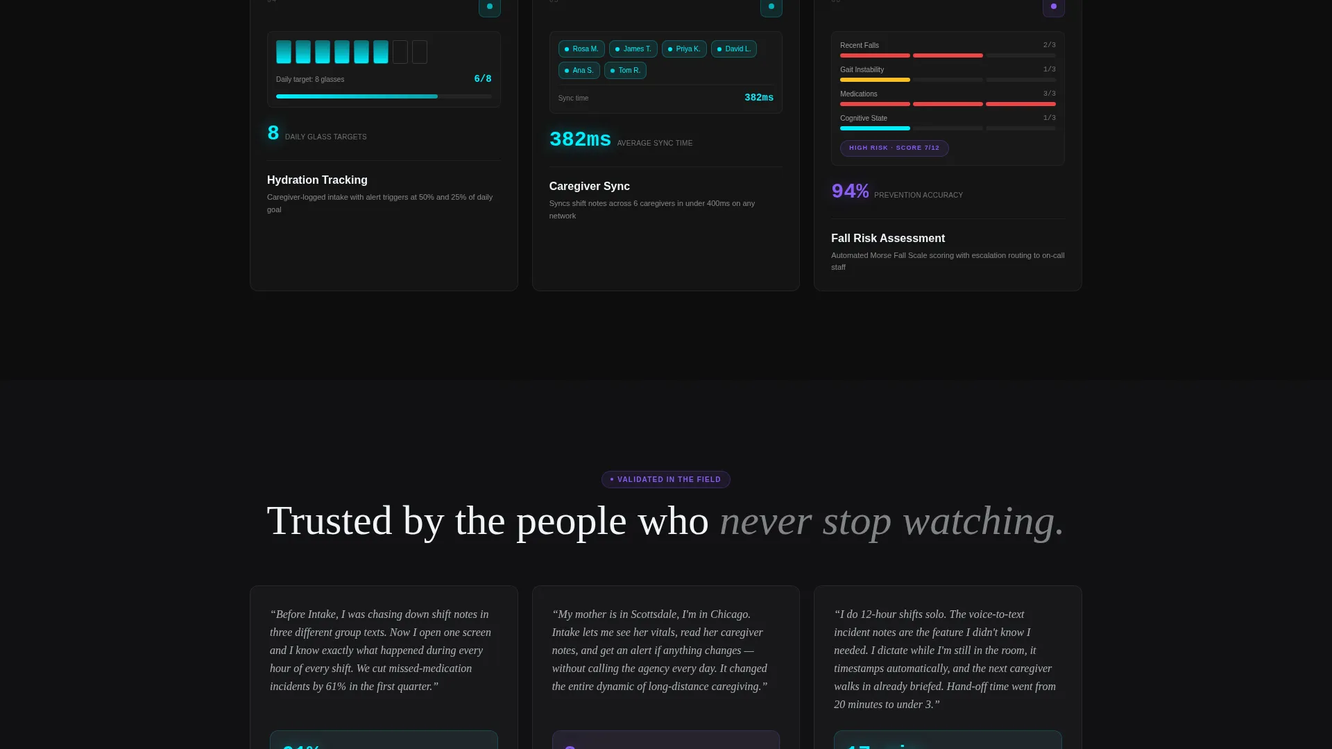
- A modular card grid where each card isolates one platform capability, carries a single animated metric, and closes with a one-line spec statement
- Two conversion paths: a primary "Download and Start Your First Client Free" call to action and a secondary "See It With Your Data" guided demo path, plus app store badges and a single-field email input for desktop users
Feature list
This template is built from specific, prompt-verified components. Each feature below reflects what the layout actually delivers.
Interactive Header Dashboard
The header is not a static hero image. It renders a live micro-dashboard directly in the browser, showing a fictional client profile for "Margaret Chen, 82, Room 14." Metrics tick in real time. A caregiver check-in pings green. A fall risk reassessment badge appears without any scroll interaction. Visitors understand the product before they read a single headline.
Modular Spec-Card Grid
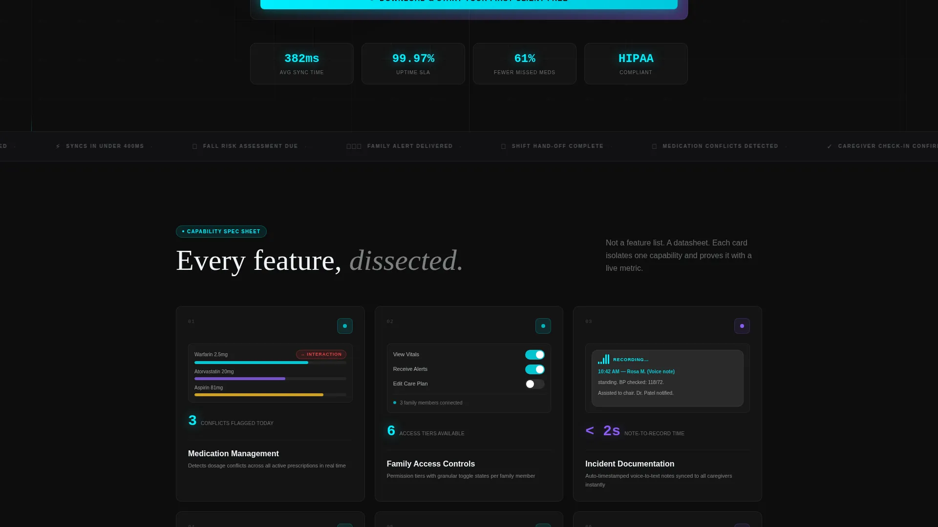
Each card in the grid isolates one capability and presents it with datasheet precision. Card one covers medication management with dosage conflict detection across three prescriptions. Card two shows family access controls with permission tier toggles. Card three displays auto-timestamped voice-to-text incident notes. Every card includes one animated metric and one single-line specification.
Dual Conversion Path Design
The primary call to action, "Download and Start Your First Client Free," appears inside the interactive header as a pulsing button that mirrors the app's own interface. A sticky bottom bar carries the same action on mobile. The secondary path offers a 60-second guided demo pre-populated with a sample client profile.
App Store Badge and Email Input Block
Desktop visitors see app store download badges alongside a single-field email input. This lets users request a download link sent directly to their phone. The block reduces friction for users who discover the product on a desktop but prefer to install on a mobile device.
Tech Glass Visual System
The layout uses a frosted-glass card aesthetic where each surface floats on a subtle blur layer. Cyan edge lighting signals active states. Violet appears only on trending data and attention-needed indicators. The visual hierarchy guides the eye the way a trained nurse scans a ward, from most urgent to least, without confusion.
Page sections overview
| Section | Purpose |
|---|---|
| Interactive Header Dashboard | Shows a live fictional client profile with ticking metrics to demonstrate the product instantly |
| Primary Call to Action | Pulsing download button inside the header, styled to match the app's own interface |
| Medication Management Card | Isolates dosage conflict detection across three prescriptions with an animated metric |
| Family Access Controls Card | Displays permission tier toggles and family-facing visibility states |
| Incident Documentation Card | Shows auto-timestamped voice-to-text note creation with a sync indicator |
| App Store and Email Block | App store badges alongside a single email field for mobile download delivery |
| Secondary Demo Path | "See It With Your Data" entry point leading to a 60-second pre-populated guided demo |
| Sticky Mobile Bar | Persistent bottom bar carrying the primary download call to action on mobile screens |
Design & branding system
The visual identity uses the Acid Digital color system rendered through a Tech Glass aesthetic. Every color carries a deliberate meaning, the way a vitals monitor uses color to communicate patient status at a glance.
- Deep obsidian (#0D0D0D) as the primary background, electric cyan (#00F0FF) for active-state indicators and data pulses, clinical violet (#8B5CF6) on secondary cards and graph lines, and sterile white (#F0F4F8) for typography and card surfaces
- Cards float on frosted-glass blur layers with cyan edge lighting, creating depth without visual noise
- Violet appears only where data is trending or needs attention, making the color itself a functional signal rather than decoration
Mobile & speed optimization
The template is designed for a mobile-first care audience. Caregivers often check dashboards from a phone during a shift, and family members frequently monitor remotely from whatever device is nearest.
- The sticky bottom bar keeps the primary download call to action accessible on mobile without requiring the visitor to scroll back to the top
- The modular card grid reflows naturally at smaller screen sizes, keeping each spec card readable and self-contained
- The interactive header is sized and structured to load and render within the browser without disrupting the scroll experience on mobile devices
How this template helps you convert
This template is built around a single insight: people in care roles need to see a tool working before they trust it. Every layout decision supports that goal.
- The interactive header functions as the pitch itself. Visitors watch a real client profile update in real time, which communicates the product's core value faster than any headline could.
- The spec-card grid replaces persuasion with evidence. By the time a visitor reaches the bottom of the grid, they have read precise capability statements, seen animated metrics, and absorbed one-line specs that answer practical questions without vagueness.
- The dual conversion path removes the all-or-nothing commitment problem. Visitors who are not ready to download can step into the guided demo instead, keeping them engaged with the product rather than bouncing from the page.
Other information about this template
This template is built specifically for the senior care software category and is not a generic SaaS landing page. The layout decisions are grounded in how care professionals actually interact with information under pressure.
- The creative direction follows a Spec Sheet approach, meaning every card reads like a product datasheet rather than a marketing headline
- The header concept is classified as Interactive Preview, a layout pattern where the product demonstration is embedded directly into the page rather than linked to an external video or screenshot
- The template style is Card Grid (Modular), which means individual feature cards can be reordered, replaced, or extended without restructuring the entire layout
- The landing page direction is App Download, with both a direct install path and a demo path to serve users at different stages of decision-making
- The Tech Glass theme and Acid Digital color system make this template visually distinct from typical care software marketing, which tends toward soft pastels and stock photography
Theme
Tech Glass
Creative direction
Spec Sheet
Color system
Acid Digital
Style
Card Grid (Modular)
Direction
App Download
Page Sections
Live Interactive Header Dashboard
Modular Spec-card Grid
Dual Conversion Path Layout
App Store Badge and Email Capture Block
Tech Glass Frosted-card System
Related questions
Who is this landing page template designed for?
What makes the header different from a standard hero section?
Can the spec cards be customized for different platform features?
What are the two conversion paths in this template?
Is this template suitable for a product that is not yet publicly launched?



