Premium Architecture Firm Software Professional Website Template
Intake is a scroll-reveal landing page template built for architecture firm software. It transforms client inquiry data into a compelling, data-driven page experience. Designed with a Tech Glass visual identity and Teal Catalyst color system, it guides studio managers, office administrators, and solo practitioners toward an interactive demo using sequential stats, animated charts, and precision-timed calls to action.
by Rocket studio
Quick summary
Intake is a single-page, scroll-reveal landing page template purpose-built for architecture firm client intake software. It opens with three bold benchmark statistics, walks visitors through animated data sections that build a diagnostic case, and closes with a high-conviction call to action. The template targets architecture professionals who lose billable time to disorganized client inquiry workflows.
Who this template is for
This template is designed for teams and individuals who manage the front end of an architecture project pipeline. If client inquiries arrive scattered and unstructured, this page speaks directly to that frustration.
- Studio managers running multiple active residential projects who need a faster path from inquiry to structured record
- Office administrators at mid-size commercial firms who regularly field proposal requests and need a professional intake solution
- Solo practitioners whose billable hours disappear into email chains that a structured form could replace
What problem this template solves
Architecture professionals consistently lose time between the first client call and the moment a project record actually exists. The gap between initial inquiry and a signed contract brief is where data drops, context fades, and hours vanish. This template builds a page that makes that problem visible and positions the platform as the fix.
- Scattered client inquiries that never become clean, structured intake records
- Manual follow-up chains that delay project scheduling and consume non-billable time
- Inconsistent data collection that creates errors in early project briefs
What you get with this template
You get a complete, scroll-reveal landing page layout built around an industry-report creative direction. Every section reveals a new layer of the intake problem and moves the visitor closer to acting. The page is designed for click-through, not form submission.
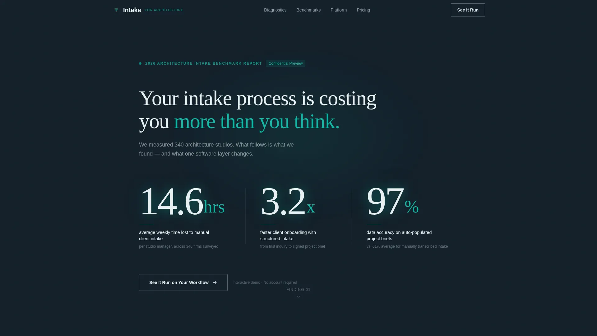
- A stats-wall header with three sequentially fading benchmark numbers that open the page with immediate credibility
- Animated chart sections that enter the viewport progressively, each building the case for automated intake
- Two strategically placed calls to action: a ghost-outlined button early in the page and a solid catalyst-orange button after the third data section
Feature list
This template includes several purpose-built components that support the industry-report creative direction and click-through goal.
Sequential Stats Header
Three oversized benchmark numbers fade in one after another as the page loads. Each stat is set in a thin architectural sans-serif against deep charcoal, with a faint teal backlight effect. No hero image, no illustration. The data leads.
Viewport-Triggered Chart Animations
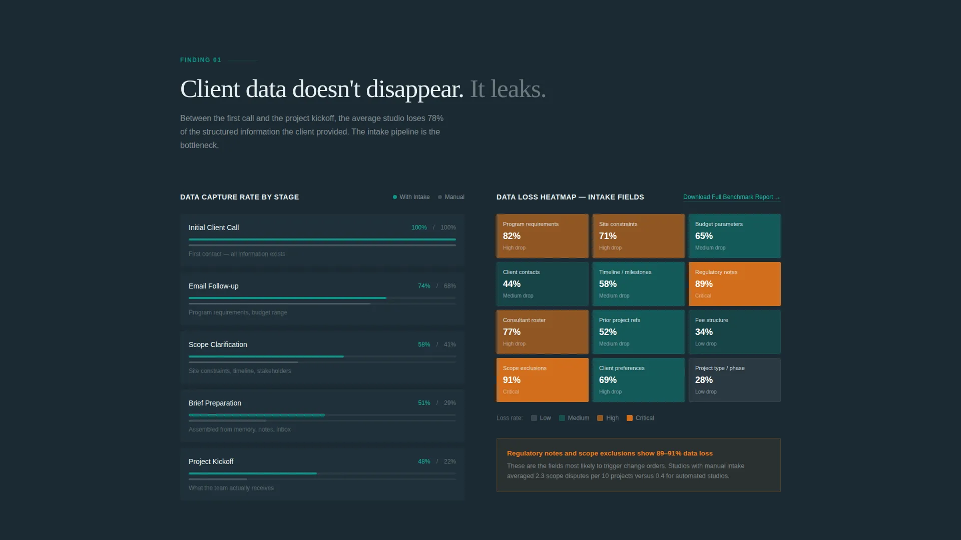
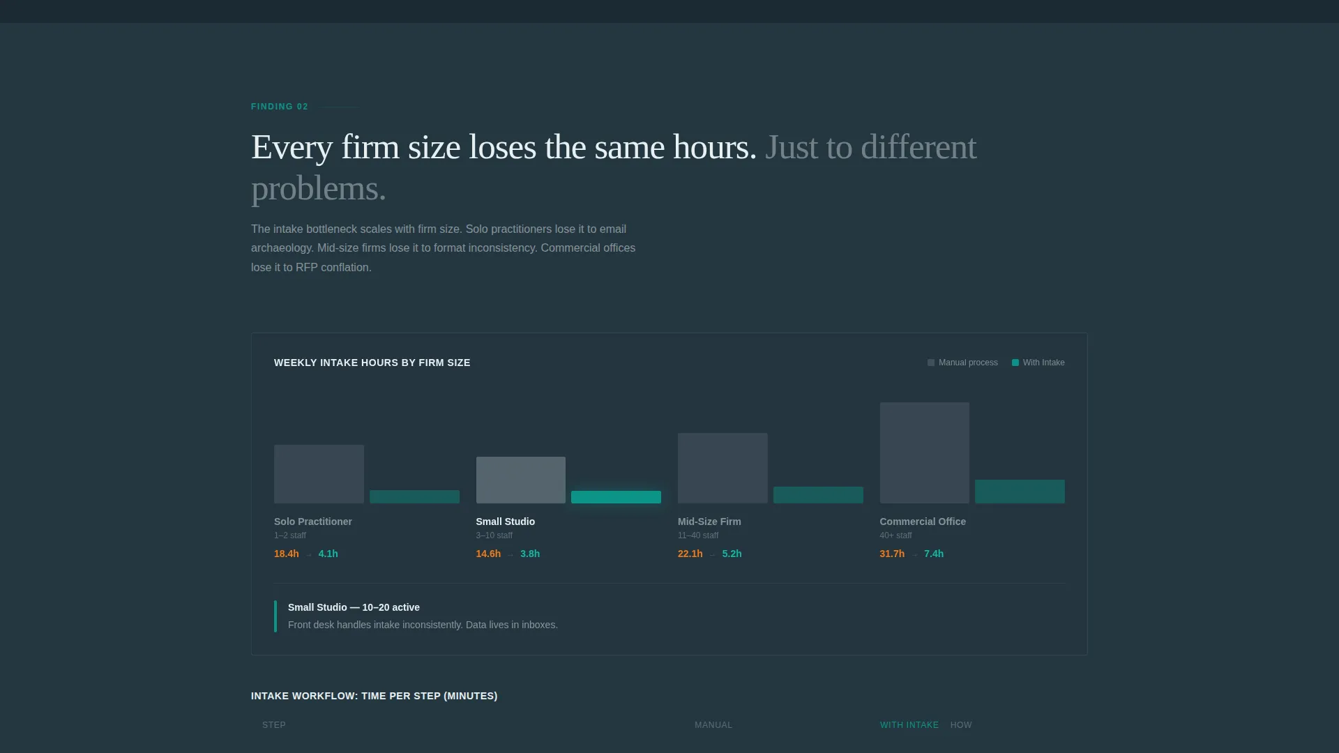
Data visualizations animate into view only when they enter the visible screen area. A workflow heatmap and benchmarked intake comparisons reveal progressively, keeping the visitor engaged section by section as the case builds.
Dual Call-to-Action System
The primary call to action, "See It Run on Your Workflow," appears first as a ghost-outlined button directly beneath the header stats. It reappears as a solid catalyst-orange button after the third data section, when visitor conviction is highest.
Secondary Lead Capture Link
A text link labeled "Download the Full Benchmark Report" sits beside the heatmap section. It captures email addresses from visitors who are curious but not yet ready to demo, without adding a form to the main page flow.
Tech Glass Visual Theme
The layout uses frosted glass surfaces, deep charcoal backgrounds, and teal highlights throughout. Catalyst orange is reserved exclusively for calls to action and data highlights, keeping the visual hierarchy clean and purposeful.
Scroll Reveal Progressive Layout
Each section enters the viewport with a reveal animation, pacing the visitor through a diagnostic-to-prescriptive narrative. The scroll experience feels like paging through a proprietary industry report, building urgency naturally without hard-sell language.
Page sections overview
| Section | Purpose |
|---|---|
| Stats Metrics Header | Opens with three benchmark numbers to establish credibility immediately |
| Ghost call to action Button | First call to action placed beneath header stats for early click capture |
| Intake Benchmark Data | Presents benchmarked intake times across different firm sizes |
| Client Data Heatmap | Shows where client data drops between first call and contract signing |
| Secondary Lead Link | Captures email from visitors not yet ready to demo |
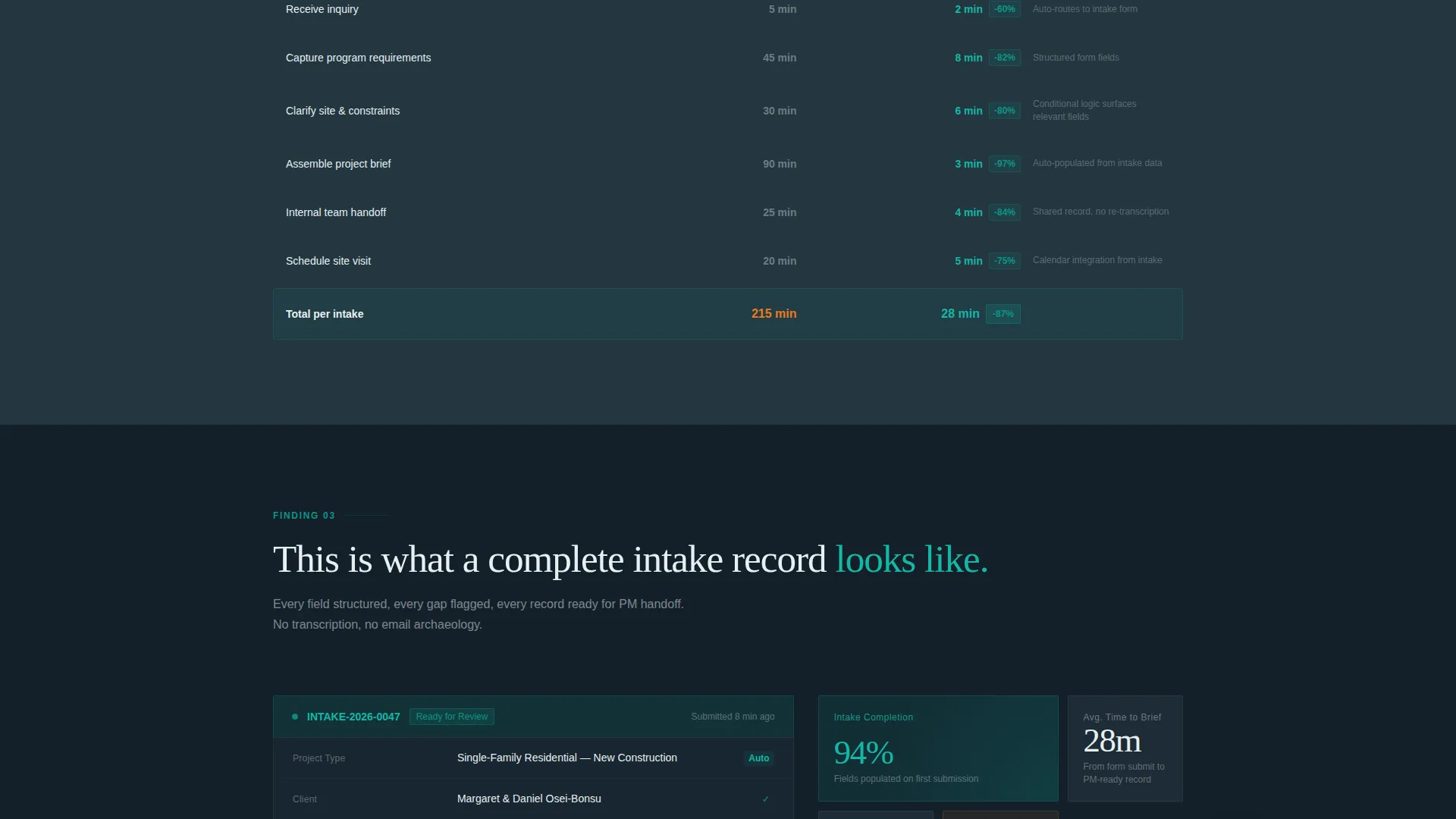
| Workflow Comparison Charts | Compares manual versus automated studio intake processes |
| Solid Orange call to action | High-conviction call to action placed after the third data section |
Design & branding system
The visual identity follows a Tech Glass theme using the Teal Catalyst color system. Every color choice has a specific role, and the palette enforces a clear reading hierarchy across the page.
- Deep architectural charcoal (#1B2A33) as the dominant background, teal (#0D9488) as the primary accent for highlights and status indicators, and frosted glass white (#E8F0F2) for surface layers
- Catalyst orange (#F27A1A) used exclusively on calls to action and data callouts, never as a decorative color
- Thin architectural sans-serif typography for stats and headings, keeping the page feeling precise and data-forward rather than decorative
Mobile & speed optimization
The template is designed so the scroll-reveal behavior and chart animations remain smooth across device sizes. Progressive reveal sections are structured to reflow cleanly on smaller screens without breaking the narrative sequence.
- Viewport-triggered animations fire based on element visibility, so no section animates before it is actually in view on any screen size
- The absence of stock imagery or hero illustrations keeps the visual load lightweight and focused on the data itself
How this template helps you convert
The page is engineered as a click-through landing page, not a form page. Every structural decision points toward one outcome: getting the right visitor to click into the interactive demo.
- The stats header creates immediate diagnostic resonance. Visitors who recognize their own lost hours in "14.6 hrs per week" are primed to keep reading before a single word of copy appears.
- The escalating data narrative moves from diagnostic to prescriptive across sections, so by the time the solid orange call-to-action button appears, the visitor has already built their own case for acting.
- The secondary lead-capture link beside the heatmap provides a lower-commitment path for visitors who need more time, keeping them inside the funnel without interrupting the main conversion flow.
Other information about this template
This template is part of a focused set of landing page designs built for architecture firm software in the technology category. It is matched to the architecture firm patient management niche, where structured client intake is a recurring operational pain point.
- The template style is Scroll Reveal (Progressive), meaning sections and data visualizations appear as the visitor scrolls rather than loading all at once
- The creative direction is Industry Report, which means the tone and layout mimic a research whitepaper rather than a traditional software marketing page
- The header concept is Stats and Metrics, placing quantified proof at the very top of the page before any descriptive copy
- The landing page direction is Click-Through, routing visitors to an interactive demo pre-loaded with a sample residential intake rather than collecting form submissions on the page itself
Theme
Tech Glass
Creative direction
Industry Report
Color system
Teal Catalyst
Style
Scroll Reveal (Progressive)
Direction
Click-Through
Page Sections
Sequential Stats Wall Header
Viewport-triggered Chart Animations
Dual Call-to-action Placement
Secondary Email Capture Link
Tech Glass Visual System
Industry Report Scroll Narrative
Related questions
What kind of architecture firm would benefit most from this template?
Does this template include a contact form?
Can I adjust the benchmark statistics in the header?
How does the scroll reveal behavior work?
Is catalyst orange used anywhere other than the call-to-action buttons?



