Healthcare Software & SaaS Professional Website Template
Intake is a split-screen healthcare client management landing page template built for clinic managers, behavioral health coordinators, and private practice owners. It pairs a live code snippet header with a rendered client card, then walks visitors through a Problem→Solution Arc that builds toward a freemium trial signup. The design uses an AI Iridescent palette for a clinical yet dynamic feel.
by Rocket studio
Quick summary
Intake is a single-page template designed for healthcare client management platforms. It uses a 50/50 split-screen layout, an animated code snippet header, and a scrolling Problem→Solution Arc. The visual identity blends deep charcoal with holographic lavender and iridescent teal. Every section moves the visitor from recognizing a pain point to trusting the platform's solution.
Who this template is for
This template is built for SaaS founders and product teams in the healthcare software space. It speaks directly to the people their platform serves, so the messaging lands immediately with the right audience.
- Clinic office managers overwhelmed by faxed referrals and scattered patient records
- Behavioral health coordinators managing caseloads across multiple electronic medical record systems
- Private practice owners who still rely on spreadsheets to track insurance authorizations
What problem this template solves
Healthcare operations teams lose time and risk errors when patient records, referral threads, and insurance callbacks live in disconnected tools. A landing page needs to name that pain clearly before presenting a solution. This template does exactly that.
- Visitors feel seen immediately because the page mirrors their actual daily chaos
- The escalating problem arc moves from inconvenience to compliance risk, raising stakes progressively
- Each solution panel arrives with growing visual confidence, turning recognition into relief
What you get with this template
You get a fully structured, single-page layout ready to represent a healthcare client management platform. The template is built for freemium or free-trial conversion and includes two distinct conversion paths.
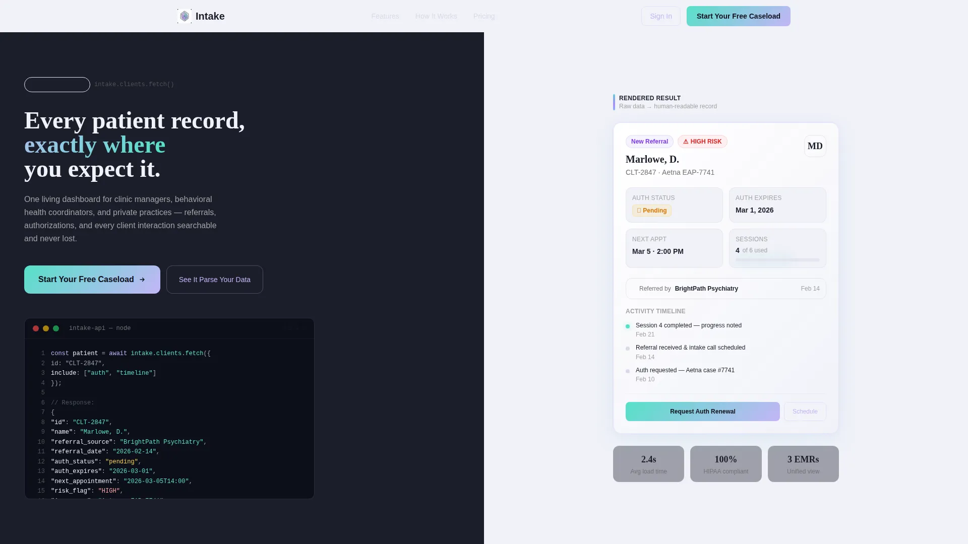
- A split-screen header pairing a syntax-highlighted API code snippet with a live rendered client card
- A scrolling Problem→Solution Arc with paired left-panel pain artifacts and right-panel platform responses
- A primary call-to-action ("Start Your Free Caseload") and a secondary inline demo widget ("See It Parse Your Data")
Feature list
This template packages several purpose-built components that work together to move a healthcare software visitor from skepticism to signup.
Animated Split-Screen Header
The header divides the viewport evenly. The left panel displays a realistic API call fetching a patient object, complete with fields like referral source, authorization status, next appointment, and risk flag, rendered in a dark terminal with lavender and teal syntax highlighting. Characters type themselves into existence mid-animation. The right panel shows the same data transformed into a clean, glowing client card with status badges and a timeline.
Scrolling Problem→Solution Arc
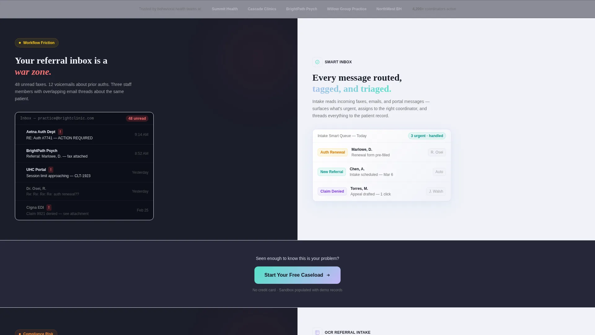
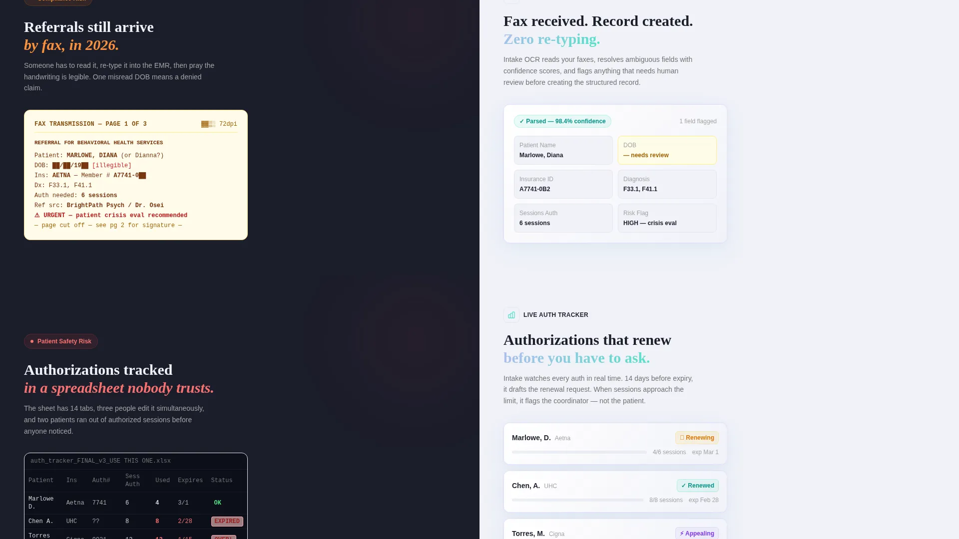
As the visitor scrolls, the left panel presents pain-point artifacts in sequence: a cluttered inbox screenshot, a redacted fax referral, a spreadsheet with red cells. The right panel answers each with the platform's corresponding solution. Stakes escalate from inconvenience to compliance risk to patient harm, and each solution panel arrives with more visual polish than the one before it.
Freemium Trial Conversion Flow
The primary call-to-action, "Start Your Free Caseload," appears after the second problem-solution pair and anchors persistently in the navigation. The signup flow asks only for a work email and practice type (solo, group, or facility) before granting immediate access to a sandbox of demo client records.
Inline Data Parsing Demo Widget
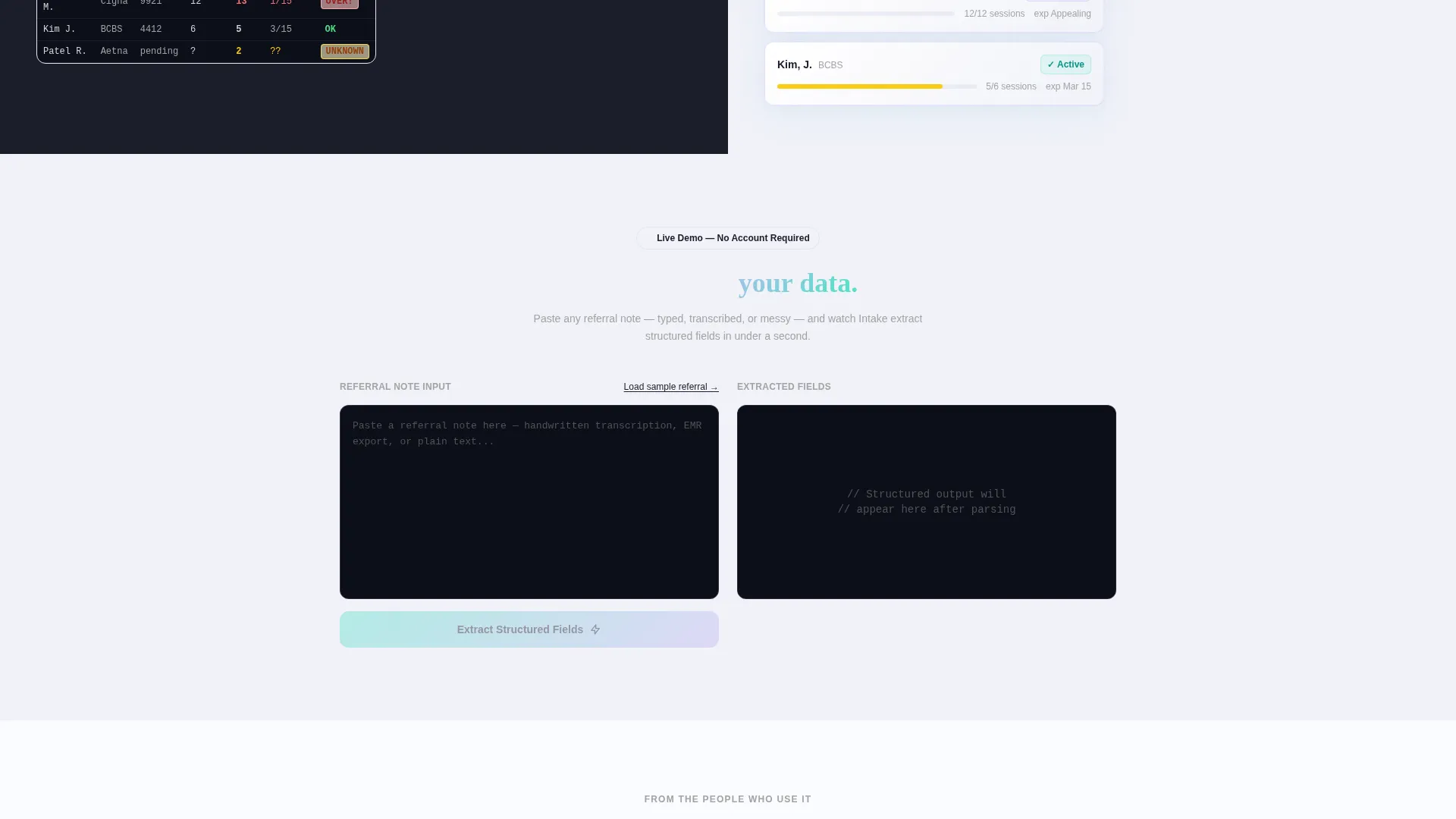
A secondary conversion path lets visitors paste a sample referral note directly into the page. The widget extracts structured fields in real time, showing the platform's capability before any commitment is required. This proof-before-signup mechanic earns the click through demonstration rather than description.
AI Iridescent Visual System
The color palette uses deep clinical charcoal (#1B1D2A) for left panels, soft holographic lavender (#C4B5F7) across accent gradients, neural-white (#F0F1F8) for content surfaces, and iridescent teal (#56E0C8) on interactive states and data highlights. The overall effect is clinical precision meeting something subtly alive, like light refracting through a prism onto a sterile countertop.
Directory and Discovery Theme Structure
The layout follows a Directory and Discovery theme, meaning information is organized so visitors can scan, locate, and trust key details quickly. Client cards, status badges, and timeline components reinforce the idea that every record is findable and every next step is visible.
Page sections overview
| Section | Purpose |
|---|---|
| Split-Screen Header | Pair raw API data with rendered client card to demonstrate platform value immediately |
| Problem Panel One | Show cluttered inbox artifact alongside smart inbox solution |
| Problem Panel Two | Show redacted fax referral alongside OCR-parsed referral intake response |
| First call to action Block | Place "Start Your Free Caseload" prompt after second problem-solution pair |
| Problem Panel Three | Show red-cell spreadsheet alongside automated authorization tracker |
| Inline Demo Widget | Let visitors paste a referral note and watch structured field extraction in real time |
| Persistent Nav call to action | Anchor "Start Your Free Caseload" button in navigation throughout the scroll journey |
| Signup Entry Form | Collect work email and practice type before granting sandbox access |
Design & branding system
The template uses an AI Iridescent color system that feels clinical and dynamic at the same time. Each color has a specific role, keeping the layout readable while the palette shifts subtly as the visitor moves through it.
- Deep clinical charcoal (#1B1D2A) anchors left panels and dark terminal backgrounds
- Soft holographic lavender (#C4B5F7) runs through syntax highlights and accent gradients, while iridescent teal (#56E0C8) pulses on interactive states, status badges, and data highlights
- Neural-white (#F0F1F8) keeps content surfaces clean and readable against the richer background tones
Mobile & speed optimization
The 50/50 split-screen layout is designed with responsive reflow in mind. On smaller viewports, the paired panels stack vertically so the problem and solution sequence stays coherent without a side-by-side dependency.
- The terminal animation and typing effect are scoped to the header section, keeping the rest of the scroll experience lightweight
- The inline demo widget and call to action blocks are designed to remain fully functional and visible at mobile widths
- Stacked panel order preserves the Problem→Solution narrative on narrow screens
How this template helps you convert
The entire page is structured as a conversion engine. Every design decision either builds trust or reduces friction on the path to signup.
- The animated code-to-card header immediately proves that raw data becomes usable information, giving technical and non-technical visitors an instant reason to stay.
- The escalating Problem→Solution Arc mirrors the visitor's real frustration in increasing detail, so by the time the first call-to-action appears, the emotional case for signing up is already made.
- The inline referral-parsing widget delivers a live proof moment before any form is filled, so the visitor experiences the platform's value rather than just reading about it.
Other information about this template
This template is built specifically for the healthcare software and SaaS category. It fits naturally within the broader healthcare client management niche, where trust, clarity, and workflow fit are the deciding factors for adoption.
- The page type is a single landing page, not a multi-page website, making it ideal for focused campaign traffic or product launch pages
- The Directory and Discovery theme makes it adaptable for platforms that manage any kind of structured client or patient data
- The Problem→Solution Arc structure can be updated with different artifact screenshots or solution panels to match a specific platform's feature set
- The freemium and trial-focused layout aligns with common go-to-market strategies in healthcare SaaS, where reducing signup friction is critical to growth
Theme
Directory & Discovery
Creative direction
Problem→Solution Arc
Color system
AI Iridescent
Style
Split Screen (50/50)
Direction
Freemium/Trial
Page Sections
Animated Split-screen Header
Scrolling Problem→solution Arc
Freemium Trial Conversion Flow
Inline Referral Parsing Widget
AI Iridescent Color System
Directory and Discovery Layout Theme
Related questions
Who is this landing page template designed for?
Can I update the problem and solution panels for my specific platform?
What does the signup flow ask from new users?
Does the inline demo widget need a backend connection?
Is this template a good fit for a paid ad campaign or product launch?



