Integrity — Trustworthy Tech Support Landing Page Template
Uptime is a scroll-reveal landing page template built for managed IT service providers. It leads with a terminal-style code animation, fires animated stat counters, and walks visitors through a side-by-side comparison of their current IT versus a managed approach. The design uses a dark iridescent palette and progressive scroll reveals to build trust and drive audit lead captures.
by Rocket studio
Quick summary
Uptime is a single-page, scroll-reveal landing page template for IT service companies. It opens with a simulated deployment terminal, then builds a case through animated counters, a structured comparison table, and a persistent call-to-action bar. The aesthetic is dark and technical, designed to feel credible to operations and finance decision-makers.
Who this template is for
This template is built for IT service providers who need to close enterprise and mid-market clients quickly. The page speaks directly to buyers who have already felt the pain of unreliable infrastructure.
- Managed IT service providers pitching to mid-market operations directors
- IT firms targeting CFOs who want predictable costs over break-fix billing
- Technology consultants serving startup CTOs scaling past informal support
What problem this template solves
Most IT service landing pages look like brochures. They list certifications and phone numbers but never confront the buyer's real fear: what happens when something breaks at 2 AM on a Sunday. This template closes that gap.
- Generic IT pages fail to contrast managed services against the status quo
- Prospects don't understand the cost difference until they see it side by side
- Vague promises about "reliability" don't move decision-makers who own budgets
What you get with this template
You get a complete, conversion-focused landing page layout with every section pre-built and sequenced for progressive scroll reveal. Nothing needs to be invented from scratch.
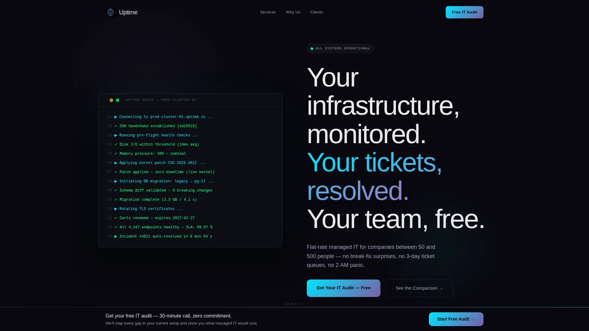
- A terminal-style animated header with a self-typing headline and blinking cursor
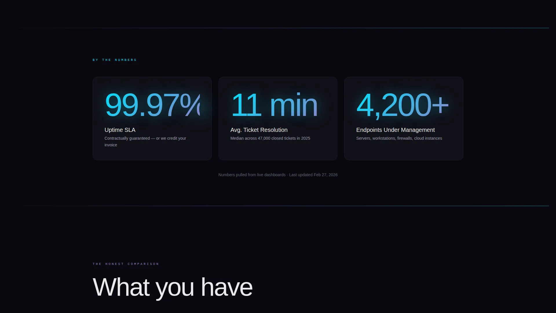
- Three animated stat counters (99.97% uptime SLA, 11-minute average ticket resolution, 4,200+ endpoints managed)
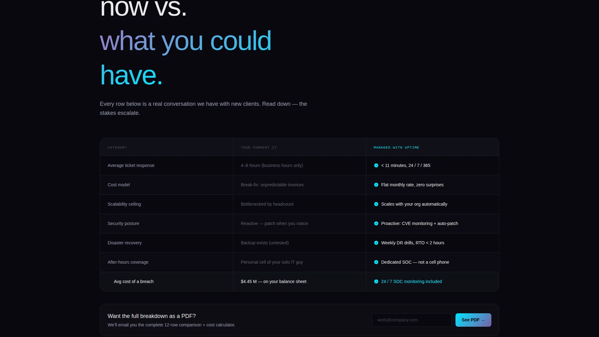
- A two-column comparison architecture contrasting current IT against a managed approach, row by row
- A persistent bottom-bar call-to-action that activates after the first counter fires
- A three-field lead capture form and a secondary lighter-intent email capture path
Feature list
This section covers the core built-in capabilities of the Uptime template as delivered.
Simulated Deployment Terminal Header
The header opens on a pure void-black field with a monospaced terminal block. Lines compile and resolve with green checkmarks in a real-time simulated sequence. A single headline types itself out letter by letter, ending with a blinking cursor before the scroll prompt appears.
Scroll-Triggered Animated Counters
Three oversized stat counters detonate into view as the visitor scrolls to them. Particles coalesce into the digits, displaying 99.97% uptime, 11-minute average ticket resolution, and 4,200+ endpoints managed. The effect signals scale and credibility before any copy is read.
Side-by-Side Comparison Layout
A two-column comparison block places "Your Current IT" in muted gray on the left and "Managed with Us" in electric cyan on the right. Each row reveals progressively on scroll, covering response times, cost per incident, scalability, security posture, and breach cost context.
Persistent Bottom-Bar Call to Action
After the first stat counter fires, a bottom bar activates and stays pinned throughout the rest of the scroll. It anchors the primary call to action without interrupting the reading flow or requiring the visitor to scroll back up.
Dual Lead Capture Paths
The primary form collects company size, the visitor's biggest IT frustration, and a work email in three sequential fields. A secondary path captures lighter-intent leads with an email-only field tied to a comparison PDF download offer.
Dynamic Motion Visual System
Scroll reveals, counter animations, and iridescent shimmer on section dividers give the page a living quality. Violet-to-cyan gradients activate on stat counters and hover states. The motion is purposeful and controlled, never decorative for its own sake.
Page sections overview
| Section | Purpose |
|---|---|
| Terminal Header | Opens with simulated deployment sequence and self-typing headline |
| Animated Stat Counters | Establishes scale with three scroll-triggered performance metrics |
| Comparison Table Block | Contrasts current IT with managed services row by row on scroll |
| Primary Lead Form | Captures qualified leads via company size, frustration field, and email |
| Secondary Email Capture | Catches lighter-intent visitors with a comparison PDF download offer |
| Persistent call to action Bar | Keeps the primary action visible after the first counter fires |
Design & branding system
The visual identity follows a Dynamic Motion theme built on an AI Iridescent color system. The palette feels like the side of a GPU under shifting light: dark, liquid, and faintly prismatic.
- Void black (#09090F) dominates all backgrounds, violet (#7B5EA7) and electric cyan (#00E5FF) appear as gradients on counters and hover states, and signal white (#EAEAEA) keeps body copy sharp and legible
- Monospaced typefaces are used in the terminal header for technical authenticity, while the rest of the page uses clean proportional type for readability
- Subtle iridescent shimmer on section dividers gives the layout a breathing quality without tipping into decorative excess
Mobile & speed optimization
The scroll-reveal architecture is designed to work cleanly on smaller screens, keeping the progressive reveal logic intact without relying on hover-only interactions.
- Counter animations and comparison row reveals are touch-friendly and do not require mouse hover to trigger
- The persistent bottom-bar call-to-action adapts to mobile viewports so it remains accessible without overlapping critical content
How this template helps you convert
The page is structured so that each scroll section does a specific job in the buying decision. By the time a visitor reaches the lead form, the comparison layout has already done the selling.
- The terminal header establishes technical credibility immediately, filtering for the right buyer before a single word of copy is read.
- The animated counters deliver proof of scale in seconds, giving CFOs and operations directors a number to hold onto.
- The progressive comparison layout escalates stakes row by row, ending at breach cost context that reframes the price of inaction.
Other information about this template
This template is part of a broader set of technology and IT services landing page designs built for high-intent conversion scenarios.
- The template is suited for IT service companies looking to replace static brochure-style pages with a structured, argument-driven layout
- The comparison architecture is particularly effective for managed service provider sales cycles where the buyer is evaluating switching costs
- The design system is fully self-contained, using void black, holographic violet, electric cyan, and signal white with no dependency on external asset libraries
- The Scroll Reveal (Progressive) template style ensures each section arrives with intention, keeping visitors engaged through the full page length
Theme
Dynamic Motion
Creative direction
Stats-First Impact
Color system
AI Iridescent
Style
Scroll Reveal (Progressive)
Direction
Comparison/Versus
Page Sections
Terminal-style Animated Header
Scroll-triggered Stat Counters
Progressive Comparison Layout
Persistent Bottom-bar Call to Action
Dual Lead Capture Paths
AI Iridescent Visual System
Related questions
Who is this landing page template designed for?
Can I customize the stat counter numbers and comparison rows?
Does the template include both lead capture options?
What makes the terminal header different from a standard hero section?
Is this a multi-page template or a single landing page?



