Authoritative Whitepaper | Free Website Template | Rocket
Intelvault is a split-screen whitepaper landing page template built for research-driven apps and intelligence platforms. It leads with animated data statistics, alternates punch-then-explain scroll sections, and drives visitors toward an app download through two strategically placed calls to action. The dark Tech Glass aesthetic and electric cyan accents give every number the weight it deserves.
by Rocket studio
Quick summary
Intelvault is a single-page template designed to market an industry whitepaper app. It opens with four oversized statistics displayed in frosted-glass panels, then walks visitors through animated data sequences before closing with a dual call-to-action driving app downloads. The layout is a strict 50/50 split screen with a Monochrome Steel palette and a single electric cyan accent.
Who this template is for
This template is built for publishers, research platforms, and intelligence app teams who need to convert serious professional readers. It speaks the language of data before it speaks the language of marketing.
- Teams launching or promoting an industry whitepaper app or research library
- Vendors targeting engineering leads, procurement directors, and strategy consultants
- Product marketers who want a premium, credibility-first landing page instead of a generic signup form
What problem this template solves
Most app landing pages lead with lifestyle visuals and vague benefit headlines. For a research-heavy product, that approach feels thin. Decision-makers in technical and strategic roles scan for proof before they commit attention.
- Generic templates fail to establish authority for data-intensive or research-backed products
- Visitors leave before understanding the depth of the content library on offer
- Standard layouts bury the strongest proof points instead of leading with them
What you get with this template
You get a fully structured, single-page layout that sequences data, context, and conversion triggers in a deliberate order. Every section is designed to build credibility before asking for anything.
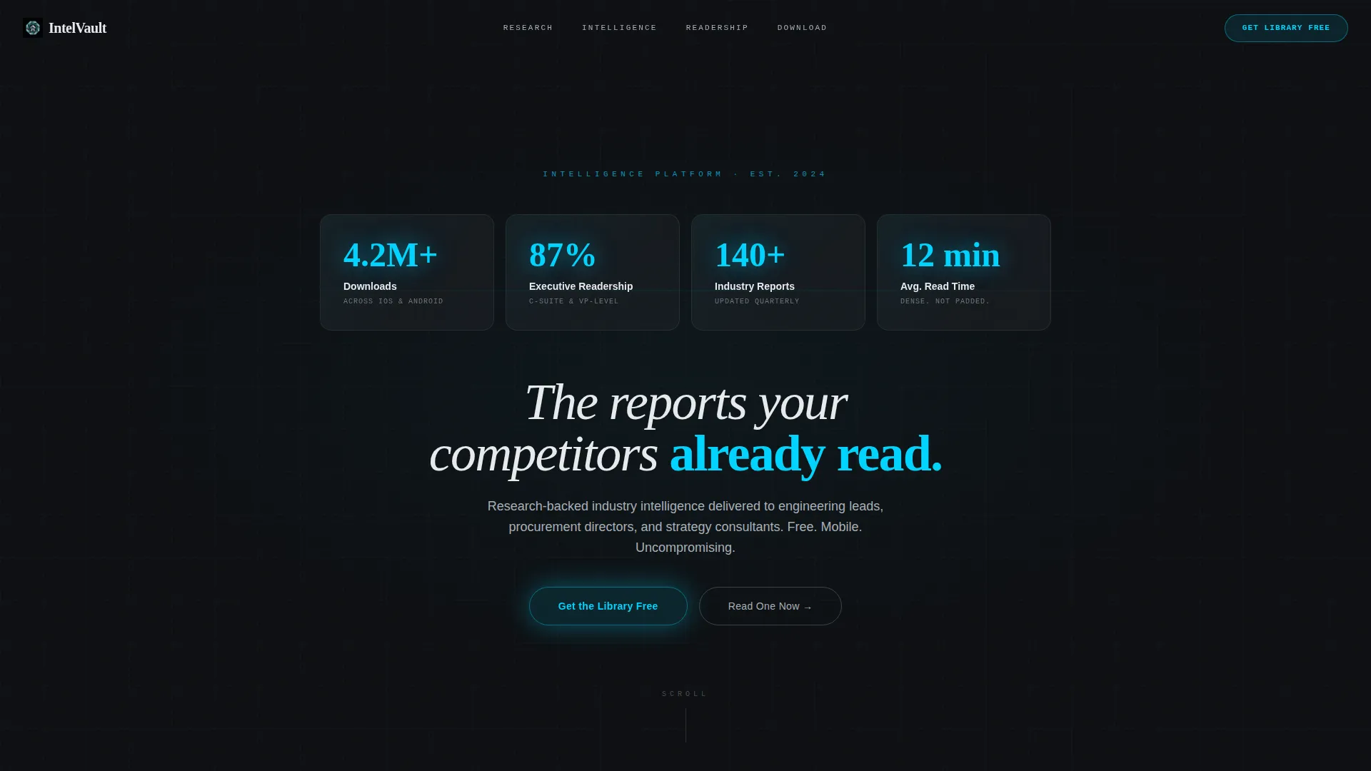
- A four-panel Dark Glass header displaying four live statistics in electric cyan
- Alternating 50/50 split-screen sections pairing animated figures with whitepaper preview thumbnails
- Two app download call-to-action placements: a sticky viewport button and a full-width footer section with app store badges
Feature list
This template packs a specific set of interaction and layout components drawn directly from its Stats-First creative direction.
Dark Glass Panel Header
Four translucent, frosted-glass rectangles float against a near-black background. Each panel holds one oversized statistic in electric cyan with a thin white label beneath. A subtle parallax depth shift responds to cursor movement, making the panels feel like physical glass under overhead light.
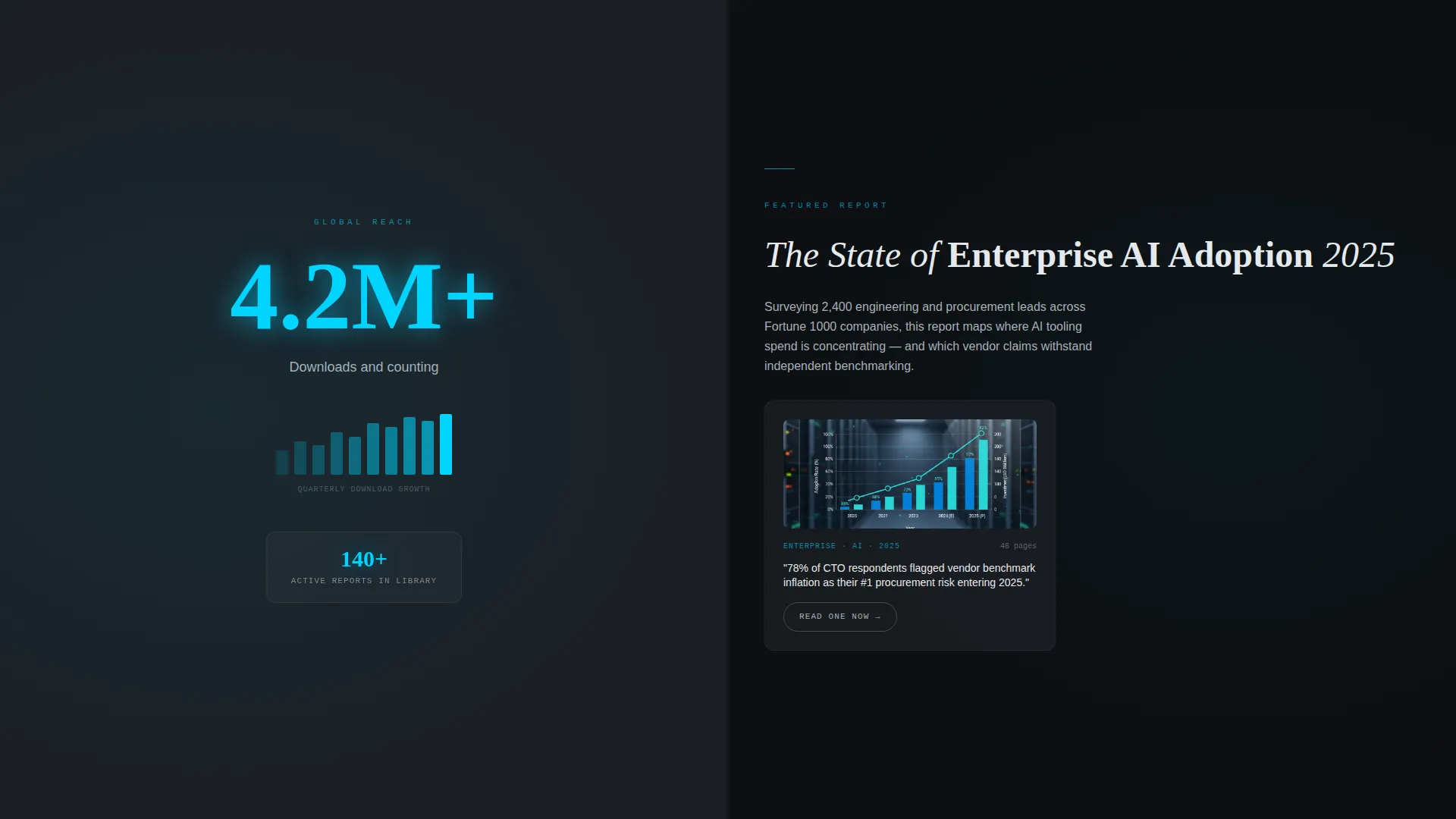
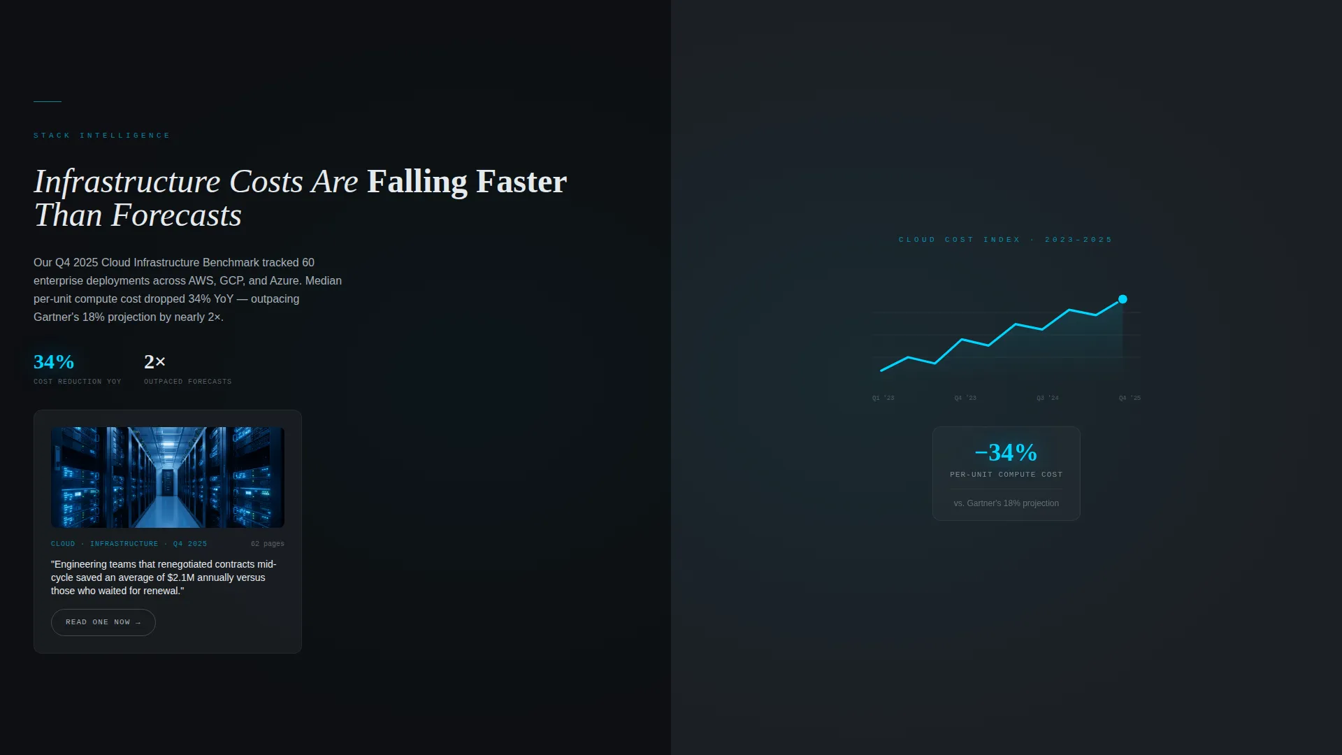
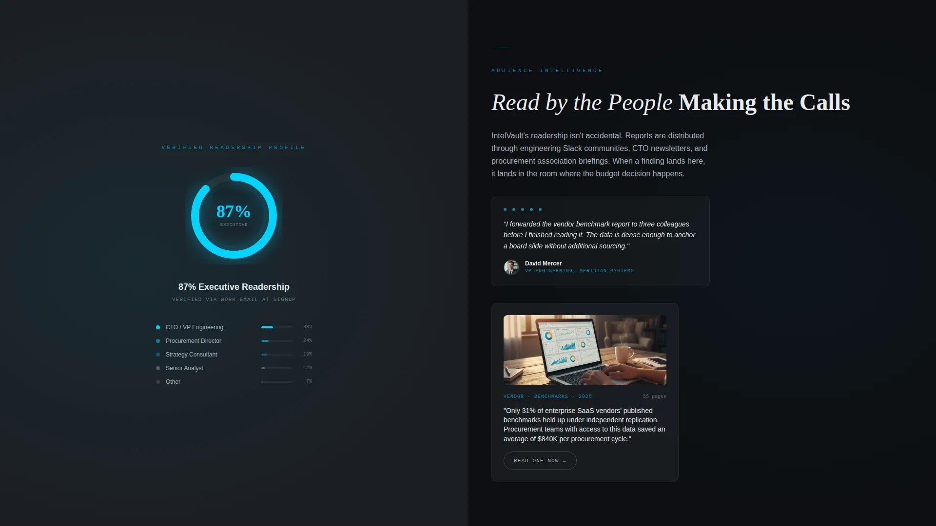
Animated Statistic Sections
Each scroll depth opens with an animated data figure before any explanatory copy appears. Counters spin to their final numbers, a micro line-chart draws itself on screen, and a percentage ring fills as the visitor scrolls. The rhythm is deliberately punch-then-explain throughout.
Split Screen Content Layout
Every content section divides the viewport into an exact 50/50 split. The left panel holds the animated figure; the right panel delivers the context paragraph alongside a whitepaper preview thumbnail. The structure escalates from macro industry statistics down to granular research findings.
Dual Call-to-Action System
The primary call to action, "Get the Library Free," appears twice. After the first scroll it anchors to the bottom of the viewport as a frosted-glass sticky button. A second placement near the footer spans the full width and includes app store badges for both platforms.
Gated Sample Report Path
A secondary call to action, "Read One Now," opens a gated sample report requiring only a work email address. This path delivers instant value to the visitor while seeding the retargeting funnel without adding a form to the main page flow.
Desktop Deep-Link Trigger
On desktop, tapping the primary call to action triggers a phone-number input where the visitor texts themselves the download link. On mobile, the same button deep-links directly to the appropriate app store. No form fields appear on the page itself.
Page sections overview
| Section | Purpose |
|---|---|
| Dark Glass Header | Opens with four animated statistics in frosted-glass panels |
| Stats Impact Row | Delivers the first animated counter before any body copy |
| Split Screen One | Pairs macro industry stat with whitepaper context and thumbnail |
| Split Screen Two | Escalates to segment-specific data with a second report preview |
| Split Screen Three | Closes the data sequence with granular research findings |
| Sticky call to action Bar | Anchors "Get the Library Free" button after the first scroll |
| Full-Width call to action | Final conversion section with app store badges and headline |
Design & branding system
The visual identity follows a Tech Glass theme built on a Monochrome Steel color system. Every color decision reinforces precision and authority without warmth or decoration.
- Four-color palette: deep gunmetal (#1B1F24), brushed chromium (#A8B0B8), frosted panel white (#E8EAED), and electric cyan (#00D4FF) reserved strictly for interactive states, live counters, and the primary call to action
- Backgrounds alternate between gunmetal and near-black; text lives in chromium and white; cyan appears only when it signals action or live data
- Typography stays clean and technical, with oversized numerals anchoring each section and tight white labels providing context beneath them
Mobile & speed optimization
The template is structured to translate its desktop split-screen layout into a clean vertical stack on smaller screens. The visual hierarchy holds because data points lead every section regardless of viewport width.
- Animated counters and ring fills are designed to trigger on scroll, making them as effective on a phone screen as on a wide monitor
- The sticky call-to-action button remains anchored to the bottom of the viewport on mobile, keeping the primary conversion trigger visible throughout the session
- The deep-link behavior adapts automatically: mobile visitors tap directly to the app store while desktop visitors receive a send-link prompt
How this template helps you convert
The conversion logic is built into the page's sequencing. Every section earns attention before asking for it, and the call to action appears exactly when trust has been established.
- The header statistics create immediate credibility before the visitor reads a single sentence of marketing copy, anchoring the session in proof rather than promises.
- The punch-then-explain scroll rhythm keeps visitors moving through the page by rewarding each scroll with a new data point, reducing early drop-off by maintaining curiosity.
- Two call-to-action placements at different scroll depths catch visitors who convert quickly and those who need the full content sequence before they act.
Other information about this template
This template sits within the Documentation and Support category, specifically the White Paper and Research subcategory, targeting the Industry Whitepaper niche. It is built as a single landing page, not a multi-page site.
- The template style is Split Screen (50/50), a layout format well suited to research products where data and explanation share equal visual weight
- The creative direction is Stats-First Impact, meaning no hero image or illustration competes with the numbers
- The header concept is Dark Glass Panels, a design choice that signals precision and technical seriousness from the first visible pixel
- The landing page direction is App Download, so every design and copy decision points toward getting the visitor to install the app rather than fill out a lead form
Theme
Tech Glass
Creative direction
Stats-First Impact
Color system
Monochrome Steel
Style
Split Screen (50/50)
Direction
App Download
Page Sections
Dark Glass Panel Header with Parallax
Animated Scroll-triggered Data Figures
50/50 Split Screen Content Sections
Dual App Download Call-to-action
Gated Sample Report Entry Point
Related questions
Does this template include form fields for lead capture?
Can I replace the statistics in the header panels with my own data?
Is this template suitable for a desktop-only audience?
What is the purpose of the 'Read One Now' secondary path?
Does the template support both iOS and Android app store links?


