Developer Tools & API Professional Website Template
Intercept is a split-screen landing page template built for QA automation and testing platforms. It pairs a dark terminal aesthetic with high-motion split panels, a live Manual QA versus Automated toggle, and a Problem-to-Solution scroll arc. Designed for engineering-focused B2B products, it guides technical buyers from pain point to confident sign-up.
by Rocket studio
Quick summary
Intercept is a single-page landing page template purpose-built for QA automation and developer testing tools. It uses a 50/50 split-screen layout, a Void and Violet color system, and a scrollable Problem-to-Solution arc. Every section is designed to make the cost of manual testing visible and the value of automation undeniable.
Who this template is for
This template is built for B2B software-as-a-service (SaaS) companies selling testing and QA automation tools to technical buyers. It is desktop-first, conversion-focused, and designed for audiences who read terminal output before they read marketing copy.
- Engineering leads and VPs of Engineering who manage flaky test suites and blocked releases
- QA managers spending every sprint manually retesting the same user flows
- Chief Technology Officers (CTOs) watching release confidence collapse because no one trusts the green checkmark
What problem this template solves
Marketing a QA automation platform to engineers is hard. Generic landing pages use vague benefit statements that technical buyers dismiss immediately. This template solves that by making the problem visceral and the solution concrete, showing error logs, regression metrics, and live comparisons instead of buzzwords.
- Buyers leave pages that don't speak their language, so the template leads with terminal output and real failure states
- Manual QA workflows are hard to visualize, so the split-screen layout shows chaos on the left and resolution on the right simultaneously
- Visitors need proof before they commit to a sign-up form, so the call to action (call to action) appears only after value is demonstrated
What you get with this template
You get a fully structured, single-page layout ready to present a testing automation product with credibility and motion. Every section is mapped to a stage in the engineering buyer's decision journey.
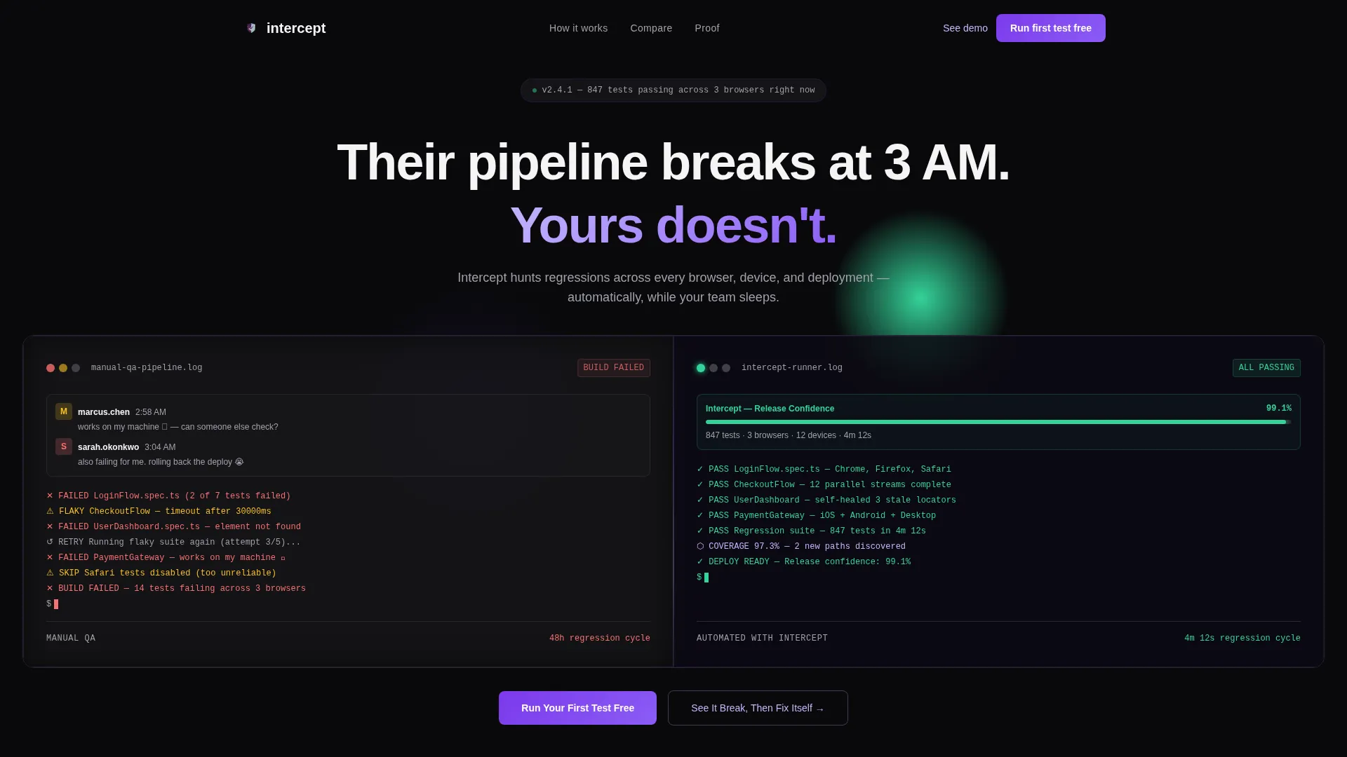
- A hero section with two frosted Dark Glass Panels showing a chaotic manual workflow on the left and a calming automated state on the right
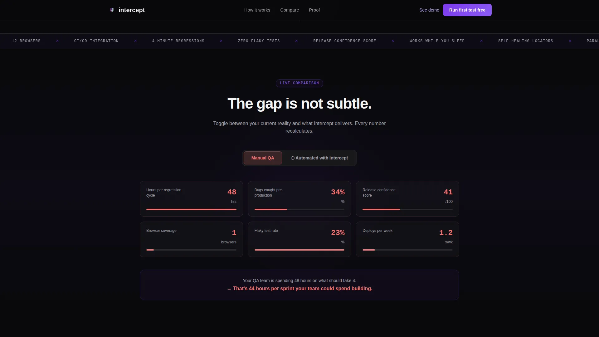
- A live comparison engine where a persistent toggle lets visitors switch between Manual QA and Automated views, recalculating metrics in real time
- Three Problem-to-Solution split sections, each pairing a named QA nightmare with its platform-powered resolution
- A social proof section featuring engineering-role testimonials and concrete metric callouts such as 48-hour to 4-hour regression cycle reductions
- A primary call to action block reading "Run Your First Test Free" and a secondary path labeled "See It Break, Then Fix Itself" triggering a live demo sandbox
- A linear single-row footer completing the layout
Feature list
This template is built around motion, interactivity, and technical credibility. Each feature below is directly reflected in the layout and component structure described in the source brief.
Split-Screen Hero with Dark Glass Panels
Two frosted, semi-transparent panels float over a void-black background. The left panel shows a chaotic manual testing workflow with pulsing red failed-build badges and a simulated "works on my machine" Slack thread. The right panel starts empty and fills with cascading automated test runs as the page loads.
Live Manual versus. Automated Comparison Toggle
A persistent toggle anchored at the top of the comparison engine lets visitors switch between two states. Every metric on the page, including hours per regression cycle, bugs caught pre-production, and release confidence score, recalculates live when the toggle switches.
Problem-to-Solution Scroll Arc
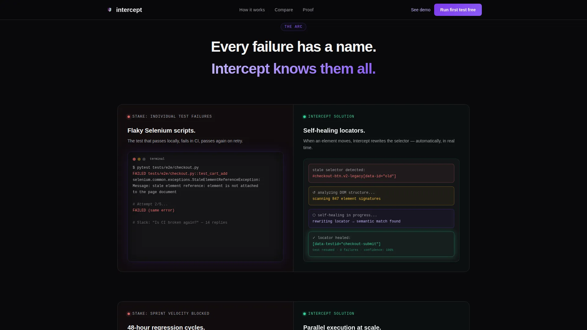
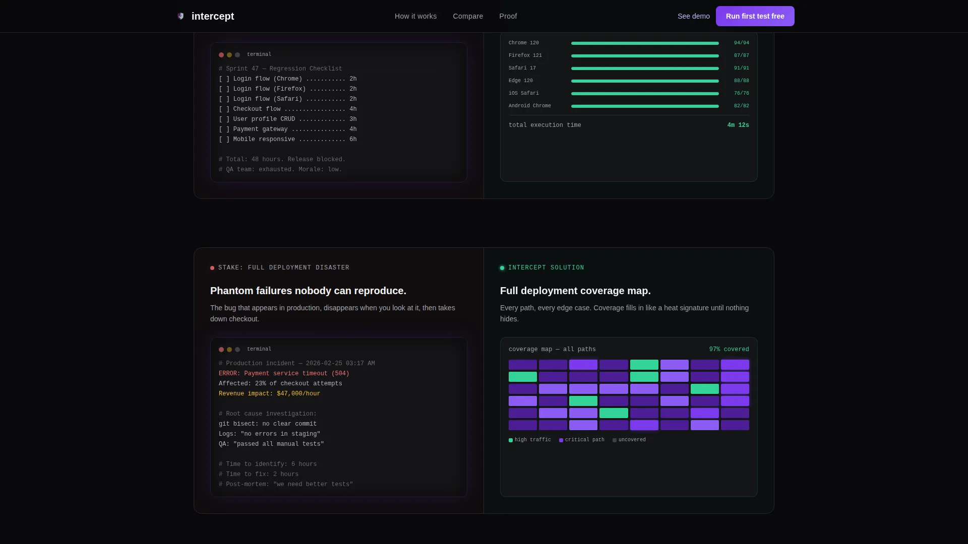
Three dedicated split sections each name a specific QA failure mode on the left, rendered with terminal output and error logs. The right half answers with an animated platform solution: parallel test execution streams, self-healing locators rewriting themselves, and a coverage heat map filling in frame by frame.
Staged call to action Placement
The primary call to action, "Run Your First Test Free," appears after the third comparison block, when the value gap feels undeniable. No sign-up form is shown before that point. When the form does appear, it asks only for a work email and repository URL.
High-Motion Animation System
The template includes cascading terminal line animations, pulsing failure badge effects, split panel reveal sequences, and counter animations. All motion is tied to scroll position and load events, keeping the experience purposeful rather than decorative.
Social Proof with Engineering-Specific Metrics
The social proof section uses testimonials attributed to engineering roles and companies, paired with a metrics bento layout. Concrete before-and-after numbers, such as regression cycle time reductions, make the proof feel real and role-relevant.
Page sections overview
| Section | Purpose |
|---|---|
| Hero Split Panels | Contrasts chaotic manual QA with calm automated testing on load |
| Comparison Engine | Live toggle recalculates QA metrics between Manual and Automated states |
| Problem Arc One | Names flaky Selenium scripts and shows self-healing locator solution |
| Problem Arc Two | Shows 48-hour regression cycles and contrasts parallel execution speed |
| Problem Arc Three | Depicts phantom failures and presents a coverage map resolution |
| Social Proof | Engineering testimonials and concrete metric callouts in bento layout |
| Primary call to action Block | "Run Your First Test Free" with demo sandbox secondary path |
| Single-Row Footer | Linear footer closes the page cleanly |
Design & branding system
The visual identity follows a Dynamic Motion theme with a terminal-inspired aesthetic. The color system is called Void and Violet, built to feel like a command-line interface at 2 AM when the pipeline finally goes green.
- Core palette: absolute void black (#09090B) as the default background, deep phantom violet (#7C3AED) for primary brand elements, luminous cathode lilac (#C4B5FD) for secondary highlights, and clinical pass-green (#34D399) reserved exclusively for success states
- Typography: JetBrains Mono is used for all terminal and code elements, while DM Sans handles body text and headlines for readability contrast
- The frosted glass panel treatment, cascading line animations, and pulsing badge effects reinforce the "failure forming in slow motion, then stopped cold" visual metaphor throughout
Mobile & speed optimization
The template is designed desktop-first, reflecting the reality that engineering tooling buyers work primarily on large screens. Mobile responsiveness is included to ensure the layout holds across devices without breaking the split-screen experience.
- Desktop-first layout prioritizes the full 50/50 split-screen experience, where the contrast between the two panels carries the core message
- Mobile-responsive breakpoints adapt the split layout so both panels remain readable on smaller screens without collapsing the visual metaphor
- Interactive components such as the comparison toggle and demo sandbox trigger are built as client-side components, while static sections use server components for efficient rendering
How this template helps you convert
Every structural decision in this template is aimed at reducing friction for skeptical technical buyers and building trust before asking for anything.
- The page withholds the sign-up form until after the third comparison block, giving visitors three full rounds of problem acknowledgment and solution proof before any commitment is requested.
- The live comparison toggle makes the value gap between manual and automated QA tangible and personal, turning abstract claims into numbers the visitor can interact with and mentally verify.
- The secondary call to action path "See It Break, Then Fix Itself" offers a zero-commitment demo sandbox entry point, giving buyers who are not yet ready to sign up a way to stay engaged and experience the product directly.
Other information about this template
This template was designed for the Testing and QA Automation niche within the broader Developer Tools and Application Programming Interface (API) subcategory of the Technology sector. It is suited to any QA automation platform that uses a conversion goal centered on a free trial or sandbox activation.
- The layout uses an English-language, US dollar, and US date format localization by default
- The Intersection Match Score of 13 reflects a strong alignment between the template's creative direction, niche, and layout style
- The template style is classified as Split Screen (50/50) with a Comparison/Versus landing page direction and a Problem-to-Solution Arc as its creative backbone
- The header concept is specifically labeled Dark Glass Panels, a distinct treatment not shared with generic SaaS templates
- Animation intensity is set to high, with interactivity also rated high, making this template most suitable for products that can support an interactive comparison experience in production
Theme
Dynamic Motion
Creative direction
Problem→Solution Arc
Color system
Void & Violet
Style
Split Screen (50/50)
Direction
Comparison/Versus
Page Sections
Split-screen Dark Glass Hero
Live QA Comparison Toggle
Three-part Problem to Solution Arc
Staged Call to Action with Demo Sandbox Path
Engineering-focused Social Proof
High-motion Terminal Animation System
Related questions
Who is this landing page template designed for?
Does the template include the live comparison toggle functionality?
When does the sign-up form appear on the page?
What animation effects are included in this template?
Can this template be adapted for a product outside QA automation?



