Interior Design Digital Presence Portfolio Website Template
Atelier is a dark-themed, data-driven interior design landing page built on a modular card grid. It leads with live-looking metrics, ROI proof cards, and an animated dashboard header before transitioning into portfolio renders. Designed for studios that speak the language of outcomes, it converts data-literate visitors through measurable evidence rather than mood-board aesthetics.
by Rocket studio
Quick summary
Atelier is a single-page interior design landing page template styled as a data command center. It opens with a full-viewport dashboard header showing animated metrics, then guides visitors through proof-first stat cards, a portfolio grid, a process deck capture card, and a services section. Every element is built to earn trust before asking for a click.
Who this template is for
This template is built for premium interior design studios that want to stand apart from taste-driven competitors. If your clients are analytical, ROI-focused, or decision-paralyzed, this page speaks their language directly.
- Interior design studios targeting tech founders, boutique hoteliers, or high-income couples
- Studio owners who want to lead with measurable outcomes rather than lifestyle photography
- Designers repositioning their practice as a data-informed, systems-driven service
What problem this template solves
Most interior design pages rely on beautiful photography to do the selling. That approach stalls when your audience wants proof, not aesthetics. Visitors with analytical mindsets leave if they cannot see process, methodology, or results.
- Potential clients cannot evaluate quality or rigor from mood boards alone
- High-intent visitors who want to study methodology before booking have no clear path
- Studios with strong outcome data have no structured way to present it upfront
What you get with this template
You get a fully structured, single-page layout that moves visitors from skepticism to action through a deliberate emotional arc. The template is ready to customize with your own metrics, renders, and service details.
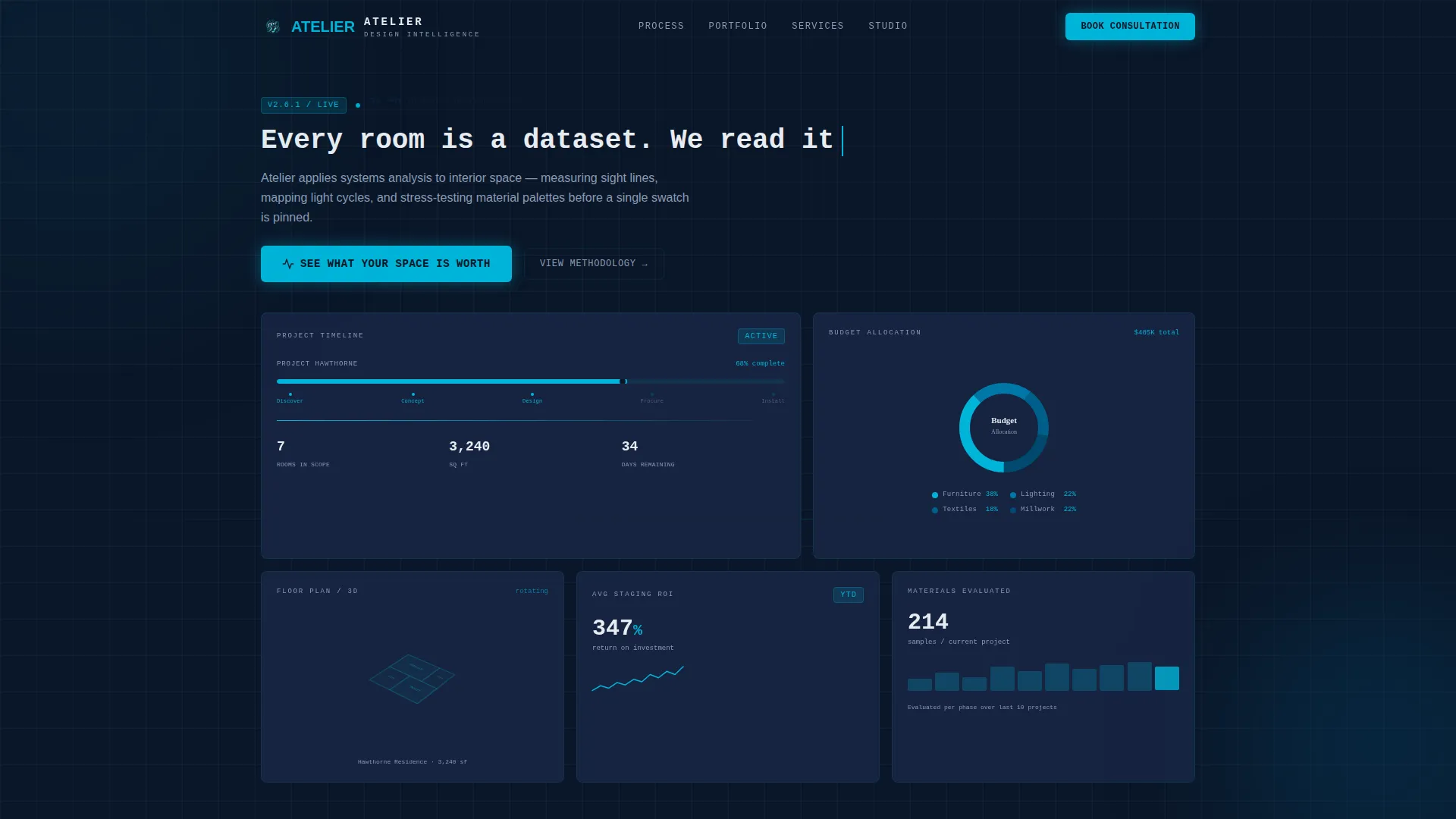
- A full-viewport dashboard header with animated metrics, a radial budget chart, a timeline bar, and a rotating floor plan panel
- A modular card grid alternating wide and two-column layouts, carrying stat cards, portfolio renders, and a process deck capture card
- A persistent bottom call-to-action bar that appears after the third card row, plus a primary button inside the header
Feature list
This template ships with a specific set of interactive and visual components drawn directly from the design brief.
Animated Dashboard Header
The hero fills the entire viewport with a stylized design-operations interface. It displays live-looking metrics such as "214 material samples evaluated," a radial chart of budget allocation, a project timeline bar at 68% completion, and a slowly rotating 3D floor plan. A monospace typewriter headline animates on load, setting the data-command tone immediately.
Proof-First Stats Card Grid
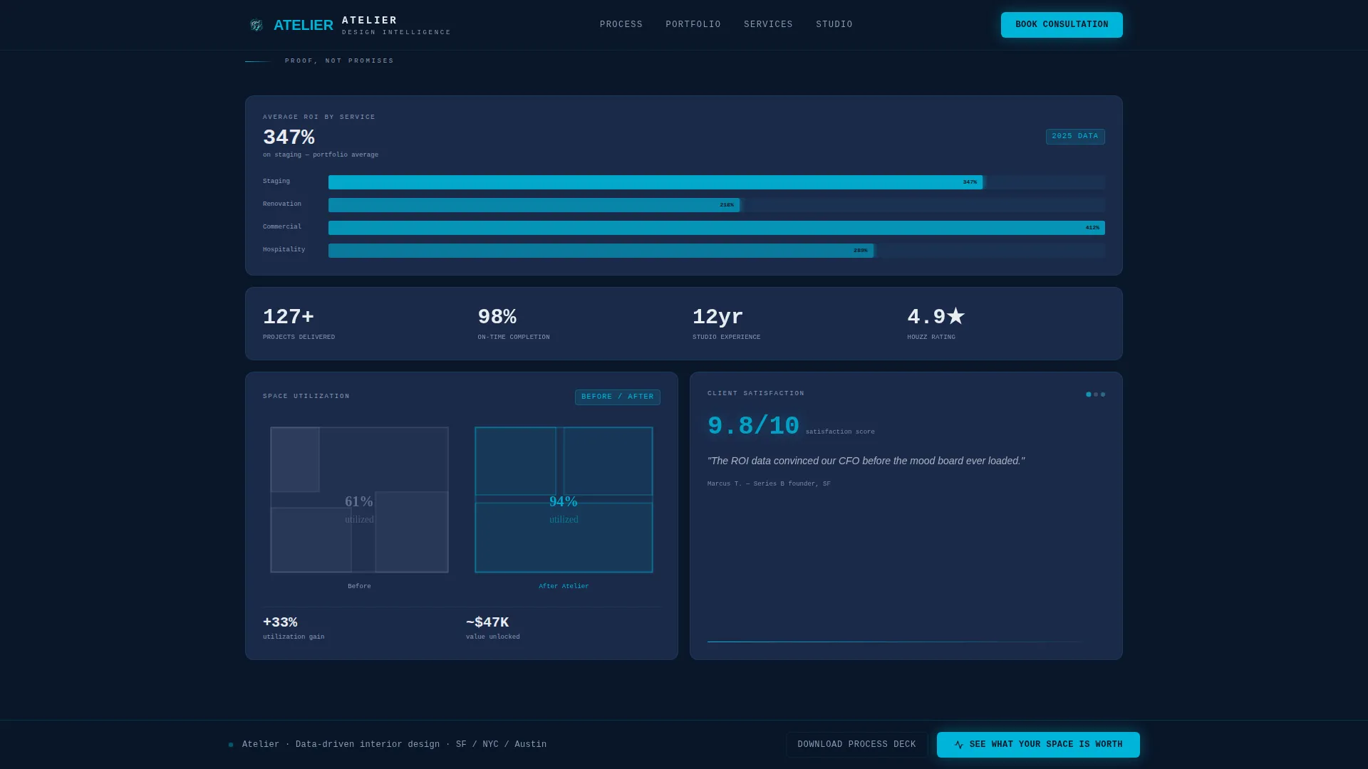
The scroll begins with quantitative evidence cards, not portfolio images. One card displays an average return on investment for staging with a micro-chart. Another shows a before-and-after floor plan with square-footage utilization percentages overlaid. A third cycles through client satisfaction scores with verbatim one-line quotes. This sequence builds trust before the portfolio appears.
Asymmetric Bento Portfolio Grid
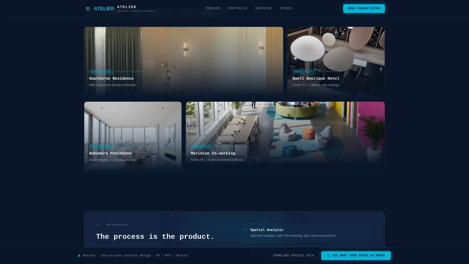
After the stats section, rendered room images appear inside an asymmetric bento-style grid. Because numbers came first, the visual results feel earned rather than decorative. The grid alternates between single wide cards and two-column pairs to create visual rhythm without repetition.
Process Deck Capture Card
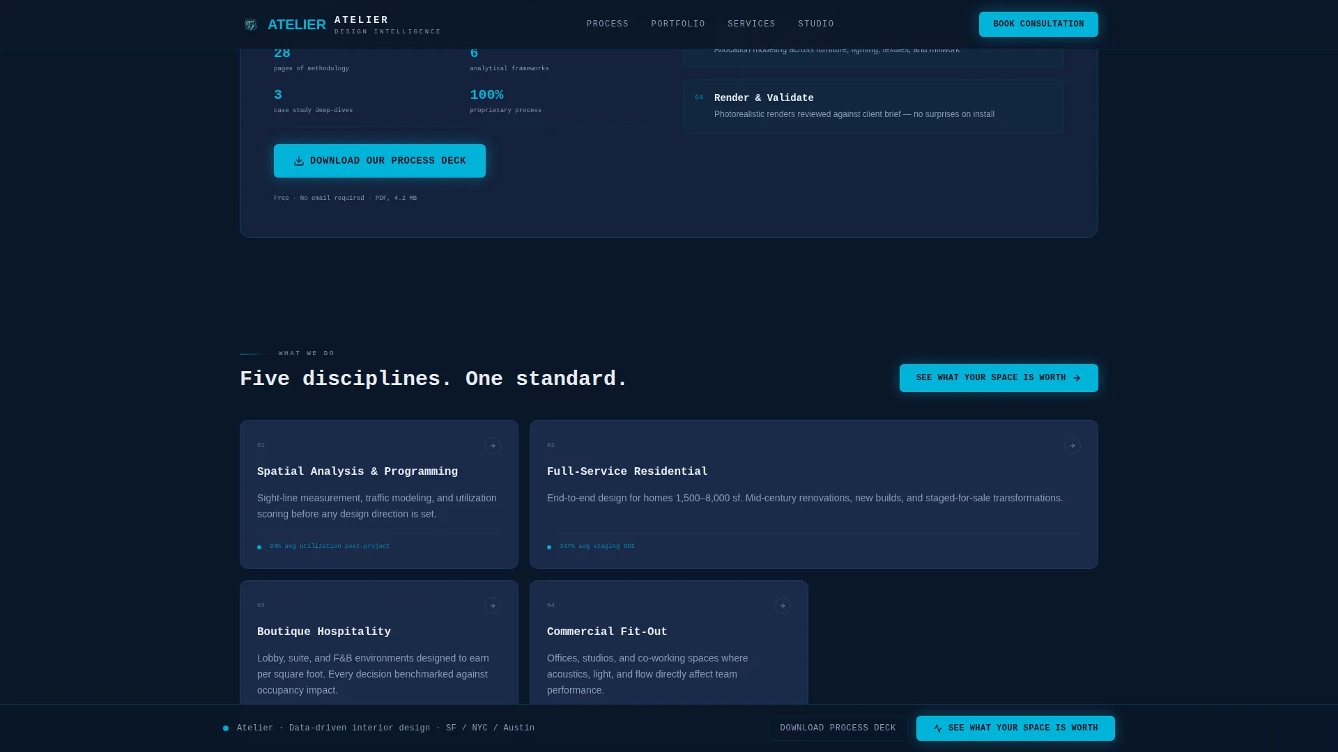
A single dark card near the grid midpoint offers a secondary conversion path. Visitors who want to study the studio's methodology before booking can download a process deck directly from this card. It captures high-intent researchers without interrupting the main scroll flow.
Persistent Bottom Call-to-Action Bar
After the third card row, a sticky bottom bar carries the primary call to action throughout the remainder of the page. This keeps the conversion prompt visible without cluttering individual cards, reducing the effort required to act at any scroll depth.
Scroll-Linked Animation System
Cards stagger into view as the visitor scrolls. Progress bars and radial charts animate on entry. Hover states on every card illuminate in electric cerulean. These interactions reinforce the cockpit aesthetic and signal that the interface is alive and responsive.
Page sections overview
| Section | Purpose |
|---|---|
| Dashboard Header Hero | Opens with animated metrics, typewriter headline, radial chart, timeline bar, and rotating floor plan |
| Stats Proof Grid | Presents ROI cards, floor plan utilization overlays, and cycling satisfaction scores as first-scroll evidence |
| Portfolio Render Grid | Displays rendered room results in an asymmetric bento layout after trust is established by data |
| Process Deck Card | Offers a methodology download as a secondary conversion path for high-intent researchers |
| Services Card Grid | Outlines what the studio delivers across modular service cards |
| Footer Row | Closes the page with a linear single-row footer layout |
Design & branding system
The visual language is built around a Data Command theme. Every color choice and typographic decision reinforces the idea of a precision instrument, not a decorative portfolio.
- Color palette: deep navy (#0A1628) as the primary background, tactical slate (#1B2A4A) on card surfaces, cool interface white (#E8ECF1) for all body and headline type, and electric cerulean (#00B4D8) as the accent on hover states, progress rings, and live data callouts
- Typography: JetBrains Mono for headlines and data labels to reinforce the monospace cockpit feel, DM Sans for body copy to keep longer text comfortable and readable
- Visual style: no stock photography or lifestyle imagery in the hero; the aesthetic relies entirely on interface elements, glowing cerulean data points, and rendered room outputs to communicate quality
Mobile & speed optimization
The template is designed desktop-first to preserve the full cockpit aesthetic, with responsive behavior that adapts the layout cleanly to smaller screens.
- The card grid collapses from alternating wide and two-column pairs into a single-column stack on mobile, keeping proof cards and portfolio items readable without horizontal scrolling
- Animations use a split between server-rendered static components and client-side components for interactive elements, so the page structure loads before animations begin
- The persistent bottom call-to-action bar reflows to a full-width mobile strip, keeping the primary conversion prompt accessible at all scroll depths
How this template helps you convert
The page is structured to move a skeptical, analytical visitor through a deliberate trust sequence before presenting any conversion prompt as a taste or lifestyle decision.
- The dashboard header and stats grid lead with measurable outcomes, so visitors arrive at the call-to-action already persuaded by numbers rather than visuals alone
- The primary call-to-action button appears inside the header and then recurs as a persistent bottom bar after the third card row, reducing the distance between conviction and click
- The process deck download card provides a lower-commitment secondary path, capturing high-intent visitors who are not yet ready to book but want to evaluate the methodology in depth
Other information about this template
This template is part of a broader interior design landing page category designed for studios that operate at the intersection of design craft and analytical rigor.
- The template style is a modular card grid with a bento asymmetric portfolio section, making it straightforward to add, remove, or reorder cards as your service offering evolves
- It is localized for English-language, United States contexts with USD currency formatting and MM/DD/YYYY date conventions built into the data display components
- The template sits within the Technology category and the Interior Design Digital Presence subcategory, reflecting its positioning as a design-tech product rather than a traditional portfolio theme
Theme
Data Command
Creative direction
Stats-First Impact
Color system
Midnight Blue
Style
Card Grid (Modular)
Direction
Click-Through
Page Sections
Animated Dashboard Header
Proof-first Stats Card Grid
Asymmetric Bento Portfolio Grid
Process Deck Capture Card
Persistent Bottom Call-to-action Bar
Scroll-linked Animation System
Related questions
Can I replace the demo metrics with my studio's real data?
Does this template work for a studio that is just starting out with limited project data?
What does the process deck capture card do?
Is the portfolio grid section limited to rendered room images?
Can the persistent bottom call-to-action bar be hidden on specific sections?



