Smart Warehouse Management Landing Page Template
This open-source warehouse management system landing page template is built for logistics teams who need enterprise-grade inventory control without the enterprise price tag. It uses a dark dashboard aesthetic, a live metrics header, and a feature comparison grid to make the case for deployment in seconds. No sales call required.
by Rocket studio
Quick summary
A dark-mode, data-first landing page template for an open-source warehouse management system. It opens with a live metrics wall, moves into a systematic feature comparison grid, and closes with a frictionless deploy form. The design language mirrors an ops dashboard at 2 AM: calm, precise, and built to hold a technical reader's attention.
Who this template is for
This template is designed for teams who already understand warehouse operations and need to communicate system value to the right decision-makers fast.
- Operations managers at third-party logistics providers running 50,000 or more SKUs
- Direct-to-consumer brands scaling past their first warehouse facility
- Supply chain directors at mid-market manufacturers who need real-time inventory accuracy without vendor lock-in
What problem this template solves
Enterprise warehouse management software is expensive, slow to implement, and often still can't handle the workflows that modern logistics teams actually run. This template gives the open-source alternative a credible, professional front door that earns trust before anyone books a meeting.
- It replaces vague marketing copy with hard numbers and direct feature comparisons
- It removes the need for a sales call by letting the data do the convincing
- It gives technical buyers a clear path to self-serve deployment in minutes
What you get with this template
You get a fully structured single-page layout that takes a visitor from curiosity to deployment conviction. Every section is purpose-built to advance that decision, not decorate it.
- A live stats header with four oversized metric cards that count up on load
- A multi-category feature comparison data grid with teal checkmarks, slate gaps, and amber pricing rows
- A sticky call-to-action bar and a three-field deploy form with no demo booking required
Feature list
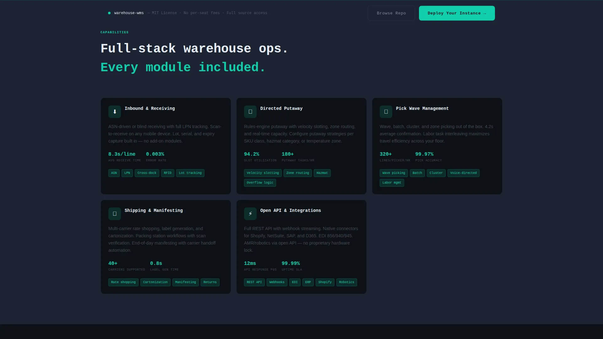
This template packs its most important structural and visual tools into a compact, high-trust layout.
Live Metrics Header Wall
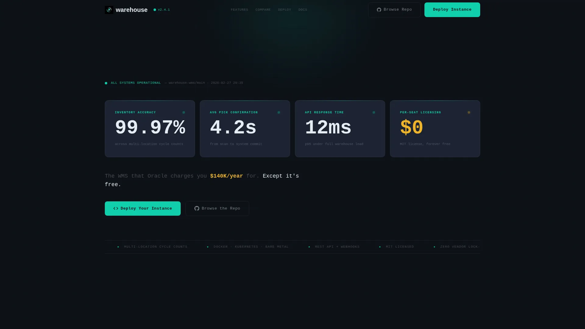
Four oversized metric cards display real performance numbers: 99.97% inventory accuracy, 4.2-second average pick confirmation, 12ms API response time, and zero per-seat licensing cost. Each number animates upward on page load, simulating a deploy monitor spinning to green.
Feature Comparison Data Grid
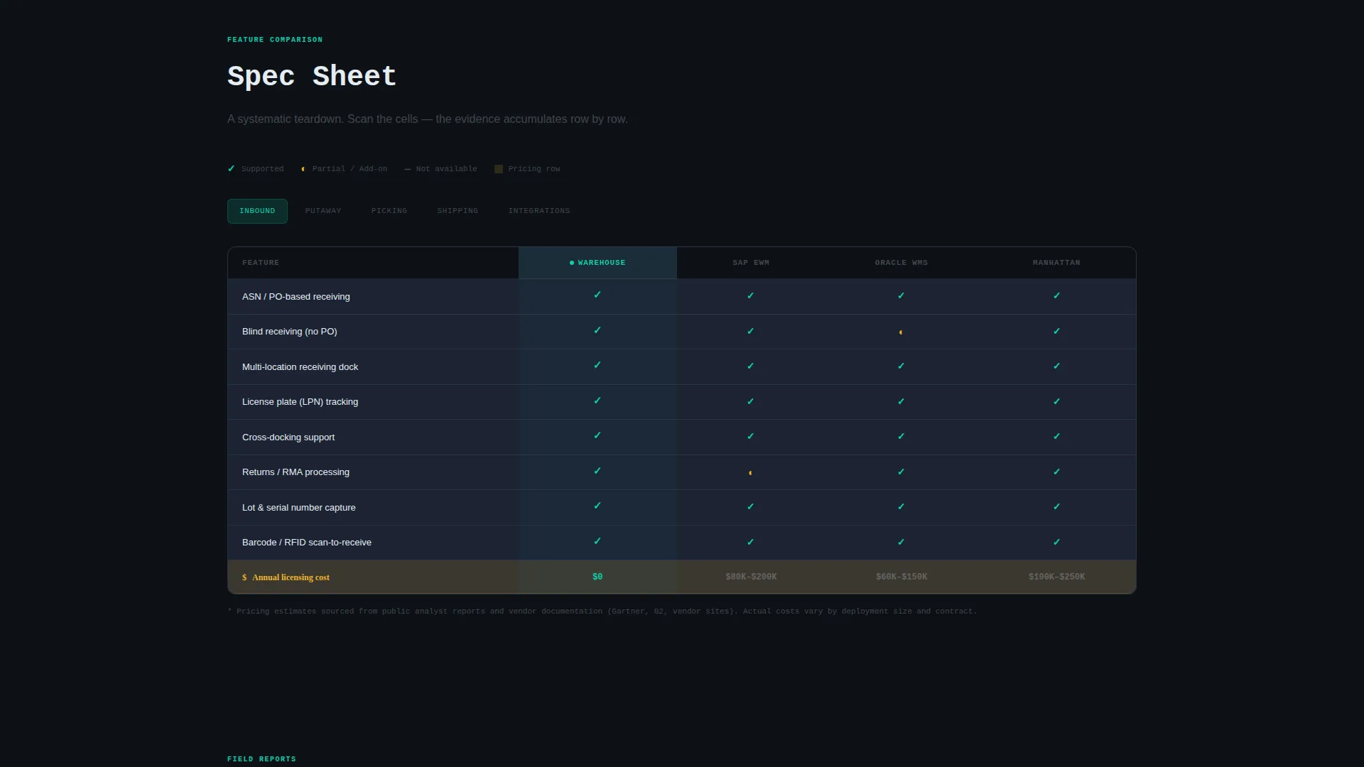
The comparison grid organizes the system teardown into feature categories: Inbound, Putaway, Picking, Shipping, and Integrations. Each category renders as a structured data grid with columns comparing the system against enterprise incumbents. Teal checkmarks signal supported features, slate cells mark gaps in competing products, and amber rows highlight pricing differences.
Sticky Deploy Call-to-Action Bar
After the comparison grid loads, a sticky bar persists on scroll with the primary "Deploy Your Instance" button. This keeps the conversion action visible without interrupting the scanning flow that drives conviction.
Three-Field Deploy Form
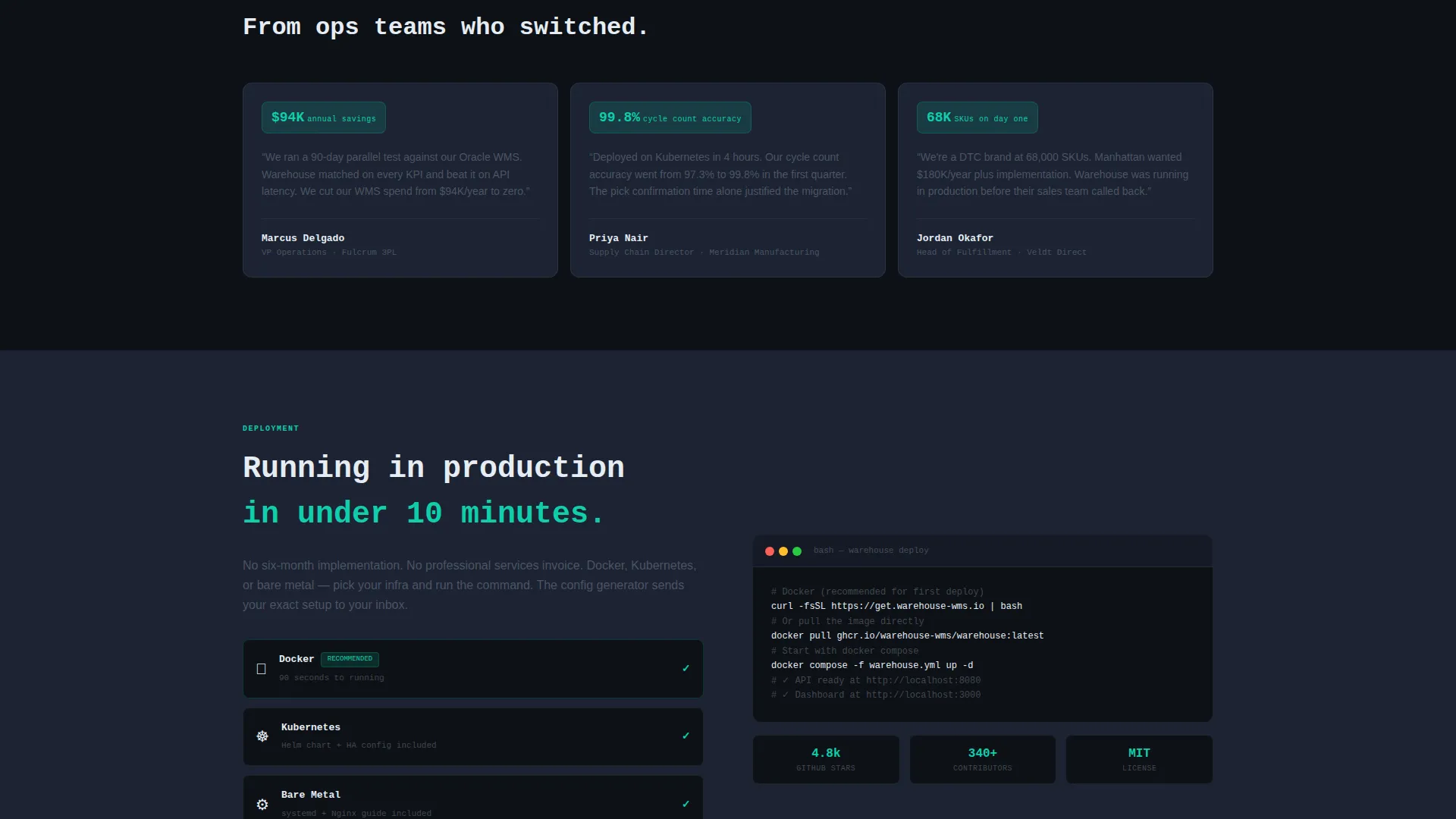
The deployment form asks only three things: infrastructure preference (Docker, Kubernetes, or bare metal), estimated SKU count, and work email. No demo scheduling, no sales representative contact, and no multi-step funnel.
Dark Dashboard Visual System
The Teal Catalyst color system uses deep terminal black for the page base, primary teal for active elements and checkmarks, cool slate for card surfaces, sharp white for data text, and amber for alert-style callouts. The result is a palette that is comfortable to read for extended sessions.
Dual Conversion Path Layout
The primary call-to-action ("Deploy Your Instance") appears immediately after the metrics header and again in the sticky bar. A secondary path ("Browse the Repo") links to the project repository for technical validation before committing to deployment.
Page sections overview
| Section | Purpose |
|---|---|
| Metrics Header Wall | Display live performance stats with animated count-up cards |
| Tagline Row | Deliver the core value proposition in a single direct line |
| Inbound Data Grid | Compare inbound receiving features against enterprise products |
| Putaway Data Grid | Show putaway workflow capabilities row by row |
| Picking Data Grid | Contrast pick wave and confirmation speed against competitors |
| Shipping Data Grid | Lay out shipping feature parity with enterprise incumbents |
| Integrations Data Grid | Summarize integration support across the comparison matrix |
| Sticky call to action Bar | Keep deploy action accessible throughout the scroll |
| Deploy Form | Capture infrastructure preference, SKU count, and work email |
Design & branding system
The Teal Catalyst color system is designed for long-session readability. It draws from the visual language of real operations dashboards, not from SaaS marketing trends.
- Deep terminal black (#0D1117) as the page base, cool slate (#1C2333) for card surfaces, and sharp white (#E6EDF3) for all data text
- Primary teal (#0FCEAB) used for active checkmarks, buttons, and pulsing status indicators throughout the grid
- Amber (#F0B429) reserved for warning-style contrast on pricing rows and competitive gap callouts
Mobile & speed optimization
The template is structured with a data-grid-first layout that prioritizes fast visual parsing on any screen size. Metric cards and grid columns are designed to reflow cleanly for smaller viewports.
- Oversized metric cards stack vertically on mobile without losing their count-up animation impact
- The sticky call-to-action bar remains accessible across all screen sizes so the deploy action is never buried
- The three-field form is intentionally minimal, reducing input friction on touch interfaces
How this template helps you convert
The page earns the deployment click by making the comparison unavoidable. It does not rely on testimonials or feature lists written in prose.
- The metrics header opens with hard numbers that establish credibility in the first viewport, before any copy is read
- The comparison grid accumulates evidence row by row across five feature categories, making the value case without a single persuasive sentence
- The sticky bar and inline deploy form remove every step between conviction and action, converting a technically confident visitor on the spot
Other information about this template
This template is built inside the Startup Velocity theme family, which is designed for technical products that need to communicate speed, reliability, and openness without leaning on corporate design conventions. The Spec Sheet creative direction is what makes the comparison grid the emotional and functional core of the page. The Dashboard and Data Grid template style means every visual element earns its place by communicating a data point, not by adding decoration. The Comparison and Versus landing page direction means the page is structured to resolve a purchase decision, not to introduce a brand. This template is well-suited for open-source enterprise software projects that compete against established commercial vendors by making the feature and cost comparison explicit.
- Template theme: Startup Velocity, using the Teal Catalyst color system
- Template style: Dashboard and Data Grid, with Spec Sheet creative direction
- Landing page direction: Comparison and Versus, built for decision-stage visitors
- Category context: Technology, Open-Source Enterprise Software, Open-Source WMS niche
Theme
Startup Velocity
Creative direction
Spec Sheet
Color system
Teal Catalyst
Style
Dashboard/Data Grid
Direction
Comparison/Versus
Page Sections
Live Metrics Header with Count-up Animation
Five-category Feature Comparison Grid
Sticky Deploy Call-to-action Bar
Minimal Three-field Deploy Form
Dual Conversion Path Design
Dark Dashboard Color System
Related questions
Who is this landing page template designed for?
Does this template include a demo booking or sales call flow?
What feature categories does the comparison grid cover?
Can I relabel the comparison grid columns for different competitor products?
What does the deploy form collect from a visitor?



