Open-Source Enterprise Software Premium Professional Website Template
The Catalog landing page template is a bento grid layout built for open-source product information management (PIM) tools. It turns scattered spreadsheet chaos into a structured, terminal-native narrative that speaks directly to operations managers, catalog teams, and integration engineers. The page guides every visitor from data disorder to deployment confidence, with a strong call to action at every scroll fold.
by Rocket studio
Quick summary
This is a single-page bento grid landing page template for Catalog, an open-source PIM engine. It follows a Problem to Solution arc, opening with integration logos and a live CLI snippet, then walking visitors through data chaos resolved into clean, governed product records. The design uses a Monochrome Steel palette and terminal typography to communicate authority, speed, and open-source credibility.
Who this template is for
This product landing page template was built for teams who live inside messy data pipelines and need a landing page that speaks their language. It does not talk down to technical buyers. It meets them where they already are: frustrated, deadline-driven, and looking for a tool that actually works.
- E-commerce operations managers drowning in multi-tab spreadsheets who need a single governed source of truth for product data
- Integration engineers wiring enterprise resource planning (ERP) systems to storefronts who need a credible, deploy-ready landing page fast
- Catalog teams at mid-market brands launching across multiple new marketplaces who need a product launch page that earns trust quickly
What problem this template solves
A product landing page is designed to promote and sell a specific product or service, and the goal is to guide visitors toward making a purchase decision or deployment action. Most landing page templates in this space either look like SaaS marketing fluff or developer README files. Neither converts the audience this PIM serves. This template solves that gap.
- Product data sprawl is invisible to most landing pages. This template makes the cost of scattered SKU data visceral and immediate, before naming a single feature.
- Generic page templates fail to segment developer and operations buyers. This layout uses bento cells that speak to both audiences simultaneously without losing either.
- Slow, form-heavy landing pages lose engineers fast. This clean landing page removes all form friction and drives clicks to either a deployment wizard or GitHub, meeting each visitor at the right conversion point.
What you get with this template
This landing page template delivers a fully structured, section-led page ready to adapt and deploy. Every component serves the Problem to Solution arc. Nothing on the page is decorative without purpose. The template is a complete design system plus narrative framework, not just a visual shell.
- A bento grid layout with staggered reveal animations, hover states on every cell, beam animations, scroll-linked transitions, and a blinking cursor CLI cell that makes the open-source install feel real and immediate
- A horizontal logo marquee header, a sticky call to action bar after the third scroll fold, and two conversion paths: a primary "Deploy Your Instance" button in signal-green and a secondary "Star Us on GitHub" badge showing a live star count
- Five structured content sections covering the hero bento grid, a before-and-after data visualization arc, a channel sync and integrations panel, a trust and metrics block, and a final deploy call to action with a footer in Vercel Horizontal Flow pattern
Feature list
This template ships with a focused set of components. Each one is grounded in the product brief and serves the overall landing page design. Below are the key features built into the template.
Problem-to-Solution Bento Grid Arc
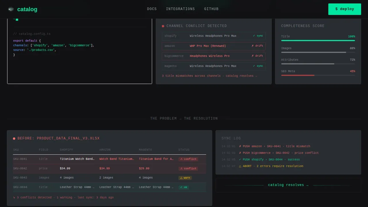
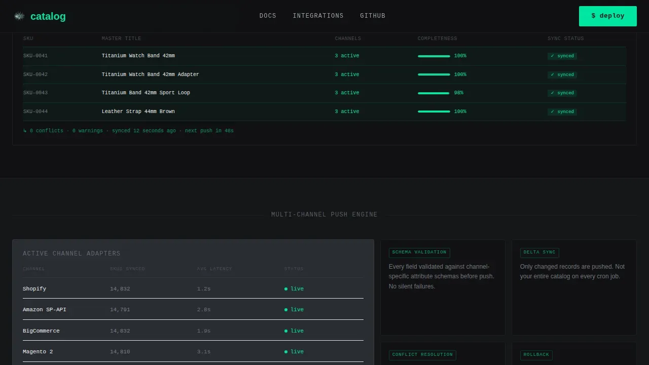
The first row of bento cells shows the mess: conflicting product titles, spreadsheets with red error highlights, and channel sync failures. As the visitor scrolls, the grid resolves. Cells shift to show unified records, green sync confirmations, and attribute completeness scores climbing to 100 percent. The grid itself becomes the product demo, making the value proposition tangible without a word of feature copy.
Terminal CLI Install Cell
A bento cell in the hero section displays a styled, three-line command-line interface (CLI) install sequence with a blinking cursor. This makes the open-source nature of the tool tactile and credible before any prose explains it. Engineers reading this landing page immediately understand the tool is self-hostable and developer-native.
Sticky Call to Action Bar
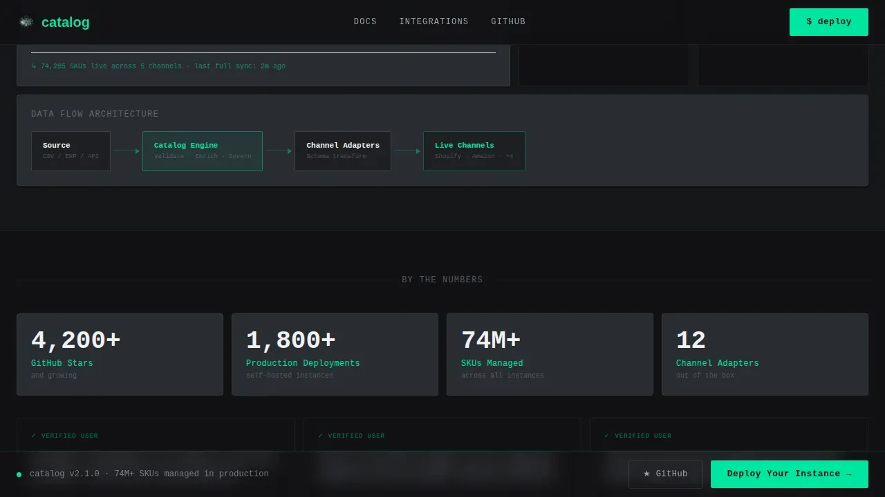
After the third scroll fold, a sticky bar appears with the primary call to action. This persistent element ensures that a motivated visitor never has to scroll back up to act. It is one of the key features that drives a high converting landing page for developer and operations audiences who decide quickly and move on quickly.
Integration Logo Marquee Header
A slowly scrolling horizontal logo bar opens the page beneath the headline. It displays integration marks for major e-commerce platforms and developer APIs. The marquee is not decorative. It shows the visitor's current environment rendered as quiet, confident signal. It answers the question "does this tool work with what I already use?" before the visitor even thinks to ask.
Trust and Metrics Block
This section surfaces social proof in the form of a live GitHub star count badge, deployment count, and community proof indicators. Including social proof builds credibility and trust with potential customers who need validation before committing to a new tool. The star badge also acts as a secondary conversion path for the developer segment.
Dual Conversion Path Design
The landing page design avoids a single call to action dead end. Engineers who need code evidence click "Star Us on GitHub." Operations buyers who are ready to move click "Deploy Your Instance." Both paths land on relevant next steps without any form friction. This dual-path approach improves conversion rate by matching the call to action to the buyer's readiness level.
Page sections overview
| Section | Purpose |
|---|---|
| Hero Bento Grid | Opens with logo marquee, CLI cell, primary call to action, and problem visualization cells |
| Problem to Solution Arc | Before-and-after bento showing data chaos resolving into clean, governed product records |
| Channel Sync Panel | Visualizes multi-channel product data push across storefronts and marketplaces |
| Trust and Metrics | Displays GitHub stars, deployment count, and community proof as social proof |
| Deploy Call to Action | Final conversion section with primary and secondary conversion paths |
| Footer | Vercel Horizontal Flow pattern footer closing the page |
Design & branding system
The visual identity follows a Data Command theme. The Monochrome Steel color system makes every design decision feel purposeful and precise. The palette is deliberately cold: no warmth, no decoration, just the quiet authority of infrastructure that works. The use of white space throughout the layout enhances readability and focuses attention on the data narrative unfolding across the bento grid.
- Color system uses forge-black (#111113) for primary backgrounds, brushed graphite (#2A2D32) for surface cells, cold-rolled silver (#9EA3AE) for secondary text, pure near-white (#F0F1F3) for body text, and signal-green (#00E5A0) reserved strictly for call to action buttons, status indicators, and success states
- Typography pairs JetBrains Mono for all terminal, code, and CLI elements with DM Sans for body copy, creating a clear visual hierarchy between machine-language and human-language content within the same landing page design
- Backgrounds alternate between forge-black and graphite across sections, with the green accent appearing sparingly so that every appearance of it carries weight and meaning
Mobile & speed optimization
The template is built desktop-first to match the primary audience of operations managers and integration engineers working on desktop environments. At the same time, the layout is fully responsive so the page works cleanly across any screen size. A significant portion of users access websites via mobile devices, so the bento grid adapts to single-column layouts on smaller screens to keep the narrative intact.
- The template is fully responsive with bento cells stacking cleanly on mobile, preserving the Problem to Solution arc without breaking the visual flow or losing any critical call to action placement
- Scroll-linked reveals, staggered bento entries, and count-up number animations are implemented as client-side components, while static sections use server components to keep the page fast loading and structurally clean
- Large, tappable buttons are used throughout the mobile layout, and the sticky call to action bar remains active on mobile so that more visitors can convert without needing to scroll back to the top
How this template helps you convert
A strong call to action is essential on product landing pages. This template does not rely on a single moment to earn the click. It builds toward conversion across every scroll fold. The design of a product landing page should focus on a singular offer, and here that singular offer is deployment. Every element serves that one outcome.
- The Problem to Solution arc makes the cost of inaction visceral. Visitors see their own chaos reflected in the opening bento cells. By the time the solution cells appear, they are already emotionally prepared to act. The call to action lands after the problem has been felt, not just described.
- Social proof at the trust and metrics block gives the visitor third-party validation before they commit. A live GitHub star count and deployment metrics answer the question "is anyone else actually using this?" without requiring the visitor to leave the page. This supports nurturing leads who are in research mode before they convert.
- The dual conversion path removes decision paralysis. Engineers click the GitHub path. Operations buyers click the deploy path. Neither group is asked to fill a form. The page removes every barrier between intent and action, supporting a high converting landing experience tuned specifically to this technical audience.
Other information about this template
This template is a free landing page template available as part of the platform's template library. It is a free template that teams can adopt as their own project without needing extensive technical expertise. The source code is structured and readable, making it straightforward to customize even for teams with limited front-end experience.
The template uses a user friendly editor workflow. Teams can easily customize the page's content, adjust color tokens, and swap integration logos without rebuilding the layout. The chosen template structure separates design system tokens from content, so updating a brand's identity across the full page takes minimal effort. Editors can generate copy directly inside the content layer without touching the layout components.
For teams exploring many templates before committing, this free version provides the full page structure with no feature gates. There is no watered-down free landing page experience here. You get the complete bento grid, all animations, and both conversion paths from the first deployment.
This landing page template works across different industries beyond open-source PIM. Any developer tool, B2B SaaS product, or data infrastructure product launching physical or digital products can adapt this template's narrative arc to their own value proposition. The modern design and minimalist design language translate well to any technical product page.
The template is built with clean, readable HTML templates under the hood. Teams who prefer a drag and drop editor workflow can layer one on top. For those comfortable with the source code, the drag and drop abstraction is optional. Both workflows are supported.
Below is a curated list of what makes this template stand out among the many templates in this category:
- The bento grid layout is visually stunning pages delivered through a structured, purposeful grid rather than decorative blocks
- Interactive elements like the blinking CLI cursor, scrolling logo marquee, and count-up metrics create engaging animations that hold attention without sacrificing clarity
- The page is professionally designed to meet the standards of successful landing pages in the developer tool and open-source enterprise software space
- For teams planning a product launch across multiple marketplaces, this template supports messaging for multiple products or channel targets within a single, cohesive landing narrative
- The template includes a pricing information placeholder cell and detailed information blocks in the bento grid that teams can populate for their own deployment context
- Video content cells can be integrated into the bento grid for teams that want to add product demos or walkthrough clips alongside the data visualization cells
- Capturing leads is handled through the deployment wizard click-through rather than an on-page form, keeping the user journey clean and friction-free
- Teams working on digital marketing campaigns can point paid traffic directly to this landing page, knowing the page's content is structured to drive conversions from cold visitors
- The high quality design of this template means it attracts more visitors who stay longer, reducing bounce and increasing the chance of a meaningful conversion
As mentioned earlier in the conversion section, the dual call to action path is the single most important structural decision in this template. It reflects the reality that the target audience includes both developers and operations buyers, and effective landing pages serve both without compromising either. Mentioned earlier in the bento arc discussion, the visual progression from entropy to order is the template's most distinctive narrative device. A digital product landing page rarely uses its layout as its argument, but this one does exactly that.
This template functions as a clean landing page for a digital product landing that communicates infrastructure-level credibility. Whether you are launching a digital product landing page for an open-source tool or adapting the structure for a different technical offer, the clean landing foundation holds. The page is built to be a clean landing environment from the first pixel to the final sticky bar. Deploying this catalog deploy clean product data landing page template takes just a few clicks through the platform's launch flow, and teams can have a live landing page running on a custom domain in a single session.

Theme
Data Command
Creative direction
Problem→Solution Arc
Color system
Monochrome Steel
Style
Bento Grid
Direction
Click-Through
Page Sections
Problem-to-solution Bento Grid Arc
Terminal CLI Install Cell
Sticky Conversion Bar
Integration Logo Marquee
Trust and Metrics Block
Dual Conversion Path Design
Related questions
Do I need coding skills to use this template?
Can I use this template for products other than a PIM tool?
Is this a free template?
How does the template handle mobile layouts?
Can I connect this landing page to a custom domain?



